

What are the basic principles of slide design?

Let’s understand the basic principles of slide design.
1. Conciseness:
- (1) **Content conciseness:** Each slide should highlight a topic and avoid information overload.
- (2) **Concise text:** Use short, clear text to avoid excessive text accumulation.
2. Consistency:
- (1) **Style consistency:** Keep the style of the entire slide set consistent, including fonts , color, layout, etc.
- (2) **Consistent layout:** Keep slides with similar content in a similar layout to improve the overall aesthetics.
3. Readability:
- (1) **Font selection:**Choose clear and easy-to-read fonts and ensure that the font size is appropriate .
- (2) **Color matching:** Use contrasting colors to ensure there is sufficient contrast between the text and the background.
Now let us take a look at some key skills in puzzle games to help players who have not passed the level yet. The first is about the use of images. In games, pictures are often one of the key clues. Look carefully at each picture, paying attention to the details and hidden information, which may lead you to your next
- (1) **High Quality Pictures:** Use high quality, Clear pictures without stretch distortion.
- (2) **Picture and text matching: **There must be a reasonable combination between text and pictures to highlight the main information.
5. Process:
- (1) **Logical flow:**Arrange the logical flow of the content to ensure that the audience can understand it smoothly Speech ideas.
- (2) **Transition effect:** Use appropriate transition effects to make page switching more natural.
6. Creativity:
- (1) **Fascinating: **Appropriately add some creative elements to arouse the audience's interest.
- (2) **Chart design:** Use eye-catching charts and graphics to enhance visualization effects.
7. Highlight key points:
- (1) **Eye-catching title:** Ensure that the title of each page is eye-catching and highlights key information.
- (2) **Keyword emphasis:** Use boldface, color, etc. to emphasize keywords.
2. Misunderstandings in designing teaching PPT
1. Content stacking:
- ( 1) **Mistake:** Putting a lot of text on one slide.
- (2) **Suggestion:** Simplify the text and use charts, keywords, etc. to express the main content.
2. Too many fonts and colors:
- (1) **Misunderstanding:** Too many fonts and colors will make the slideshow The film looks confusing.
- (2) **Recommendation:** Keep fonts and colors consistent and avoid over-design.
3. Pictures are messy:
- (1) **Misunderstanding:**Insert pictures at will, causing page clutter.
- (2) **Suggestion: **Select high-quality pictures and keep the combination of pictures and text reasonable.
4. Excessive animation:
- (1) **Myth:**Excessive animation effects will distract.
- (2) **Recommendation:** Use animation moderately to highlight important information and avoid abuse.
5. Missing navigation and summary:
- (1) **Misunderstanding:** Ignore setting navigation and summary in PPT.
- (2) **Suggestion:** Add a navigation page to provide a clear speech framework, and finally summarize the main points.
Summary:
- (1) The basic principles of slide design include simplicity, consistency, readability, use of pictures, and flow Sexual, creative and focused.
- (2) When designing teaching PPT, it is necessary to avoid misunderstandings such as content stacking, excessive font colors, cluttered pictures, excessive animation, and missing navigation summaries. Properly apply design principles to improve the effectiveness of slides and teaching.
The above is the detailed content of What are the basic principles of slide design?. For more information, please follow other related articles on the PHP Chinese website!

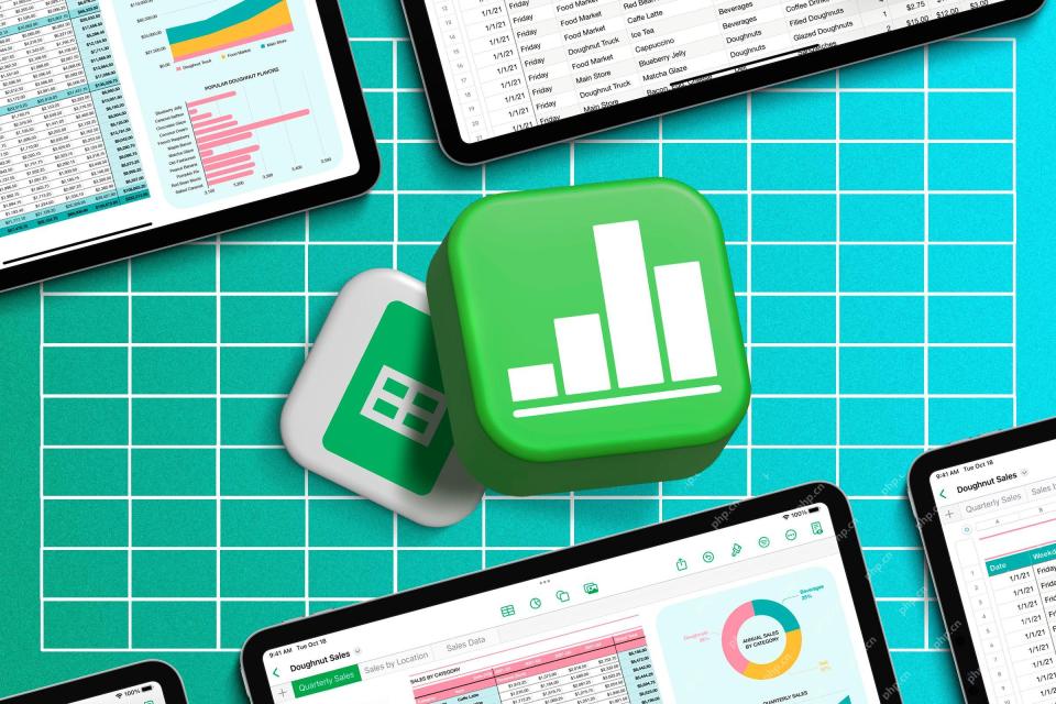 How to Use AI Function in Google SheetsMay 03, 2025 am 06:01 AM
Google Sheets' AI Function: A Powerful New Tool for Data Analysis Google Sheets now boasts a built-in AI function, powered by Gemini, eliminating the need for add-ons to leverage the power of language models directly within your spreadsheets. This f
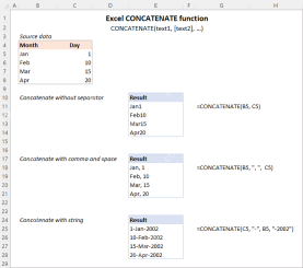 Excel CONCATENATE function to combine strings, cells, columnsApr 30, 2025 am 10:23 AM
This article explores various methods for combining text strings, numbers, and dates in Excel using the CONCATENATE function and the "&" operator. We'll cover formulas for joining individual cells, columns, and ranges, offering solutio
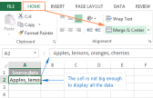 Merge and combine cells in Excel without losing dataApr 30, 2025 am 09:43 AM
This tutorial explores various methods for efficiently merging cells in Excel, focusing on techniques to retain data when combining cells in Excel 365, 2021, 2019, 2016, 2013, 2010, and earlier versions. Often, Excel users need to consolidate two or
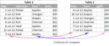 Excel: Compare two columns for matches and differencesApr 30, 2025 am 09:22 AM
This tutorial explores various methods for comparing two or more columns in Excel to identify matches and differences. We'll cover row-by-row comparisons, comparing multiple columns for row matches, finding matches and differences across lists, high
 Rounding in Excel: ROUND, ROUNDUP, ROUNDDOWN, FLOOR, CEILING functionsApr 30, 2025 am 09:18 AM
This tutorial explores Excel's rounding functions: ROUND, ROUNDUP, ROUNDDOWN, FLOOR, CEILING, MROUND, and others. It demonstrates how to round decimal numbers to integers or a specific number of decimal places, extract fractional parts, round to the
 Consolidate in Excel: Merge multiple sheets into oneApr 29, 2025 am 10:04 AM
This tutorial explores various methods for combining Excel sheets, catering to different needs: consolidating data, merging sheets via data copying, or merging spreadsheets based on key columns. Many Excel users face the challenge of merging multipl
 Calculate moving average in Excel: formulas and chartsApr 29, 2025 am 09:47 AM
This tutorial shows you how to quickly calculate simple moving averages in Excel, using functions to determine moving averages over the last N days, weeks, months, or years, and how to add a moving average trendline to your charts. Previous articles
 How to calculate average in Excel: formula examplesApr 29, 2025 am 09:38 AM
This tutorial demonstrates various methods for calculating averages in Excel, including formula-based and formula-free approaches, with options for rounding results. Microsoft Excel offers several functions for averaging numerical data, and this gui


Hot AI Tools

Undresser.AI Undress
AI-powered app for creating realistic nude photos

AI Clothes Remover
Online AI tool for removing clothes from photos.

Undress AI Tool
Undress images for free

Clothoff.io
AI clothes remover

Video Face Swap
Swap faces in any video effortlessly with our completely free AI face swap tool!

Hot Article
Hot Tools

Dreamweaver CS6
Visual web development tools

Notepad++7.3.1
Easy-to-use and free code editor

SublimeText3 Linux new version
SublimeText3 Linux latest version

MantisBT
Mantis is an easy-to-deploy web-based defect tracking tool designed to aid in product defect tracking. It requires PHP, MySQL and a web server. Check out our demo and hosting services.

SublimeText3 Chinese version
Chinese version, very easy to use

