The graphical interface on Windows 12 already has Apple's shadow
In July last year, Microsoft announced that it would resume its three-year release cycle plan, which means that Windows will have a major version update every three years.
Through time calculation, Windows 12 will be coming in 2024.

Not long after that, Microsoft accidentally showed another early UI for Windows 12 at the Microsoft Ignite conference.

How do you rate it? To put it bluntly, it is fruity.

#Because of the unexpected exposure of this picture, the Windows 12 concept version was immediately launched on YouTube.

#The overhauled start menu and taskbar, coupled with a more rounded design...the quality is indeed very high.


But it can only be considered a concept version, because its relationship with Microsoft should be limited to Power by PowerPoint.
This blogger is also an "old habitual offender". In addition to Win12.1, he also used the same method to create Win11X, Win21, Android 14 and other systems that do not yet exist.

It’s just fun, no one should take it seriously, right?

What a coincidence, UP owner @老孙12 made a concept version of Win12 that can be installed based on the concept video above.

The system itself is obviously modified from the existing Win11, and is not suitable for daily use. Everyone can just experience it in the cloud.
Create a new virtual machine and choose to install the system later. Add two CD/DVD drives and choose PE and system image respectively (note the order).

Start the virtual machine into PE and use the partition assistant to partition the disk.
In addition to the system partition, you must also prepare a FAT32 format partition (100-300MB) for boot use.

Find the mounted DVD drive on this computer and double-click Setup.exe to start the installation.

# The interface is quite similar to the concept video, but the level of sophistication is average. The "round and square" corners should have been cut out directly.


After installation, you have to add a boot to it. At this time, you must select the FAT32 format partition created previously.

#I can finally start to experience the restart. At first glance when I enter the desktop, it is indeed very different from Win11.
The taskbar is similar to the effect modified by RoundedTB (in appearance), and many raindrop widgets are added to the desktop.

Although the style is generally similar to the previous concept video, the details are still rough. Essentially, it is a streamlined and modified version of Win11 22621.

The user experience is quite average, especially the operation logic of the taskbar and start menu is very unfriendly.

Generally speaking, Tu Yile is indeed a bit interesting, and this idea and action are still worthy of praise.
But if you want to try it, don’t have high expectations.
After all, it is just a complete work. If it is really completed, the amount of work will be unimaginably large.

Since the news of Win12, whether it is official leaks or netizens’ actions, Windows cannot escape the consequences.
Win11 finally changed from right angles to rounded corners. I believe 12 will not abandon it easily, and I can probably imagine what it looks like.

#According to previous reports, Microsoft seems to have started the development of Win12 in March last year.
Can the tradition of Windows being useful across generations be continued on Win12?
The above is the detailed content of The graphical interface on Windows 12 already has Apple's shadow. For more information, please follow other related articles on the PHP Chinese website!
 Windows Maps Will Become 'Nonfunctional' This JulyApr 26, 2025 am 09:01 AM
Related ##### Before Dropbox and OneDrive, We Had Windows Briefcase Windows Briefcase: A Pioneer in File Synchronization. Posts 1 Choosing a navigation app? Bing Maps offers the closest experience to the discontinued Windows Maps. Google Maps and
 Before Dropbox and OneDrive, We Had Windows BriefcaseApr 26, 2025 am 06:11 AM
The "breviation package" feature introduced by Windows 95 makes file synchronization possible. At that time, this function was unique in the field of file synchronization. However, with the rise of cloud services such as OneDrive, Microsoft has gradually phased out the "branded briefcase" feature since Windows 8. You might be surprised that file synchronization is not a new technology, in fact, Microsoft has provided this feature with a virtual folder called "Briefcase" as early as Windows 95. A brief history of Windows "Briefcase" As the name suggests, the "brookie" feature was released with Windows 95 released in 1995, which is still considered by many to be one of the best operating systems. It has user friends
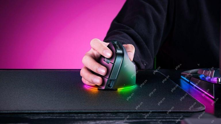 Razer Joins the Vertical Mouse Party With New Pro Click V2Apr 26, 2025 am 03:05 AM
Razer Pro Click V2 Vertical Edition Review: Comfort and Performance Razer's first vertical mouse, the Pro Click V2 vertical version, is known for its ergonomic design. The tilt angle of 71.7 degrees, like a handshake, effectively reduces wrist pressure. In terms of technical specifications, the vertical version and the standard version of Pro Click V2 have many similarities. Both are equipped with Razer's advanced Focus Pro optical sensor, with a maximum sensitivity of 30,000 DPI, a maximum speed of 550 inches per second and a maximum acceleration of 40G. All mechanical buttons can withstand 60 million clicks, ensuring durability. In terms of battery life, the vertical version is up to 6 months
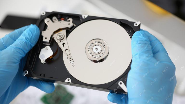 Western Digital Is Preparing 40TB HDDs, but It's Not Stopping ThereApr 25, 2025 am 09:01 AM
Western Digital's 40TB HDDs: A Stepping Stone to 100TB Western Digital (WD) is gearing up to launch 40TB hard disk drives (HDDs), but their ambitions extend far beyond that. This move is a crucial step in WD's roadmap to achieve its ambitious goal:
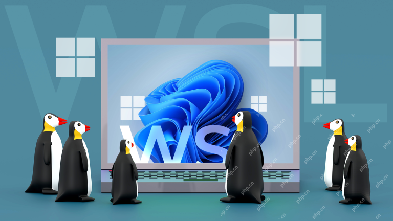 6 Reasons to Try Windows Subsystem for Linux (WSL)Apr 25, 2025 am 06:09 AM
Windows Subsystem for Linux (WSL): Your Gateway to the Linux World While Windows enjoys widespread consumer popularity for its user-friendliness, Linux dominates the professional sphere. Whether you're a curious beginner or seeking seamless Windows-
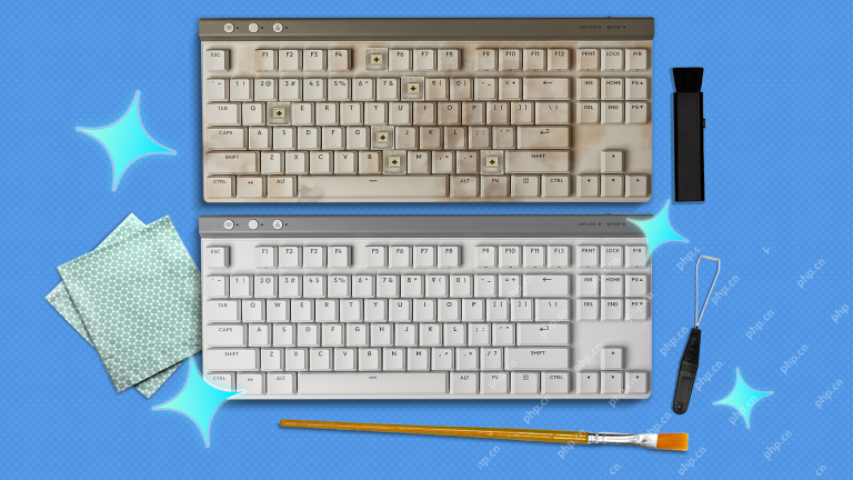 Don't Throw Out That Old Keyboard, Fix Up It Up InsteadApr 25, 2025 am 06:01 AM
How to Clean and Repair a Broken Keyboard I always have some tools ready before starting to repair any computer parts: Precision screwdriver set Cotton swab Isopropanol Magnetic bowl In addition, you need gentle dishwashing liquid, toothpicks, compressed air and keycap puller. Easy to pull out the key caps. After preparing the materials, you must first determine the degree of damage to the keyboard. Be sure to check for damage to the cable first. Just stained with soda and dust? Or are mechanical parts damaged? Or is there a circuit problem? The easiest first step to diagnose a problem is to open Notepad (or other plain text editor) and press each key on the keyboard to make sure they all appear correctly in Notepad. Note any keys that don't work, are difficult to press, or are stuck. Be sure to check all Cs on your keyboard
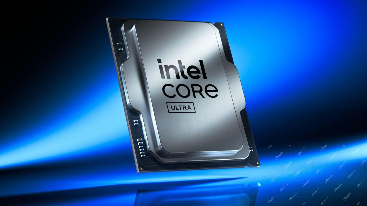 Intel Arrow Lake CPUs Are Getting a Speed Boost, but You Need an UpdateApr 25, 2025 am 03:01 AM
Intel's Free Arrow Lake Overclocking Boost: Faster Gaming for Core Ultra CPUs Your Intel Core Ultra 200-series processor might already be a powerhouse, but Intel's latest free update delivers a significant performance boost for gamers. The "Int
 Windows 11 Fixed My Biggest Problem With The TaskbarApr 25, 2025 am 01:10 AM
Windows 11 Taskbar's New "End Task" Button: A Game Changer for App Closing Closing stubborn or frozen apps on Windows has always been a hassle. The simple "Close" button often fails to completely shut down background processes.


Hot AI Tools

Undresser.AI Undress
AI-powered app for creating realistic nude photos

AI Clothes Remover
Online AI tool for removing clothes from photos.

Undress AI Tool
Undress images for free

Clothoff.io
AI clothes remover

Video Face Swap
Swap faces in any video effortlessly with our completely free AI face swap tool!

Hot Article

Hot Tools

MinGW - Minimalist GNU for Windows
This project is in the process of being migrated to osdn.net/projects/mingw, you can continue to follow us there. MinGW: A native Windows port of the GNU Compiler Collection (GCC), freely distributable import libraries and header files for building native Windows applications; includes extensions to the MSVC runtime to support C99 functionality. All MinGW software can run on 64-bit Windows platforms.

PhpStorm Mac version
The latest (2018.2.1) professional PHP integrated development tool

SublimeText3 Linux new version
SublimeText3 Linux latest version

mPDF
mPDF is a PHP library that can generate PDF files from UTF-8 encoded HTML. The original author, Ian Back, wrote mPDF to output PDF files "on the fly" from his website and handle different languages. It is slower than original scripts like HTML2FPDF and produces larger files when using Unicode fonts, but supports CSS styles etc. and has a lot of enhancements. Supports almost all languages, including RTL (Arabic and Hebrew) and CJK (Chinese, Japanese and Korean). Supports nested block-level elements (such as P, DIV),

Dreamweaver Mac version
Visual web development tools


