Home >Web Front-end >CSS Tutorial >2D transform functions in CSS
2D transform functions in CSS
- PHPzforward
- 2023-08-27 18:57:02757browse
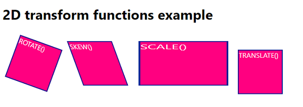
The 2D transformation function is used to apply a 2D transformation to an element, which can be rotated, moved, scaled and skewed.
Translation - Moves the element along the x and y axes.
Scale - Resizes an element in the x y direction.
Rotation - Moves an element by a certain amount.
Tilt - Tilts the element in the x y direction.
Here is the code to display the 2D transform function in CSS -
Example
Live Demonstration
<!DOCTYPE html>
<html>
<head>
<style>
body {
   font-family: "Segoe UI", Tahoma, Geneva, Verdana, sans-serif;
}
div {
   width: 100px;
   height: 100px;
   background-color: rgb(255, 0, 128);
   border:2px solid rgb(0, 35, 150);
   margin: 20px;
   display: inline-block;
   color: white;
}
.rotate {
   transform: rotate(20deg);
}
.translate {
   transform: translate(30px, 20px);
}
.scale {
   transform: scale(2, 1);
   margin-left:70px;
}
.skew {
   transform: skew(20deg);
}
</style>
</head>
<body>
<h1>2D transform functions example</h1>
<div class="rotate">ROTATE()</div>
<div class="skew">SKEW()</div>
<div class="scale">SCALE()</div>
<div class="translate">TRANSLATE()</div>
</body>
</html>
Output
The above code will produce the following output-

The above is the detailed content of 2D transform functions in CSS. For more information, please follow other related articles on the PHP Chinese website!
Statement:
This article is reproduced at:tutorialspoint.com. If there is any infringement, please contact admin@php.cn delete
Previous article:Create horizontal scroll capture using HTML and CSSNext article:Create horizontal scroll capture using HTML and CSS

