Text
ROC Analysis and area under the curve (AUC) are widely used tools in data science, borrowed from signal processing, to evaluate the quality of models under different parameterizations, Or compare the performance of two or more models.
Traditional performance metrics, such as precision and recall, rely heavily on the observation of positive samples. Therefore, ROC and AUC evaluate quality using true positive and false positive rates, taking into account both positive and negative observations.
There are multiple steps in the process from decomposing a problem to using machine learning to solve it. It involves data collection, cleaning and feature engineering, building the model, and finally, evaluating the model performance.
When you evaluate the quality of a model, you typically use metrics such as precision and recall, also known as confidence and sensitivity, respectively, in the field of data mining.
These metrics compare predicted values to actual observations, usually from a holdout set, visualized using a confusion matrix.
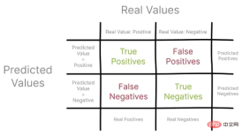
Let’s first focus on accuracy, also known as positive predictive value. Using a confusion matrix, you can construct Precision as the ratio of all true positives to all predicted positives.

Recall, also known as true positive rate, represents the ratio of true positives to all observed and predicted positives.

Using different sets of observations in a confusion matrix to describe Precision and Recall, you can start to understand how these metrics inform the model Performance view.
It is worth noting that Precision and Recall only focus on positive examples and predictions, without considering any negative examples. Furthermore, they do not compare the model's performance to the median scenario, which is just a random guess.
1. ROC Curve
ROC is a summary tool used to visualize the trade-off between Precision and Recall. ROC analysis uses an ROC curve to determine how much of a binary signal's value is contaminated by noise, i.e., randomness. It provides a summary of sensitivity and specificity for a continuous predictor over a range of operating points. The ROC curve is obtained by plotting the false positive rate on the x-axis against the true positive rate on the y-axis.
Because the true positive rate is the probability of detecting a signal, and the false positive rate is the probability of a false positive, ROC analysis is also widely used in medical research to determine the threshold that reliably detects disease or other behavior.
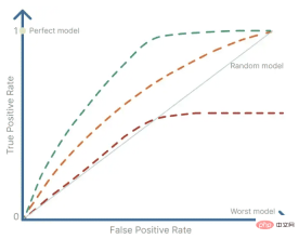
A perfect model would have a false positive rate and a true positive rate equal to 1, so it would be the single operating point in the upper left corner of the ROC plot. And the worst possible model will have a single operating point in the lower left corner of the ROC plot where the false positive rate equals 1 and the true positive rate equals 0.
The random guessing model has a 50% chance of correctly predicting the outcome, so the false positive rate will always equal the true positive rate. This is why there is a diagonal line in the graph, which represents a 50/50 probability of detecting signal versus noise.
2. AUC Area
To fully analyze the ROC curve and compare the performance of the model with several other models, you actually need to calculate the area under the curve (AUC), also in the literature is called the c statistic. The area under the curve (AUC) has a value between 0 and 1 because the curve is plotted on a 1x1 grid and parallel to signal theory, it is a measure of signal detectability.
This is a very useful statistic as it gives us an idea of how well the model ranks real observations versus false observations. It is actually a normalized version of the Wilcoxon-Mann-Whitney rank sum test, which tests the null hypothesis where two ordered measurement samples are drawn from a single distribution.
To plot a ROC curve and calculate the area under the curve (AUC), you decide to use SckitLearn's RocCurveDisplay method and compare a multilayer perceptron to a random forest model in an attempt to solve the same classification task.
import matplotlib.pyplot as plt
from sklearn.ensemble import RandomForestClassifier
from sklearn.metrics import roc_auc_score, RocCurveDisplay
def plot_roc(model, test_features, test_targets):
    """
    Plotting the ROC curve for a given Model and the ROC curve for a Random Forests Models
    """
    # comparing the given model with a Random Forests model
    random_forests_model = RandomForestClassifier(random_state=42)
    random_forests_model.fit(train_features, train_targets)
    rfc_disp = RocCurveDisplay.from_estimator(random_forests_model, test_features, test_targets)
    model_disp = RocCurveDisplay.from_estimator(model, test_features, test_targets, ax=rfc_disp.ax_)
    model_disp.figure_.suptitle("ROC curve: Multilayer Perceptron vs Random Forests")
    plt.show()
# using perceptron model as input
plot_roc(ml_percetron_model, test_features, test_targets)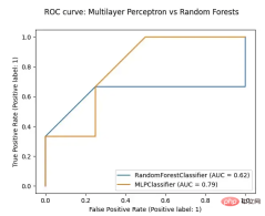
The above is the detailed content of What are python model performance ROC and AUC. For more information, please follow other related articles on the PHP Chinese website!
 What data types can be stored in a Python array?Apr 27, 2025 am 12:11 AM
Pythonlistscanstoreanydatatype,arraymodulearraysstoreonetype,andNumPyarraysarefornumericalcomputations.1)Listsareversatilebutlessmemory-efficient.2)Arraymodulearraysarememory-efficientforhomogeneousdata.3)NumPyarraysareoptimizedforperformanceinscient
 What happens if you try to store a value of the wrong data type in a Python array?Apr 27, 2025 am 12:10 AM
WhenyouattempttostoreavalueofthewrongdatatypeinaPythonarray,you'llencounteraTypeError.Thisisduetothearraymodule'sstricttypeenforcement,whichrequiresallelementstobeofthesametypeasspecifiedbythetypecode.Forperformancereasons,arraysaremoreefficientthanl
 Which is part of the Python standard library: lists or arrays?Apr 27, 2025 am 12:03 AM
Pythonlistsarepartofthestandardlibrary,whilearraysarenot.Listsarebuilt-in,versatile,andusedforstoringcollections,whereasarraysareprovidedbythearraymoduleandlesscommonlyusedduetolimitedfunctionality.
 What should you check if the script executes with the wrong Python version?Apr 27, 2025 am 12:01 AM
ThescriptisrunningwiththewrongPythonversionduetoincorrectdefaultinterpretersettings.Tofixthis:1)CheckthedefaultPythonversionusingpython--versionorpython3--version.2)Usevirtualenvironmentsbycreatingonewithpython3.9-mvenvmyenv,activatingit,andverifying
 What are some common operations that can be performed on Python arrays?Apr 26, 2025 am 12:22 AM
Pythonarrayssupportvariousoperations:1)Slicingextractssubsets,2)Appending/Extendingaddselements,3)Insertingplaceselementsatspecificpositions,4)Removingdeleteselements,5)Sorting/Reversingchangesorder,and6)Listcomprehensionscreatenewlistsbasedonexistin
 In what types of applications are NumPy arrays commonly used?Apr 26, 2025 am 12:13 AM
NumPyarraysareessentialforapplicationsrequiringefficientnumericalcomputationsanddatamanipulation.Theyarecrucialindatascience,machinelearning,physics,engineering,andfinanceduetotheirabilitytohandlelarge-scaledataefficiently.Forexample,infinancialanaly
 When would you choose to use an array over a list in Python?Apr 26, 2025 am 12:12 AM
Useanarray.arrayoveralistinPythonwhendealingwithhomogeneousdata,performance-criticalcode,orinterfacingwithCcode.1)HomogeneousData:Arrayssavememorywithtypedelements.2)Performance-CriticalCode:Arraysofferbetterperformancefornumericaloperations.3)Interf
 Are all list operations supported by arrays, and vice versa? Why or why not?Apr 26, 2025 am 12:05 AM
No,notalllistoperationsaresupportedbyarrays,andviceversa.1)Arraysdonotsupportdynamicoperationslikeappendorinsertwithoutresizing,whichimpactsperformance.2)Listsdonotguaranteeconstanttimecomplexityfordirectaccesslikearraysdo.


Hot AI Tools

Undresser.AI Undress
AI-powered app for creating realistic nude photos

AI Clothes Remover
Online AI tool for removing clothes from photos.

Undress AI Tool
Undress images for free

Clothoff.io
AI clothes remover

Video Face Swap
Swap faces in any video effortlessly with our completely free AI face swap tool!

Hot Article

Hot Tools

SublimeText3 Mac version
God-level code editing software (SublimeText3)

DVWA
Damn Vulnerable Web App (DVWA) is a PHP/MySQL web application that is very vulnerable. Its main goals are to be an aid for security professionals to test their skills and tools in a legal environment, to help web developers better understand the process of securing web applications, and to help teachers/students teach/learn in a classroom environment Web application security. The goal of DVWA is to practice some of the most common web vulnerabilities through a simple and straightforward interface, with varying degrees of difficulty. Please note that this software

EditPlus Chinese cracked version
Small size, syntax highlighting, does not support code prompt function

SecLists
SecLists is the ultimate security tester's companion. It is a collection of various types of lists that are frequently used during security assessments, all in one place. SecLists helps make security testing more efficient and productive by conveniently providing all the lists a security tester might need. List types include usernames, passwords, URLs, fuzzing payloads, sensitive data patterns, web shells, and more. The tester can simply pull this repository onto a new test machine and he will have access to every type of list he needs.

WebStorm Mac version
Useful JavaScript development tools


