 Backend Development
 Python Tutorial
 Python visualization | Python visualization advanced essentials - plotly
Python visualization | Python visualization advanced essentials - plotly

1. Introduction
Plotly is a very famous and powerful open source data visualization framework. It builds an interactive web form based on browser display. Use charts to display information and create dozens of beautiful charts and maps.
2. Drawing grammar rules
2.1 Offline drawing method
There are two ways to draw images in Plotly, online and offline. Drawing requires registering an account to obtain an API key, which is more troublesome, so this article only introduces the offline drawing method.
There are two methods for offline drawing: plotly.offline.plot() and plotly.offline.iplot(). The former generates image files in html format in the current working directory in an offline way. and automatically open;
The latter is a special method in jupyter notebook, which embeds the generated graphics into the ipynb file. This article adopts the latter method (note that plotly is used in jupyter notebook .offline.iplot(), you need to run plotly.offline.init_notebook_mode() before to complete the initialization of the drawing code, otherwise an error will be reported).
The main parameters of plotly.offline.iplot() are as follows:
- figure_or_data: Pass in plotly.graph_objs.Figure, plotly.graph_objs. Composed of Data, dictionary or list, it can describe the data of a graph
- show_link: bool type, used to adjust whether the output image has a plotly mark in the lower right corner
- link_text : str type input, used to set the description text content in the lower right corner of the image (when show_link=True), the default is 'Export to plot.ly'
- image: str type or None, control generation The download format of the image, including 'png', 'jpeg', 'svg', 'webp', the default is None, that is, the download method will not be set for the generated image
- filename: str type, Controls the file name of the saved image, the default is 'plot'
- image_height: int type, controls the pixel value of the image height, the default is 600
- image_width: int type , the pixel value that controls the width of the image, the default is 800
The following is a simple example:
import plotly
import plotly.graph_objs as go
'''初始化jupyter notebook中的绘图模式'''
plotly.offline.init_notebook_mode()
'''绘制一个基本的折线图,控制其尺寸为1600x600'''
plotly.offline.iplot([{'x': [1, 2, 3], 'y': [5, 2, 7]}],
 image_height=600,
 image_width=1600)
Help on package plotly.graph_objs in plotly:
NAME
 plotly.graph_objs
DESCRIPTION
 graph_objs
 ==========
 This package imports definitions for all of Plotly's graph objects. For more
 information, run help(Obj) on any of the following objects defined here.
 The reason for the package graph_objs and the module graph_objs is to provide
 a clearer API for users.
PACKAGE CONTENTS
 _area
 _bar
 _box
 _candlestick
 _carpet
 _choropleth
 _cone
 _contour
 _contourcarpet
 _deprecations
 _figure
 _figurewidget
 _frame
 _heatmap
 _heatmapgl
 _histogram
 _histogram2d
 _histogram2dcontour
 _layout
 _mesh3d
 _ohlc
 _parcoords
 _pie
 _pointcloud
 _sankey
 _scatter
 _scatter3d
 _scattercarpet
 _scattergeo
 _scattergl
 _scattermapbox
 _scatterpolar
 _scatterpolargl
 _scatterternary
 _splom
 _surface
 _table
 _violin
 area (package)
 bar (package)
 box (package)
 candlestick (package)
 carpet (package)
 choropleth (package)
 cone (package)
 contour (package)
 contourcarpet (package)
 graph_objs
 graph_objs_tools
 heatmap (package)
 heatmapgl (package)
 histogram (package)
 histogram2d (package)
 histogram2dcontour (package)
 layout (package)
 mesh3d (package)
 ohlc (package)
 parcoords (package)
 pie (package)
 pointcloud (package)
 sankey (package)
 scatter (package)
 scatter3d (package)
 scattercarpet (package)
 scattergeo (package)
 scattergl (package)
 scattermapbox (package)
 scatterpolar (package)
 scatterpolargl (package)
 scatterternary (package)
 splom (package)
 surface (package)
 table (package)
 violin (package)
DATA
 absolute_import = _Feature((2, 5, 0, 'alpha', 1), (3, 0, 0, 'alpha', 0...
FILE
 d:anacondalibsite-packagesplotlygraph_objs__init__.py
It can be seen that graph_objs There are a lot of graphic objects included in it, and this article will also select some of the commonly used ones to introduce.
import plotly
import plotly.graph_objs as go
import numpy as np
'''构造1000个服从二维正态分布的模拟数据'''
N = 1000
random_x = np.random.randn(N)
random_y = np.random.randn(N)
'''构造trace,配置相关参数'''
trace = go.Scatter(
 x = random_x,
 y = random_y,
 mode = 'markers'
)
'''将trace保存于列表之中'''
data = [trace]
'''启动绘图'''
plotly.offline.init_notebook_mode()
plotly.offline.iplot(data, filename='basic-scatter')

import numpy as np
import plotly
import plotly.graph_objs as go
'''创建仿真数据'''
N = 100
random_x = np.linspace(0, 1, N)
random_y0 = np.random.randn(N)+5
random_y1 = np.random.randn(N)
random_y2 = np.random.randn(N)-5
'''构造trace0'''
trace0 = go.Scatter(
 x = random_x,
 y = random_y0,
 mode = 'markers',
 name = 'markers'
)
'''构造trace1'''
trace1 = go.Scatter(
 x = random_x,
 y = random_y1,
 mode = 'lines+markers',
 name = 'lines+markers'
)
'''构造trace2'''
trace2 = go.Scatter(
 x = random_x,
 y = random_y2,
 mode = 'lines',
 name = 'lines'
)
'''将所有trace保存在列表中'''
data = [trace0, trace1, trace2]
'''启动绘图'''
plotly.offline.init_notebook_mode()
plotly.offline.iplot(data, filename='scatter-mode')

2.4.1 Text
Text is a very important part of a picture, and plotly is very powerful. The drawing mechanism of APP has carefully divided the text in a picture, and can personalize the font of a certain component part in a very targeted way:
- font:字典型,用于控制图像中全局字体的部分,其常用键及功能如下:
- family:str型,用于控制字体,默认为'Open Sans',可选项有'verdana','arial','sans-serif'等等,具体自行移步官网说明文档
- size:int型,用于控制字体大小,默认为12
- color:str型,传入十六进制色彩,默认为'#444'
下面是一个简单的例子:
import plotly
import plotly.graph_objs as go
import numpy as np
'''构造1000个服从二维正态分布的模拟数据'''
N = 1000
random_x = np.random.randn(N)
random_y = np.random.randn(N)
'''构造trace,配置相关参数'''
trace = go.Scatter(
 x = random_x,
 y = random_y,
 mode = 'markers'
)
'''将trace保存于列表之中'''
data = [trace]
'''创建layout对象'''
layout = go.Layout(title='测试',
 font={
 'size':22,
 'family':'sans-serif',
 'color':'9ed900'#将全局字体颜色设置颜色为葱绿
 })
'''将graph部分和layout部分组合成figure对象'''
fig = go.Figure(data=data, layout=layout)
'''启动绘图直接绘制figure对象'''
plotly.offline.init_notebook_mode()
plotly.offline.iplot(fig,filename='basic-scatter')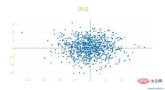
标题文字:
- title:str型,用于控制图像的主标题
- titlefont:字典型,用于独立控制标题字体的部分,其常用键如下:
- family:同font中的family,用于单独控制标题字体
- size:int型,控制标题的字体大小
- color:同font中的color
下面是一个简单的例子:
import plotly
import plotly.graph_objs as go
import numpy as np
'''构造1000个服从二维正态分布的模拟数据'''
N = 1000
random_x = np.random.randn(N)
random_y = np.random.randn(N)
'''构造trace,配置相关参数'''
trace = go.Scatter(
x = random_x,
y = random_y,
mode = 'markers'
)
'''将trace保存于列表之中'''
data = [trace]
'''创建layout对象'''
layout = go.Layout(title='测试',
titlefont={
'size':20,
'color':'9ed900'#将标题字体颜色设置颜色为葱绿
})
'''将graph部分和layout部分组合成figure对象'''
fig = go.Figure(data=data, layout=layout)
'''启动绘图直接绘制figure对象'''
plotly.offline.init_notebook_mode()
plotly.offline.iplot(fig,filename='basic-scatter')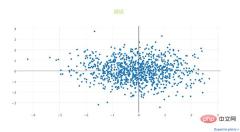
2.4.2 坐标轴
- xaxis或yaxis:字典型,控制横坐标的各属性,其主要键如下:
- color:str型,传入十六进制色彩,控制横坐标上所有元素的基础颜色(在未单独指定颜色之前,这些元素均采用此处color指定的颜色)
- title:str型,设置横坐标轴上的标题
- titlefont:字典型,同之前所有同名参数
- type:str型,用于控制横坐标轴类型,'-'表示根据输入数据自适应调整,'linear'表示线性坐标轴,'log'表示对数坐标轴,'date'表示日期型坐标轴,'category'表示分类型坐标轴,默认为'-'
- autorange:bool型或'reversed',控制是否根据横坐标对应的数据自动调整坐标轴范围,默认为True
- range:list型,控制横坐标轴的区间范围,自行设置无默认项,取决于横坐标轴的数据类型,格式均为[左端点,右端点]
- tickmode:str型,设置坐标轴刻度的格式,'auto'表示自动根据输入的数据来决定,'linear'表示线性的数值型,'array'表示由自定义的数组来表示(用数组来自定义刻度标签时必须选择此项)
- tickvals:list、numpy array或pandas中的series,作为坐标轴刻度标签的替代(tickmode此时必须被设置为'array')
- ticks:str型,控制刻度标签的书写位置,'outside'表示在外侧显示,'inside'表示在内侧显示,''表示不显示
- ticklen:int型,设置刻度标签的像素长度
- tickwidth:int型,设置刻度标签的像素宽度
- tickcolor:str型,传入十六进制色彩,用于控制刻度标签的颜色
- tickfont:字典型,同前面所有字典型字体控制参数,用于对刻度标签进行单独控制
- tickangle:int型,设置刻度标签的旋转角度
- showline:bool型,控制是否绘制出该坐标轴上的直线部分
- linecolor:str型,十六进制色彩,控制坐标轴线条的色彩
- linewidth:int型,设置坐标轴直线部分的像素宽度
- showgrid:bool型,控制是否绘制网格线
- gridcolor:str型,十六进制色彩,控制网格线的颜色
- gridwidth:int型,控制网格线的像素宽度
- zeroline:bool型,控制是否在0值处绘制0刻度线
- side:str型,控制x(y)轴放置于作图区域的位置,'top'、'bottom'控制横轴放置于顶部亦或是底部;'left'、'right'控制纵轴放置于左侧亦或是右侧
下面是几个简单的示例。
1. 对横纵坐标轴标题字体进行修改。
import plotly
import plotly.graph_objs as go
import numpy as np
'''构造1000个服从二维正态分布的模拟数据'''
N = 1000
random_x = np.random.randn(N)
random_y = np.random.randn(N)
'''构造trace,配置相关参数'''
trace = go.Scatter(
 x = random_x,
 y = random_y,
 mode = 'markers'
)
'''将trace保存于列表之中'''
data = [trace]
'''创建layout对象,对横纵坐标轴的标题进行一定的设置'''
layout = go.Layout(xaxis={
 'title':'这是横坐标轴',
 'titlefont':{
 'size':30
 }
},yaxis={
 'title':'这是纵坐标轴',
 'titlefont':{
 'size':40
 }
})
'''将graph部分和layout部分组合成figure对象'''
fig = go.Figure(data=data, layout=layout)
'''启动绘图直接绘制figure对象'''
plotly.offline.init_notebook_mode()
plotly.offline.iplot(fig,filename='basic-scatter')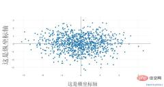
2. 对横纵方向的坐标轴线条及网格进行设置
import plotly
import plotly.graph_objs as go
import numpy as np
'''构造1000个服从二维正态分布的模拟数据'''
N = 1000
random_x = np.random.randn(N)
random_y = np.random.randn(N)
'''构造trace,配置相关参数'''
trace = go.Scatter(
 x = random_x,
 y = random_y,
 mode = 'markers'
)
'''将trace保存于列表之中'''
data = [trace]
'''创建layout对象,对横纵坐标轴的线条及网格颜色进行一定的设置'''
layout = go.Layout(xaxis={
 'showline':False,
 'showgrid':True,
 'zeroline':False,
 'showgrid':True,
 'gridcolor':'7fecad'
 },yaxis={
'showline':False,
 'showgrid':True,
 'gridcolor':'#3d3b4f',
 'zeroline':False
})
'''将graph部分和layout部分组合成figure对象'''
fig = go.Figure(data=data, layout=layout)
'''启动绘图直接绘制figure对象'''
plotly.offline.init_notebook_mode()
plotly.offline.iplot(fig,filename='basic-scatter')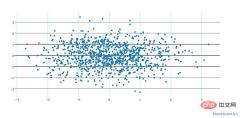
2.4.3 图例
- showlegend:bool型,控制是否绘制图例
- legend:字典型,用于控制用图例相关的所有属性的设置,主要键如下:
- bgcolor:str型,十六进制设置图例背景颜色
- bordercolor:设置图例边框的颜色
- borderwidth:int型,设置图例边框的颜色
- font:字典型,设置图例文字部分的字体,同前面所有font设置规则
- orientation:str型,设置图例各元素的堆叠方向,'v'表示竖直,'h'表示水平堆叠
- x:数值型,-2到3之间,用于设置图例在水平方向上的位置,默认为1.02
- xanchor:str型,用于直接设置图例水平位置的固定位置,有'left'、'center'、'right'和'auto'几个可选项
- y:数值型,-2到3之间,用于设置图例在竖直方向上的位置,默认为1
- yanchor:str型,用于直接设置图例竖直方向上的固定位置,有'top'、'middle'、'bottom'和'auto'几个选项
下面是一个简单的例子。
将图例的位置挪动到图像中心,即百分比上(0.5,0.5)的位置:
import numpy as np
import plotly
import plotly.graph_objs as go
'''创建仿真数据'''
N = 100
random_x = np.linspace(0, 1, N)
random_y0 = np.random.randn(N)+5
random_y1 = np.random.randn(N)
random_y2 = np.random.randn(N)-5
'''构造trace0'''
trace0 = go.Scatter(
 x = random_x,
 y = random_y0,
 mode = 'markers',
 name = 'markers'
)
'''构造trace1'''
trace1 = go.Scatter(
 x = random_x,
 y = random_y1,
 mode = 'lines+markers',
 name = 'lines+markers'
)
'''构造trace2'''
trace2 = go.Scatter(
 x = random_x,
 y = random_y2,
 mode = 'lines',
 name = 'lines'
)
'''将所有trace保存在列表中'''
data = [trace0, trace1, trace2]
'''构造layout对象,对图例位置进行一定的设置'''
layout = go.Layout(legend={
 'x':0.5,
 'y':0.5
})
'''构造figure对象'''
fig = go.Figure(data=data,layout=layout)
'''启动绘图'''
plotly.offline.init_notebook_mode()
plotly.offline.iplot(fig, filename='scatter-mode')
2.4.4 其它杂项
- width: int type, controls the pixel width of the image, the default is 700
- height: int type, controls the pixel height of the image, the default is 450
- margin : Typical input, controls the width of the image border, its main keys are as follows:
- l: int type, controls the pixel width of the blank area from the left border of the image, the default is 80
- r: int type, controls the pixel width of the blank area from the right border of the image, the default is 80
- t: int type, controls the pixel width of the blank area from the upper border of the image, The default is 100
- b: int type, controls the pixel width of the blank area from the lower boundary of the image, the default is 80
- pad: int type, controls the coordinate axis and The pixel distance of the image area, the default is 0
- paper_bgcolor: str type, pass in hexadecimal color, control the color of the picture bed
- plot_bgcolor: str type, Input hexadecimal color to control the color of the drawing area
- hidesources: bool type, control whether to mark the source link in the lower right corner of the image
- hovermode: str type Or False, used to set the hover interaction method. There are 'x', 'y', 'closest' and False options. False means no hover interaction method
- hoverlabel: Typical input, used to control various attributes of the information box that appears when hovering. The main keys are as follows:
- bgcolor: str type, input hexadecimal color, control the background color of the information box
- bordercolor: str type, input hexadecimal color, control the color of the border of the information box
- font: font type, control the attributes of the font in the information box , its main keys are as follows:
- family: same as before, control font
- size: int type, control font size, default 13
- color: str type, input hexadecimal color, control font color
- namelength: int type, control the length limit of the corresponding trace name displayed in the information box, it is recommended to set it to - 1, that is, display all, the default is 15, that is, for traces longer than 15, only the first 15 characters will be displayed
- grid: dictionary type, controlling the planning of multiple figures on one page (subplots) The properties of the grid, its common keys are as follows:
- rows: int type, controls the number of rows in the grid (placement of sub-graphs of Cartesian coordinate system type), you can also set more than the actual The number of rows required for drawing to achieve the purpose of blank space
- roworder: str type, set the sub-picture by row, whether to overlap from bottom to top or top to bottom, corresponding to 'top to bottom' and 'bottom to top', the default is 'top to bottm', note that only the overlay order of rows can be set, the overlay order in the column direction is always from left to right
- columns: int type , same as rows, controls the number of columns in the grid
- pattern: str type, used to control the sharing of coordinate axes between sub-pictures in multiple pictures on a page, 'coupled' means that each column shares the same x-axis , each row shares a y-axis, 'independent' means that each subgraph's xy-axis is independent (this is especially useful when drawing subgraphs with large dimensional differences)
- xgap: float type, 0.0 -1.0, used to control the width of the horizontal blank area between sub-pictures as a percentage of the width of a sub-picture
- ygap: Same as xgap, controls the width between sub-pictures in the vertical direction
- Domain: Typical type, when setting multiple pictures on a page, the width of the area occupied by the sub-pictures from the upper, lower, left and right boundaries. The main keys are as follows:
- x: list Type, the format is [x1,x2], x1 controls the distance between the left end of the sub-image area and the left end of the image bed, x2 controls the distance between the right end of the sub-image area and the left end of the image bed, x1 and x2 both represent percentages, and are taken between 0.0-1.0 Value
- y: Same as x, controls the distance percentage between the upper and lower ends of the sub-image area and the upper end of the image bed
Summary
The above is the basic part of plotly drawing. If there are any typos, please point them out.
The above is the detailed content of Python visualization | Python visualization advanced essentials - plotly. For more information, please follow other related articles on the PHP Chinese website!
 Python: compiler or Interpreter?May 13, 2025 am 12:10 AM
Python is an interpreted language, but it also includes the compilation process. 1) Python code is first compiled into bytecode. 2) Bytecode is interpreted and executed by Python virtual machine. 3) This hybrid mechanism makes Python both flexible and efficient, but not as fast as a fully compiled language.
 Python For Loop vs While Loop: When to Use Which?May 13, 2025 am 12:07 AM
Useaforloopwheniteratingoverasequenceorforaspecificnumberoftimes;useawhileloopwhencontinuinguntilaconditionismet.Forloopsareidealforknownsequences,whilewhileloopssuitsituationswithundeterminediterations.
 Python loops: The most common errorsMay 13, 2025 am 12:07 AM
Pythonloopscanleadtoerrorslikeinfiniteloops,modifyinglistsduringiteration,off-by-oneerrors,zero-indexingissues,andnestedloopinefficiencies.Toavoidthese:1)Use'i
 For loop and while loop in Python: What are the advantages of each?May 13, 2025 am 12:01 AM
Forloopsareadvantageousforknowniterationsandsequences,offeringsimplicityandreadability;whileloopsareidealfordynamicconditionsandunknowniterations,providingcontrolovertermination.1)Forloopsareperfectforiteratingoverlists,tuples,orstrings,directlyacces
 Python: A Deep Dive into Compilation and InterpretationMay 12, 2025 am 12:14 AM
Pythonusesahybridmodelofcompilationandinterpretation:1)ThePythoninterpretercompilessourcecodeintoplatform-independentbytecode.2)ThePythonVirtualMachine(PVM)thenexecutesthisbytecode,balancingeaseofusewithperformance.
 Is Python an interpreted or a compiled language, and why does it matter?May 12, 2025 am 12:09 AM
Pythonisbothinterpretedandcompiled.1)It'scompiledtobytecodeforportabilityacrossplatforms.2)Thebytecodeistheninterpreted,allowingfordynamictypingandrapiddevelopment,thoughitmaybeslowerthanfullycompiledlanguages.
 For Loop vs While Loop in Python: Key Differences ExplainedMay 12, 2025 am 12:08 AM
Forloopsareidealwhenyouknowthenumberofiterationsinadvance,whilewhileloopsarebetterforsituationswhereyouneedtoloopuntilaconditionismet.Forloopsaremoreefficientandreadable,suitableforiteratingoversequences,whereaswhileloopsoffermorecontrolandareusefulf
 For and While loops: a practical guideMay 12, 2025 am 12:07 AM
Forloopsareusedwhenthenumberofiterationsisknowninadvance,whilewhileloopsareusedwhentheiterationsdependonacondition.1)Forloopsareidealforiteratingoversequenceslikelistsorarrays.2)Whileloopsaresuitableforscenarioswheretheloopcontinuesuntilaspecificcond


Hot AI Tools

Undresser.AI Undress
AI-powered app for creating realistic nude photos

AI Clothes Remover
Online AI tool for removing clothes from photos.

Undress AI Tool
Undress images for free

Clothoff.io
AI clothes remover

Video Face Swap
Swap faces in any video effortlessly with our completely free AI face swap tool!

Hot Article

Hot Tools

WebStorm Mac version
Useful JavaScript development tools

EditPlus Chinese cracked version
Small size, syntax highlighting, does not support code prompt function

SecLists
SecLists is the ultimate security tester's companion. It is a collection of various types of lists that are frequently used during security assessments, all in one place. SecLists helps make security testing more efficient and productive by conveniently providing all the lists a security tester might need. List types include usernames, passwords, URLs, fuzzing payloads, sensitive data patterns, web shells, and more. The tester can simply pull this repository onto a new test machine and he will have access to every type of list he needs.

SublimeText3 Mac version
God-level code editing software (SublimeText3)

Atom editor mac version download
The most popular open source editor


