How to create complex financial charts using Python code?

Introduction
The proliferation of programming and technology applied to finance is inevitable, and growth never seems to decline. One of the most interesting parts of applied programming is the interpretation and visualization of historical or real-time stock data.
Now, for visualizing general data in python, modules like matplotlib, seaborn etc. come into play, but when it comes to visualizing financial data, Plotly will be the first choice as it provides interactive visuals Built-in functions. Here I would like to introduce an unsung hero which is nothing more than a brother library of mplfinance library matplotlib.
We all know how versatile the matplotlib package is and can easily plot any type of data. Even financial charts like candlesticks can be drawn using the matplotlib package, but we have to start from scratch.
Recently, I came to know that there is a separate module called mplfinance dedicated to creating advanced financial visualizations. In this article, we will take a deeper look at this Python library and explore its capabilities for generating different types of charts.
Importing packages
Importing the required packages into our python environment is an essential step. In this article, we need three packages, they are pandas to process data frames, requests to call the API and extract stock data, and mplfinance to create financial charts. For those of you who haven't installed these packages yet, copy this code into your terminal:
pip install pandas
pip install requests
pip install mplfinance
After you finish installing the packages, it's time to import them into our python environment .
import pandas as pd
import requests
import mplfinance as mf
Extract Stock Data
Now, we have imported all the necessary packages. Let’s pull Amazon’s historical stock data using the API endpoint provided by 12data.com[1]. Until then, a note on 12data.com: 12data is one of the leading market data providers with a large number of API endpoints for all types of market data. Interacting with the API provided by Twelve Data is very easy and has one of the best documentation ever. Also, make sure you have an account on 12data.com, only then will you have access to your API key (an important element for extracting data using the API).
Python implementation
def get_historical_data(symbol, start_date):
api_key = 'YOUR API KEY'
api_url = f'https://api.twelvedata.com/time_series?symbol={symbol}&interval=1day&outputsize=5000&apikey={api_key}'
raw_df = requests. get(api_url).json()
df = pd.DataFrame(raw_df['values']).iloc[::-1].set_index('datetime').astype(float)
df = df[df.index >= start_date]
df.index = pd.to_datetime(df.index)
return df
amzn = get_historical_data('AMZN', '2021-01-01')
amzn.tail()
Output:

Code Description
The first thing we do is define a function called 'get_historical_data' which takes as parameters the stock symbol ('symbol') and the start date of the historical data ('start_date').
Inside the function, we define the API key and URL and store them into their respective variables.
Next, we use the 'get' function to extract the historical data in JSON format and store it into the 'raw_df' variable. After doing some cleaning and formatting of the raw JSON data, we return it as an empty Pandas DataFrame.
Finally, we call the created function to pull Amazon’s historical data starting from the beginning of 2021 and store it in the "amzn" variable.
OHLC Chart
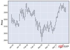
The OHLC chart is a bar chart that shows the opening, high, low and closing prices for each period.
OHLC charts are useful because they show four major data points over a period of time, with many traders considering the closing price to be the most important. It also helps to show increasing or decreasing momentum. When the opening and closing are far apart, the performance is strong, and when the opening and closing are close, the performance is indecisive or weak.
High and Low show the full price range for the period, helping to assess volatility1[2]. Now to create an OHLC chart using mplfinance, all it takes is one line of code:
mf.plot(amzn.iloc[:-50,:])
In the above code, we first call the plot function and in it we extract the Amazon OHLC The data is sliced into the last 50 readings, the purpose of this is just to make the chart clearer so that the elements are visible. The single line of code above will produce an output that looks like this:

OHLC Chart
Candlestick Chart
Traders use Candlestick charting based on the past The pattern determines possible price movements. Candlesticks are useful when trading because they display four price points (open, close, high, and low) throughout the time period specified by the trader.
The most interesting part of this type of chart is that it also helps traders read sentiment, which is the primary driver of the market itself2[3]. To generate a candlestick chart using mplfinance, we just add another parameter, the type parameter plot of the function and candle is mentioned in it. The code looks like this:
mf.plot(amzn.iloc[:-50,:], type = 'candle')
The above code will generate a candlestick chart like this:

烛台图
砖形图
砖形图( Renko chart)是一种使用价格变动构建的图表,而不是像大多数图表那样同时使用价格和标准化时间间隔。该图表看起来像一系列砖块,当价格移动指定的价格金额时会创建一个新砖块,并且每个块都与前一个砖块成 45 度角(向上或向下)。Renko 图表的主要用途是过滤掉噪音并帮助交易者更清楚地看到趋势,因为所有小于框大小的运动都被过滤掉 3[4] 。
据我所知,mplfinance 是唯一提供 Renko 图表的 Python 库,也是我们接下来要看到的,这就是为什么这个包在金融可视化方面具有强大优势的原因。现在要创建一个 Renko,我们只需要在函数renko的type参数中指定plot。Renko 图表的代码如下所示:
mf.plot(amzn, type = 'renko')
我们还可以向plot函数添加一个额外的参数,该参数是根据renko_params我们的需要和其他类似类型修改砖块大小的参数,但我更喜欢默认的。上面的代码生成了一个看起来像这样的砖形图:

砖形图
点数图
点数图,简称 P&F 图,类似于 Renko 图,它在不考虑时间流逝的情况下绘制资产的价格走势。与其他一些类型的图表(例如烛台)相反,烛台标志着资产在设定的时间段内的变动程度,而 P&F 图表使用由堆叠的 X 或 O 组成的列,每个列代表一定数量的价格变动。X 代表价格上涨,而 O 代表价格下跌。当价格反转反转量 4[5] 时,会在 O 之后形成新的 X 列或在 X 之后形成新的 O 列。
支持点数图的函数在其他地方找不到,只能在 mplfinance 库中找到,而且它还使我们可以通过仅pnf在函数的type参数中指定来创建图表的过程更容易plot。代码如下所示:
mf.plot(amzn, type = 'pnf')

点数图
添加更多信息
mplfinance 包不仅限于生成不同类型的图表,还使我们能够通过添加简单移动平均线 (SMA) 和交易量等附加指标使这些图表更具洞察力。对于那些不知道这两者的人来说,成交量是交易者在特定时间范围内买卖的股票数量,而简单移动平均线 (SMA) 只不过是特定时间段的平均价格。它是一种技术指标,广泛用于创建交易策略。
用 matplotlib 绘制这些数据需要一千年,而 mplfinance 允许我们只用一行代码就可以完成这项任务。除了type参数之外,我们只需要引入另外两个参数,一个是mav我们必须指定每个 SMA 的回溯期的参数,另一个是volume我们必须提到的参数,True 如果我们想将成交量图添加到我们的图表中,或者False 我们不想。这两个指标的代码如下所示:
mf.plot(amzn, mav = (10, 20), type = 'candle', volume = True)
可以通过两种方式修改和试验上述代码。第一种方法显然是尝试不同类型的图表。在上述代码中,我们提到我们的图表类型是烛台,但你可以将其更改为 OHLC、Renko 甚至 P&F 图表,并观察每个图表及其两个附加指标的外观。下一个方法是使用mav我们可以添加任意数量的具有不同回顾期的 SMA的参数。上述代码的输出如下所示:

保存图片
如果你想知道如何保存这些财务可视化中的任何一个,只需添加另一个参数,savefig即你只需提及其文件名的参数,其余部分将被处理。假设你想保存上面的图,那么你必须遵循的代码如下所示:
mf.plot(amzn,
mav = (10, 20),
type = 'candle',
volume = True,
savefig = 'amzn.png')
这就是你为保存精彩的财务可视化所需要做的全部工作。很容易,对吧?
写在最后
在我看来,与Plotly或Altair等库相比,mplfinance是绘制金融数据最强大的库。本文只是简单介绍了使用mplfinance可以实现的功能,但是这个了不起的库附带了许多新特性。它允许我们添加自定义的技术指标数据,并与实际的图表一起绘制,我们可以自定义整个模板,甚至图表中的每一个元素,添加趋势线,等等。
这个库最好的部分是它的易用性,并帮助我们用一行代码生成高级的财务可视化。虽然像Plotly这样的包有创建这些图表的内置函数,但不可能在一行代码中完成。
mplfinance现在唯一的缺点是它糟糕的文档,这使得人们甚至不知道这个包是关于什么的。文档是一个至关重要的方面,当涉及到开源项目时,文档应该被认为是至关重要的。特别像mplfinance这样的关键和有用的项目必须有清晰文档,对其提供的工具和功能有明确的解释。
到这里,你看完了这篇文章。如果你忘记了图表的代码,不要担心,最后我提供了完整的源代码。你也可以收藏本文,等需要用到的时候再查看。
完整代码
import pandas as pd
import requests
import mplfinance as mf
# Extracting stock data
def get_historical_data(symbol, start_date):
api_key = 'YOUR API KEY'
api_url = f'https://api.twelvedata.com/time_series?symbol={symbol}&interval=1day&outputsize=5000&apikey={api_key}'
raw_df = requests.get(api_url).json()
df = pd.DataFrame(raw_df['values']).iloc[::-1].set_index('datetime').astype(float)
df = df[df.index >= start_date]
df.index = pd.to_datetime(df.index)
return df
amzn = get_historical_data('AMZN', '2021-01-01')
amzn.tail()
# 1. OHLC Chart
mf.plot(amzn.iloc[:-50,:])
# 2. Candlestick Chart
mf.plot(amzn.iloc[:-50,:], type = 'candle')
# 3. Renko Chart
mf.plot(amzn, type = 'renko')
# 4. Point and Figure Chart
mf.plot(amzn, type = 'pnf')
# 5. Technical chart
mf.plot(amzn, mav = (10, 20), type = 'candle', volume = True)
# 6. Plot customization
mf.plot(amzn, mav = (5, 10, 20), type = 'candle',
volume = True, figratio = (10,5),
style = 'binance', title = 'AMZN STOCK PRICE',
tight_layout = True)
# 7. Saving the plot
mf.plot(amzn, mav = (5, 10, 20), type = 'candle',
volume = True, figratio = (10,5),
style = 'binance', title = 'AMZN STOCK PRICE',
tight_layout = True, savefig = 'amzn.png')
The above is the detailed content of How to create complex financial charts using Python code?. For more information, please follow other related articles on the PHP Chinese website!
 What data types can be stored in a Python array?Apr 27, 2025 am 12:11 AM
Pythonlistscanstoreanydatatype,arraymodulearraysstoreonetype,andNumPyarraysarefornumericalcomputations.1)Listsareversatilebutlessmemory-efficient.2)Arraymodulearraysarememory-efficientforhomogeneousdata.3)NumPyarraysareoptimizedforperformanceinscient
 What happens if you try to store a value of the wrong data type in a Python array?Apr 27, 2025 am 12:10 AM
WhenyouattempttostoreavalueofthewrongdatatypeinaPythonarray,you'llencounteraTypeError.Thisisduetothearraymodule'sstricttypeenforcement,whichrequiresallelementstobeofthesametypeasspecifiedbythetypecode.Forperformancereasons,arraysaremoreefficientthanl
 Which is part of the Python standard library: lists or arrays?Apr 27, 2025 am 12:03 AM
Pythonlistsarepartofthestandardlibrary,whilearraysarenot.Listsarebuilt-in,versatile,andusedforstoringcollections,whereasarraysareprovidedbythearraymoduleandlesscommonlyusedduetolimitedfunctionality.
 What should you check if the script executes with the wrong Python version?Apr 27, 2025 am 12:01 AM
ThescriptisrunningwiththewrongPythonversionduetoincorrectdefaultinterpretersettings.Tofixthis:1)CheckthedefaultPythonversionusingpython--versionorpython3--version.2)Usevirtualenvironmentsbycreatingonewithpython3.9-mvenvmyenv,activatingit,andverifying
 What are some common operations that can be performed on Python arrays?Apr 26, 2025 am 12:22 AM
Pythonarrayssupportvariousoperations:1)Slicingextractssubsets,2)Appending/Extendingaddselements,3)Insertingplaceselementsatspecificpositions,4)Removingdeleteselements,5)Sorting/Reversingchangesorder,and6)Listcomprehensionscreatenewlistsbasedonexistin
 In what types of applications are NumPy arrays commonly used?Apr 26, 2025 am 12:13 AM
NumPyarraysareessentialforapplicationsrequiringefficientnumericalcomputationsanddatamanipulation.Theyarecrucialindatascience,machinelearning,physics,engineering,andfinanceduetotheirabilitytohandlelarge-scaledataefficiently.Forexample,infinancialanaly
 When would you choose to use an array over a list in Python?Apr 26, 2025 am 12:12 AM
Useanarray.arrayoveralistinPythonwhendealingwithhomogeneousdata,performance-criticalcode,orinterfacingwithCcode.1)HomogeneousData:Arrayssavememorywithtypedelements.2)Performance-CriticalCode:Arraysofferbetterperformancefornumericaloperations.3)Interf
 Are all list operations supported by arrays, and vice versa? Why or why not?Apr 26, 2025 am 12:05 AM
No,notalllistoperationsaresupportedbyarrays,andviceversa.1)Arraysdonotsupportdynamicoperationslikeappendorinsertwithoutresizing,whichimpactsperformance.2)Listsdonotguaranteeconstanttimecomplexityfordirectaccesslikearraysdo.


Hot AI Tools

Undresser.AI Undress
AI-powered app for creating realistic nude photos

AI Clothes Remover
Online AI tool for removing clothes from photos.

Undress AI Tool
Undress images for free

Clothoff.io
AI clothes remover

Video Face Swap
Swap faces in any video effortlessly with our completely free AI face swap tool!

Hot Article

Hot Tools

Atom editor mac version download
The most popular open source editor

SecLists
SecLists is the ultimate security tester's companion. It is a collection of various types of lists that are frequently used during security assessments, all in one place. SecLists helps make security testing more efficient and productive by conveniently providing all the lists a security tester might need. List types include usernames, passwords, URLs, fuzzing payloads, sensitive data patterns, web shells, and more. The tester can simply pull this repository onto a new test machine and he will have access to every type of list he needs.

Dreamweaver CS6
Visual web development tools

SublimeText3 Chinese version
Chinese version, very easy to use

DVWA
Damn Vulnerable Web App (DVWA) is a PHP/MySQL web application that is very vulnerable. Its main goals are to be an aid for security professionals to test their skills and tools in a legal environment, to help web developers better understand the process of securing web applications, and to help teachers/students teach/learn in a classroom environment Web application security. The goal of DVWA is to practice some of the most common web vulnerabilities through a simple and straightforward interface, with varying degrees of difficulty. Please note that this software


