


Three steps for Python data visualization

1. First of all, we need to know which libraries we use to draw pictures?
matplotlib
The most basic drawing library in Python is matplotlib, which is the most basic Python visualization library. Generally I started with Python data visualization from matplotlib, and then started to expand vertically and horizontally.
Seaborn
is an advanced visualization effect library based on matplotlib. It mainly targets variable feature selection in data mining and machine learning. Seaborn can use short codes to draw and describe more Visualization of dimensional data.
Other libraries include
Bokeh (a library used for browser-side interactive visualization to realize the interaction between analysts and data); Mapbox (processing geographical data engine for stronger visualization tool library) and so on.
This article mainly uses matplotlib for case analysis
Step one: Determine the problem and select graphics
The business may be complicated, but after splitting, we have to find our What specific issue do you want to express through graphics? For training in analytical thinking, you can learn the methods in "McKinsey Method" and "Pyramid Principle".
This is a summary on the Internet about the selection of chart types.
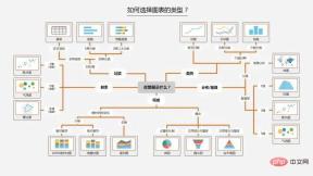
In Python, we can summarize it into the following four basic visual elements to display graphics:
- Point: scatter plot two-dimensional data, Suitable for simple two-dimensional relationships;
- Line: line plot two-dimensional data, suitable for time series;
- Column: bar plot two-dimensional data, suitable for category statistics;
- Color: heatmap is suitable for displaying the third dimension;
There are relationships such as distribution, composition, comparison, connection and change trends between data. Corresponding to different relationships, select the corresponding graphics for display.
Step 2: Transform data and apply functions
A lot of programming work in data analysis and modeling is based on data preparation: loading, cleaning, transformation and reshaping . Our visualization step also needs to organize the data, convert it into the format we need, and then apply the visualization method to complete the drawing.
The following are some commonly used data conversion methods:
- Merge: merge, concat, combine_frist (similar to a full outer join in the database)
- Reshape: reshape; axial rotation: pivot (similar to excel pivot table)
- Deduplication: drop_duplicates
- Mapping: map
- Fill replacement: fillna,replace
- Rename axis index: rename
The get_dummies function that converts categorical variables into 'dummy variable matrix' and limits the value of a certain column of data in df, etc.
The function will find the corresponding function in Python based on the graphics selected in the first step.
Step 3: Parameter settings, clear at a glance
After the original graphics are drawn, we can modify the color (color), line style (linestyle), mark (maker) or other chart decorations according to needs Item title (Title), axis label (xlabel, ylabel), axis tick (set_xticks), and legend (legend), etc., make the graphics more intuitive.
The third step is based on the second step, in order to make the graphics more clear and clear. Specific parameters can be found in the charting function.
2. Basics of visual drawing
Basics of Matplotlib drawing
#导入包
import numpy as np
import pandas as pd
import matplotlib.pyplot as plt
Figure and Subplot
The graphics of matplotlib are both located in Figure (canvas), and Subplot Create an image space. You cannot draw through figure. You must use add_subplot to create one or more subplots.
figsize can specify the image size.
#创建画布
fig = plt.figure()
<Figure size 432x288 with 0 Axes>
#创建subplot,221表示这是2行2列表格中的第1个图像。
ax1 = fig.add_subplot(221)
#但现在更习惯使用以下方法创建画布和图像,2,2表示这是一个2*2的画布,可以放置4个图像
fig , axes = plt.subplots(2,2,sharex=True,sharey=True)
#plt.subplot的sharex和sharey参数可以指定所有的subplot使用相同的x,y轴刻度。
Use Figure's subplots_adjust method to adjust the spacing.
subplots_adjust(left=None,bottom=None,right=None,
top=None,wspace=None,hspace=None)

Color, marker, and linestyle
The plot function of matplotlib accepts a set of X and Y coordinates, and can also accept a color The string abbreviation of the line type: **'g--', which means the color is green and the line type is '--' dashed line. **It can also be specified explicitly using parameters.
Line charts can also add some markers to highlight the locations of data points. Tags can also be placed in the format string, but the tag type and line style must come after the color.
plt.plot(np.random.randn(30),color='g',
 linestyle='--',marker='o')
[<matplotlib.lines.Line2D at 0x8c919b0>]
Scales, labels and legends
plt’s xlim, xticks and xtickslabels methods control the range, scale position and tick labels of the chart respectively.
When the method is called without parameters, the current parameter value is returned; when the method is called with parameters, the parameter value is set.
plt.plot(np.random.randn(30),color='g',
 linestyle='--',marker='o')
plt.xlim() #不带参数调用,显示当前参数;
#可将xlim替换为另外两个方法试试
rrree
img
(-1.4500000000000002, 30.45)
plt.plot(np.random.randn(30),color='g',
 linestyle='--',marker='o')
plt.xlim([0,15]) #横轴刻度变成0-15
设置标题,轴标签,刻度以及刻度标签
fig = plt.figure();ax = fig.add_subplot(1,1,1)
ax.plot(np.random.randn(1000).cumsum())
ticks = ax.set_xticks([0,250,500,750,1000]) #设置刻度值
labels = ax.set_xticklabels(['one','two','three','four','five']) #设置刻度标签
ax.set_title('My first Plot') #设置标题
ax.set_xlabel('Stage') #设置轴标签
Text(0.5,0,'Stage')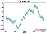
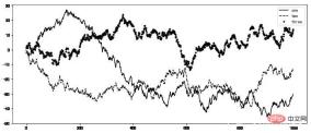
添加图例
图例legend是另一种用于标识图标元素的重要工具。 可以在添加subplot的时候传入label参数。
fig = plt.figure(figsize=(12,5));ax = fig.add_subplot(111)
ax.plot(np.random.randn(1000).cumsum(),'k',label='one') #传入label参数,定义label名称
ax.plot(np.random.randn(1000).cumsum(),'k--',label='two')
ax.plot(np.random.randn(1000).cumsum(),'k.',label='three')
#图形创建完后,只需要调用legend参数将label调出来即可。
ax.legend(loc='best')
#要求不是很严格的话,建议使用loc=‘best’参数来让它自己选择最佳位置
注解
除标准的图表对象之外,我们还可以自定义添加一些文字注解或者箭头。
注解可以通过text,arrow和annotate等函数进行添加。text函数可以将文本绘制在指定的x,y坐标位置,还可以进行自定义格式
plt.plot(np.random.randn(1000).cumsum())
plt.text(600,10,'test ',family='monospace',fontsize=10)
#中文注释在默认环境下并不能正常显示,需要修改配置文件,
# 使其支持中文字体。具体步骤请自行搜索。
保存图表到文件
利用plt.savefig可以将当前图表保存到文件。例如,要将图表保存为png文件,可以执行
文件类型是根据拓展名而定的。其他参数还有:
- fname:含有文件路径的字符串,拓展名指定文件类型
- dpi:分辨率,默认100 facecolor,edgcolor 图像的背景色,默认‘w’白色
- format:显示设置文件格式('png','pdf','svg','ps','jpg'等)
- bbox_inches:图表需要保留的部分。如果设置为“tight”,则将尝试剪除图像周围的空白部分
plt.savefig('./plot.jpg') #保存图像为plot名称的jpg格式图像
<Figure size 432x288 with 0 Axes>
3、Pandas中的绘图函数
Matplotlib作图
matplotlib是最基础的绘图函数,也是相对较低级的工具。 组装一张图表需要单独调用各个基础组件才行。Pandas中有许多基于matplotlib的高级绘图方法,原本需要多行代码才能搞定的图表,使用pandas只需要短短几行。
我们使用的就调用了pandas中的绘图包。
import matplotlib.pyplot as plt
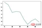
线型图
Series和DataFrame都有一个用于生成各类图表的plot方法。 默认情况下,他们生成的是线型图。
s = pd.Series(np.random.randn(10).cumsum(),index=np.arange(0,100,10))
s.plot() #Series对象的索引index会传给matplotlib用作绘制x轴。
<matplotlib.axes._subplots.AxesSubplot at 0xf553128>
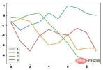
df = pd.DataFrame(np.random.randn(10,4).cumsum(0),
columns=['A','B','C','D'])
df.plot() #plot会自动为不同变量改变颜色,并添加图例
<matplotlib.axes._subplots.AxesSubplot at 0xf4f9eb8>
Series.plot方法的参数
- label:用于图表的标签
- style:风格字符串,'g--'
- alpha:图像的填充不透明度(0-1)
- kind:图表类型(bar,line,hist,kde等)
- xticks:设定x轴刻度值
- yticks:设定y轴刻度值
- xlim,ylim:设定轴界限,[0,10]
- grid:显示轴网格线,默认关闭
- rot:旋转刻度标签
- use_index:将对象的索引用作刻度标签
- logy:在Y轴上使用对数标尺
DataFrame.plot方法的参数
DataFrame除了Series中的参数外,还有一些独有的选项。
- subplots:将各个DataFrame列绘制到单独的subplot中
- sharex,sharey:共享x,y轴
- figsize:控制图像大小
- title:图像标题
- legend:添加图例,默认显示
- sort_columns:以字母顺序绘制各列,默认使用当前顺序
柱状图
在生成线型图的代码中加上kind=‘bar’或者kind=‘barh’,可以生成柱状图或水平柱状图。
fig,axes = plt.subplots(2,1)
data = pd.Series(np.random.rand(10),index=list('abcdefghij'))
data.plot(kind='bar',ax=axes[0],rot=0,alpha=0.3)
data.plot(kind='barh',ax=axes[1],grid=True)
<matplotlib.axes._subplots.AxesSubplot at 0xfe39898>
柱状图有一个非常实用的方法:
利用value_counts图形化显示Series或者DF中各值的出现频率。
比如df.value_counts().plot(kind='bar')
Python可视化的基础语法就到这里,其他图形的绘制方法大同小异。
重点是遵循三个步骤的思路来进行思考、选择、应用。多多练习可以更加熟练。
The above is the detailed content of Three steps for Python data visualization. For more information, please follow other related articles on the PHP Chinese website!

 How do you slice a Python array?May 01, 2025 am 12:18 AM
The basic syntax for Python list slicing is list[start:stop:step]. 1.start is the first element index included, 2.stop is the first element index excluded, and 3.step determines the step size between elements. Slices are not only used to extract data, but also to modify and invert lists.
 Under what circumstances might lists perform better than arrays?May 01, 2025 am 12:06 AM
Listsoutperformarraysin:1)dynamicsizingandfrequentinsertions/deletions,2)storingheterogeneousdata,and3)memoryefficiencyforsparsedata,butmayhaveslightperformancecostsincertainoperations.
 How can you convert a Python array to a Python list?May 01, 2025 am 12:05 AM
ToconvertaPythonarraytoalist,usethelist()constructororageneratorexpression.1)Importthearraymoduleandcreateanarray.2)Uselist(arr)or[xforxinarr]toconvertittoalist,consideringperformanceandmemoryefficiencyforlargedatasets.
 What is the purpose of using arrays when lists exist in Python?May 01, 2025 am 12:04 AM
ChoosearraysoverlistsinPythonforbetterperformanceandmemoryefficiencyinspecificscenarios.1)Largenumericaldatasets:Arraysreducememoryusage.2)Performance-criticaloperations:Arraysofferspeedboostsfortaskslikeappendingorsearching.3)Typesafety:Arraysenforc
 Explain how to iterate through the elements of a list and an array.May 01, 2025 am 12:01 AM
In Python, you can use for loops, enumerate and list comprehensions to traverse lists; in Java, you can use traditional for loops and enhanced for loops to traverse arrays. 1. Python list traversal methods include: for loop, enumerate and list comprehension. 2. Java array traversal methods include: traditional for loop and enhanced for loop.
 What is Python Switch Statement?Apr 30, 2025 pm 02:08 PM
The article discusses Python's new "match" statement introduced in version 3.10, which serves as an equivalent to switch statements in other languages. It enhances code readability and offers performance benefits over traditional if-elif-el
 What are Exception Groups in Python?Apr 30, 2025 pm 02:07 PM
Exception Groups in Python 3.11 allow handling multiple exceptions simultaneously, improving error management in concurrent scenarios and complex operations.
 What are Function Annotations in Python?Apr 30, 2025 pm 02:06 PM
Function annotations in Python add metadata to functions for type checking, documentation, and IDE support. They enhance code readability, maintenance, and are crucial in API development, data science, and library creation.


Hot AI Tools

Undresser.AI Undress
AI-powered app for creating realistic nude photos

AI Clothes Remover
Online AI tool for removing clothes from photos.

Undress AI Tool
Undress images for free

Clothoff.io
AI clothes remover

Video Face Swap
Swap faces in any video effortlessly with our completely free AI face swap tool!

Hot Article
Hot Tools

ZendStudio 13.5.1 Mac
Powerful PHP integrated development environment

DVWA
Damn Vulnerable Web App (DVWA) is a PHP/MySQL web application that is very vulnerable. Its main goals are to be an aid for security professionals to test their skills and tools in a legal environment, to help web developers better understand the process of securing web applications, and to help teachers/students teach/learn in a classroom environment Web application security. The goal of DVWA is to practice some of the most common web vulnerabilities through a simple and straightforward interface, with varying degrees of difficulty. Please note that this software

mPDF
mPDF is a PHP library that can generate PDF files from UTF-8 encoded HTML. The original author, Ian Back, wrote mPDF to output PDF files "on the fly" from his website and handle different languages. It is slower than original scripts like HTML2FPDF and produces larger files when using Unicode fonts, but supports CSS styles etc. and has a lot of enhancements. Supports almost all languages, including RTL (Arabic and Hebrew) and CJK (Chinese, Japanese and Korean). Supports nested block-level elements (such as P, DIV),

SublimeText3 English version
Recommended: Win version, supports code prompts!

MantisBT
Mantis is an easy-to-deploy web-based defect tracking tool designed to aid in product defect tracking. It requires PHP, MySQL and a web server. Check out our demo and hosting services.

