Home >Web Front-end >CSS Tutorial >Cleverly use CSS3 filters to create text flash switching animation effects!
Cleverly use CSS3 filters to create text flash switching animation effects!
- 青灯夜游forward
- 2022-07-20 10:55:132820browse
This article will show you how to use CSS3 filters to achieve a high-end text flash switching animation effect. I hope it will be helpful to everyone!

I accidentally saw such an interesting text flash animation today:

If this type of text flash switching effect is used properly, it can better attract the user's attention. [Recommended learning: css video tutorial]
Of course, today I am not trying to use CSS to achieve the above effects. In the process of trying, I found another type that can use CSS to realize text flash animation very easily, using blur() filter and contrast() The fusion effect produced by the filter is similar to this:

This technique has also been mentioned in many articles, and will be briefly described in this article.
blur filter mixing contrast filter produces a fusion effect
The focus of this article, The fusion effect produced by adding a blur filter and a contrast filter. Take out the two filters separately. Their functions are:
filter: blur(): Set a Gaussian blur effect to the image.filter: contrast(): Adjust the contrast of the image.
However, when they "fused" together, a wonderful fusion phenomenon occurred.
Let’s take a look at a simple example first:

CodePen Demo -- filter mix between blur and contrast
https: //codepen.io/Chokcoco/pen/QqWBqV
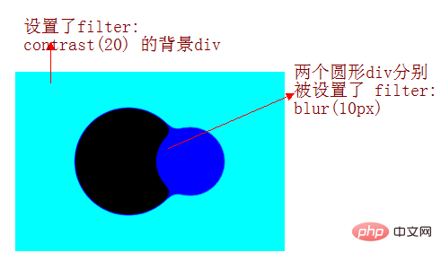
Look carefully at the process of the intersection of the two circles. When the edges are in contact, a boundary fusion effect will be produced. Use the contrast filter to The blurred edges of Gaussian blur are removed, and Gaussian blur is used to achieve the fusion effect.
The implementation of the above effects is based on two points:
The graphics are animated on the canvas background set to
filter: contrast()The animated graphic is set
filter: blur()( The parent element of the animated graphic needs to be setfilter: contrast( )canvas)
Of course, the background color is not necessarily white. We slightly modify the above Demo. The simple diagram is as follows:

Use the blur/contrast filter to switch text
Using the above techniques, we can achieve the fusion effect of text, like this:

CodePen Demo -- word animation | word filter
https://codepen.io/Chokcoco/pen/jLjNRj
This way , using this technique, we can cleverly conceive the animation:
Multiple texts appear in sequence (use
animation-delayfor control processing)Make sure that when the previous text disappears, the next text appears
Superimpose the above filter
The core code is as follows:
<div class="g-container">
  <div class="word">iPhone</div>
  <div class="word">13</div>
  <div class="word">Pro</div>
  <div class="word">强得很!</div>
</div>
@import url('https://fonts.googleapis.com/css2?family=Montserrat&display=swap');

$speed: 8s;
$wordCount: 4;

.g-container {
    position: relative;
    width: 100vw;
    height: 100vh;
    background: #000;
    font-family: 'Montserrat', sans-serif;
    color: #fff;
    font-size: 120px;
    filter: contrast(15);
}
.word {
    position: absolute;
    top: 50%;
    left: 50%;
    transform: translate(-50%, -50%);
    animation: change $speed infinite ease-in-out;

    @for $i from 0 to $wordCount {
        &:nth-child(#{$i + 1}) {
            animation-delay: ($speed / ($wordCount + 1) * $i) - $speed;
        }
    }
}

@keyframes change {
    0%,
    5%,
    100% {
        filter: blur(0px);
        opacity: 1;
    }
    50%,
    80% {
        filter: blur(80px);
        opacity: 0;
    }
}
The entire code needs to focus on the @keyframes change animation. We add this animation to the text in sequence (that is, using animation -delay adds a delay in sequence) to achieve the effect of displaying the next text in the process of the previous text disappearing.
The above .g-container adds such a code-- filter: contrast(15). If this sentence is removed, the effect is as follows:

Add this key code - filter: contrast(15), the whole effect is as shown in the picture at the beginning:

CodePen Demo -- Pure CSS to achieve text fusion flash switching effect
https://codepen.io/Chokcoco/pen/xxLjdmz
Two core key points of the entire animation:
Uses
blurfilter blendingcontrastfilters to produce fusion effectsIn the process of the previous text disappearing, the next text is displayed to create the effect that the currently displayed text is evolved from the previous text
Thus, you can control the number of text through HTML, change the $speed representing the animation duration and the $wordCount of the number of text in the SASS variable, and finally @keyframes The parameters in change are constantly adjusted to optimize the effect you want. Various text flash effects have evolved.
Finally
Okay, this article ends here, I hope this article will be helpful to you:)
Original address: https: //segmentfault.com/a/1190000040965698
Author: chokcoco
(Learning video sharing: Getting started with web front-end)
The above is the detailed content of Cleverly use CSS3 filters to create text flash switching animation effects!. For more information, please follow other related articles on the PHP Chinese website!
Related articles
See more- How to achieve image filter effect in css3? Filter attribute implementation (detailed picture and text explanation)
- CSS filter:hue-rotate hue rotation filter realizes mass production of buttons
- JavaScript implements simple PS filter effect (with code)
- How to upload and download images processed by CSS filters and blending modes?
- A detailed look at CSS gradients, shadows, and filters
- Let's talk about how to use CSS filters to achieve concave and smooth rounded corners.

