Home >Web Front-end >CSS Tutorial >As a Mid-Autumn Festival gift, share a CSS sun, earth and moon revolution animation effect!
As a Mid-Autumn Festival gift, share a CSS sun, earth and moon revolution animation effect!
- 青灯夜游forward
- 2021-09-15 10:31:002668browse
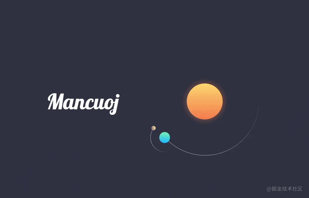
The Mid-Autumn Festival is coming soon. In this article, I will share with you an animation effect of the sun, earth and moon revolution realized by pure CSS. Open it and come and learn it!

For this Mid-Autumn Festival event of the Nuggets, I have been thinking hard for two days, and finally thought of something that no one has done in the Nuggets (probably not done yet) Come on, I don’t know either) - Use HTML CSS to simulate the revolution of the sun, earth and moon. [Related recommendations: "css video tutorial"]
We all know that the moon in the Mid-Autumn Festival is big and round because the sun, earth and moon are in a straight line during their revolution. In the middle, the sun and moon are at opposite ends of the earth. The moon phase on this day is the full moon. This paragraph can be skipped because it is related to the Mid-Autumn Festival.
But because I have never learned front-end at all, I have relearned flexbox and grid in the past two days. The results should be said to be pretty good (if If there is no problem with my aesthetics).
I really like the color scheme, I hope you like it too.
I put the source code on CodePen, linkSun Earth Moon (codepen.io)
HTML
The key point is CSS. Put three div in HTML and it will be ok.
<!DOCTYPE html>
<html>
    <head>
        <meta charset="UTF-8"/>
        <title>Mancuoj</title>
        <link
            href="simulation.css"
            rel="stylesheet"
        />
    </head>

    <body>
        <h1>Mancuoj</h1>
        <figure>
            <div></div>
            <div>
                <div></div>
            </div>
        </figure>
    </body>
</html>
Background and text
Import my favorite Lobster font, and then set it to white and make the font a little thinner.
@import url("https://fonts.googleapis.com/css2?family=Lobster&display=swap");

h1 {
    color: white;
    font-size: 60px;
    font-family: Lobster, monospace;
    font-weight: 100;
}
I randomly found a dark purple background, and then set the content of the painting to the middle.
body {
    margin: 0;
    height: 100vh;
    display: flex;
    align-items: center;
    justify-content: center;
    background-color: #2f3141;
}

.container {
    font-size: 10px;
    width: 40em;
    height: 40em;
    position: relative;
    display: flex;
    align-items: center;
    justify-content: center;
}
Sun, Earth and Moon Animation
As we all know: the earth revolves around the sun, and the moon revolves around the earth.
What we are drawing is the revolution, so just draw the sun directly and add shadows and highlights, and the moon and the earth will rotate.
The most important thing is actually the color matching (there are recommended websites at the end of the article). I experimented with color matching for a long time, and finally used three gradient colors to represent the sun, earth and moon.
日: linear-gradient(#fcd670, #f2784b);
地: linear-gradient(#19b5fe, #7befb2);
月: linear-gradient(#8d6e63, #ffe0b2);
CSS should not be difficult for everyone, just take a look.
The track uses borders, and silver lines are used as the orbit of revolution.
The animation uses its own animation, which rotates one circle each time.
.sun {
    position: absolute;
    width: 10em;
    height: 10em;
    background: linear-gradient(#fcd670, #f2784b);
    border-radius: 50%;
    box-shadow: 0 0 8px 8px rgba(242, 120, 75, 0.2);
}

.earth {
    --diameter: 30;
    --duration: 36.5;
}

.moon {
    --diameter: 8;
    --duration: 2.7;
    top: 0.3em;
    right: 0.3em;
}

.earth,
.moon {
    position: absolute;
    width: calc(var(--diameter) * 1em);
    height: calc(var(--diameter) * 1em);
    border-width: 0.1em;
    border-style: solid solid none none;
    border-color: silver transparent transparent transparent;
    border-radius: 50%;
    animation: orbit linear infinite;
    animation-duration: calc(var(--duration) * 1s);
}

@keyframes orbit {
    to {
        transform: rotate(1turn);
    }
}

.earth::before {
    --diameter: 3;
    --color: linear-gradient(#19b5fe, #7befb2);
    --top: 2.8;
    --right: 2.8;
}

.moon::before {
    --diameter: 1.2;
    --color: linear-gradient(#8d6e63, #ffe0b2);
    --top: 0.8;
    --right: 0.2;
}

.earth::before,
.moon::before {
    content: "";
    position: absolute;
    width: calc(var(--diameter) * 1em);
    height: calc(var(--diameter) * 1em);
    background: var(--color);
    border-radius: 50%;
    top: calc(var(--top) * 1em);
    right: calc(var(--right) * 1em);
}
Summary
It’s not easy to participate in an event, but the front end is still quite fun.
Recommend a few websites where I can find colors:
##Original address: https ://juejin.cn/post/7006507905050492935Introduction to ProgrammingAuthor: Mancuoj
For more programming-related knowledge, please visit:
The above is the detailed content of As a Mid-Autumn Festival gift, share a CSS sun, earth and moon revolution animation effect!. For more information, please follow other related articles on the PHP Chinese website!
Related articles
See more- HTML5+CSS3 dynamically draws an elephant
- One trick to teach you how to use css3 to create buttons and add dynamic effects (code sharing)
- Tips for using CSS filters to make your website more cool, worth collecting!
- How to convert row elements to block elements and block elements to row elements in css
- Detailed explanation of pseudo-elements in CSS::before and ::after

