Home >Web Front-end >CSS Tutorial >One trick to teach you how to use css3 to create buttons and add dynamic effects (code sharing)
One trick to teach you how to use css3 to create buttons and add dynamic effects (code sharing)
- 奋力向前Original
- 2021-09-06 17:08:002739browse
In the previous article "Newbie: How to use ccs to make a simple layout (with code)", I introduced you how to use ccs to make a simple layout. The following article will introduce to you how to use css3 to create buttons and add dynamic effects. Let’s see how to do it together.

##cssHow to achieve the button button effect?
body, use the button button, add the text value and set it to "Start Game" to facilitate setting class to idSelector.
<body>
<input id="search" name="cx" type="button" value="开始游戏" class="btn search">
</body>
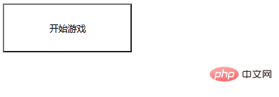
Effect code
 ##The effect comes out and you can see the button effect, but no dynamic decoration is added to it. By using
Add dynamic effects to it and let’s see how to do it. css editing code:
1. Between
style, initialize the style of search, add setting height and width, and then use settings Background background, set no-repeat This attribute background image will not be repeated. <pre class="brush:php;toolbar:false">.search {
width: 185px;
height: 70px;
background: url(images/btn_08.jpg) no-repeat center;
}</pre>Code effect
 2. Next, add a rounded corner effect to the
button and set the properties for each border# The four values of ##, and finally set the center alignment using float: left. <pre class="brush:php;toolbar:false">border-radius: 8px;
-webkit-border-radius: 8px;
-o-border-radius: 8px;
-moz-border-radius: 8px;
float: left; </pre>Code effect
The four-point edge rounded corner effect is out
search
Add font size, text alignment, and font thickness to the style, and set the style, color, and shape of all borders of theborder element.
font-size: 30px;
text-align: center;
font-weight: bold;
border: none;
color: #fff;
cursor: pointer;
line-height: 70px;
font-family: 微软雅黑;
4. Between style, initialize the style of btn, add setting height and width, and then use set background background.
.btn {
		    width: 383px;
		    height: 70px;line-height: 0;
		    border: 2px solid #a2f3ff;
		    background: #f3682d;

		}
Code effect
5. Then add font size, text alignment, font thickness, and settings to  btn
btn
borderThe style, color, and shape of all borders of the element.
border-radius: 37px;
-webkit-border-radius: 37px;
-o-border-radius: 37px;
-moz-border-radius: 37px;
text-shadow: 3px 2px #d4481b;
-webkit-text-shadow: 3px 2px #d4481b;
-o-text-shadow: 3px 2px #d4481b;
-moz-text-shadow: 3px 2px #d4481b;
font-family: 微软雅黑;
Code effect
6. Bind animation to  search
#search{
		    animation: breathe 1.1s infinite;
7、使用@keyframes规则,创建动画。
@keyframes breathe{
		  0%{ transform: scale(.99); }
		  50%{ transform: scale(1.03); }
		  100%{ transform: scale(.99); }
		}
代码效果

ok,编辑代码完成。
完整代码
<!DOCTYPE html>
<html>
<head>
	<meta charset="UTF-8">
	<title>button按钮</title>
	<style type="text/css">
		.search {
		    width: 185px;
		    height: 70px;
		    background: url(images/btn_08.jpg) no-repeat center;
		    border-radius: 8px;
		    -webkit-border-radius: 8px;
		    -o-border-radius: 8px;
		    -moz-border-radius: 8px;
		    float: left;
		    font-size: 30px;
		    text-align: center;
		    font-weight: bold;
		    border: none;
		    color: #fff;
		    cursor: pointer;
		    line-height: 70px;
		    font-family: 微软雅黑;
		}
		.btn {
		    width: 383px;
		    height: 70px;line-height: 0;
		    border: 2px solid #a2f3ff;
		    background: #f3682d;
		    margin: 22px 0 0 17px;
		    border-radius: 37px;
		    -webkit-border-radius: 37px;
		    -o-border-radius: 37px;
		    -moz-border-radius: 37px;
		    text-shadow: 3px 2px #d4481b;
		    -webkit-text-shadow: 3px 2px #d4481b;
		    -o-text-shadow: 3px 2px #d4481b;
		    -moz-text-shadow: 3px 2px #d4481b;
		    font-family: 微软雅黑;
		}
		#search{
		    animation: breathe 1.1s infinite;
		}
		@keyframes breathe{
		  0%{ transform: scale(.99); }
		  50%{ transform: scale(1.03); }
		  100%{ transform: scale(.99); }
		}
	</style>
</head>
<body>
	<input id="search" name="cx" type="button" value="开始游戏" class="btn search">
</body>
</html>推荐学习:CSS3视频教程
The above is the detailed content of One trick to teach you how to use css3 to create buttons and add dynamic effects (code sharing). For more information, please follow other related articles on the PHP Chinese website!
Related articles
See more- How to create a cool image enlargement effect using pure CSS3?
- How to add dynamic color changing effect to background image in CSS3
- How to create waterfall layout using pure CSS3? Brief analysis of columns method
- How to add background image to text using pure CSS3
- Use CSS3 to create practical loading animation effects (two types)
- HTML5+CSS3 dynamically draws an elephant
- Teach you how to use css3 to add three-dimensional effects to fonts (with code)

