
 Web Front-endCSS TutorialCreate a simple bubble dialog box with pure CSS (detailed explanation with pictures and text)
Create a simple bubble dialog box with pure CSS (detailed explanation with pictures and text)

This article will introduce you step by step how to use pure CSS to create a simple bubble dialog box. It has certain reference value. Friends in need can refer to it. I hope it will be helpful to everyone.

You can directly insert the bubble box image, but the image needs to be loaded every time, which can be achieved with CSS!
First of all, we need to understand how the bubble box is implemented. Once you know the principles, you can be infinitely flexible! ! ! !
Let’s start with a basic bubble diagram!

The first step is to have a frame! It's very simple, just a div! Then set relative positioning to its div.
HTML:
<div class="div"></div>
CSS:
.div{
    width: 200px;
    height: 100px;
    border: 2px solid #ff0;
    position: relative;
	}
As shown in the picture, this is a box, the basic shape is there!

Then, the most critical thing is how to realize the triangle part~
We must understand before that, where does the triangle come from?
Here, let me give an example to analyze it! ! ! !
Let’s take a look at the picture below. step by step! ! !
HTML:
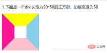
<p>1.下面是一个div.长宽为50*50的正方形,边框宽度为50</p>
<div class="div1"></div>
CSS:
		.div1{
			width: 50px;
			height: 50px;
			border: 50px solid;
			border-color: yellow skyblue pink deeppink;
		}
Rendering: We can see that when the border is 50px, it is already trapezoidal, right?
Next, set the width and height of the square to 0, leaving only a 50px border. Let’s take a look at the rendering. Do four triangles appear? Yes, the frame doesn’t wrap anything anymore. Only the border itself remains.

We take the upper border and set the color of the remaining three sides to transparent!

Do you know where the triangle comes from?
Let’s go back to the bubble box. We only need to position the triangle under the rectangular box, and the bubble box will basically be formed! !
CSS: Insert this style before the div! Use ::before and it’s ok!!! Position it absolutely! Set the top border color to: #ff0, the left and right borders to a transparent color, and the bottom border to a transparent color
		.div::before{
			content: '';
			width: 0;
			height: 0;
			border: 20px solid;
			position: absolute;
			bottom: -40px;
			left: 140px;
			border-color:  #ff0 transparent transparent;
		}
Result picture:

Okay, probably It looks like, hey! ! ! Isn’t it just a little bit worse? oh! It turns out that the triangle should be hollow, not a solid triangle! ! Then, wouldn't it be enough to insert a similar triangle after the div element with a white background color and cover it with the original yellow triangle? OK, let’s take a look! ! !
CSS:
		.div::after{
			content: '';
			width: 0;
			height: 0;
			border: 20px solid;
			position: absolute;
			bottom: -36px;
			left: 140px;
			border-color:  #fff transparent transparent;
		}
Rendering:

After completion, if it is a bit abrupt, add a rounded corner to the bubble box. ! ! !
css:
.div{
			width: 200px;
			height: 100px;
			border: 2px  solid #ff0;
			border-radius: 7px;  /*圆角弧度为7px*/
			position: relative;
		}
You can also set a bubble box with a filled color yourself! ! ! It’s very simple, no coding required! !

Okay, you’re done! A basic bubble box is complete! ! ! !
For more programming-related knowledge, please visit: Programming Teaching! !
The above is the detailed content of Create a simple bubble dialog box with pure CSS (detailed explanation with pictures and text). For more information, please follow other related articles on the PHP Chinese website!

 A Little Reminder That Pseudo Elements are Children, Kinda.Apr 19, 2025 am 11:39 AM
Here's a container with some child elements:
 Menus with 'Dynamic Hit Areas'Apr 19, 2025 am 11:37 AM
Flyout menus! The second you need to implement a menu that uses a hover event to display more menu items, you're in tricky territory. For one, they should
 Improving Video Accessibility with WebVTTApr 19, 2025 am 11:27 AM
"The power of the Web is in its universality. Access by everyone regardless of disability is an essential aspect."- Tim Berners-Lee
 Weekly Platform News: CSS ::marker pseudo-element, pre-rendering web components, adding Webmention to your siteApr 19, 2025 am 11:25 AM
In this week's roundup: datepickers are giving keyboard users headaches, a new web component compiler that helps fight FOUC, we finally get our hands on styling list item markers, and four steps to getting webmentions on your site.
 Making width and flexible items play nice togetherApr 19, 2025 am 11:23 AM
The short answer: flex-shrink and flex-basis are probably what you’re lookin’ for.

 Weekly Platform News: HTML Inspection in Search Console, Global Scope of Scripts, Babel env Adds defaults QueryApr 19, 2025 am 11:18 AM
In this week's look around the world of web platform news, Google Search Console makes it easier to view crawled markup, we learn that custom properties
 IndieWeb and WebmentionsApr 19, 2025 am 11:16 AM
The IndieWeb is a thing! They've got a conference coming up and everything. The New Yorker is even writing about it:


Hot AI Tools

Undresser.AI Undress
AI-powered app for creating realistic nude photos

AI Clothes Remover
Online AI tool for removing clothes from photos.

Undress AI Tool
Undress images for free

Clothoff.io
AI clothes remover

AI Hentai Generator
Generate AI Hentai for free.

Hot Article
Hot Tools

Notepad++7.3.1
Easy-to-use and free code editor

SublimeText3 Mac version
God-level code editing software (SublimeText3)

Dreamweaver Mac version
Visual web development tools

WebStorm Mac version
Useful JavaScript development tools

Zend Studio 13.0.1
Powerful PHP integrated development environment

