


Today I will tell you how to use this CSS 3D, as well as the related knowledge of spatial coordinate axes. Friends who are interested can come and find out, I hope it will be helpful to you.
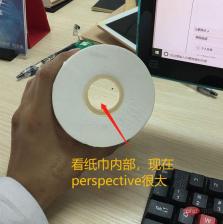
First the renderings:

Basic idea: three-layer structure:Perspective Container>>Vector>>specific3dimage.
Perspective container: Determines the 3D rendering effect. The pespective attribute here receives parameters in pixels. The larger the value of perspective, the more " The farther the eyes are from the observation object", the smaller the value, which means "The closer the eyes are to the observation object"
Without the perspective attribute, it will not be possible Adjust the viewing angle.

: Supports carrying 3D images The biggest difference between this carrier and ordinary html tags is that it has an additional attribute: transform-style:preserve-3d
. Indicates that it supports 3D image display.If this attribute is missing, the 3D graphics that have been 3D converted will be pressed in a 2D plane and cannot show a 3D effect, because the containers are flat, even if the content It doesn't help that it's 3D.
Specific 3d image
:Conversion from 2d to 3d The 3d image here They are all converted from 2D plane images, so how to convert them. You need to use the translateX, translateY, translateZ attributes, of course the abbreviation is translate-3d, and rotateX, rotateY, rotateZ, etc. The specific rules of translate (translation) and rotate (rotation) are based on the famous reference picture below: the three-dimensional coordinate diagram.
First of all, let’s talk about the rules of translate. There is no need to say more about this. Just compare it and see it. For example, translateZ(-100px) is in this picture In the picture, it is equivalent to the image moving 100px in the direction of the -z axis. To put it more vividly, "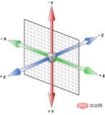 is sunken 100px
The difficulty lies in rotate. Let me tell you a very simple judgment rule:
The forward axis is facing the eye, clockwise the rotation angle is positive, and counterclockwise the rotation The angle is negative.
Or you can use the left-hand rule: Stretch out your left hand, thumb pointing In the direction of the positive axis, the four fingers point to the positive direction of rotation, but be sure to remember that it is the left hand! ##
Left-handed brother’s town:
 It’s that simple. For example, now we want to make a 3D dice. First, the six floor plans are as shown above. As shown in the center of the three-dimensional coordinate system, their sizes are the same as the carrier. To turn it into a dice, the following transformation needs to be done:
(Note: The carrier and The length and width of the 6 faces are all 200px)
Attached are all source codes: Hope this article is helpful to you. <template>
<div>
<section>
<div>前面</div>
<div>后面</div>
<div>左面</div>
<div>右面</div>
<div>上面</div>
<div>下面</div>
</section>
</div>
</template>
<style scoped>
.box {
width: 100%;
height: 100%;
perspective: 500px;
}
.cube {
position: relative;
width: 200px;
height: 200px;
margin: 100px auto;
color: #ff92ff;
font-size: 36px;
font-weight: 100;
text-align: center;
line-height: 200px;
transform-style: preserve-3d;
transform: rotateX(-50deg) rotateY(-50deg) rotateZ(0deg);
// animation: move 8s infinite linear;
@keyframes move {
0% {
transform: rotateX(0deg) rotateY(0deg) rotateZ(0deg);
}
100% {
transform: rotateX(720deg) rotateY(360deg) rotateZ(360deg);
}
}
div {
position: absolute;
width: 100%;
height: 100%;
border: 10px solid #66daff;
border-radius: 20px;
background-color: rgba(51, 51, 51, 0.3);
}
.front {
transform: translateZ(100px);
}
.back {
transform: translateZ(-100px) rotateY(180deg);
}
.left {
transform: translateX(-100px) rotateY(-90deg);
}
.right {
transform: translateX(100px) rotateY(90deg);
}
.top {
transform: translateY(-100px) rotateX(90deg);
}
.bottom {
transform: translateY(100px) rotateX(-90deg);
}
}
</style>
The above is the detailed content of A brief discussion on css 3d and spatial coordinate axes. For more information, please follow other related articles on the PHP Chinese website!

 A Little Reminder That Pseudo Elements are Children, Kinda.Apr 19, 2025 am 11:39 AM
Here's a container with some child elements:
 Menus with 'Dynamic Hit Areas'Apr 19, 2025 am 11:37 AM
Flyout menus! The second you need to implement a menu that uses a hover event to display more menu items, you're in tricky territory. For one, they should
 Improving Video Accessibility with WebVTTApr 19, 2025 am 11:27 AM
"The power of the Web is in its universality. Access by everyone regardless of disability is an essential aspect."- Tim Berners-Lee
 Weekly Platform News: CSS ::marker pseudo-element, pre-rendering web components, adding Webmention to your siteApr 19, 2025 am 11:25 AM
In this week's roundup: datepickers are giving keyboard users headaches, a new web component compiler that helps fight FOUC, we finally get our hands on styling list item markers, and four steps to getting webmentions on your site.
 Making width and flexible items play nice togetherApr 19, 2025 am 11:23 AM
The short answer: flex-shrink and flex-basis are probably what you’re lookin’ for.

 Weekly Platform News: HTML Inspection in Search Console, Global Scope of Scripts, Babel env Adds defaults QueryApr 19, 2025 am 11:18 AM
In this week's look around the world of web platform news, Google Search Console makes it easier to view crawled markup, we learn that custom properties
 IndieWeb and WebmentionsApr 19, 2025 am 11:16 AM
The IndieWeb is a thing! They've got a conference coming up and everything. The New Yorker is even writing about it:


Hot AI Tools

Undresser.AI Undress
AI-powered app for creating realistic nude photos

AI Clothes Remover
Online AI tool for removing clothes from photos.

Undress AI Tool
Undress images for free

Clothoff.io
AI clothes remover

Video Face Swap
Swap faces in any video effortlessly with our completely free AI face swap tool!

Hot Article
Hot Tools

SublimeText3 Linux new version
SublimeText3 Linux latest version

Dreamweaver Mac version
Visual web development tools

ZendStudio 13.5.1 Mac
Powerful PHP integrated development environment

SecLists
SecLists is the ultimate security tester's companion. It is a collection of various types of lists that are frequently used during security assessments, all in one place. SecLists helps make security testing more efficient and productive by conveniently providing all the lists a security tester might need. List types include usernames, passwords, URLs, fuzzing payloads, sensitive data patterns, web shells, and more. The tester can simply pull this repository onto a new test machine and he will have access to every type of list he needs.

SublimeText3 Mac version
God-level code editing software (SublimeText3)

