Home >Web Front-end >CSS Tutorial >How to use disabled and enabled? Detailed explanation of disabled and enabled
How to use disabled and enabled? Detailed explanation of disabled and enabled
- 云罗郡主forward
- 2018-11-21 16:52:4112088browse
The content of this article is about how to use disabled and enabled? The detailed explanation of disabled and enabled has certain reference value. Friends in need can refer to it. I hope it will be helpful to you.
:enabled and:disabled selector
In web forms, some form elements (such as input boxes, password boxes, check boxes, etc.) have "available" and "unavailable" 2 states. By default, these form elements are available.
In CSS3, we can use the :enabled selector and :disabled selector to set the CSS styles of the form elements in the available and unavailable states respectively. Example:
<!DOCTYPE html>
<html xmlns="http://www.w3.org/1999/xhtml">
<head>
    <title>CSS3 :enabled选择器与:disabled选择器</title>
    <style type="text/css">
        input[type="text"]:enabled
        {
            outline:1px solid #63E3FF;
        }
        input[type="text"]:disabled
        {
            background-color:#FFD572;
        }
    </style>
</head>
<body>
    <form>
        <p><label for="enabled">可用:</label><input type="text" name="enabled"/></p>
        <p><label for="disabled">禁用:</label><input type="text" name="disabled" disabled="disabled"/></p>
    </form>
</body>
</html>
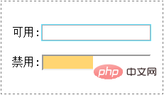
The preview effect in the browser is as follows:

Analysis:
Here we add the text box for the "available" state An outline, and then changes the background color of the text box in the "disabled" state.
The above is how to use disabled and enabled? A complete introduction to disabled and enabled in detail. If you want to know more about CSS3 tutorial, please pay attention to the PHP Chinese website.
The above is the detailed content of How to use disabled and enabled? Detailed explanation of disabled and enabled. For more information, please follow other related articles on the PHP Chinese website!

