Home >Web Front-end >CSS Tutorial >Introduction to the role of BFC (block-level formatting context) in CSS
Introduction to the role of BFC (block-level formatting context) in CSS
- 不言forward
- 2018-10-25 16:26:032747browse
This article brings you an introduction to the role of BFC (block-level formatting context) in CSS. It has certain reference value. Friends in need can refer to it. I hope it will be helpful to you.
Definition
BFC stands for block formatting context, which means block-level formatting context. It is the CSS rendering mode of the box model layout in the Web page.
Maybe the above explanation is a bit confusing. In layman’s terms, BFC refers to the layout of an area. The layout of this area has a distinctive feature: the sub-elements in this area will not affect external elements no matter what layout or style is used. A common use of BFC is to clear the effect of floating. Normally, if the effect of floating is unknown, the height of the parent element will collapse.
So when will BFC be triggered? Any one of the following conditions is met:
The value of float is not none
The value of position is not static or relate
The value of display is any one of table-cell, table-caption, inline-block, flex or inline-flex
The value of overflow is not visible
Function
Clear floating
We often encounter this situation: when a child element contained in a container contains a floating element, it will As a result, the container has no height. People often use a pseudo-class, and then use the clear attribute in the pseudo-class to clear the float. In fact, the same purpose can be achieved by defining a BFC. For example:
<div>
    <div></div>
    <div></div>
</div>
.container {
  width: 600px;
  background-color: black;
}
.container p {
  float: left;
  width: 200px;
  height: 200px;
  margin-left: 10px;
  background-color: green;
}

When the child element has a float attribute and the parent container does not set a height, the height of the parent container will collapse. We can solve this problem by adding overflow:hidden to the parent container to create a BFC. :
.container {
  width: 600px;
  background-color: black;
  overflow: hidden;
}
.container p {
  float: left;
  width: 200px;
  height: 200px;
  margin-left: 10px;
  background-color: green;
}

Prevent text wrapping
<div>
    <img  alt="Introduction to the role of BFC (block-level formatting context) in CSS" >
    <p>test test test test test test test test test test test test test test test test test test test test test test test test test test test test test test test test test </p>
</div>
img {
  float: left;
  width: 40px;
  height: 40px;
}

As above As shown in the example, under normal circumstances, the result we expect is to display the picture on the left and the text description on the right, instead of the text shown above surrounding the picture. At this time, we can also solve this problem by creating a BFC:
img {
  float: left;
  width: 40px;
  height: 40px;
  margin-right: 10px;
}
p {
  overflow: hidden;
}
Prevent margins from collapsing
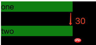
In regular document flow, child elements are placed vertically one after another starting from the top of the parent element. The vertical spacing between adjacent brothers is determined by the one with the largest spacing among them. Elements are determined rather than stacked together, which is margin collapse, for example:
<div>
    <p>one</p>
    <p>two</p>
</div>
.container {
  width: 200px;
  background-color: black;
}
p {
  width: 150px;
  background-color: green;
}
.one {
  margin: 10px 0;
}
.two {
  margin: 20px 0;
}

In this case, we can create a New BFC to solve
<div>
  <p>one</p>
  <div>
    <p>two</p>
  </div>
</div>
.container {
  width: 200px;
  background-color: black;
}
p {
  width: 150px;
  background-color: green;
}
.one {
  margin: 10px 0;
}
.two {
  margin: 20px 0;
}
.new {
  overflow: hidden;
}

The above is the detailed content of Introduction to the role of BFC (block-level formatting context) in CSS. For more information, please follow other related articles on the PHP Chinese website!
Related articles
See more- Detailed explanation of CSS BFC principle and its application
- CSS understands block-level formatting context BFC
- The magic of BFC in CSS.
- css block level formatting context BFC
- How to understand BFC-block formatting context (picture and text)
- What is BFC? What is the use of BFC in css?
- What is BFC? An in-depth analysis of BFC

