
Home >Web Front-end >CSS Tutorial >The magic of BFC in CSS.
The magic of BFC in CSS.
- php中世界最好的语言Original
- 2018-03-20 16:30:042637browse
This time I will bring you the magic of BFC in CSS. , what are the precautions when using BFC in CSS? The following is a practical case, let’s take a look.
When writing styles, we often add a style or modify a certain attribute to achieve our expectations.
And BFC is hidden in it. When you modify the style, you can trigger it accidentally without realizing it, so you don't realize the magic of BFC.
1. What is BFC (Block Formatting Context)
When writing CSS styles, to set css on an element, we first need to know whether the element is a block-level element or Inline elements, and BFC is used to format block-level boxes.
Formatting Context: refers to a rendering area in the page and has a set of rendering rules, which determines how its sub-elements are positioned, as well as their interaction and interaction with other elements.
BFC definition: Block-level formatting context, which refers to an independent block-level rendering area, only Block-level Box participates. This area has a set of rendering rules to constrain the layout of block-level boxes, and is consistent with Not relevant outside the area.
2. Generation of BFC
We mentioned that BFC is a rendering area, so where is this rendering area and what is its specific size? These are determined by the elements that generate the BFC.
Elements that meet one of the following CSS declarations will generate a BFC:
1. The root element or other elements containing it
2. The value of float is not none;
3. The value of overflow is not visible;
4. The value of position is not static;
5. The value of display is inline- block, table-cell, table-caption;
6, flex boxes (display of element: flex or inline-flex);
Note: Some people also think that display: table can generate BFC, I think the main reason is that table will generate an anonymous table-cell by default, and it is this anonymous table-cell that generates BFC.
3. The layout rules of BFC
are simply summarized as follows:
1. The internal elements will be arranged one after another in the vertical direction. You can Understood as a regular flow in BFC
2. The vertical distance of elements is determined by margin, that is, the margins of two adjacent boxes belonging to the same BFC may overlap
3 , the left margin of each element is in contact with the left boundary of the containing block (from left to right, otherwise the opposite), even if there is a float, which means that the child elements in BFC will not exceed its Containing blocks
4. The BFC area will not overlap with the float element area5. When calculating the height of BFC, floating sub-elements also participate in the calculation6. BFC is An isolated independent container on the page. The child elements inside the container will not affect the elements outside and vice versa4. Application of BFC
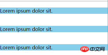
said So much, then what is the use of our BFC? Below we use several examples to solve some problems: Example 1. Solving the margin overlap problemFriends who play CSS all know margin collapse, that is, adjacent vertical elements have margins set at the same time. Afterwards, the actual margin value will collapse to the larger value. The basic principle is that they are in the same BFC, which conforms to the rule that "the margins of two adjacent elements belonging to the same BFC will overlap". margin overlapping phenomenon<!DOCTYPE html>
<html lang="en">
<head>
<meta charset="UTF-8">
<meta name="viewport" content="width=device-width, initial-scale=1.0">
<meta http-equiv="X-UA-Compatible" content="ie=edge">
<title>margin重叠现象</title>
<style type="text/css">
*{margin: 0;padding: 0;}
.box p {
margin: 20px 0px;
background-color: skyblue;
}
</style>
</head>
<body>
<p class="box" >
<p>Lorem ipsum dolor sit.</p>
<p>Lorem ipsum dolor sit.</p>
<p>Lorem ipsum dolor sit.</p>
</p>
</body>
</html>
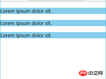
 ##Through the experimental results, we found that the upper and lower margins overlap.
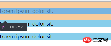
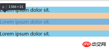
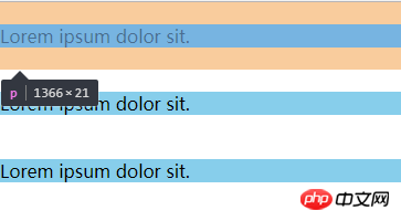
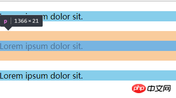
We can wrap a container around one of the elements and trigger the container to generate a BFC. Then the two elements belong to different BFCs, and margin overlap will not occur.
We make the following modifications:
<p class="box">
    <p>Lorem ipsum dolor sit.</p>
    <p style="overflow:hidden;">
        <p>Lorem ipsum dolor sit.</p>
    </p>
    <p>Lorem ipsum dolor sit.</p>
</p>
我们使用overflow:hidden;生成了一个BFC,成功解决了margin重叠问题。
实例2、解决浮动问题
我们知道给父元素设置overflow:hidden可以清除子元素的浮动,但往往都不知道原理是什么。
其实这就是应用了BFC的原理:当在父元素中设置overflow:hidden时就会触发BFC,所以他内部的元素就不会影响外面的布局,BFC就把浮动的子元素高度当做了自己内部的高度去处理溢出,所以外面看起来是清除了浮动。
<!DOCTYPE html>
<html lang="en">
<head>
    <meta charset="UTF-8">
    <meta name="viewport" content="width=device-width, initial-scale=1.0">
    <meta http-equiv="X-UA-Compatible" content="ie=edge">
    <title>BFC浮动问题</title>
    <style>
        .one {
            /* 文档流 里面的文字标签将父元素撑起来 */
            background-color: pink;
        }
        .two {
            float: left;
        }
    </style>
</head>
<body>
    <!-- 文档流 从上到下,当遇到float、position:absolute时,会离开文档流 -->
    <p class="one">
    <p class="two">Hello World!</p>
    </p>
    你好世界!
</body>
</html>

我们做如下修改:
.one {
        background-color: pink;
        overflow: hidden;
    }

对比发现,当我们一个元素设置成为BFC之后,计算BFC元素高度的时候,浮动元素也参与了计算。
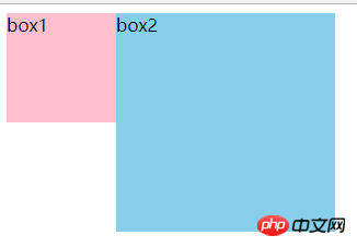
实例3、解决侵占浮动元素的问题
我们知道浮动元素会脱离文档流,然后浮盖在文档流元素上。
<!DOCTYPE html>
<html lang="en">
<head>
    <meta charset="UTF-8">
    <meta name="viewport" content="width=device-width, initial-scale=1.0">
    <meta http-equiv="X-UA-Compatible" content="ie=edge">
    <title>BFC侵占浮动元素的问题</title>
    <style>
        .box1 {
            float: left;
            width: 100px;
            height: 100px;
            background-color: pink;
        }
        .box2 {
            width: 200px;
            height: 200px;
            background-color: skyblue;
        }
    </style>
</head>
<body>
    <p class="box1">box1</p>
    <p class="box2">box2</p>
</body>
</html>
当一个元素浮动,另一个元素不浮动时,浮动元素因为脱离文档流就会盖在不浮动的元素上。
我们做如下修改:
.box2 {
        width: 200px;
        height: 200px;
        background-color: skyblue;
        overflow: hidden;
    }
或如下修改:
.box2 {
        width: 200px;
        height: 200px;
        background-color: skyblue;
        /* overflow: hidden; */
        float: left;
    }
我们为非浮动元素建立BFC环境,根据BFC的不与float box重叠的规则,解决了侵占元素问题。
这一特性,我认为还是很有用的,特别是应用在两栏布局上,对比我们常规为非浮动元素或非定位元素设置margin来挤开的方法,其优点在于不需要去知道浮动或定位元素的宽度。
相信看了本文案例你已经掌握了方法,更多精彩请关注php中文网其它相关文章!
推荐阅读:
The above is the detailed content of The magic of BFC in CSS.. For more information, please follow other related articles on the PHP Chinese website!