Home >Web Front-end >CSS Tutorial >Four common methods to achieve adaptive layout with fixed middle on both sides using css
Four common methods to achieve adaptive layout with fixed middle on both sides using css
- 不言forward
- 2018-10-17 15:09:513215browse
What this article brings to you is about the four common methods of using CSS to implement adaptive layout with fixed middle on both sides. It has certain reference value. Friends in need can refer to it. I hope it will be helpful to you.
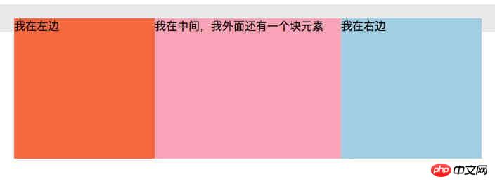
Analysis of four common methods and principles: floating, floating inline div, positioning, and flex.
Floating
<style>
    .wrap {background: #eee; padding: 20px; }
    p {margin: 0; }
    .left {width: 200px; height: 200px; float: left; background: coral; }
    .right {width: 200px; height: 200px; float: right; background: lightblue; }
    .middle {margin: 0 200px; background: lightpink; }
</style>
<div>
    <p>我在左边</p>
    <p>我在右边</p>
    <p>我排最后,但是跑到中间来了</p>
</div>

##Principle:
- Floating elements and non-floating elements are not in the same three-dimensional space. If they are not floated, the elements below them will float upward.
- The height of the floating element is 0, and the floating box level is higher than the
block
block-level horizontal box and lower than theinline/inline-blockhorizontal box .
Floating inline div
<style>
    .wrap {background: #eee; padding: 20px; }
    p {margin: 0; }
    .left {width: 200px; height: 200px; float: left; background: coral; margin-left: -100%;}
    .right {width: 200px; height: 200px; float: left; background: lightblue; margin-left: -200px;}
    .middle {width: 100%; height: 200px;float: left; background: lightpink; }
    span{
        display: inline-block;
        margin: 0 200px;
    }
</style>

<div>
    <p>
        <span>
            我在中间
        </span>
    </p>
    <p>我在左边</p>
    <p>我在右边</p>
</div>

Principle:
- Three elements are all floating, and the theme element is 100% full of one row. Use negative
margin
to place the elements on the left and right sides. - There is a sub-element inside the theme element. The sub-element is
margin: 0 200px
to prevent the content from being covered under the two floating elements on the left and right.
Positioning
<style>
    .wrap {background: #eee; position: relative;}
    p {margin: 0; }
    .left {width: 200px; height: 200px; background: coral; position: absolute;left: 0; top: 0;}
    .right {width: 200px; height: 200px; background: lightblue; position: absolute;right: 0; top: 0;}
    .middle {height: 200px; background: lightpink; margin: 0 200px;}
</style>

<div>
    <p>我在中间,我用 margin 抵消左右两块定位元素占据空间</p>
    <p>我在左边,我是定位元素</p>
    <p>我在右边,我是定位元素</p>
</div>

- The left and right elements are positioned and can be placed in any position.
- Use
- margin: 0 200px
for the middle element to prevent the content from running under the left and right positioning elements and being covered.
<style>
    .wrap {background: #eee; display: flex}
    p {margin: 0; }
    .left {width: 200px; height: 200px; background: coral; }
    .right {width: 200px; height: 200px; background: lightblue; }
    .middle {height: 200px; background: lightpink; flex: 1;}
</style>

<p>
    </p><p>我在左边</p>
    <p>我在中间,flex: 1 自动占据剩余空间</p>
    <p>我在右边</p>
flex layout, sub-elements are arranged horizontally by default.
flex: 0 1 auto -> By default, the occupied space does not follow the parent to enlarge, and becomes smaller with the original width.
flex: 1 1 auto -> auto, the occupied space follows The parent is enlarged, and at the same time it becomes smaller. Its original width is
flex: 0 0 auto -> none. The occupied space does not enlarge with the parent, and it does not become smaller at the same time. Its own original width
flex: 1 1 1 -> auto, the space occupied follows the parent to enlarge and become smaller at the same time, and automatically fills the remaining space
##The above is the detailed content of Four common methods to achieve adaptive layout with fixed middle on both sides using css. For more information, please follow other related articles on the PHP Chinese website!

