Home >Web Front-end >CSS Tutorial >Summary of implementation methods for vertical and horizontal centering in css (with code)
Summary of implementation methods for vertical and horizontal centering in css (with code)
- 不言forward
- 2018-10-17 15:26:472425browse
This article brings you a summary of the implementation methods of vertical and horizontal centering in CSS (with code). It has certain reference value. Friends in need can refer to it. I hope it will be helpful to you.
Recently I have seen many interview questions asking: Please tell me several ways to use CSS to achieve vertical and horizontal centering? When I was reading the basics of CSS, I saw an article that talked about complete centering. Here is a summary of the content in the article
1. Use absolute (Absolute Centering)
1.1 The specific code is as follows:
.container {
    position: relative;
}

.absolute_center {
    position: absolute;
    top: 0;
    right: 0;
    bottom: 0;
    left: 0;
    width: 50%;
    height: 50%;
    margin: auto;
    padding: 20px;
    overflow: auto;
}
<div>
    <div>
        <ul>
            <li>
                该方法的核心思想是是使用绝对定位布局,使当前元素脱离正常的流体特性,而使用absolute的流体特性
            </li>
        </ul>
    </div>
</div>
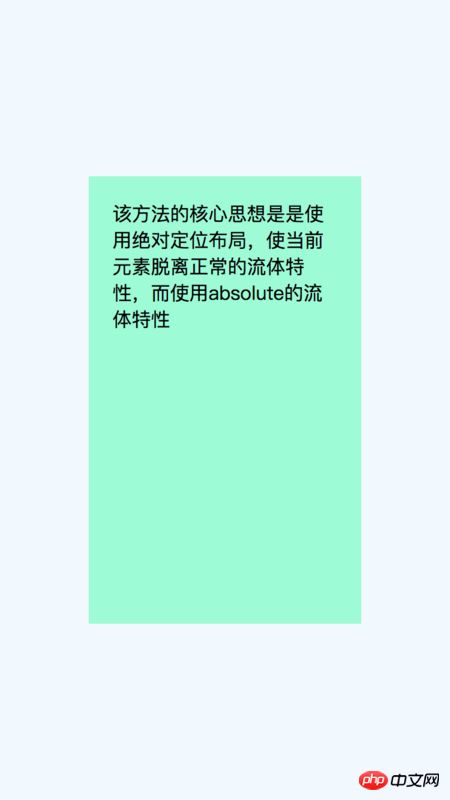
##1.2 The core idea of this method is:
Use absolute for positioning and layout, breaking away from the normal fluid properties of block elements, and completing vertical and horizontal centering through the fluid properties of absolute.There are two basic knowledge points you need to know:
1. Fluid properties:Blocky horizontal elements, such as div elements, are by default (non-floating, absolute positioning, etc.), the horizontal direction will automatically fill the outer container; if there is margin-left/margin-right, padding-left/padding-right, border-left-width/border-right-width etc., the actual content area will respond to narrowing;
2. Absolute fluid properties:
It does not have fluid properties by default, but only under specific conditions, and this condition is "positioning in opposite directions at the same time" "When", that is, left and right are positioned in the horizontal direction, top and bottom are positioned in the vertical direction, and when the opposite directions have positioning values at the same time, absolute fluid characteristics occur.
1.3 Advantages and Disadvantages:
2. No additional markup html elements, simple style;
3. Content width and height writing supports percentage and min-/max-writing;
4. Right Image files are also supported;
2. The overflow attribute must be added to prevent the content from appearing if the text height exceeds the outer container. overflow situation;
, negative margins
This may be the most commonly used method at present, when the height and width of the element are When fixing the value, set the element to a relative layout to get out of the document flow, set top: 50%; left: 50%;, and use margin-left and margin-top to completely center the element.2.1 The specific code is as follows:
.container {
    position: relative;
    width: 100%;
    height: 100%;
    background-color: aliceblue;
}

.is-Negative {
    position: absolute;
    width: 300px;
    height: 200px;
    padding: 20px;
    position: absolute;
    top: 50%;
    left: 50%;
    margin-left: -170px;
    margin-top: -120px;
    background-color: cornsilk;
}
<div>
    <div>
    </div>
</div>
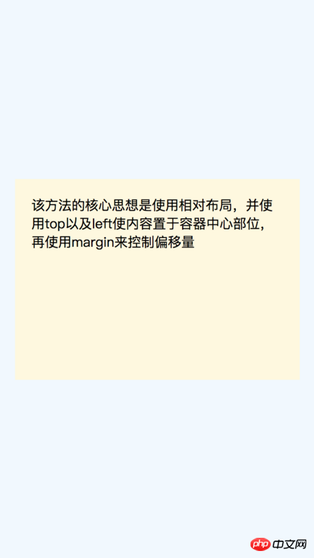
Use relative layout, use top and left to place the content in the center of the container, and then use margin to control the offset.
There is a note here:
When using the box-sizing:border-box attribute, the offset does not need to calculate the border and padding.
Advantages:
1. Good compatibility, including IE6-IE7
2. No extra Mark html elements, less code;
Disadvantages:
1. Non-responsive, cannot be used with percentage and min-/max-;
2.The overflow attribute must be added To prevent overflow if the text height of the content exceeds the outer container;3. When the element uses box-sizing:border-box and uses the default content-box offset, it is different and needs to be recalculated ;
3.1 The specific code is as follows:
.container {
    position: relative;
    width: 100%;
    height: 100%;
    background-color: aliceblue;
}

.is-Transformed {
    width: 50%;
    margin: auto;
    position: absolute;
    top: 50%;
    left: 50%;
    padding: 20px;
    -webkit-transform: translate(-50%,-50%);
        -ms-transform: translate(-50%,-50%);
            transform: translate(-50%,-50%);
    background-color: darkseagreen;
}
<div>
    <div>
        <ul>
            <li>
                该方法的核心思想是使用相对布局,并使用top以及left使内容置于容器中心部位,再使用translate来控制偏移量
            </li>
        </ul>
    </div>
</div>
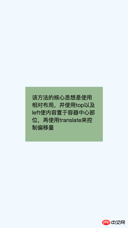
Use relative layout, use top and left to place the content in the center of the container, and then use transform to control the offset quantity.
Advantages:
1. Content width and height are adaptive, and the width and height of the content do not need to be specified. ;
2. Small amount of code
Disadvantages:
1. Compatibility is a bit poor. Since transform is not compatible with IE8, it only supports modern browsers of IE9 and above;
2. In order to be compatible with various browsers, some additional css prefixes are needed;3. If the element uses the transform attribute, it may affect other transformation effects;
4. Sometimes the edges will be blurred In this case, this is a browser rendering problem, especially when the transform-style: preserve-3d attribute is used. It may be the best vertical centering solution, but there is a biggest problem. It requires additional html elements. To use table-cell to complete the vertical centering effect, 3 elements are needed to complete.
@import "./absolute_center4.png"{width="50%"} 4.2 该方法的核心思想是: 使用表格来实现垂直居中,再使用margin: 0 auto;来实现水平居中。 具体操作步骤如下: 1.设置父元素为块级表格; 4.3 优缺点: 优点: 1.内容高度自适应; 缺点: 1.完成一个垂直居中效果,需要3个html元素; 五、使用Inline-block 这也是一种常用的垂直水平居中的方法,但会存在一个问题:当内容的宽度大于容器宽度-0.25em的时候,会发生内容上移到顶部的方法,所以需要一些小的技巧来避免这样的问题。 5.1 具体代码如下: 5.2 该方法的核心思想是: 和table有点类似,设置内容为inline-block块,设置vertical-align: middle;属性使元素垂直方向居中,再父容器设置text-align:center;使子元素水平方向居中; 优: 1、内容高度自适应; 缺: 1.依赖margin-left:-0.25em来矫正水平方向居中的误差; 六、使用Flexbox 弹性布局是当前移动端比较流行的布局方式,它可以很优雅的完成垂直水平居中效果。 6.1 具体代码如下: 6.2 该方法的核心思想是: 使用弹性布局,align-items: center;使元素在侧轴方向居中(默认是垂直方向),justify-content: center;使元素在主轴方向居中(默认是水平方向); 6.3 优缺点: 优: 1.内容宽度、高度自适应,即便文本溢出也很优雅; 缺: 1.兼容性比较差,目前只有IE10以上兼容;.container {
position: relative;
width: 100%;
height: 100%;
background-color: aliceblue;
}
.container.is-Table {
display: table;
}
.is-Table .Table-Cell {
display: table-cell;
vertical-align: middle;
}
.is-Table .Center-Block {
width: 50%;
margin: 0 auto;
padding: 20px;
background-color: deepskyblue;
}
<div>
    <div>
        <div>
            使用table-cell完成垂直水平居中
        </div>
    </div>
</div>
2.设置子元素为表格单元格;
3.给子元素添加vertical-align:middle属性,此单元格已实现垂直居中;
4.设置子元素中的内容的宽度,添加margin: 0 auto;属性,使子元素水平居中。
2.如果子元素的内容溢出,会拉伸父元素的高度;
3.兼容性好,兼容到IE8;.container {
position: relative;
width: 100%;
height: 100%;
background-color: aliceblue;
}
.container.is-Inline {
text-align: center;
overflow: auto;
}
.container.is-Inline:after,
.is-Inline .Center-Block {
display: inline-block;
vertical-align: middle;
}
.container.is-Inline:after {
content: '';
height: 100%;
margin-left: -0.25em; /* To offset spacing. May vary by font */
}
.is-Inline .Center-Block {
background-color: greenyellow;
padding: 20px;
max-width: 99%; /* Prevents issues with long content causes the content block to be pushed to the top */
/* max-width: calc(100% - 0.25em) /* Only for IE9+ */
}
<div>
    <div>
        使用inline-block完成水平垂直居中
    </div>
</div>

5.3 优缺点:
2.如果子元素的内容溢出,会拉伸父元素的高度;
3.兼容性好,兼容到IE7;
2.内容的宽度必须小于容器的宽度减去0.25em。.container {
position: relative;
width: 100%;
height: 100%;
background-color: aliceblue;
}
.container.is-Flexbox {
display: -webkit-box;
display: -moz-box;
display: -ms-flexbox;
display: -webkit-flex;
display: flex;
-webkit-box-align: center;
-moz-box-align: center;
-ms-flex-align: center;
-webkit-align-items: center;
align-items: center;
-webkit-box-pack: center;
-moz-box-pack: center;
-ms-flex-pack: center;
-webkit-justify-content: center;
justify-content: center;
}
.center_block {
background-color: wheat;
padding: 20px;
}
<div>
  <div>
    使用flexbox完成水平垂直居中
  </div>
</div>

2.可以使用很多弹性布局的新特性;
2.需要写额外的兼容性前缀;
3.各个浏览器的表现可能会有一些差异;
The above is the detailed content of Summary of implementation methods for vertical and horizontal centering in css (with code). For more information, please follow other related articles on the PHP Chinese website!
Related articles
See more- Detailed introduction to the transform attribute in CSS3 to achieve vertical and horizontal centering of divs with variable width and height
- About using css to center text and images vertically and horizontally
- What are the methods for vertical and horizontal centering in CSS?
- How to achieve vertical and horizontal centering with CSS
- How to achieve vertical and horizontal centering in css when the size of the element is not known (code)

