


The following brings you a simple implementation of CSS3 drawing hexagons. The content is quite good, so I will share it with you now and give it as a reference.
Because it is very simple, let’s summarize it first: using CSS3 to draw hexagons mainly uses pseudo-classes: before and :after to draw before and after the source element. Two elements, and use the border style of css3 to turn these two elements into triangles and place them at both ends of the source element.
(Because I have worked in a biological company before, I feel that hexagons are closer to concepts such as biomolecules and genes. Including when we search for pictures of biomolecules, genes, etc. on the Internet, many of them also have hexagonal styles, so At that time, if you do some functional navigation or tags on the page, you will feel that the hexagon is closer).
The complete page effect is as shown below: (In fact, multiple hexagons are positioned like this. Of course, you can also set the colors of different hexagons, so that you can better distinguish different module functions. ).

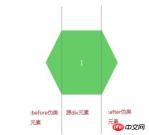
We can propose a separate hexagon for analysis, as shown below:
After knowing the analysis idea, we You can first learn how to draw triangles. There are many examples on the Internet, but you don’t have to look for unused children’s shoes. The code and examples are also given below, as follows:
Rendering:
CSS code:
.arrow{
              display: inline-block;
              width:0px;
              height: 0px;
              border-style: solid;
              border-width: 100px; //与padding、margin属性类似,顺序为上、右、下、左
              border-color: red blue orange gray;  //顺序为上、右、下、左}
HTML code:
<p class="arrow"></p>
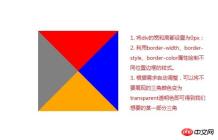
As shown in the picture above , use the border attribute to fill the color we don’t want with a transparent color, and then we can get a certain part of the triangle. The code and picture effects are as follows.
Rendering: (The triangle on the left is what we need, the others are set to transparent colors)

CSS code:
.arrow{
              display: inline-block;
              width:0px;
              height: 0px;
              border-bottom: 100px solid transparent;  //设置透明色
              border-top: 100px solid transparent;   //设置透明色
              border-right: 100px solid transparent;  //设置透明色
              border-left: 100px solid gray;
          }
HTML code:
<p class="arrow"></p>
Okay. Now that we know how to draw a triangle, we can use the CSS pseudo-classes :before and :after to complete the hexagon we want to draw.
: before is to insert content in front of the element
: after is to insert content after the element
If we want to insert some textual content, we can enter the text that needs to be displayed in its content attribute, such as content: "HELLO WORLD", but our example does not need to display additional information. We just need to turn the two pseudo-elements before and after into triangles and place them in fixed positions.
The complete code is given as follows:
<!DOCTYPE html>
<html>
<head lang="en">
    <meta charset="UTF-8">
    <title></title>
    <style type="text/css">
     .sharp:before{
         content:"";  //不需要展现文字等内容,所以设置为空字符
         width:0px;
         border-bottom:80px solid transparent;
         border-top:80px solid transparent;
         border-right:40px solid #6c6;
         position:absolute;
         left:-40px;
         top:0px;
     }
     .sharp{
         min-width:100px;
         height:160px;
         background:#6c6;
         display: inline-block;
         position: absolute;
         line-height: 160px;
         color:#FFFFFF;
         font-size: 20px;
         text-align: center;
     }
     .sharp:after{
         content:"";  //不需要展现文字等内容,所以设置为空字符
         width:0px;
         border-bottom:80px solid transparent;
         border-top:80px solid transparent;
         border-left-width:40px;
         border-left-style: solid;
         border-left-color:#6c6;
         position:absolute;
         right:-40px;
         top:0px;
     }
        #sharpContainer{
            width:100%;
            height: 600px;
        }
        #sharpContainer .center{
            top:200px;
            left:300px;
        }
         #sharpContainer .top{
             top:20px;
             left:300px;
         }
         #sharpContainer .top-left{
             top:110px;
             left:140px;
         }
         #sharpContainer .top-right{
             top:110px;
             left:460px;
         }
         #sharpContainer .bottom{
             top:380px;
             left:300px;
         }
         #sharpContainer .bottom-left{
             top:290px;
             left:140px;
         }
         #sharpContainer .bottom-right{
             top:290px;
             left:460px;
         }
    </style>
</head>
<body>
<p id="sharpContainer">
    <p class="sharp center">
    </p>
    <p class="sharp top">
    </p>
    <p class="sharp top-left">
    </p>
    <p class="sharp top-right">
    </p>
    <p class="sharp bottom">
    </p>
    <p class="sharp bottom-left">
    </p>
    <p class="sharp bottom-right">
    </p>
</p>
</body>
</html>
Hexagon drawing is actually a very simple effect, as long as we understand how to draw triangles and use:before,:after Pseudo-class style is enough. In the future, we can add more irregular graphics to the project
The above is the entire content of this article. I hope it will be helpful to everyone's learning. For more related content, please pay attention to the PHP Chinese website !
Related recommendations:
How to implement the animation effect of tilting and rotating at the same time in CSS3
Using the border-radius of CSS3 Realize the drawing of Tai Chi and love patterns
CSS3 realizes the extended content display on mouse hover
The above is the detailed content of About how to draw hexagons in CSS3. For more information, please follow other related articles on the PHP Chinese website!

 Anchor Positioning Just Don't Care About Source OrderApr 29, 2025 am 09:37 AM
The fact that anchor positioning eschews HTML source order is so CSS-y because it's another separation of concerns between content and presentation.
 What does margin: 40px 100px 120px 80px signify?Apr 28, 2025 pm 05:31 PM
Article discusses CSS margin property, specifically "margin: 40px 100px 120px 80px", its application, and effects on webpage layout.
 What are the different CSS border properties?Apr 28, 2025 pm 05:30 PM
The article discusses CSS border properties, focusing on customization, best practices, and responsiveness. Main argument: border-radius is most effective for responsive designs.
 What are CSS backgrounds, list the properties?Apr 28, 2025 pm 05:29 PM
The article discusses CSS background properties, their uses in enhancing website design, and common mistakes to avoid. Key focus is on responsive design using background-size.
 What are CSS HSL Colors?Apr 28, 2025 pm 05:28 PM
Article discusses CSS HSL colors, their use in web design, and advantages over RGB. Main focus is on enhancing design and accessibility through intuitive color manipulation.
 How can we add comments in CSS?Apr 28, 2025 pm 05:27 PM
The article discusses the use of comments in CSS, detailing single-line and multi-line comment syntaxes. It argues that comments enhance code readability, maintainability, and collaboration, but may impact website performance if not managed properly.
 What are CSS Selectors?Apr 28, 2025 pm 05:26 PM
The article discusses CSS Selectors, their types, and usage for styling HTML elements. It compares ID and class selectors and addresses performance issues with complex selectors.
 Which type of CSS holds the highest priority?Apr 28, 2025 pm 05:25 PM
The article discusses CSS priority, focusing on inline styles having the highest specificity. It explains specificity levels, overriding methods, and debugging tools for managing CSS conflicts.


Hot AI Tools

Undresser.AI Undress
AI-powered app for creating realistic nude photos

AI Clothes Remover
Online AI tool for removing clothes from photos.

Undress AI Tool
Undress images for free

Clothoff.io
AI clothes remover

Video Face Swap
Swap faces in any video effortlessly with our completely free AI face swap tool!

Hot Article
Hot Tools

Atom editor mac version download
The most popular open source editor

VSCode Windows 64-bit Download
A free and powerful IDE editor launched by Microsoft

Zend Studio 13.0.1
Powerful PHP integrated development environment

SublimeText3 English version
Recommended: Win version, supports code prompts!

Notepad++7.3.1
Easy-to-use and free code editor

