Home >Web Front-end >CSS Tutorial >How to achieve simultaneous tilt and rotation animation effects in CSS3
How to achieve simultaneous tilt and rotation animation effects in CSS3
- 不言Original
- 2018-06-26 15:29:142188browse
This article mainly introduces to you through example code how to use CSS3 to achieve the animation effect of tilting and rotating at the same time. The article gives a complete example code. You can see the effect by running it directly. Friends in need We can learn from it, let’s take a look below.
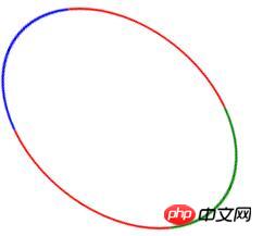
Look at the static effect first, the effect after running will be better

The sample code is as follows
<!DOCTYPE html>
<html lang="zh-CN">
<head>
  <meta charset="UTF-8" />
 <title>css3学习</title>
 <style type="text/css">
 .d{width: 200px;height: 200px;border-radius: 50%;border: 2px solid red;border-left-color: green;border-right-color: blue;
  -webkit-animation:abc 2s infinite linear;
  animation:abc 2s infinite linear;
 }
 /*chrome,Safari,ff,o测试没问题,IE11一闪一闪的*/
 @keyframes abc{
  0% {transform:skew(20deg) rotate(0deg);}
    50% {transform:skew(20deg) rotate(180deg);}
    100% {transform:skew(20deg) rotate(360deg);}
 }
 @-webkit-keyframes abc{
  0% {-webkit-transform:skew(20deg) rotate(0deg);}
    50% {-webkit-transform:skew(20deg) rotate(180deg);}
    100% {-webkit-transform:skew(20deg) rotate(360deg);}
 }
 </style>
</head>
<body>
 <p id="abc" class="d"></p>
</body>
</html>
The above is the entire content of this article, I hope It will be helpful for everyone’s learning. For more related content, please pay attention to the PHP Chinese website!
Related recommendations:
Use CSS3 border-radius to draw Tai Chi and love patterns
##Use CSS3 to realize text Code for bright light effects
The above is the detailed content of How to achieve simultaneous tilt and rotation animation effects in CSS3. For more information, please follow other related articles on the PHP Chinese website!

