
Home >Web Front-end >CSS Tutorial >How to make a 0.5px thin line using css3
How to make a 0.5px thin line using css3

- 不言Original
- 2018-06-26 15:24:562903browse
This article mainly introduces the relevant information about the sample code of using css3 to make a 0.5px thin line. The content is quite good. I will share it with you now and give it as a reference.
CSS3 in Webapp implements 0.5px thin line
It feels like I haven’t written a blog for a long time. My life has been relatively stable recently, so I have to start writing again. One is to make some records, because I am afraid that one day I will forget it, look back at the blog, and pick it up again. Memory, that's it.
I have seen e-commerce mobile websites such as Taobao, JD.com, Yixun, Yihaodian, etc. The common features of these large e-commerce sites are exquisite workmanship and good user experience. Among them, in terms of layout , a 0.5px line looks much more refined than a 1px line.
Method 1: Use gradients to do
html code:
<p></p>
css code:
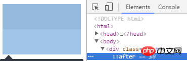
.bd-t{
  position:relative;
}

.bd-t::after {
  content: " ";
  position: absolute;
  left: 0;
  top: 0;
  width: 100%;
  height: 1px;
  background-image: linear-gradient(0deg, transparent 50%, #e0e0e0 50%);
}
Be careful! Pay attention to this There are pitfalls everywhere! ! ! :
For compatibility with different browsers, we need to use different prefixes such as:
-webkit-linear-gradient
-ms-linear-gradient
-o-linear-gradient
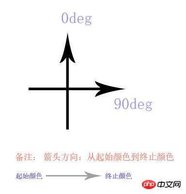
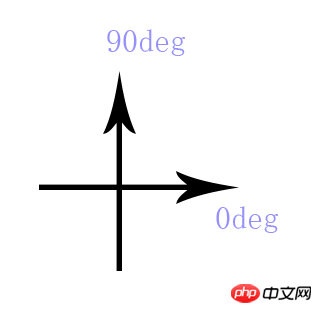
The pitfall is in these prefixes: We change the height 1px in the code to 100px, and the parameters are the same 0deg, transparent 50%, #e0e0e0 50% and use the latest version of chrome to test.
linear-gradient has the following results:
After a series of test summaries, we can deduce the following gradient method:
The code rendering of webkit-linear-gradient is as follows:
After summary, we see that the gradient method of -webkit prefix is:
If other prefixes are used, friends are invited to try to fill in the pits themselves!
Note:
Recommended this way of writing, this is the approach of Baidu Nuomi Mobile Station (if it has not been revised): http://m.nuomi.com/, from the description of the above code , you can see that in order to achieve the effect of 0.5px border on the top of the box: border-top: 0.5px solid #e0e0e0;, use after as a hook, width 100%, height 1px, The background gradient, half transparent and half colored, is ok. In the same way, the thin lines on the bottom, left and right are all the same. Of course, if you need to use it in combination, nesting between boxes is also possible, or you have your own ideas (of course there are many ways to do it!)...
Method 2: Use zoom
html code:
<p></p>
css code:
.bd-t{
position:relative;
}
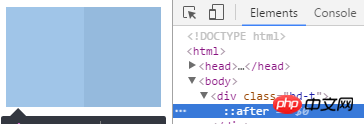
.bd-t:after{
content: " ";
position: absolute;
left: 0;
top: 0;
width: 100%;
height: 1px;
background-color: #e0e0e0;
/* 如果不用 background-color, 使用 border-top:1px solid #e0e0e0; */
-webkit-transform: scaleY(.5);
transform:scaleY(.5);
}Instructions
This is a way to achieve a 0.5px upper border on the box. This is not recommended. The method is because after testing, some mobile browsers do not display very well. The principle of this implementation is: in the Y-axis direction, compress half. As noted above.
If you feel that the effect is not very good, here is a fallback or workaround, whatsoever: It is the method commented out above: you can try using border-top:1px solid #e0e0e0; instead of background- This is how JD.com does color (if it has not been revised): http://m.jd.com/
Expansion of method two: If you want to achieve 0.5px lines all around Words:
html code:
<p class='bd-all'></p>
css code:
  .bd-all{
      position:relative;
  }

 .bd-all:after{
      content: "  ";
      position: absolute;
      left: 0;
      top: 0;
      z-index:-1;
      width: 200%;
      height:200%;
      border:1px solid #e0e0e0;
      -webkit-transform-origin: 0 0;
      transform-origin: 0 0;
      -webkit-transform: scale(.5, .5);
      transform: scale(.5, .5);
 }
Description:
This is how to achieve 0.5px around a box. If you add the border-radius rounded corner effect, you will find that some mobile phones will have rounded corners, but the impact is not very big. If there are two boxes, the upper box has no border effect, and the lower box has a border effect. The two boxes are the same width and the top and bottom are laid together. You will find that sometimes they are not aligned on the mobile phone... they are staggered by 0.5px. , the reason is already very clear... and the z-index can be adjusted according to different needs. If possible, it is okay not to use it.
Method 3: Using background-image and css3 Jiugongge reduction
Jingdong did this before, but it is no longer used. For specific methods, please see the demo structure below:
├─demo/ ························ demo 目录
        └─┬─ test.html  ··············· test.html 文件
        └─── pic.png ·················· png 图片文件
There are the following key codes in test.html:
html structure:
<p class="bd-t"></p>
css structure:
.bd-t{
   position: relative;
}
.bd-t::after {
content: " ";
position: absolute;
left: 0;
top: 0;
width: 100%;
border-top: 1px solid transparent;
/* 下面用 stretch 和 round 都可以 */
border-image: url('pic.png') 2 1 1 1 stretch;
-webkit-border-image: url('pic.png') 2 1 1 1 stretch;
}
The nine-square grid cutting method of pic.png is as shown below:

There are many specific usages of border-image on the Internet:
On MDN There is a clear introduction and many accompanying pictures, including compatibility, etc.: https://developer.mozilla.org/en-US/docs/Web/CSS/border-image
但是不推荐这种写法,毕竟图片质量比较大,能用代码解决的,不用图片。在这里border-width 是 1px , 但是 背景是有2px的距离,所以在1px的border-top上,显示出有颜色的高度就是0.5px, 同理,底边,左边和右边的0.5px,也都很容易实现。 这个就是css3的魅力体现(这个现在兼容性也不是很好,在一些较低端的安卓浏览器和一些版本的safari 支持的也不是很好)。
方式四 (推荐): weui的实现方式 :
这是一款微信团队开发的UI 组件 详情见: weui , 它的使用方式是这样的:
.weui-cell:before{
   content: " ";
   position: absolute;
   left: 0;
   top: 0;
   right: 0;
   height: 1px;
   border-top: 1px solid #D9D9D9;
   color: #D9D9D9;
   -webkit-transform-origin: 0 0;
   transform-origin: 0 0;
   -webkit-transform: scaleY(0.5);
   transform: scaleY(0.5);
}
方式五: 使用同周边相似的浅色,利用视觉效果,让用户产生错觉
这个就考验设计师的功力了 :)
其他说明:不是很推荐使用渐变来做 , 在移动设备上可以看到,但在一些浏览器上看不到,不便于调试。
以上就是本文的全部内容,希望对大家的学习有所帮助,更多相关内容请关注PHP中文网!
相关推荐:
The above is the detailed content of How to make a 0.5px thin line using css3. For more information, please follow other related articles on the PHP Chinese website!