


This article mainly introduces the tutorial of using RGBa to adjust transparency in CSS3. RGBA is an extension of the RGB color model. This abbreviation represents the first letters of the three primary colors of red, green and blue. The Alpha value represents the transparency or opacity of the color. Friends in need can refer to
In CSS3, an opacity attribute has been added to allow developers to set the transparency of elements. Now opacity has been supported by mainstream modern browsers, but opacity will change the set element and its sub-elements are set to the same transparency at the same time. Such transparency rules are quite inflexible and often cause a lot of trouble in actual development. In fact, there is another color transparency solution in CSS3 - RGBa. Compared with opacity, RGBa can set transparency on a single element without affecting its sub-elements. However, RGBa's browser support is not as extensive as opacity, so it has attracted relatively little attention from developers.
RGBA(R,G,B,A)
Value:
R: red value. Positive integer | Percent
G: Green value. Positive integer | Percent
B: Blue value. Positive integer | Percent
A: Alpha transparency. The value is between 0~1.
The following is white using rgba() to set 50% transparency.
p {
color: rgba(255, 255, 255, 0.5);
}
RGBA is an extension of the RGB color model. This acronym stands for the first letters of the three primary colors red, green, and blue, and the alpha value represents the transparency/opacity of the color.
Let’s start with a detailed introduction to RGBa colors.
1. RGBa Color Basics
RGBa essentially adds an alpha channel to the set element, that is, in addition to the three color channels of red, green, and blue. Add a channel representing transparency, in which the RGB value uses the familiar three integers from 0 to 255 to represent red, green, and blue respectively, while the alpha value is from 0 to 1 (one decimal place). The following is an example to illustrate its specific usage:
In CSS 2.1, the use of RGB color declarations is supported (although developers may be more accustomed to using hexadecimal representation such as #343434), for example To set the background color for the p element with the id of example, #343434, you can write
/* RGB 表示方式 */
#example {background: rgb(52, 52, 52); }
. Next, use RGBa to change the background color in the example to have 0.5 transparency.
/* 设置 0.5 透明度 */
#example-a {background: rgba(52, 52, 52, 0.5); }
/* 也可以省略小数点前的 0 */
#example-a {background: rgba(52, 52, 52, .5); }
The effects before and after increasing transparency are as follows (in order to more clearly reflect the effect of transparency, the body in the example adds a background texture): 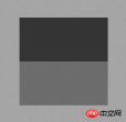
It can be seen that RGBa only adds one parameter to the original RGB. Although this change is small, it provides developers with great convenience.
In addition, in addition to the background attribute, RGBa can also be used in the color and border attributes (note: the border attribute using RGBa will have slightly different effects in Firefox than in other browsers).
2. Browser support and progressive enhancement
Although RGBa has received good support in mainstream modern browsers, Webkit’s support for RGBa is the earliest, and Chrome at least RGBa has been supported since version 0.415. Chrome can be said to be very powerful in this regard. In addition, Gecko and Presto kernels have gradually implemented support for RGBa. IE browser has only supported RGBa since IE9. More specific browser support is as follows:
Chrome 0.4.154.33, Firefox 3.0, Safari 3.2.1, Opera 10.10, IE9
For more detailed browser support, please refer here.
For browsers that do not support RGBa, you can use the progressive enhancement solution. Kayo recommends a solution that specifies a reserved color. First, developers must be aware that browsers that do not support RGBa will treat CSS property values that use RGBa as a syntax error and therefore ignore the CSS property setting. Therefore, developers can first set an attribute that does not use transparency before setting the RGBa color to avoid the situation of no color at all when the browser does not support RGBa. The following is an expanded explanation of the above example:
#example1 {background: rgb(52, 52, 52); background: rgba(52, 52, 52, .5); }
does not support RGBa The browser will ignore the second background attribute setting and set the background color of the element according to the first attribute value. Although the effect between browsers cannot be the same, it has achieved a similar effect and reflects a good Progressive enhancement solution.
Of course, for IE, you can use filters to achieve the same effect as in browsers that support RGBa. For example: for the above example, you can write the code as follows
<style type="text/css">
#example-a {background: rgba(52, 52, 52, .5); }
</style>
<!--[if IE]>
<style type="text/css">
#example-a {
background: transparent;
filter: progid:DXImageTransform.Microsoft.gradient(startColorstr='#34343432', endColorstr='#34343432');
zoom: 1;
}
</style>
<![endif]-->It should be noted here that the filter uses the same color and transparency as in the above example, but uses hexadecimal representation.
IE will ignore the RGBa color setting and set the color according to the filter filter, which has the same effect as RGBa.
3. Does not affect child elements
As mentioned at the beginning of the article, the advantage of RGBa over opacity is that it will not affect its child elements, that is, it can be set separately for elements Sets transparency, but child elements are not affected by this setting. Let's give a specific example below, using RGBa and opacity as elements to set transparency to illustrate the difference between the two.
Full code:
<!DOCTYPE HTML>
<html lang="zh-CN">
<head>
    <meta charset="UTF-8">
    <title>RGBa 与 opacity 效果的区别</title>
    <style type="text/css">
        body {padding-top: 200px; background: url(bg.png); }
        #example, #example-a {width: 200px; height: 100px; margin: 0 auto; }
        #example {background: rgb(52, 52, 52); opacity: 0.5; }
        #example-a {margin-top: 20px; background: rgba(52, 52, 52, .5); }
        .inside {display: block; width: 50px; height: 50px; margin-left: 10px; background: rgb(100, 140, 180); }
    </style>
</head>
<body>
    <p id="example">
        <span class="inside"></span>
    </p>
    <p id="example-a">
        <span class="inside"></span>
    </p>
</body>
</html>
具体效果
可以看出,opacity 会使其中的子元素 span 同时变为半透明的效果,而 RGBa 则只改变被设置的元素的透明度,而在大多数情况下,开发者只需要设置当前元素的透明度(如遮罩,半透明背景等),因此使用 RGBa 会更加的灵活。
另外,在 IE9 中,直接使用 RGBa 颜色与使用 opacity 设置透明的效果会有差异(读者可以在 IE9 下浏览 Demo 查看具体的效果),开发者需要注意这一点差异。
以上就是本文的全部内容,希望对大家的学习有所帮助,更多相关内容请关注PHP中文网!
相关推荐:
The above is the detailed content of How to use RGBa to adjust transparency in CSS3. For more information, please follow other related articles on the PHP Chinese website!

 The Lost CSS Tricks of Cohost.orgApr 25, 2025 am 09:51 AM
In this post, Blackle Mori shows you a few of the hacks found while trying to push the limits of Cohost’s HTML support. Use these if you dare, lest you too get labelled a CSS criminal.
 Next Level CSS Styling for CursorsApr 23, 2025 am 11:04 AM
Custom cursors with CSS are great, but we can take things to the next level with JavaScript. Using JavaScript, we can transition between cursor states, place dynamic text within the cursor, apply complex animations, and apply filters.
 Worlds Collide: Keyframe Collision Detection Using Style QueriesApr 23, 2025 am 10:42 AM
Interactive CSS animations with elements ricocheting off each other seem more plausible in 2025. While it’s unnecessary to implement Pong in CSS, the increasing flexibility and power of CSS reinforce Lee's suspicion that one day it will be a
 Using CSS backdrop-filter for UI EffectsApr 23, 2025 am 10:20 AM
Tips and tricks on utilizing the CSS backdrop-filter property to style user interfaces. You’ll learn how to layer backdrop filters among multiple elements, and integrate them with other CSS graphical effects to create elaborate designs.
 SMIL on?Apr 23, 2025 am 09:57 AM
Well, it turns out that SVG's built-in animation features were never deprecated as planned. Sure, CSS and JavaScript are more than capable of carrying the load, but it's good to know that SMIL is not dead in the water as previously
 'Pretty' is in the eye of the beholderApr 23, 2025 am 09:40 AM
Yay, let's jump for text-wrap: pretty landing in Safari Technology Preview! But beware that it's different from how it works in Chromium browsers.
 CSS-Tricks Chronicles XLIIIApr 23, 2025 am 09:35 AM
This CSS-Tricks update highlights significant progress in the Almanac, recent podcast appearances, a new CSS counters guide, and the addition of several new authors contributing valuable content.
 Tailwind's @apply Feature is Better Than it SoundsApr 23, 2025 am 09:23 AM
Most of the time, people showcase Tailwind's @apply feature with one of Tailwind's single-property utilities (which changes a single CSS declaration). When showcased this way, @apply doesn't sound promising at all. So obvio


Hot AI Tools

Undresser.AI Undress
AI-powered app for creating realistic nude photos

AI Clothes Remover
Online AI tool for removing clothes from photos.

Undress AI Tool
Undress images for free

Clothoff.io
AI clothes remover

Video Face Swap
Swap faces in any video effortlessly with our completely free AI face swap tool!

Hot Article
Hot Tools

EditPlus Chinese cracked version
Small size, syntax highlighting, does not support code prompt function

MantisBT
Mantis is an easy-to-deploy web-based defect tracking tool designed to aid in product defect tracking. It requires PHP, MySQL and a web server. Check out our demo and hosting services.

SAP NetWeaver Server Adapter for Eclipse
Integrate Eclipse with SAP NetWeaver application server.

mPDF
mPDF is a PHP library that can generate PDF files from UTF-8 encoded HTML. The original author, Ian Back, wrote mPDF to output PDF files "on the fly" from his website and handle different languages. It is slower than original scripts like HTML2FPDF and produces larger files when using Unicode fonts, but supports CSS styles etc. and has a lot of enhancements. Supports almost all languages, including RTL (Arabic and Hebrew) and CJK (Chinese, Japanese and Korean). Supports nested block-level elements (such as P, DIV),

MinGW - Minimalist GNU for Windows
This project is in the process of being migrated to osdn.net/projects/mingw, you can continue to follow us there. MinGW: A native Windows port of the GNU Compiler Collection (GCC), freely distributable import libraries and header files for building native Windows applications; includes extensions to the MSVC runtime to support C99 functionality. All MinGW software can run on 64-bit Windows platforms.

