
Home >Web Front-end >CSS Tutorial >Analysis on absolute positioning (absolute) and floating positioning (float)
Analysis on absolute positioning (absolute) and floating positioning (float)

- 不言Original
- 2018-06-22 14:21:452235browse
This article mainly introduces the analysis of absolute positioning (absolute) and floating positioning (float). It has a certain reference value. Now I share it with you. Friends in need can refer to it
Absolute positioning Or floating can be used to achieve column effects. The two can be used independently or combined together to complement each other.
In CSS, there are two ways to implement column layout. The first method is to use absolute positioning (absolute positioning) among the four CSS positioning options (absolute, static, relative and fixed), which can remove an element in the document from its original position and reposition it. Anywhere you want. The second is to use the float concept in CSS.
Absolute positioning or floating can be used to achieve column effects. The two can be used independently or combined together to complement each other.
1. Absolute positioning
The advantage of absolute positioning is that we can precisely control the position of any element - there is no guesswork or luck involved. Because an absolutely positioned element is completely removed from the regular document flow without leaving a trace, it has no impact on other elements.
So let us try to use absolute positioning to achieve the following layout.
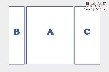
This is a three-column layout and is centered. Among them, column A is the main content column, and columns B and C are side columns. First of all, we cannot directly use absolute positioning to position the three columns A, B, and C to the center position, because the resolution of each person's monitor is different. The centering effect of positioning on a monitor with a resolution of 1024X768 will not work at other resolutions. The effect seen on a high-speed monitor will definitely not be centered. So, how to solve this problem?
Fortunately, there is an extremely useful feature in the absolute positioning model, that is: if a certain The container of an absolutely positioned element has also been positioned, then the top and left values specified by the element will not be calculated based on the root element html of the document (that is, the upper left corner of the browser window), but will be based on the upper left corner of its container. Calculate this offset. In other words, that is: the positioned container will act as the starting point for absolute positioning of all elements in it.
So, using this feature, we add a container D outside columns A, B, and C, as shown below:
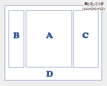
Then, we let Container D is centered and an attribute is added to it: position:relative. In this way, using absolute positioning to position the top and left values of A, B, and C, the positions of A, B, and C will be based on the upper left corner of container D. The position is calculated, so that we can achieve the effect of centering the three columns we expect.
However, our commonly used layout is not that simple. In addition to three columns, we also need a header and a footer, as shown below:
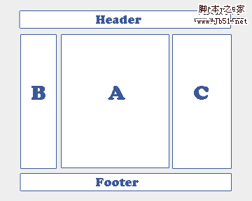
At this time, using absolute positioning layout will not work, because the absolutely positioned elements will be completely removed from the document flow. At this time, the footer will be next to the header and displayed below the header.
If we must use absolute positioning, we must know the height of each of the three columns in advance, and then position the footer based on the highest column. If the length of the text in any column cannot be determined, in addition to using JavaScript, we can only give up the idea of absolute positioning and instead invest in the embrace of floating layout.
2. Float
The original intention of floating is to float the picture inserted into the article to the left or right, so that the text under the picture automatically wraps around it, so that the left side of the picture Or there won't be a large blank space on the right side.
Although the syntax of floating is simple, it is not so easy to master. Let us give an example of how to use floating to layout. Similarly, we are going to implement a three-column layout with a footer. As shown below:
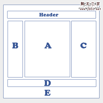
How to use floating to achieve such an effect? In fact, it is very simple:
1. Set the width of E and center E
2. Set the width of A, B, and C, and float A, B, and C to the left respectively.
3. Set the clear attribute to the footer
It should be noted that floating layout still follows the regular document flow, so compared with absolute positioning, the position of the element declaration in the HTML source file is particularly important during floating positioning. Of course, the simplest way to solve this problem is to exchange the declaration order of the left column and the right column in the source file. There are also ways to achieve the same layout without exchanging the order of the columns. However, this requires the use of a comparison Obscure way to use negative margin values. Under normal circumstances, people will most likely choose to swap the order of declarations in the left and middle columns of the source file.
The above is the entire content of this article. I hope it will be helpful to everyone's study. For more related content, please pay attention to the PHP Chinese website!
Related recommendations:
About css adaptive method to achieve fixed width on the right and width on the left
About HTML Analysis of the rel attribute in
#
The above is the detailed content of Analysis on absolute positioning (absolute) and floating positioning (float). For more information, please follow other related articles on the PHP Chinese website!