

This time I will bring you a detailed explanation of the Float attribute in CSS. What are the precautions for using the Float attribute in CSS? . Here is a practical case, let's take a look.
1. Characteristics of Float
1. Apply text around images
2. Create a block-level box
3. Multiple columnsFloating layout
4. The width and height of floating elements are adaptive, but their values can be set.
2. Core solved problems
Text surrounds the image: img tagPlace multiple text labels in one In the container, if the img is floated, the text label will surround the image.
<img  src="/static/imghwm/default1.png" data-src="../img/a.jpg" class="lazy" alt="Detailed explanation of Float attribute in CSS" >
        <p>001文件内容文件内容文内容文件内容<br>
        文件内容文件内容文件内容文件内容文件内内容文件内容<br>
        文件内容文件内容文件内容文件内容文件内容<br>
        文件内容文件内容文件内容文件内容文内容文件内容文件内容<br>
        </p><p>p标签文件内容文件内容文件内容文件内容文件内容文容文件内容文件内容文件内容</p>
        <p>p标签文件内容文件内容文件内容文件内容文件内容文件内容</p>
        文件内容文件内容文件内容文件件内容文件内容文件内容<br>
        文件内容文件内容文件内容文件内容文件内容文件内容文件内容文件内容<br>
        文件内容文件内容文件内容文件内容文件内容文件内内容文件内容<br>
        文件内容文件内容文件内容文件容文件内容文件内容<br>
        文件内容文件内容文件内容文件容文件内容文件内容<br>

2.1 This is a problem
The floating element is adjacent to the normal element, and there is no gap between the floating element and the normal element Clear float. At this time, the normal element will be covered by the floating element, but the contained content will be displayed around the floating element.
<p>001</p>
<p></p><p>002</p>
001 floats, 002 does not float, but the 002 element itself is covered by 001, but the content is displayed around 001.

3. Non-core and main application areas
Column layout: let the blocks be horizontal first Arrange, and then start a new line with the excess part.
Main features
1. Parent height collapse (this is also a serious problem)
.wrap{
           background:red;
           padding:10px;
           width:auto;
        }
        .left{
            background:gray;
            width:200px;
            height:100px;
            float:left;
        }
        .right{
            background:yellow;
            width:100px;
            height:100px;
            float:left;
        }
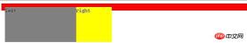
<p>
        </p><p>left</p>
        <p>right</p>
2. Width and height changes into an adaptive sub-element, but the width and height settings are valid
.wrap{
           background:red;
           padding:10px;
           float:left;
        }
        .left{
            width:100px;
            background:gray;
        }
        .right:{
            width:200px;
            background:yellow;
        }
<p>
        </p><p>left</p>
        <p>right</p>

2. Solve the problem of height collapse
First we You need to understand the two basic concepts of BFC and IFC, because they are closely related to browser rendering.
1.BFC (block-level formatting context)
It is an independently rendered area, stipulating how to lay out the interior of the area, and has nothing to do with the outside. The main rules are as follows:
1.1 The internal boxes will be placed vertically, one after another
1.2 The vertical distance of the Box is determined by margin, and the margins of two adjacent boxes belonging to the same BFC will overlap
1.3 The BFC area will not overlap with float
.head{
            background:pink;
            margin: 20px 0px;
            height:100px;
        }
        .wrap{
           background:red;
           padding:10px;
           margin:20px 0px;
           overflow:hidden;
        }
        .left{
            width:100px;
            background:gray;
            margin:10px 0px;
        }
        .right:{
            width:200px;
            background:yellow;
            margin:20px 0px;
        }
head
    <p>
        </p><p>left</p>
        <p>right</p>

There are 20px margins between the two boxes of .head and .wrap, but they overlap. ;
Between .head and .left, .head has a 20px margin and .left has a 10px margin. There is no overlap because .wrap creates a BFC (overflow:hidden) .
1.4 The left margin of each box is in contact with the left side of the containing border box (the same is true for the right side), and the same is true for floats
2. IFC (row-level formatting context)
Boxes are placed horizontally one after the other starting from the top of the containing block. The space occupied by the horizontal margins, borders, and padding are all put together (display is inline, inline-block; elements with inline characteristics have the following characteristics). The rules are as follows:
2.1 The width and height cannot be specified
2.2 Margin, Padding, and border are invalid in the vertical direction
2.3 The left side of the line box is close to the left side of the containing block, and the line The right side of a box is flush with the right side of its containing box, and a float can be inserted between the edge of the containing block and the line box.
2.4 The height of the inline box is determined by line-height.
For examples in this section, please refer to the inline element in the display chapter.
3. Solution
主要根据BFC的原理实现,因为BFC的渲染的是整块区域,也就会计算出宽、高。这也是传说中的清除浮动的方案
3.1 父容器创建BFC方法
3.1.1 创建BFC的方法
a) Float除了none以外的取值;
b) Overflow除了visible以外的值;
c) Display值为table-cell、table-caption、inline-block、flex、inline-flex等
d) Position值为absloute、fixed
e) Fieldset元素
3.1.2 清除浮动
a) Float、overflow、display三种方式都可以清除浮动,但position、fieldset虽然创建了bfc但不可以清除浮动(也就是不能解决高度塌陷的问题)。主要原因为:position、fieldset都需要子元素来撑开父容器的高度,但子元素浮动后又不存在高度,所以失效。
b) Float、overflow、display示例代码:
.wrap{
            background: gray;
            padding: 10px;
            overflow: auto;
        }
        .left, .right{
            background: red;
            float: left;
            width: 200px;
            height: 100px;
        }
        .right{
            background: yellow;
        }
        .footer{
            background: pink;
        }
<p> </p><p>left</p> <p>right</p>footer

3.1.3 最后一个子元素clear:both
利用clear:both触发父容器重新计算高度的原理实现,示例代码如下:
.wrap{
            background: gray;
            padding: 10px;
        }
        .left, .right{
            background: red;
            float: left;
            width: 200px;
            height: 100px;
        }
        .right{
            background: yellow;
        }
        .footer{
            background: pink;
        }
        .clear{
            clear: both;
            zoom: 1;
        }
<p> </p><p>left</p> <p>right</p>footer
3.1.4 After添加最后一个子元素
利用css的:after伪元素实现,动态插入元素并清除浮动:
.wrap{
            background: gray;
            padding: 10px;
        }
        .wrap:after{
            content: '';
            display: block;
            overflow: hidden;
            clear: both;
        }
        .left, .right{
            background: red;
            float: left;
            width: 200px;
            height: 100px;
        }
        .right{
            background: yellow;
        }
        .footer{
            background: pink;
        }
<p>
        </p><p>left</p>
        <p>right</p>

<p>footer</p>
4. 总结
1. 利用bfc方式清除浮动,简单、浏览器支持良好,但在IE6-版本支持存在问题。但是存在以下局限性,要适环境而用:
a) Overflow方式:滚动条会被隐藏,如果子内容超高则存在显示不全的问题;
b) Float方式:让父容器浮动,那么就存在对父容器同辈元素的影响;
c) Dipslay方式:让父容器变为table或者flex等,都存在不明确的影响,大家都不推荐使用。
2. 最佳解决方案:利用:after添加一个伪元素并给予clear:both和zoom:1来实现清除浮动,兼容性好,对环境影响最小。
相信看了本文案例你已经掌握了方法,更多精彩请关注php中文网其它相关文章!
推荐阅读:
The above is the detailed content of Detailed explanation of Float attribute in CSS. For more information, please follow other related articles on the PHP Chinese website!

 Anchor Positioning Just Don't Care About Source OrderApr 29, 2025 am 09:37 AM
The fact that anchor positioning eschews HTML source order is so CSS-y because it's another separation of concerns between content and presentation.
 What does margin: 40px 100px 120px 80px signify?Apr 28, 2025 pm 05:31 PM
Article discusses CSS margin property, specifically "margin: 40px 100px 120px 80px", its application, and effects on webpage layout.
 What are the different CSS border properties?Apr 28, 2025 pm 05:30 PM
The article discusses CSS border properties, focusing on customization, best practices, and responsiveness. Main argument: border-radius is most effective for responsive designs.
 What are CSS backgrounds, list the properties?Apr 28, 2025 pm 05:29 PM
The article discusses CSS background properties, their uses in enhancing website design, and common mistakes to avoid. Key focus is on responsive design using background-size.
 What are CSS HSL Colors?Apr 28, 2025 pm 05:28 PM
Article discusses CSS HSL colors, their use in web design, and advantages over RGB. Main focus is on enhancing design and accessibility through intuitive color manipulation.
 How can we add comments in CSS?Apr 28, 2025 pm 05:27 PM
The article discusses the use of comments in CSS, detailing single-line and multi-line comment syntaxes. It argues that comments enhance code readability, maintainability, and collaboration, but may impact website performance if not managed properly.
 What are CSS Selectors?Apr 28, 2025 pm 05:26 PM
The article discusses CSS Selectors, their types, and usage for styling HTML elements. It compares ID and class selectors and addresses performance issues with complex selectors.
 Which type of CSS holds the highest priority?Apr 28, 2025 pm 05:25 PM
The article discusses CSS priority, focusing on inline styles having the highest specificity. It explains specificity levels, overriding methods, and debugging tools for managing CSS conflicts.


Hot AI Tools

Undresser.AI Undress
AI-powered app for creating realistic nude photos

AI Clothes Remover
Online AI tool for removing clothes from photos.

Undress AI Tool
Undress images for free

Clothoff.io
AI clothes remover

Video Face Swap
Swap faces in any video effortlessly with our completely free AI face swap tool!

Hot Article
Hot Tools

MantisBT
Mantis is an easy-to-deploy web-based defect tracking tool designed to aid in product defect tracking. It requires PHP, MySQL and a web server. Check out our demo and hosting services.

MinGW - Minimalist GNU for Windows
This project is in the process of being migrated to osdn.net/projects/mingw, you can continue to follow us there. MinGW: A native Windows port of the GNU Compiler Collection (GCC), freely distributable import libraries and header files for building native Windows applications; includes extensions to the MSVC runtime to support C99 functionality. All MinGW software can run on 64-bit Windows platforms.

SublimeText3 English version
Recommended: Win version, supports code prompts!

PhpStorm Mac version
The latest (2018.2.1) professional PHP integrated development tool

EditPlus Chinese cracked version
Small size, syntax highlighting, does not support code prompt function

