This time I will bring you the 2D conversion module in HTML and CSS. What are the precautions for the 2D conversion module in HTML and CSS. The following is a practical case, let's take a look.
1. 2D conversion module
2D conversion module
/*where deg is the unit, representing how many degrees*/
transform: rotate(45deg);/*
First parameter: Horizontal direction
Second parameter: Vertical direction
*/transform: translate(100px, 0px);/*
First parameter: Horizontal direction
Two parameters: vertical direction
Note:
If the value is 1, it means no change
If the value is greater than 1, it means it needs to be enlarged
If the value is less than 1, it means it needs to be reduced
If the horizontal and vertical scaling are the same, then it can be abbreviated as a parameter
*//*transform: scale(0.5, 0.5);*/transform: scale(1.5);/*
Note:
1. If multiple transformations are required, separate them with spaces.
2. The 2D transformation module will modify the coordinate system of the element, so the translation after rotation is not a horizontal translation.
*/transform: rotate(45deg ) translate(100px, 0px);
2D conversion module

/*
第一个参数:水平方向
第二个参数:垂直方向
注意点
取值有三种形式
具体像素
百分比
特殊关键字
*/
/*transform-origin: 200px 0px;*/
/*transform-origin: 50% 50%;*/
/*transform-origin: 0% 0%;*/
/*transform-origin: center center;*/
transform-origin: left top;

<html lang="en"> <head>
<meta charset="UTF-8">
<title>95-2D转换模块-旋转轴向</title>
<style>
*{ margin: 0; padding: 0; }
ul{ width: 800px; height: 500px; margin: 0 auto; }
ul li{ list-style: none; width: 200px; height: 200px; margin: 0 auto; margin-top: 50px; border: 1px solid #000;
/* 1.什么是透视 近大远小
2.注意点 一定要注意, 透视属性必须添加到需要呈现近大远小效果的元素的父元素上面 */
perspective: 500px; } ul li img{ width: 200px; height: 200px;
/*perspective: 500px;*/
} ul li:nth-child(1){
/*默认情况下所有元素都是围绕Z轴进行旋转*/
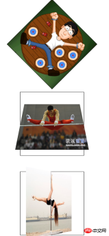
transform: rotateZ(45deg); } ul li:nth-child(2) img{ transform: rotateX(45deg); } ul li:nth-child(3) img{ /* 总结: 想围绕哪个轴旋转, 那么只需要在rotate后面加上哪个轴即可 */ transform: rotateY(45deg); } </style> </head> <body> <ul> <li></li> <li></li> <li></li> </ul> </body> </html>

<html lang="en">
<head>
<meta charset="UTF-8">
<title>96-2D转换模块-练习</title>
<style>
*{ margin: 0; padding: 0; }
p{ width: 310px; height: 438px; border: 1px solid #000;
background-color: skyblue; margin: 100px auto; perspective: 500px; }
p img{ transform-origin: center bottom; transition: transform 1s; }
p:hover img{ transform: rotateX(80deg); }
</style> </head> <body> <p>  </p>
</body>
</html>

<html lang="en">
<head>
<meta charset="UTF-8">
<title>97-2D转换模块-相片墙</title>
<style>
*{ margin: 0; padding: 0; }
ul{ height: 400px; border: 1px solid #000;
background-color: skyblue; margin-top: 100px;
text-align: center; }
ul li{ list-style: none;
width: 150px; height: 200px;
background-color: red; display: inline-block;
//转换成行内块级元素,用于水平排版
margin-top: 100px; transition: all 1s;
position: relative; box-shadow: 0 0 10px; }
ul li:nth-child(1){ transform: rotate(30deg); }
ul li:nth-child(2){ transform: rotate(-40deg); }
ul li:nth-child(3){ transform: rotate(10deg); }
ul li:nth-child(4){ transform: rotate(45deg); }
ul li img{ width: 150px; height: 200px;
border: 5px solid #fff; box-sizing: border-box;
}
ul li:hover{ /*transform: rotate(0deg);*/
/*transform: none;*/ transform: scale(1.5);
//之前的旋转被层叠掉, 只执行放大
z-index: 998;
//显示在最上面
}
</style>
</head>
<body>
<ul>
<li></li>
<li></li>
<li></li>
<li></li>
</ul>
</body>
</html> I believe you have mastered the method after reading the case in this article. For more exciting information, please pay attention to other related articles on the php Chinese website! Recommended reading:
The layout of web pages and clearing floats
The layout of web pages and floating
The above is the detailed content of 2D conversion module in HTML and CSS. For more information, please follow other related articles on the PHP Chinese website!
 The Future of HTML, CSS, and JavaScript: Web Development TrendsApr 19, 2025 am 12:02 AM
The future trends of HTML are semantics and web components, the future trends of CSS are CSS-in-JS and CSSHoudini, and the future trends of JavaScript are WebAssembly and Serverless. 1. HTML semantics improve accessibility and SEO effects, and Web components improve development efficiency, but attention should be paid to browser compatibility. 2. CSS-in-JS enhances style management flexibility but may increase file size. CSSHoudini allows direct operation of CSS rendering. 3.WebAssembly optimizes browser application performance but has a steep learning curve, and Serverless simplifies development but requires optimization of cold start problems.
 HTML: The Structure, CSS: The Style, JavaScript: The BehaviorApr 18, 2025 am 12:09 AM
The roles of HTML, CSS and JavaScript in web development are: 1. HTML defines the web page structure, 2. CSS controls the web page style, and 3. JavaScript adds dynamic behavior. Together, they build the framework, aesthetics and interactivity of modern websites.
 The Future of HTML: Evolution and Trends in Web DesignApr 17, 2025 am 12:12 AM
The future of HTML is full of infinite possibilities. 1) New features and standards will include more semantic tags and the popularity of WebComponents. 2) The web design trend will continue to develop towards responsive and accessible design. 3) Performance optimization will improve the user experience through responsive image loading and lazy loading technologies.
 HTML vs. CSS vs. JavaScript: A Comparative OverviewApr 16, 2025 am 12:04 AM
The roles of HTML, CSS and JavaScript in web development are: HTML is responsible for content structure, CSS is responsible for style, and JavaScript is responsible for dynamic behavior. 1. HTML defines the web page structure and content through tags to ensure semantics. 2. CSS controls the web page style through selectors and attributes to make it beautiful and easy to read. 3. JavaScript controls web page behavior through scripts to achieve dynamic and interactive functions.
 HTML: Is It a Programming Language or Something Else?Apr 15, 2025 am 12:13 AM
HTMLisnotaprogramminglanguage;itisamarkuplanguage.1)HTMLstructuresandformatswebcontentusingtags.2)ItworkswithCSSforstylingandJavaScriptforinteractivity,enhancingwebdevelopment.
 HTML: Building the Structure of Web PagesApr 14, 2025 am 12:14 AM
HTML is the cornerstone of building web page structure. 1. HTML defines the content structure and semantics, and uses, etc. tags. 2. Provide semantic markers, such as, etc., to improve SEO effect. 3. To realize user interaction through tags, pay attention to form verification. 4. Use advanced elements such as, combined with JavaScript to achieve dynamic effects. 5. Common errors include unclosed labels and unquoted attribute values, and verification tools are required. 6. Optimization strategies include reducing HTTP requests, compressing HTML, using semantic tags, etc.
 From Text to Websites: The Power of HTMLApr 13, 2025 am 12:07 AM
HTML is a language used to build web pages, defining web page structure and content through tags and attributes. 1) HTML organizes document structure through tags, such as,. 2) The browser parses HTML to build the DOM and renders the web page. 3) New features of HTML5, such as, enhance multimedia functions. 4) Common errors include unclosed labels and unquoted attribute values. 5) Optimization suggestions include using semantic tags and reducing file size.
 Understanding HTML, CSS, and JavaScript: A Beginner's GuideApr 12, 2025 am 12:02 AM
WebdevelopmentreliesonHTML,CSS,andJavaScript:1)HTMLstructurescontent,2)CSSstylesit,and3)JavaScriptaddsinteractivity,formingthebasisofmodernwebexperiences.


Hot AI Tools

Undresser.AI Undress
AI-powered app for creating realistic nude photos

AI Clothes Remover
Online AI tool for removing clothes from photos.

Undress AI Tool
Undress images for free

Clothoff.io
AI clothes remover

Video Face Swap
Swap faces in any video effortlessly with our completely free AI face swap tool!

Hot Article

Hot Tools

ZendStudio 13.5.1 Mac
Powerful PHP integrated development environment

mPDF
mPDF is a PHP library that can generate PDF files from UTF-8 encoded HTML. The original author, Ian Back, wrote mPDF to output PDF files "on the fly" from his website and handle different languages. It is slower than original scripts like HTML2FPDF and produces larger files when using Unicode fonts, but supports CSS styles etc. and has a lot of enhancements. Supports almost all languages, including RTL (Arabic and Hebrew) and CJK (Chinese, Japanese and Korean). Supports nested block-level elements (such as P, DIV),

Atom editor mac version download
The most popular open source editor

VSCode Windows 64-bit Download
A free and powerful IDE editor launched by Microsoft

Zend Studio 13.0.1
Powerful PHP integrated development environment


