
Home >Web Front-end >CSS Tutorial >CSS code to implement hole punching on the edge of coupons
CSS code to implement hole punching on the edge of coupons

- 小云云Original
- 2018-02-09 10:34:422813browse
This edge punching effect is used in the project. Try this style written in pure CSS. This article mainly shares with you an edge punching effect written in pure CSS. Friends who need it can refer to it. I hope it can help. Everyone.
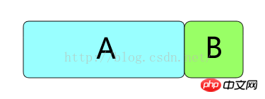
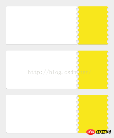
The effect is roughly as shown

Step-by-step implementation ideas:
1, first draw two boxes with rounded corners, A and B (A and B need to add projection effects respectively, which are not done in the picture)
#2. Draw a row of circles on the left and right gaps of B (actually The square uses 50% rounded corners), and the circle fill color is the same as the background color (the background color here is white, so the circle fill is white)
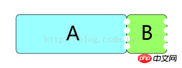
3, give Add inner shadow to the round hole to achieve a real punching effect. The css used here is:
box-shadow:0 1px 1px rgba(0,0,0,0.2) inset;
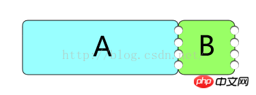
4. At this time, there is a row of round holes on the right side of B. Due to the addition of the inner shadow, it appears that there is more of the right half. Here we need to process the excess part.
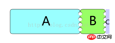
Then use a block with the same color as the background (white here) to block the excess right half. hole (that is, area C. In order to see clearly, a different color is used here. After adjusting it to the same color as the background, it will be the initial rendering)
Note: A The widths of A and B can be adaptive (such as the percentage of the outer layer respectively). Due to the number and position of the holes, the heights of A and B must be hard-coded
Specific The implemented code is as follows:
<!DOCTYPE HTML>
<html>
<head>
<meta http-equiv="Content-Type" content="text/html" charset="utf-8" />
<meta name="viewport" content="initial-scale=1.0, minimum-scale=1.0, maximum-scale=1.0, user-scalable=no" />
<title>Stamp Demo</title>
<style>
html,body,p,p,i,span,ul,li{
    margin:0;
    padding:0;
}
body{
    background-color:#eee;
}
ul{
    list-style:none;
}
.stamp_list{
    margin:20px auto;
    width:90%;
}
.stamp{
    height: 125px;
    margin-bottom: 20px;
    position: relative;
    box-sizing:border-box;
    border-radius:5px;
}
.stamp_inner{
    height: 125px;
    display:inline-block;
    vertical-align:top;
    box-sizing:border-box;
    position:relative;
    border-radius:5px;
    box-shadow:0 1px 1px rgba(0, 0, 0, 0.2);
}
.stamp_left{
    width: 70%;
    background: #ffffff;
}
.stamp_left .box{
    position:absolute;
    right:0;
    bottom:0;
    width:78px;
    height:81px;
}
.stamp_right{
    width:30%;
    background: #F8E71C;
}
.circle_list{
    position:absolute;
    top:5px;
}
.circle_list1{
    left:-5px;
}
.circle_list2{
    right:-5px;
}
.circle_list2:after{
    content: '';
    position: absolute;
    top: 0;
    bottom: 0;
    left: 6px;
    right: -5px;
    z-index: 1;
    background-color: #eee;
}
.circle_list>li{
    background-color:#eee;
    width:10px;
    height:10px;
    border-radius:50%;
    margin-bottom:5px;
    box-shadow:0 1px 1px rgba(0,0,0,0.2) inset;
}
</style>
</head>
<body>
<ul class="stamp_list">
    <li class="stamp">
        <p class="stamp_inner stamp_left">
        </p
        ><p class="stamp_inner stamp_right">
            <span>123</span>
            <ul class="circle_list circle_list1">
                <li></li>
                <li></li>
                <li></li>
                <li></li>
                <li></li>
                <li></li>
                <li></li>
                <li></li>
            </ul>
            <ul class="circle_list circle_list2">
                <li></li>
                <li></li>
                <li></li>
                <li></li>
                <li></li>
                <li></li>
                <li></li>
                <li></li>
            </ul>
        </p>
    </li>
</ul>
</body>
</html>
The real effect of the specific code implementation:
The above is the detailed content of CSS code to implement hole punching on the edge of coupons. For more information, please follow other related articles on the PHP Chinese website!