This article mainly introduces the relevant information on the sticky footer layout that explains the classic CSS layout in detail. The editor thinks it is quite good, so I will share it with you now and give it as a reference. Let’s follow the editor to take a look, I hope it can help everyone.
What is Sticky footer layout?
Our common web page layout methods are generally divided into header (header) part, content (content area) part and footer (footer) part. When there is less content in the header area and content area, the footer area is not arranged along with the content area but is always displayed at the bottom of the screen. When there is a lot of content in the content area, the footer can be displayed at the bottom of the page as the document flows. This is the legendary Sticky footer layout. Isn't it easy to understand? It doesn’t matter if you don’t understand. Let me give you a simple example.
For example
When there is less content, the normal document flow is displayed as follows:

In normal document flow, when there is less content, the footer section is not always fixed at the bottom of the screen. At this time it’s time for the legendary sitcky footer layout to appear.
The sticky footer layout effect is as shown below:

No matter how much content there is in the content area, the footer is always displayed at the bottom of the screen. When the content area exceeds the height of the screen. The footer will always appear at the very bottom of the page. Now that everyone knows the true face of sticky footer, let’s take a look at how it is implemented.
Sticky footer layout implementation
Negative margin layout method
html code:
<p class="detail">
     <p class="wrapper clearfix">
       <p class="title">
        <h1 id="这里是头部">这里是头部</h1>
       </p>
       <p class="main">
        <p>这里是main content区域...</p>
        <p>这里是main content区域...</p>
        <p>这里是main content区域...</p>
        <p>这里是main content区域...</p>
       </p>
     </p>
     <p class="footer">
       <p>© 2017 No rights reserved.</p>
    <p>Made with ♥ by an anonymous pastafarian.</p>
     </p>
  </p>
css code:
p,h1,p{margin:0; padding: 0;}
 .detail{
      position:fixed;
      overflow:auto;
      width:100%;
      height:100%;
    }
 .wrapper{
      min-height:100%;
      width:100%;
    }
 .title h1{
      font-size:40px;
      text-align: center;
    }
 .main{
      margin-top:64px;
      padding-bottom:64px;
    }
 .main p{
      font-size: 25px;
      text-align: center;
    }
 .footer{
      margin:-64px auto 0 auto;
      font-size:32px;
    }
 .footer p{
      text-align: center;
    }
 .clearfix::after {
      display: block;
      content: ".";
      height: 0;
      clear: both;
      visibility: hidden;
    }
Note: The padding-bottom in main and the negative margin value in footer must be consistent.
flex layout method
html code:
<header>
      <h1 id="Site-nbsp-name">Site name</h1>
  </header>
  <p class="main">
      <p>Bacon Ipsum dolor sit amet...</p>
      <p>Bacon Ipsum dolor sit amet...</p>
      <p>Bacon Ipsum dolor sit amet...</p>
      <p>Bacon Ipsum dolor sit amet...</p>
  </p>
  <footer>
      <p>© 2017 No rights reserved.</p>
      <p>Made with ♥ by an anonymous pastafarian.</p>
  </footer>
css code:
body{display: flex; flex-flow: column; min-height: 100vh; overflow:auto;}
    h1{font-size: 60px; text-align: center;}
    p{font-size: 24px; text-align: center;}
   .main{flex:1;}
The flex layout structure is simple and the code is streamlined. Because of the compatibility of flex, you need to pay attention when using this method of layout.
Summary
This concludes our discussion. I hope it will be helpful to my friends. This is also my first time recording a blog. I hope you guys will bear with me and provide guidance if there are some imperfections. The sticky footer layout is also a classic layout in CSS. Beginners should be familiar with this layout. Of course, if you use it a lot, you will naturally learn it.
Related recommendations:
Sticky Footer Detailed explanation of two absolute bottom routine examples
What is the layout of Sticky footer?
CSS Sticky Footer: Perfect CSS absolute bottom_html/css_WEB-ITnose
The above is the detailed content of Detailed explanation of CSS classic layout Sticky footer layout. For more information, please follow other related articles on the PHP Chinese website!
 Replace String Characters in JavaScriptMar 11, 2025 am 12:07 AM
Detailed explanation of JavaScript string replacement method and FAQ This article will explore two ways to replace string characters in JavaScript: internal JavaScript code and internal HTML for web pages. Replace string inside JavaScript code The most direct way is to use the replace() method: str = str.replace("find","replace"); This method replaces only the first match. To replace all matches, use a regular expression and add the global flag g: str = str.replace(/fi
 8 Stunning jQuery Page Layout PluginsMar 06, 2025 am 12:48 AM
Leverage jQuery for Effortless Web Page Layouts: 8 Essential Plugins jQuery simplifies web page layout significantly. This article highlights eight powerful jQuery plugins that streamline the process, particularly useful for manual website creation
 Build Your Own AJAX Web ApplicationsMar 09, 2025 am 12:11 AM
So here you are, ready to learn all about this thing called AJAX. But, what exactly is it? The term AJAX refers to a loose grouping of technologies that are used to create dynamic, interactive web content. The term AJAX, originally coined by Jesse J
 How do I create and publish my own JavaScript libraries?Mar 18, 2025 pm 03:12 PM
Article discusses creating, publishing, and maintaining JavaScript libraries, focusing on planning, development, testing, documentation, and promotion strategies.
 Load Box Content Dynamically using AJAXMar 06, 2025 am 01:07 AM
This tutorial demonstrates creating dynamic page boxes loaded via AJAX, enabling instant refresh without full page reloads. It leverages jQuery and JavaScript. Think of it as a custom Facebook-style content box loader. Key Concepts: AJAX and jQuery
 10 jQuery Fun and Games PluginsMar 08, 2025 am 12:42 AM
10 fun jQuery game plugins to make your website more attractive and enhance user stickiness! While Flash is still the best software for developing casual web games, jQuery can also create surprising effects, and while not comparable to pure action Flash games, in some cases you can also have unexpected fun in your browser. jQuery tic toe game The "Hello world" of game programming now has a jQuery version. Source code jQuery Crazy Word Composition Game This is a fill-in-the-blank game, and it can produce some weird results due to not knowing the context of the word. Source code jQuery mine sweeping game
 How to Write a Cookie-less Session Library for JavaScriptMar 06, 2025 am 01:18 AM
This JavaScript library leverages the window.name property to manage session data without relying on cookies. It offers a robust solution for storing and retrieving session variables across browsers. The library provides three core methods: Session
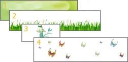
 jQuery Parallax Tutorial - Animated Header BackgroundMar 08, 2025 am 12:39 AM
This tutorial demonstrates how to create a captivating parallax background effect using jQuery. We'll build a header banner with layered images that create a stunning visual depth. The updated plugin works with jQuery 1.6.4 and later. Download the


Hot AI Tools

Undresser.AI Undress
AI-powered app for creating realistic nude photos

AI Clothes Remover
Online AI tool for removing clothes from photos.

Undress AI Tool
Undress images for free

Clothoff.io
AI clothes remover

AI Hentai Generator
Generate AI Hentai for free.

Hot Article

Hot Tools

EditPlus Chinese cracked version
Small size, syntax highlighting, does not support code prompt function

VSCode Windows 64-bit Download
A free and powerful IDE editor launched by Microsoft

ZendStudio 13.5.1 Mac
Powerful PHP integrated development environment

MantisBT
Mantis is an easy-to-deploy web-based defect tracking tool designed to aid in product defect tracking. It requires PHP, MySQL and a web server. Check out our demo and hosting services.

SublimeText3 Chinese version
Chinese version, very easy to use


