
Home >Web Front-end >CSS Tutorial >Summary of shapes about new features of css3
Summary of shapes about new features of css3

- 小云云Original
- 2017-12-22 16:53:491678browse
css3 is an upgraded version of css, which also has many new features. This article mainly introduces the shape summary of the new features of css3. It is of great practical value. Friends who need it can refer to it. I hope it can help everyone.
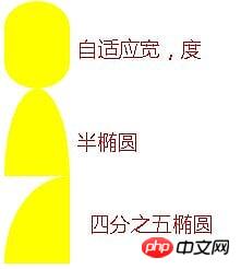
1. Adaptive ellipse
border-radius feature:
The horizontal and vertical radii can be specified separately, and the value It can be a percentage, just use / (slash) to separate the two values (adaptive width ellipse can be implemented).
You can also separately specify four horizontal and vertical radii with different angles (semi-ellipse can be realized)
Quarter ellipse, mainly Is to adjust the horizontal and vertical radius
Sample code:
.wrap{
            border-radius: 50% / 30%;
            width: 60px;
            height: 80px;
            background: yellow;
        }
        .wrap02{
            width: 60px;
            height: 80px;
            background: yellow;
            border-radius: 50% / 100% 100% 0 0;
        }
        .wrap03{
            width: 60px;
            height: 80px;
            background: yellow;
            border-radius: 100% 0 0 0;
        }
2. The flat quadrilateral
needs to be applied to the skewX of transform for distortion
The main solution is to make the container become a flat quadrilateral, and the internal text and elements and display
nested elements vertically, and the internal elements can be reversely twisted using skew. Nested inner elements must be block because transform cannot be applied to inline elements.
Use pseudo-elements to distort (:before)
##
.wrap{
            width: 80px;
            height: 40px;
            transform: skewX(-45deg);
            background: yellow;
        }
        .wrap>p{
            transform: skewX(45deg);
        }
        .btn{
            position: relative;
            padding: 10px;
        }
        .btn:before{
            content: '';
            position: absolute;
            top: 0px;
            left: 0px;
            right: 0px;
            bottom: 0px;
            z-index: -1;
            background: #85a;
            transform: skewX(-45deg);
        }

3. Diamond
- Apply the nesting of elements, and the outer and inner elements rotate with each other to achieve an octagonal shape;
- Design the max-width width of the internal element to be 100%, so that the entire image can only fill the entire outer p;
- scale attribute Controls the magnification of its image. By default, the center point is the origin of magnification (the Pythagorean theorem will be used, do not specify additional transform-origin).
.wrap{
            width: 200px;
            transform: rotate(-45deg);
            overflow: hidden;
        }
        .wrap > img{
            transform: rotate(45deg) scale(1.42);
            max-width: 100%;
        }

4. Corner cutting effect
- Using linear-gradient, you can set the angle, multi-value and gradient transparency to achieve this.
- You also need to pay attention to the settings of the background-size and background-repeat attributes to prevent the effect from overlapping the background and causing the effect to not take effect
.wrap{
            width: 200px;
            height: 100px;
            background: #58a;
            background: linear-gradient(-135deg, transparent 15px, #58a 0px) top right,
            linear-gradient(135deg,transparent 15px, #655 0px) top left,
            linear-gradient(-45deg, transparent 15px, #58a 0px) bottom right,
            linear-gradient(45deg, transparent 15px, #655 0px) bottom left;
            background-size: 50% 50%;
            background-repeat: no-repeat;
        }

- You can use border-image to achieve corner cutting and set the value of border-image-slice (picture border offset inward);
- border-image uses svg to make pictures
- border sets the width + transparency, plus the border-image-slice is offset inward to create The border has a corner cutter;
- background-clip: It must be set to padding-box, otherwise the background will extend to the border.
.wrapSvg{
border:15px solid transparent;
border-image: 1 url('data:image/svg+xml, <svg xmlns="http://www.w3.org/2000/svg" width="3" height="3" fill="%2358a"><polygon points="0,1 1,0 2,0 3,1 3,2 2,3 1,3 0,2"/></svg>');
margin-top: 50px;
width: 200px;
height: 100px;
background: #58a;
background-clip: padding-box;
}Other solutions
- Leverage clip-path attribute, but not fully supported
- css4 will directly give the corner-path attribute to support corner cutting
Understand the basic principles of transform
 a and d represent scaling and cannot be 0; c and b control tilt; e and f control displacement
- translate(displacement): matrix(1,0,0,1,x,y)
- scale(scale): matrix(x,0,0,y,0 ,0);
- skew (skew): matrix(1,tany,tanx,1,0,0), since the input is deg (angle), the angle needs to be converted to Radian value
- rotate (rotation): matrix(cosN,sinN,-sinN,cosN,0,0), angle converted to radians
- The application of the above values is related to the value of transform-origin, which is the origin of rotation of the positioning element, which can be top, bottom, center, etc. Three coordinate systems of x, y, and z can be specified
perpective :Perspective, it cannot be negative, 0 or percentage, it can only be a numerical value;
- represents the distance from the observer to the observed object
- The farther the perspective distance is from the object, the smaller the object will appear
- Perspective can only be set on the parent or ancestor of the deformed element, because the browser will generate deformations for its children. The perspective effect
- #does not have the skew attribute in 3D transformation.
 ##6. Simple pie chart
Animated pie chart, the effect is as follows:
The implementation steps are as follows:
画出一个yellowgreen的圆,并利用linear-gradient设置background-image的值,实现两种颜色各显示一半的功能:
然后加入一个伪元素,继承父级(真实元素)的背景色,然后用rotate旋转即可
要利用margin-left让其靠左
利用transform-origin设置其旋转定位点
动画展示代码如下:
@keyframes spin{
            to{ transform: rotate(.5turn); }
        }
        @keyframes bg{
            50%{ background-color: #655; }
        }
        .wrap{
            width: 100px; height: 100px;
            border-radius: 50%;
            background: yellowgreen;
            background-image: linear-gradient(to right, transparent 50%, #655 0);
        }
        .wrap::before{
            content: '';
            display: block;
            margin-left: 50%;
            background-color: inherit;
            height: 100%;
            border-radius: 0 100% 100% 0 / 50%;
            transform-origin: left;
            animation:spin 3s linear infinite,
                bg 6s step-end infinite;
        }
相关推荐:
The above is the detailed content of Summary of shapes about new features of css3. For more information, please follow other related articles on the PHP Chinese website!