Home >Web Front-end >CSS Tutorial >How to achieve frosted glass background effect with CSS3
How to achieve frosted glass background effect with CSS3
- 小云云Original
- 2017-12-22 17:03:505327browse
This article mainly introduces in detail how to create a frosted glass background effect in CSS3. It is a very interesting technique in CSS3. I hope it can help everyone.
Introduction
I saw this effect in the book CSS Secrets, and it feels very good;
The implementation principle is also quite simple;
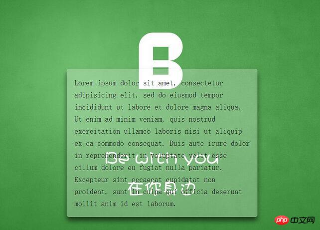
Renderings and implementation
Renderings

Code implementation
<!DOCTYPE html> <html lang="en"> <head> <meta charset="UTF-8"> <title>Document</title> <style> /** * 设置背景图全屏覆盖及固定 * 设置内部元素偏移 */ body { /*此处背景图自行替换*/ background: url(demo.jpg) no-repeat center center fixed; background-size: cover; min-height: 100vh; box-sizing: border-box; margin: 0; padding-top: calc(50vh - 6em); font: 150%/1.6 Baskerville, Palatino, serif; } /** * 整体居中功能; * 背景透明虚化 * 溢出隐藏 * 边缘圆角化 * 文字增加淡阴影 */ .description{ position: relative; margin: 0 auto; padding: 1em; max-width: 23em; background: hsla(0,0%,100%,.25) border-box; overflow: hidden; border-radius: .3em; box-shadow: 0 0 0 1px hsla(0,0%,100%,.3) inset, 0 .5em 1em rgba(0, 0, 0, 0.6); text-shadow: 0 1px 1px hsla(0,0%,100%,.3); } /*使用滤镜模糊边缘*/ .description::before{ content: ''; position: absolute; top: 0; rightright: 0; bottombottom: 0; left: 0; margin: -30px; z-index: -1; -webkit-filter: blur(20px); filter: blur(20px); } </style> </head> <body> <p class="description"> Lorem ipsum dolor sit amet, consectetur adipisicing elit, sed do eiusmod tempor incididunt ut labore et dolore magna aliqua. Ut enim ad minim veniam, quis nostrud exercitation ullamco laboris nisi ut aliquip ex ea commodo consequat. Duis aute irure dolor in reprehenderit in voluptate velit esse cillum dolore eu fugiat nulla pariatur. Excepteur sint occaecat cupidatat non proident, sunt in culpa qui officia deserunt mollit anim id est laborum. </p> </body> </html>
Summary
This implementation mode is written with performance and maintenance considerations in mind
- For example, using em, you can easily zoom in and out of the overall size
- hsla is used here, this is This is my first time using this color value; I only adjusted this in PS before. It is a very good color mode. It is similar to RGBA, but HSLA is more in line with the viewing of human eyes;
- I also learned a new way of abbreviating backgrounds
/*分开写*/
background-color:#ff0;
background-image:url(background.gif);
background-repeat:no-repeat;
background-attachment:fixed;
background-position:0 0;
background-size:cover;
/*简写*/
background: #ff0 url(background.gif) no-repeat / fixed cover;
/*设置background-size必须用单斜杠隔开*/
Related recommendations:
Play with js settings to randomly switch background images
Using H5 and CSS3 to create a full-screen background rotation tutorial
How to set the background layer transparency in css
The above is the detailed content of How to achieve frosted glass background effect with CSS3. For more information, please follow other related articles on the PHP Chinese website!

