
Home >Web Front-end >CSS Tutorial >In-depth understanding of the usage of CSS line-height and vertical-align
In-depth understanding of the usage of CSS line-height and vertical-align

- 小云云Original
- 2017-12-22 15:54:324127browse
line-height and vertical-align are both simple CSS properties, so much so that most people think they know how they work. But in fact, these two properties are very complicated, and may be regarded as the two most difficult properties in CSS, because these two properties are closely related to a little-known feature in CSS: inline formatting context (IFC), which this article will focus on. I would like to share with you the usage of line-height and vertical-align in CSS, I hope it can help you.
For example, the value of line-height can be a length (length) or a number, and its default value is normal. So, what is normal? We often understand normal as 1, or 1.2, and even the CSS specification document does not mention this issue. We know that when the value of line-height is a number, it represents a multiple of font-size, but the problem is that the height of the text corresponding to font-size:100px is different in different fonts! So will line-height change as the text size changes? Does normal really mean 1 or 1.2? How is vertical-align affected by line-height?
Let’s take a deeper look at a not-so-simple CSS mechanism.
font-size
The following is a simple HTML code. A p tag contains 3 span tags. Each span has a font-family:
<p>
    <span class="a">Ba</span>
    <span class="b">Ba</span>
    <span class="c">Ba</span>
</p>
 p  { font-size: 100px }
.a { font-family: Helvetica }
.b { font-family: Gruppo    }
.c { font-family: Catamaran }
(Translator's Note: These fonts may not be available on your computer)
If the font-size is the same but the font-family is different, the height of the span element obtained is also different: 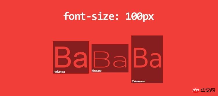
Why can’t font-size: 100px get elements of the same height? I measured the height of each span: Helvetica 115px, Gruppo 97px, Catamaran 164px. 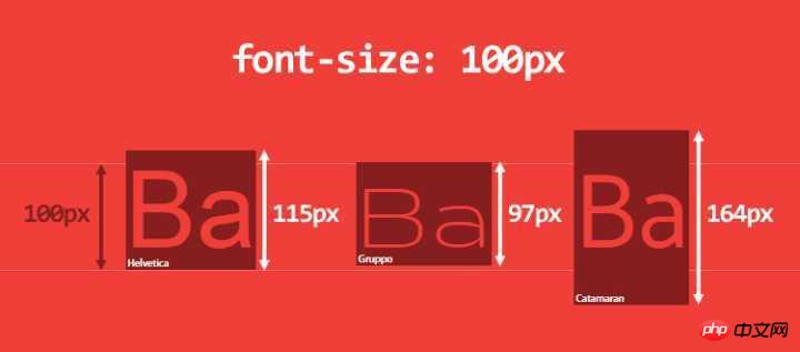
It seems strange at first, but if you think about it carefully, it makes sense. The reason lies in the font itself, which is how fonts work:
A font defines an em-square, which is the metal container used to hold characters. This em-square is usually set to have width and height of 1000 relative units, but it can also be 1024 or 2048 relative units.
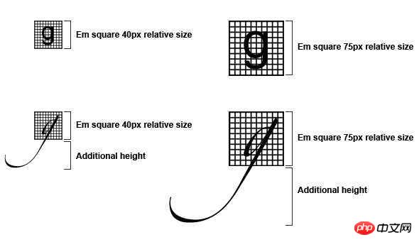
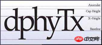
Font measurements are set based on this relative unit, including ascender, descender, capital height, x-height, etc. Note that the values here are allowed to bleed outside relative to em-square (Translator's Note: It can probably be understood as beyond em-square)
In the browser, the 1000 relative units above will scale according to the font-size you need.
We put the Catamaran font into FontForge and analyze its font metrics:
- ##em-square is 1000
- The ascender is 1100 and the descender is 540. Through testing, it was found that the browser on macOS uses the HHead Ascent and HHead Descent values, and the browser on Windows uses Win Ascent and Win Descent (and the values are different on the two platforms). We also see that the Capital Height is 680 and the X height is 485.

This calculated height determines the content-area of the HTML element , I will talk about content-area later. You can think of content-area as the area where background works.
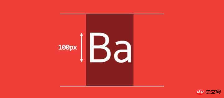
We can also see that the height of uppercase letters is 68px and the height (x-height) of lowercase letters is 49px. So 1ex = 49px, 1em = 100px, not 164px. (Great, em is based on font-size, not based on calculated height)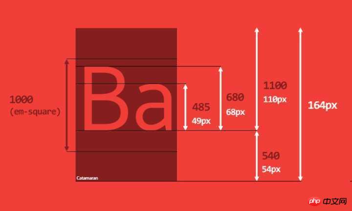
The height of a line-box is calculated from the heights of all its child elements. The browser will calculate the height of each child element in this line, and then calculate the height of the line-box (specifically, the height from the highest point to the lowest point of the child element), so by default, a line-box is always Has enough height to accommodate its child elements.
每个 HTML 元素实际上都是由多个 line-box 的容器,如果你知道每个 line-box 的高度,那么你就知道了整个元素的高度。
如果我们修改一下最初的 HTML 代码:
<p>
    Good design will be better.
    <span class="a">Ba</span>
    <span class="b">Ba</span>
    <span class="c">Ba</span>
    We get to make a consequence.
</p>
那么就会得到 3 个 line-box(宽度固定):
第一行和最后一行各有一个匿名内联元素(文本内容)
中间一行包含两个匿名内联元素和三个 span
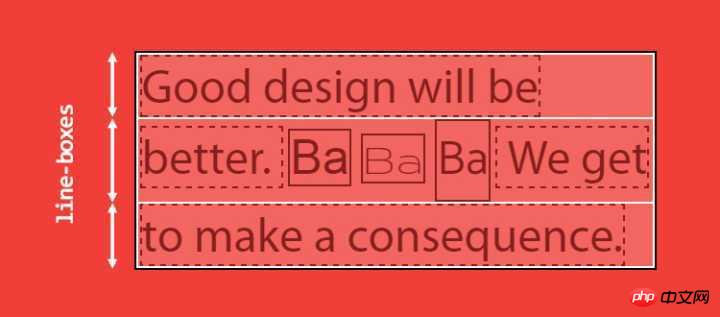
我们清楚地看到第二个 line-box比其他两个要高一些。因为第二行里面的子元素因为有一个用到了 Catamaran 字体的 span。
line-box 的难点在于我们看不见它,而且不能用 CSS 控制它。即使我们用 ::first-line 给第一行加上背景色,我们也看不出第一个 line-box 的高度。
line-height
目前我已经提到了两个概念:content-area 和 line-box。如果你仔细看了,会发现我说 line-box 的高度是根据子元素的高度计算出来的,而不是子元素的 content-area 的高度。这个区别大了。
接下来说句听起来很奇怪的话:一个内联元素有两个高度:content-area 高度和 virtual-area (实际区域?)高度(virtual-area 是我自己发明的单词,它表示对人类有效的高度,你在其他地方是看不到这个单词的)。
content-area 的高度是由字体度量定义的(见上文)
vitual-area 的高度就是 line-height,这个高度用于计算 line-box 的高度
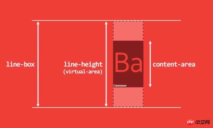
这么一来,这就打破了一个长久的谣言:line-height 表示两个 baseline 之间的距离。在 CSS 里,不是这样的。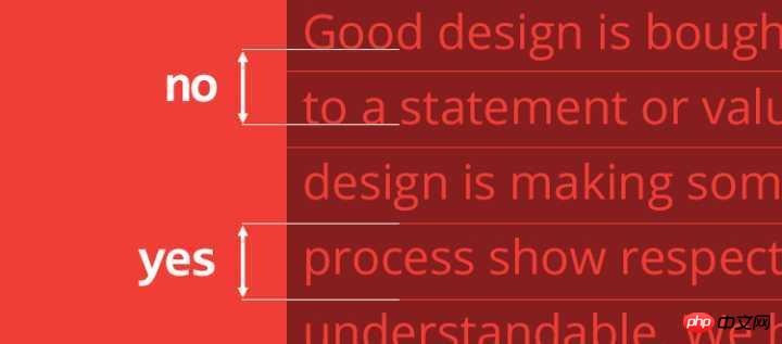
virtual-area 和 content-area 高度的差异叫做 leading。leading 的一半会被加到 content-area 顶部,另一半会被加到底部。因此 content-area 总是处于 virtual-area 的中间。
计算出来的 line-height(也就是 virtual-area 的高度)可以等于、大于或小于 content-area。如果 virtual-area 小于 content-area,那么 leading 就是负的,因此 line-box 看起来就比内容还矮了。
还有一些其他种类的内联元素:
可替换的内联元素,如 img / input / svg 等
inline-block 元素,以及所有 display 值以 inline- 开头的元素,如 inline-table / inline-flex
处于某种特殊格式化上下文的内联元素,例如 flexbox 元素中的子元素都处于 flex formatting context(弹性格式化上下文)中,这些子元素的 display 值都是「blockified」
这类内联元素,其高度是基于 height、margin 和 border 属性(译者注:好像漏了 padding)。如果你将其 height 设置为 auto 的话,那么其高度的取值就是 line-height,其 content-area 的取值也是 line-height。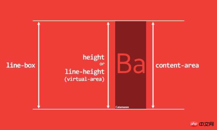
我们目前依然没有解释 line-height:normal 是什么意思。要解答这个问题,我们又得回到 content-area 高度的计算了,问题的答案就在字体度量里面。
我们回到 FontForge,Catamaran 的 em-square 高度是 1000,同时我们还看到很多其他的 ascender/descender 值: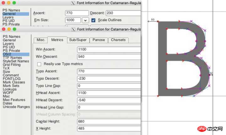
常规的 Ascent/Descent:ascender 是 770,descender 是 230,用于渲染字符。
规格 Ascent/Descent:ascender 是 1100,descender 是 540。用于计算 content-area 的高度
规格 Line Gap:用于计算 line-height: normal。
在 Catamaran 这款字体中,Line Gap 的值是 0,那么 line-height: normal 的结果就跟 content-area 的高度一样,是 1640 相对单位。
为了对比,我们再看看 Arial 字体,它的 em-square 是 2048,ascender 是 1854,descender 是 434,line gap 是 67。那么当 font-size: 100px 时,
其 content-area 的高度就是 100/2048*(1854+434) = 111.72,约为 112px;
其 line-height: normal 的结果就是 100/2048*(67+1854+434) 约为 115px。
所有这些值都是由字体设计师设置的。
这么看来,line-height:1 就是一个很糟糕的实践。记得吗,当 line-height 的值是一个数字时,其实就是相对 font-size 的倍数,而不是相对于 content-area。所以 line-height:1 很有可能使得 virtual-area 比 content-area 矮,从而引发很多其他的问题。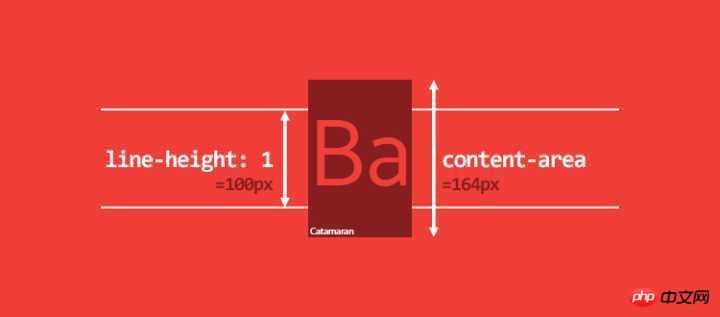
不仅仅是 line-height:1 有问题,我电脑上的 1117 款字体中,大概有 1059 款字体的 line-height 比 1 大,最低的是 0.618,最高的是 3.378。你没看错,是 3.378!
line-box 计算的一些细节:
对于内联元素,padding 和 border 会增大 background 区域,但是不会增大 content-area(不是 line-box 的高度)。一般来说你无法再屏幕上看到 content-area。margin-top 和 margin-bottom 对两者都没有影响。
对于可替换内联元素(replaced inline elements)、inline-block 元素和 blockified 内联元素,padding、margin 和 border 会增大 height(译者注:注意 margin),因此会影响 content-area 和 line-box 的高度
vertical-align
我还没提过 vertical-align 属性,它也是计算 line-box 高度的重要因素之一。我们甚至可以说 vertical-align 是内联格式化上下文(IFC)中最重要的属性。
它的默认值是 baseline。还记得字体度量里的 ascender 和 descender 吗?这两个值决定了 baseline 的位置。很少有
字体的 ascender 和 descender 的比例是一比一的,所以我们经常看到一些意想不到的现象,下面是例子。
代码如下:
<p>
    <span>Ba</span>
    <span>Ba</span>
</p>
p {
    font-family: Catamaran;
    font-size: 100px;
    line-height: 200px;
}
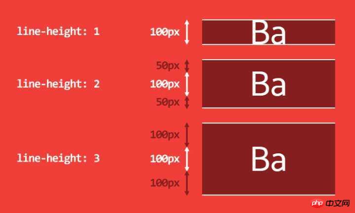
一个 p 标签内有两个 span 标签,span 继承了 font-family、font-size 和 200px 的 line-height。这时两个 span 的 baseline 是等高的,line-box 的高度就是 span 的 line-height。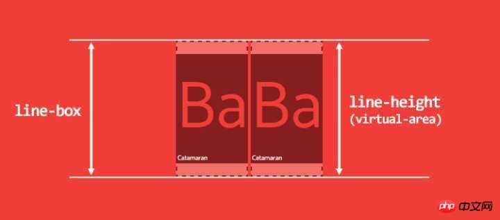
如果第二个 span 的 font-size 变小了呢?
span:last-child {
    font-size: 50px;
}
我们会发现一个非常奇怪的现象,line-box 的高度变高了!如下图所示。提示你一下,line-box 的高度是从子元素的最高点到最低点的举例。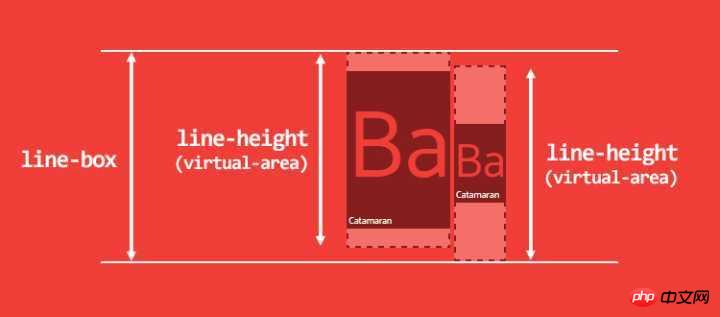
这个例子可以作为「应该将 line-height 的值写成数字」的论据,但是有时候我们为了做出好看的排版,必须把 line-height 写成一个固定值。
不过我实话告诉你吧,不管你把 line-height
写成什么,你都会在对齐内联元素的时候遇到麻烦。
我们来看另一个例子。p 标签有 line-height:200px,内含一个 span,span 继承了 p 的 line-height。
<p>
    <span>Ba</span>
</p>
p {
    line-height: 200px;
}
span {
    font-family: Catamaran;
    font-size: 100px;
}
此时 line-box 的高度是多少?貌似是 200px,但其实不是。这里你没有考虑到的问题是 p 有自己的 font-family,默认值是 serif。p 的 baseline 和 span 的 baseline 位置不一样,因此最终的 line-box 比我们预想的要高一些。出现这种问题是因为浏览器认为每个 line-box 的起始位置都有一个宽度为 0 的字符(CSS 文档将其称为 strut),并将其纳入 line-box 的高度的计算中。
看不见的字符,看得见的影响。
为了说明这个问题,我们画图解释一下这个问题。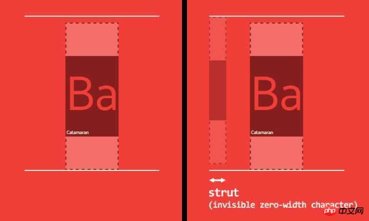
用 baseline 来对齐令人费解,如果我们用 vertical-align: middle 会不会好一点呢?读 CSS 文档你会发现,middle 的意思是「用父元素 baseline 高度加上父元素中 x-height 的一半的高度来对齐当前元素的垂直方向的中点」。baseline 所处的高度跟字体有关,x-height 的高度也跟字体有关,所以 middle 对齐也不靠谱。更糟糕的是,一般来说,middle 根本就不是居中对齐!内联元素的对齐受太多因素影响,因此不可能用 CSS 实现。
顺便一说,vertical-align 的其他 4 个值有可能有点用:
vertical-align: top / bottom,表示与 line-box 的顶部或底部对齐
vertical-align: text-top / text-bottom,表示与 content-area 的顶部或底部对齐
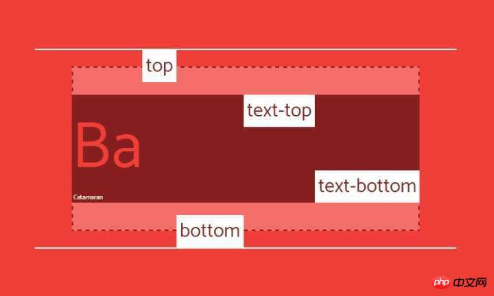
不过你依然要小心,大部分情况下,对齐的是 virtual-area,也就是一个不可见的高度。看看下面这个用 vertical-align:top 的例子: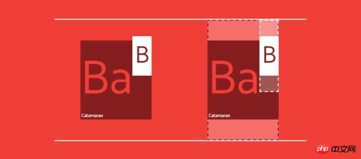
最后,vertical-align 的值也可以是数字,表示根据 baseline 升高或降低,不到万不得已还是别用数字吧。
CSS is awesome
我们讨论了 line-height 和 vertical-align 如果互相影响,现在问题来了:CSS 可以控制字体度量吗?简单来说答案是:不行。我也很想用 CSS 来控制字体。无论怎样,我还是想试试。字体度量只是一些固定的值而已,我们应该可以围绕它做点什么。
比如说,我们想要一段文字使用 Catamaran 字体,同时大写字母的高度正好是 100px,看起来可以实现,我们只需要一些数学知识。
首先我们把所有字体度量设置为 CSS 自定义属性,然后计算出一个 font-size,让大写字母的高度正好是 100px。
p {
    /* font metrics */
    --font: Catamaran;
    --fm-capitalHeight: 0.68;
    --fm-descender: 0.54;
    --fm-ascender: 1.1;
    --fm-linegap: 0;

    /* desired font-size for capital height */
    --capital-height: 100;

    /* apply font-family */
    font-family: var(--font);

    /* compute font-size to get capital height equal desired font-size */
    --computedFontSize: (var(--capital-height) / var(--fm-capitalHeight));
    font-size: calc(var(--computedFontSize) * 1px);
}
看起来也并不复杂不是吗?如果我们想要文字垂直居中怎么办呢?也就是让 B 上面的空间和下面的空间高度一样。为了做到这一点,我们必须要根据 ascender 和 descender 的比例来计算 vertical-align。
首先计算出 line-height:normal 的值和 content-area 的高度:
p {
    …
    --lineheightNormal: (var(--fm-ascender) + var(--fm-descender) + var(--fm-linegap));
    --contentArea: (var(--lineheightNormal) * var(--computedFontSize));
}
然后我们需要计算:
B 下面空间的高度
B 上面空间的高度
像这样:
p {
    …
    --distanceBottom: (var(--fm-descender));
    --distanceTop: (var(--fm-ascender) - var(--fm-capitalHeight));
}
然后我们就可以计算 vertical-align 的值。
p {
    …
    --valign: ((var(--distanceBottom) - var(--distanceTop)) * var(--computedFontSize));
}
span {
    vertical-align: calc(var(--valign) * -1px);
}
最后,设置 line-height:
p {
    …
    /* desired line-height */
    --line-height: 3;
    line-height: calc(((var(--line-height) * var(--capital-height)) - var(--valign)) * 1px);
}
添加一个和 B 一样高的 icon 就很容易了:
span::before {
    content: '';
    display: inline-block;
    width: calc(1px * var(--capital-height));
    height: calc(1px * var(--capital-height));
    margin-right: 10px;
    background: url('https://cdn.pbrd.co/images/yBAKn5bbv.png');
    background-size: cover;
}
JSBin 效果演示
注意这只是为了演示,请不要在生产环境中使用此方案。
结论
我们知道了:
IFC 真的很难懂
所有的内联元素都有两个高度
基于字体度量的 content-area
virtual-area(也就是 line-height )
这两个高度你都无法看到
line-height: normal 是基于字体度量计算出来的
line-height: n (n=1,2,3…) 可能得出一个比 virtual-area 还要矮的content-area
vertical-align 不靠谱
line-box 的高度的受其子元素的 line-height 和 vertical-align 的影响
我们无法轻易的用 CSS 来控制字体度量
相关推荐:
The above is the detailed content of In-depth understanding of the usage of CSS line-height and vertical-align. For more information, please follow other related articles on the PHP Chinese website!