
 Web Front-endHTML TutorialSummary of pixel display problems in mobile development tutorials_Experiences and tips_Web page production
Summary of pixel display problems in mobile development tutorials_Experiences and tips_Web page production

Recently during development, I discovered some problems with mobile pixels that I have never noticed before. This article mainly introduces you to relevant information about pixel display problems in mobile development tutorials. The article uses sample code The introduction is very detailed and has certain reference value for everyone's study or work. Friends who need it can follow the editor to study together.
Preface
I believe that in the process of mobile terminal development, everyone will find that the display on the mobile terminal is generally different from that on the desktop terminal. For example, when a block element with a size of 1334x750 pixels is displayed on the iPhone 6, although the nominal screen pixel density of the iPhone 6 on Apple's official website is 1334x750, we found that this block element with a size of 1334x750 pixels cannot cover the entire screen.
Then why? Let’s discuss it from several aspects.
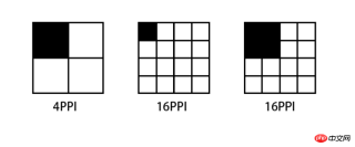
Pixel density (PPI)
PPI (Pixel Per Inch), which means how many pixels per inch, similar to population Density and building density, the following figure illustrates several PPI representations.

Taking iPhone6 as an example, the general calculation formula for pixel density is: Math.sqrt(1366*1366 + 640*640)
But to calculate this PPI, we first need to know how many pixels there are on the device's screen, which is the first Pixel in Pixel Per Inch.
Device pixel (DP) && Device pixel ratio (DPR)
Device pixel (Device pixel), also called physical pixel (Physical pixel) ), which is the screen specifications of iPhone 6 mentioned at the beginning of this article. The pixels referred to in pixel density are device pixels. For general display devices, one pixel corresponds to a luminous point on the screen, so PPI is also called DPI (dots per inch), but this is only true on display devices. Equivalently, for example, it is different on a printer.
Since the screen specifications of each mobile phone on the market are different, some are 720P, some are 1080P, even 2K, etc. Some of the screens of these devices have more pixels and some have less pixels. If the same pixel is displayed , a situation like the following will occur:
The higher the PPI screen, the smaller the area that displays one pixel. A picture composed of 4x4 pixels If it is displayed on a screen with a PPI of 64, then the display will be reduced to half of the original size when switched to a screen with 256PPI.
Conversely, if you want to display the same effect on a screen with a PPI of 256 as a screen with a PPI of 64, you have to enlarge the image by 2 times.
Therefore, for mobile phones equipped with high-definition screens, manufacturers must ensure that all types of materials are displayed on their devices in the same way as standard-definition devices for the usability of their devices, that is, icons and text can be correctly recognized and clicked accurately. The solution is to enlarge all sizes several times. This magnification ratio is called Device Pixel Ratio (DPR). Generally, DPR corresponds to the following table:
| Ȧ | ##ldpimdpi | hdpi | xhdpi | |
|---|---|---|---|---|
| 120 | 160 | 240 | 320 | ##dpr |
| 1.0 | 1.5 | 2.0 |


The above is the detailed content of Summary of pixel display problems in mobile development tutorials_Experiences and tips_Web page production. For more information, please follow other related articles on the PHP Chinese website!

 HTML as a Markup Language: Its Function and PurposeApr 22, 2025 am 12:02 AM
The function of HTML is to define the structure and content of a web page, and its purpose is to provide a standardized way to display information. 1) HTML organizes various parts of the web page through tags and attributes, such as titles and paragraphs. 2) It supports the separation of content and performance and improves maintenance efficiency. 3) HTML is extensible, allowing custom tags to enhance SEO.
 The Future of HTML, CSS, and JavaScript: Web Development TrendsApr 19, 2025 am 12:02 AM
The future trends of HTML are semantics and web components, the future trends of CSS are CSS-in-JS and CSSHoudini, and the future trends of JavaScript are WebAssembly and Serverless. 1. HTML semantics improve accessibility and SEO effects, and Web components improve development efficiency, but attention should be paid to browser compatibility. 2. CSS-in-JS enhances style management flexibility but may increase file size. CSSHoudini allows direct operation of CSS rendering. 3.WebAssembly optimizes browser application performance but has a steep learning curve, and Serverless simplifies development but requires optimization of cold start problems.
 HTML: The Structure, CSS: The Style, JavaScript: The BehaviorApr 18, 2025 am 12:09 AM
The roles of HTML, CSS and JavaScript in web development are: 1. HTML defines the web page structure, 2. CSS controls the web page style, and 3. JavaScript adds dynamic behavior. Together, they build the framework, aesthetics and interactivity of modern websites.
 The Future of HTML: Evolution and Trends in Web DesignApr 17, 2025 am 12:12 AM
The future of HTML is full of infinite possibilities. 1) New features and standards will include more semantic tags and the popularity of WebComponents. 2) The web design trend will continue to develop towards responsive and accessible design. 3) Performance optimization will improve the user experience through responsive image loading and lazy loading technologies.
 HTML vs. CSS vs. JavaScript: A Comparative OverviewApr 16, 2025 am 12:04 AM
The roles of HTML, CSS and JavaScript in web development are: HTML is responsible for content structure, CSS is responsible for style, and JavaScript is responsible for dynamic behavior. 1. HTML defines the web page structure and content through tags to ensure semantics. 2. CSS controls the web page style through selectors and attributes to make it beautiful and easy to read. 3. JavaScript controls web page behavior through scripts to achieve dynamic and interactive functions.
 HTML: Is It a Programming Language or Something Else?Apr 15, 2025 am 12:13 AM
HTMLisnotaprogramminglanguage;itisamarkuplanguage.1)HTMLstructuresandformatswebcontentusingtags.2)ItworkswithCSSforstylingandJavaScriptforinteractivity,enhancingwebdevelopment.
 HTML: Building the Structure of Web PagesApr 14, 2025 am 12:14 AM
HTML is the cornerstone of building web page structure. 1. HTML defines the content structure and semantics, and uses, etc. tags. 2. Provide semantic markers, such as, etc., to improve SEO effect. 3. To realize user interaction through tags, pay attention to form verification. 4. Use advanced elements such as, combined with JavaScript to achieve dynamic effects. 5. Common errors include unclosed labels and unquoted attribute values, and verification tools are required. 6. Optimization strategies include reducing HTTP requests, compressing HTML, using semantic tags, etc.
 From Text to Websites: The Power of HTMLApr 13, 2025 am 12:07 AM
HTML is a language used to build web pages, defining web page structure and content through tags and attributes. 1) HTML organizes document structure through tags, such as,. 2) The browser parses HTML to build the DOM and renders the web page. 3) New features of HTML5, such as, enhance multimedia functions. 4) Common errors include unclosed labels and unquoted attribute values. 5) Optimization suggestions include using semantic tags and reducing file size.


Hot AI Tools

Undresser.AI Undress
AI-powered app for creating realistic nude photos

AI Clothes Remover
Online AI tool for removing clothes from photos.

Undress AI Tool
Undress images for free

Clothoff.io
AI clothes remover

Video Face Swap
Swap faces in any video effortlessly with our completely free AI face swap tool!

Hot Article
Hot Tools

MantisBT
Mantis is an easy-to-deploy web-based defect tracking tool designed to aid in product defect tracking. It requires PHP, MySQL and a web server. Check out our demo and hosting services.

Dreamweaver Mac version
Visual web development tools

SublimeText3 Mac version
God-level code editing software (SublimeText3)

PhpStorm Mac version
The latest (2018.2.1) professional PHP integrated development tool

WebStorm Mac version
Useful JavaScript development tools

