Home >Web Front-end >CSS Tutorial >css grid layout GRID tutorial
css grid layout GRID tutorial
- 小云云Original
- 2017-12-06 14:03:372829browse
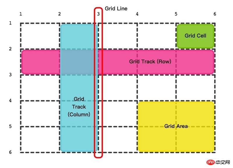
Grid is a real layout artifact. Css only really had the concept of layout after the introduction of Flex layout and Grid layout modules. I don’t know if the initial table layout was crazy, but then floats were flying all over the place. You may have to use abosulte to realize the layout of the page. In short, it is very awkward to implement. You must always pay attention to: will it collapse if I write it this way, will it affect the subsequent elements, and why is it wrong? The author boldly calls these implementations structural tricks. Flex and Grid are the real cloth. bureau. Flex is responsible for one-dimensional layout, and Grid is responsible for two-dimensional layout. Both layouts are very powerful, but one is more difficult than the other. There are so many attributes that I want to vomit blood. What makes me awesome is the module instead of the attribute. Woolen cloth. Today we will only introduce the concepts related to Grid layout around the following figure
Grid container
The place where Grid layout begins, the grid module carrier. From the outside, it looks like a block or it may be an inline-block block, and the inside of the container is one grid after another. Like Flex layout, it is also divided into container properties and item properties.
Grid lines
Grid lines include horizontal and vertical lines. The criss-crossing lines cut the grid container into the smallest unitsCell. Grid lines are numbered, starting with the number 1. There are 6 horizontal lines and 6 vertical lines in the picture above. You can also name the threads if you like, and a thread can have multiple names. 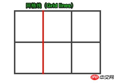
Cell
Grid Cell The green background block in the picture is the cell, the smallest unit of measurement for the grid layout, and the container has a total of 25 cells. 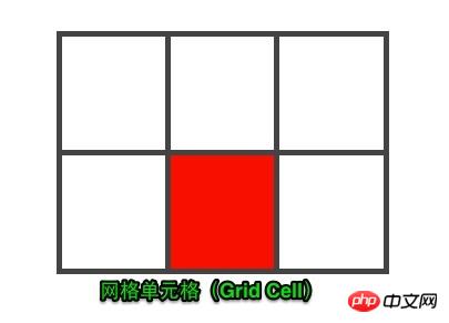
Grid Track
The middle part of two adjacent grid lines is the track. Why is there the concept of track? Because The width of the track needs to be set. If the width and height are set to the cells separately, it is likely to become a waterfall flow, and the complexity will rise sharply. Take another look at the light blue and light pink tracks in the picture above to get a feel for it. 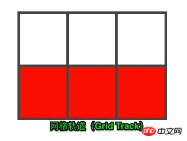
Grid area
The meaning of the existence of grid lines, cells, and tracks is to divide the container into the areas you need Grid Area. A region is a whole block that can contain multiple cells, so how to divide it? The area where two horizontal grid lines and two vertical grid lines intersect is the area. If the container is divided into multiple areas reasonably, the layout purpose will be achieved. Regions can overlap, so it has a z-index. 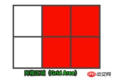
#That’s it for today’s concept part. The knowledge related to grid layout programming will be introduced in detail later.
ps: The picture is excerpted from CSS Grid Layout: What is Grid Layout
Companion article in-depth understanding of the layout artifact flexbox
Grid, a real layout artifact. Css only really had the concept of layout after the introduction of Flex layout and Grid layout modules. I don’t know if the initial table layout was crazy, but then floats were flying all over the place. You may have to use abosulte to realize the layout of the page. In short, it is very awkward to implement. You must always pay attention to: will it collapse if I write it this way, will it affect the subsequent elements, and why is it wrong? The author boldly calls these implementations layout tricks. Flex and Grid are the real layouts. Flex is responsible for one-dimensional layout, and Grid is responsible for two-dimensional layout. Both layouts are very powerful, but one is more difficult than the other. There are so many attributes that I want to vomit blood. What makes me awesome is the module instead of the attribute. Woolen cloth. Today we will only introduce the concepts related to Grid layout based on the figure below. 
Grid container
The place where the Grid layout starts, the carrier of the grid module. From the outside, it looks like a block or it may be an inline-block block, and the inside of the container is one grid after another. Like Flex layout, it is also divided into container properties and item properties.
Grid lines
Grid lines include horizontal and vertical lines. The criss-crossing lines cut the grid container into the smallest unitsCell. Grid lines are numbered, starting with the number 1. There are 6 horizontal lines and 6 vertical lines in the picture above. You can also name the threads if you like, and a thread can have multiple names. 
Cell
Grid Cell The green background block in the picture is the cell, the smallest unit of measurement for the grid layout. The container has a total of 25 cells. 
Grid Track
The middle part of two adjacent grid lines is the track. Why is there the concept of track? Because You need to set the width of the track. If you set the width and height separately to the cells, it is likely to become a waterfall flow, and the complexity will rise sharply. Take another look at the light blue and light pink tracks in the picture above to get a feel for it. 
Grid area
The meaning of the existence of grid lines, cells, and tracks is to divide the container into the areas you need Grid Area. A region is a whole block that can contain multiple cells, so how to divide it? The area where two horizontal grid lines and two vertical grid lines intersect is the area. If the container is divided into multiple areas reasonably, the layout purpose will be achieved. Regions can overlap, so it has a z-index. 
The above content is the css grid layout GRID tutorial, I hope it can help everyone.
Related recommendations:
CSS Introduction to Grid layout module_html/css_WEB-ITnose
Teach you CSS Grid layout in five minutes
The above is the detailed content of css grid layout GRID tutorial. For more information, please follow other related articles on the PHP Chinese website!

