First, let’s do some understanding of the names in the flexible box

As shown in the figure, the flexible box is divided into two axes, one is the main axis and the other is the cross axis , the main axis direction can be changed (from left to right to up and down). After the main axis direction is changed, the cross axis direction will also change accordingly
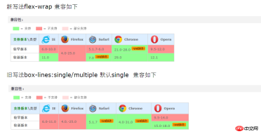
Then, let’s take a look at the general support of the browser

As can be seen from the picture, IE's support for flexible boxes can be said to be excellent. Other browsers are OK. Due to the pitfalls of IE, I feel that I can give up this layout scheme on PC. , but on the mobile side, it has been supported since Android 2.1 (compatible writing is required), so it can still be used on the mobile side, but the prefix should not be forgotten.
Let’s take a look at some ways to write the flexible box
Open the flexible box
##
display: flex;
兼容写法(IE10下版本不支持这属性)
display:-webkit-box;
display: -moz-box;
display: -ms-flexbox;
display: -webkit-flex;
display: flex;

flex-direction: row;
row:水平方向从左到右(默认)
row-reverse:主轴从右到左
column:主轴从上到下
column-reverse:主轴从下到上
Compatible writing method
-webkit-box-orient:vertical;
-webkit-box-direction:normal;
-moz-box-orient:vertical;
-moz-box-direction:normal;
flex-direction:column;

flex-wrap:设置当前容器尺寸不足的情况下,项目是否换行显示。默认不可以换行显示。
nowarp:项目不换行显示(默认)
warp:项目换行显示,但是在第一行项目的下边。
warp-reverse:项目换行显示,但是在第一行项目的上边
Compatible writing method
-webkit-flex-wrap:wrap;
-webkit-box-lines:multiple;
-moz-flex-wrap:wrap;
flex-wrap:wrap;

##
flex-flow: row nowrap;
Compatible writing method
-webkit-flex-flow:row wrap;
-webkit-box-orient:horizontal;
-webkit-box-lines:multiple;
-moz-flex-flow:row wrap;
box-orient:horizontal;
box-lines:multiple;
flex-flow:row wrap;
 Horizontal layout
flex-start:主轴起始位置对齐
flex-end:主轴结束位置对齐
center:主轴居中对齐
space-between:主轴方向两端对齐,项目之间存在相等的间隔
space-around:主轴方向上的项目左右两端都有间隔,因此两端的项目间隔比中间的项目间隔小一半
justify-content:space-around;
Compatible writing method (the version under IE11 does not support this Attribute, other browsers need to add the prefix)
-webkit-justify-content:center;
justify-content:center;
-moz-box-pack:center;
-webkit--moz-box-pack:center;
box-pack:center;
Vertical layout
flex-start:设置标签交叉轴的起始点对齐
flex-end:设置标签交叉轴的结束点对齐
center:设置标签交叉轴居中对齐
baseline:设置项目中第一行文本的基线对齐
stretch:设置项目的高度占满整个容器的高度(前提:项目的高度未指定)
align-items: baseline;
Compatible writing method
align-items:center;
-webkit-align-items:center;
box-align:center;
-moz-box-align:center;
-webkit-box-align:center;
Telescopic box layout
flex:num;Compatible writing method
box-flex:num;
-webkit-box-flex:num;
-moz-box-flex:num;
flex:num;
-webkit-flex:num;
Element appearance order
<span style="color: #800000;">order:num;<br></span>
兼容写法
box-order:num;
-webkit-box-order:num;
-moz-box-order:num;
order:num;
-webkit-order:num;
Okay, these are the commonly used attributes. In fact, there are some other attributes that I won’t mention here. 
The above is the detailed content of How to use flexible box arrangement in css3. For more information, please follow other related articles on the PHP Chinese website!
 A Little Reminder That Pseudo Elements are Children, Kinda.Apr 19, 2025 am 11:39 AM
Here's a container with some child elements:
 Menus with 'Dynamic Hit Areas'Apr 19, 2025 am 11:37 AM
Flyout menus! The second you need to implement a menu that uses a hover event to display more menu items, you're in tricky territory. For one, they should
 Improving Video Accessibility with WebVTTApr 19, 2025 am 11:27 AM
"The power of the Web is in its universality. Access by everyone regardless of disability is an essential aspect."- Tim Berners-Lee
 Weekly Platform News: CSS ::marker pseudo-element, pre-rendering web components, adding Webmention to your siteApr 19, 2025 am 11:25 AM
In this week's roundup: datepickers are giving keyboard users headaches, a new web component compiler that helps fight FOUC, we finally get our hands on styling list item markers, and four steps to getting webmentions on your site.
 Making width and flexible items play nice togetherApr 19, 2025 am 11:23 AM
The short answer: flex-shrink and flex-basis are probably what you’re lookin’ for.
 Weekly Platform News: HTML Inspection in Search Console, Global Scope of Scripts, Babel env Adds defaults QueryApr 19, 2025 am 11:18 AM
In this week's look around the world of web platform news, Google Search Console makes it easier to view crawled markup, we learn that custom properties
 IndieWeb and WebmentionsApr 19, 2025 am 11:16 AM
The IndieWeb is a thing! They've got a conference coming up and everything. The New Yorker is even writing about it:


Hot AI Tools

Undresser.AI Undress
AI-powered app for creating realistic nude photos

AI Clothes Remover
Online AI tool for removing clothes from photos.

Undress AI Tool
Undress images for free

Clothoff.io
AI clothes remover

Video Face Swap
Swap faces in any video effortlessly with our completely free AI face swap tool!

Hot Article

Hot Tools

Atom editor mac version download
The most popular open source editor

SublimeText3 Linux new version
SublimeText3 Linux latest version

SublimeText3 Mac version
God-level code editing software (SublimeText3)

SublimeText3 English version
Recommended: Win version, supports code prompts!

SAP NetWeaver Server Adapter for Eclipse
Integrate Eclipse with SAP NetWeaver application server.


