Home >Web Front-end >CSS Tutorial >Sharing a simple example of how to make a small clock with css3
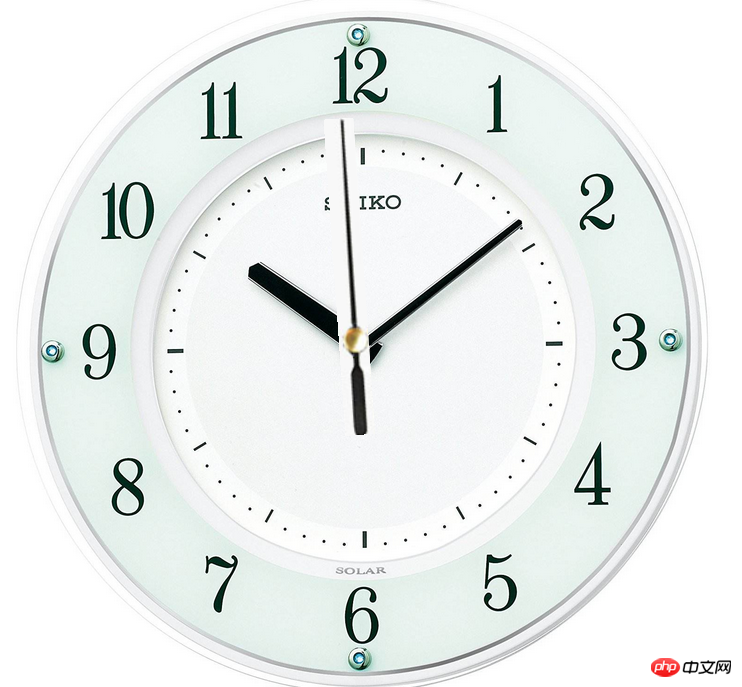
Sharing a simple example of how to make a small clock with css3
- 黄舟Original
- 2017-09-01 15:15:471503browse
Sharing a simple example of how to make a small clock with css3
<!DOCTYPE html>
<html lang="en">
<head>
  <meta charset="UTF-8">
  <title>Title</title>
  <style>
    *{
      padding:0;
      margin:0;
    }
    #hd{
      width:700px;
      height:700px;
      background: url("zhong2.jpg") no-repeat;
      -webkit-background-size: 100% 100%;
      background-size: 100% 100%;
      /*设置模糊背景*/
      box-shadow: 10px 10px 10px rgba(0,0,0,0.4);
      /*box-shadow: 10px 10px 10px black;*/
      position: relative;
      margin:0  auto;
      border-radius: 50%;
    }
    #hd img{
      width:35px;
      position: absolute;
      left:335px;
      top:113px;
      animation: run 60s linear infinite;
      /*设置旋转基准点*/
      transform-origin: 50% 67%;
      }
    @keyframes run {
      from{
        transform: rotate(0deg);
      }
      to{
        transform: rotate(360deg);
      }
      }
      </style>
      </head>
      <body>
      <div id="hd">
      <img src="/static/imghwm/default1.png"  data-src="zhizhen3.jpg"  class="lazy"   alt="">
      </div>
      </body>
      </html>

The above is the detailed content of Sharing a simple example of how to make a small clock with css3. For more information, please follow other related articles on the PHP Chinese website!
Statement:
The content of this article is voluntarily contributed by netizens, and the copyright belongs to the original author. This site does not assume corresponding legal responsibility. If you find any content suspected of plagiarism or infringement, please contact admin@php.cn

