


I believe that everyone has a Doraemon in their childhood, a small belly filled with incredible Doraemon, a Doraemon who stays with you when you are helpless and sad. , a Doraemon who accompanies you to think wildly and eat Dorayaki with you~ Today we will draw a Doraemon in our hearts~

Define Doraemon's container
-
The same thing first defines a large container for Doraemon and determines its size and position.
<!-- 哆啦A梦大容器 -->
<p class="doa"></p>
/*哆啦A梦*/
 .doa{position: relative;top: 100px;}
Draw Doraemon’s head (including the face, the face includes eyes and nose)
The head contains several pieces Part: Doraemon’s face and nose. The face also includes two eyes. There are eyeballs and eye whites in the two eyes, so there will be several layers of dom nesting. Of course, the basic graphics are all made of p+border -radius pieced together.
Just put the various parts of the drawn items into the corresponding positions.
-
If you look at the few pictures I drew earlier, you will know that border-radius is a very commonly used attribute. Almost every deformation of p is inseparable from it. In fact, the true face of border-radius It should be border-radius: 300px 300px 300px 300px/300px 300px 300px 300px; for Jiangzi, we generally don’t write the content after the slash. The slash section is the horizontal length, and the slash is the vertical height. By default, it is not written after the front bar. The horizontal and vertical sizes are the same. I know what I said is not detailed enough. You can refer to my Xinshen’s blog When Will Autumn Moon Come? How much do you know about CSS3 border-radius? , guaranteeing that you will thoroughly understand border-radius under the guidance of an experienced driver in minutes. Why don’t you get on the bus quickly?
<!-- 头 --> <p class="head"> <!-- 存放脸部的容器 --> <p class="face"> <!-- 左眼大圈儿 --> <p> <!-- 左眼眼珠(黑色部分) --> <p> <!-- 左眼眼白,黑色里面的白色部分 --> <p></p> </p> </p> <!-- 右眼大圈儿 --> <p> <!--右眼眼珠(黑色部分) --> <p> <!-- 右眼眼白,黑色里面的白色部分 --> <p></p> </p> </p> </p> <!-- 红鼻子部分 --> <p class="nose"> <!-- 红鼻子里面的白圈儿 --> <p></p> </p> <!-- 红鼻子下面的那根黑线,也属于鼻子部分 --> <p class="nose1"></p> </p> .head{ margin: 0 auto; /*头部定义大小并居中显示*/ width: 400px; height: 350px; background: #008ee3; /*头部定义背景颜色*/ position: relative; border-radius: 50% 50% 25% 25% / 55% 55% 45% 45%; /*头部定义四个方向圆角大小*/ } .face{ width: 310px; /*脸部定义大小*/ height: 260px; background: snow; /*脸部定义背景颜色*/ border-radius: 50% 50% 25% 25% / 55% 55% 45% 45%; /*脸部定义四个方向的圆角大小*/ position: relative; /*脸部定义位置,是相对于head的位置*/ top: 90px; left: 45px; } /*左眼眶*/ .face>p:first-child{ width: 80px; /*左眼框定义大小*/ height: 100px; border-radius: 50%; /*左眼框定义与圆角大小*/ border:2px #000 solid; /*定义外边框*/ background: snow; float: left; /*为了使左右两个眼睛能在一排显示*/ position: relative; /*位置是相对于face的位置*/ top:-40px; left: 71px; z-index: 50; } /*右眼眶,画法跟左眼一样*/ .face>p:last-child{ width: 80px; height: 100px; border-radius: 50%; border:2px #000 solid; background: snow; float: left; position: relative; top:-40px; left: 71px; z-index: 50; } /*左眼珠1*/ .face>p:first-child p{ width: 20px; /*定义眼珠的大小*/ height: 25px; background: #000; border-radius: 50%; position: absolute; /*定义眼珠的位置,相对于眼眶的位置*/ top: 45px; left: 60px; } /*左瞳孔*/ .face>p:first-child p p{ width: 10px; /*定义黑色瞳孔的大小*/ height: 10px; background: #ffffff; border-radius: 50%; position: absolute; /*定义黑色瞳孔的位置,相对于眼珠的位置*/ top: 7px; left: 10px; } /*右眼珠和左眼珠画法一样*/ .face>p:last-child p{ width: 20px; height: 25px; background: #000; border-radius: 50%; position: absolute; top: 45px; } /*右瞳孔和左瞳孔的画法一样*/ .face>p:last-child p p{ width: 10px; height: 10px; background: #ffffff; border-radius: 50%; position: absolute; top: 7px; } .nose{ width: 30px; /*定义红鼻子的大小*/ height: 30px; border-radius: 50%; background: #c70000; position: absolute; top: 130px; left: 50%; margin-left: -15px; z-index: 10; } .nose p{ width: 10px; /*定义红鼻子里面白色圈圈的大小*/ height: 10px; border-radius: 50%; position: absolute; background: #ffffff; top: 10px; margin-left: 20px; z-index: 10; } .nose1{ width: 2px; /*定义红鼻子下面的那一条黑线*/ height: 130px; background: #000; position: absolute; top: 160px; left: 50%; margin-left: -1px; z-index: 10; } -

Doraemon’s head.png
Drawing Doraemon The mouth part of the dream
-
The mouth should be very simple. At a glance, you can tell that it is realized with border+border-radius.
<p class="mouth"></p>
.mouth{
 width: 250px; /*定义嘴巴的大小*/
 height: 200px;
 border-radius: 50%;
 background: snow;
 border-bottom: 2px #000 solid;
 margin: -230px auto;
 position: relative; /*定义嘴巴的位置*/
 }
##Doraemon’s mouth.png - Drawing Doraemon The beard part
- The beard part is actually the method of drawing beards that was introduced in the previous article when drawing html to create animation [Serial 3]-Kitten Smiley Animation when drawing beards. I won’t go into details here, the basic idea is the same.
<!-- 胡须 -->
  <p class="beard">
 <!-- 左边胡须部分 -->
 <p class="left">
 <!-- 第一根胡须 -->
 <p></p>
 <!-- 第二根胡须 -->
 <p></p>
 <!-- 第三根胡须 -->
 <p></p>
 </p>
 <p class="right">
 <p></p>
 <p></p>
 <p></p>
 </p>
 <!-- 脖子部分的小白条部分 -->
 <span></span>
 </p>
/*胡须样式*/
.beard .left p:first-child{
 width: 120px;
 height: 40px;
 border-top: 2px #000 solid;
 border-radius: 10% 90% 10% 90% / 10% 90% 10% 90%;
 position: absolute;
 left: 50%;
 top: 140px;
 margin-left: -170px;
 z-index: 100;
 }
 .beard .left p:nth-child(2){
 width: 120px;
 height: 40px;
 border-top: 2px #000 solid;
 border-radius: 10% 90% 10% 90% / 30% 70% 40% 60%;
 position: absolute;
 left: 50%;
 top: 170px;
 margin-left: -170px;
 z-index: 100;
 }
 .beard .left p:last-child{
 width: 120px;
 height: 40px;
 border-top: 2px #000 solid;
 border-radius: 10% 90% 10% 90% / 40% 60% 10% 90%;
 position: absolute;
 left: 50%;
 top: 200px;
 margin-left: -170px;
 z-index: 100;
 }

 .beard .right p:first-child{
 width: 120px;
 height: 40px;
 border-top: 2px #000 solid;
 border-radius: 90% 10% 90% 10% / 90% 10% 90% 10%;
 position: absolute;
 left: 50%;
 top: 140px;
 margin-left: 50px;
 z-index: 100;
 }
 .beard .right p:nth-child(2){
 width: 120px;
 height: 40px;
 border-top: 2px #000 solid;
 border-radius: 90% 10% 90% 10% / 70% 30% 60% 40%;
 position: absolute;
 left: 50%;
 top: 170px;
 margin-left: 50px;
 z-index: 100;
 }
 .beard .right p:last-child{
 width: 120px;
 height: 40px;
 border-top: 2px #000 solid;
 border-radius: 90% 10% 90% 10% / 60% 40% 90% 10%;
 position: absolute;
 left: 50%;
 top: 200px;
 margin-left: 50px;
 z-index: 100;
 }
 .beard span{
 display: block;
 width: 60px;
 height: 3.5px;
 background: #ffffff;
 border-radius: 4px;
 position: absolute;
 top: 352px;
 left: 50%;
 margin-left: -105px;
 }
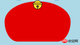
##Doraemon’s beard.png Drawing Doraemon The neck part (the neck part includes the bell) - The neck is the shape after the basic p deformation, and the excess part can be hidden under the head.
- The bell part is composed of very simple basic graphics.
<!-- 脖 -->
  <p class="neck">
 <!-- 铃铛的圆形 -->
 <p></p>
 <!-- 铃铛的小圆角矩形 -->
 <p></p>
 <!-- 铃铛的小圆形 -->
 <p></p>
 <!-- 铃铛的小竖线 -->
 <p></p>
 </p>
.neck{
 width: 330px;
 height: 200px;
 border-radius: 50% 50% 20% 20% / 50% 50% 50% 50%;
 background: #e30000;
 margin: 80px auto;
 z-index: 100;
 }
 .neck p:first-child{
 border: 2px #000 solid;
 border-radius: 50%;
 width: 40px;
 height: 40px;
 background: #ffdd2e;
 position: absolute;
 top: 350px;
 left: 50%;
 margin-left: -22px;
 transition: all 1s;
 }
 .neck p:nth-child(2){
 border: 2px #000 solid;
 width: 44px;
 height: 5px;
 background: #ffdd2e;
 position: absolute;
 left: 50%;
 margin-left: -24px;
 top: 363px;
 border-radius: 5px;
 transition: all 1s;
 }
 .neck p:nth-child(3){
 width: 8px;
 height: 8px;
 border: 2px #000 solid;
 position: absolute;
 background: #6c5844;
 border-radius: 50%;
 left: 50%;
 margin-left: -6px;
 top: 375px;
 transition: all 1s;
 }
 .neck p:nth-child(4){
 width: 2px;
 height: 8px;
 background: #000;
 position: absolute;
 left: 50%;
 margin-left: -1px;
 top: 385px;
 transition: all 1s;
 }
##Doraemon’s neck.png##Complete Doraemon The dynamic effect of
is more cute when Doraemon moves, right? Then let’s make it move (transition attribute).
Move the mouse to the eye area and move the left eyeball to the left.
Move the mouse to the mouth and the facial expression changes.
-
Move the mouse to the bell part, and the bell will become larger.
/*眼睛动效*/ .head:hover .face>p:first-child p{ left: 0px; transition: all 1s; } .head:hover .face>p:first-child p p{ left: 0px; transition: all 1s; } /*嘴巴动效,嘴巴的dom容器下面要加了个空的p容器*/ .mouth p:first-child{ width: 82px; height: 2px; background: #000; position: absolute; z-index: 1000; top: -25px; left: 6px; display: none; } .mouth p:nth-child(2){ width: 82px; height: 2px; background: #000; position: absolute; z-index: 1000; top: -25px; left: 90px; display: none; } .mouth:hover{ border-radius: 0; width: 180px; height: 200px; } .mouth:hover p:first-child,.mouth:hover p:nth-child(2){ display: block; } /*铃铛动效*/ .neck:hover p:first-child{ width: 60px; height: 60px; left: 50%; margin-left: -30px; } .neck:hover p:nth-child(2){ width: 66px; height: 7.5px; left: 50%; margin-left: -33px; } .neck:hover p:nth-child(3){ width: 12px; height: 12px; left: 50%; margin-left: -6px; top: 385px; } .neck:hover p:nth-child(4){ width: 2px; height: 12px; left: 50%; margin-left: 1px; top: 400px; } -


 ##Doraemon’s neck.png
The above is the detailed content of Share HTML sample code to create animated Doraemon. For more information, please follow other related articles on the PHP Chinese website!

 HTML as a Markup Language: Its Function and PurposeApr 22, 2025 am 12:02 AM
The function of HTML is to define the structure and content of a web page, and its purpose is to provide a standardized way to display information. 1) HTML organizes various parts of the web page through tags and attributes, such as titles and paragraphs. 2) It supports the separation of content and performance and improves maintenance efficiency. 3) HTML is extensible, allowing custom tags to enhance SEO.
 The Future of HTML, CSS, and JavaScript: Web Development TrendsApr 19, 2025 am 12:02 AM
The future trends of HTML are semantics and web components, the future trends of CSS are CSS-in-JS and CSSHoudini, and the future trends of JavaScript are WebAssembly and Serverless. 1. HTML semantics improve accessibility and SEO effects, and Web components improve development efficiency, but attention should be paid to browser compatibility. 2. CSS-in-JS enhances style management flexibility but may increase file size. CSSHoudini allows direct operation of CSS rendering. 3.WebAssembly optimizes browser application performance but has a steep learning curve, and Serverless simplifies development but requires optimization of cold start problems.
 HTML: The Structure, CSS: The Style, JavaScript: The BehaviorApr 18, 2025 am 12:09 AM
The roles of HTML, CSS and JavaScript in web development are: 1. HTML defines the web page structure, 2. CSS controls the web page style, and 3. JavaScript adds dynamic behavior. Together, they build the framework, aesthetics and interactivity of modern websites.
 The Future of HTML: Evolution and Trends in Web DesignApr 17, 2025 am 12:12 AM
The future of HTML is full of infinite possibilities. 1) New features and standards will include more semantic tags and the popularity of WebComponents. 2) The web design trend will continue to develop towards responsive and accessible design. 3) Performance optimization will improve the user experience through responsive image loading and lazy loading technologies.
 HTML vs. CSS vs. JavaScript: A Comparative OverviewApr 16, 2025 am 12:04 AM
The roles of HTML, CSS and JavaScript in web development are: HTML is responsible for content structure, CSS is responsible for style, and JavaScript is responsible for dynamic behavior. 1. HTML defines the web page structure and content through tags to ensure semantics. 2. CSS controls the web page style through selectors and attributes to make it beautiful and easy to read. 3. JavaScript controls web page behavior through scripts to achieve dynamic and interactive functions.
 HTML: Is It a Programming Language or Something Else?Apr 15, 2025 am 12:13 AM
HTMLisnotaprogramminglanguage;itisamarkuplanguage.1)HTMLstructuresandformatswebcontentusingtags.2)ItworkswithCSSforstylingandJavaScriptforinteractivity,enhancingwebdevelopment.
 HTML: Building the Structure of Web PagesApr 14, 2025 am 12:14 AM
HTML is the cornerstone of building web page structure. 1. HTML defines the content structure and semantics, and uses, etc. tags. 2. Provide semantic markers, such as, etc., to improve SEO effect. 3. To realize user interaction through tags, pay attention to form verification. 4. Use advanced elements such as, combined with JavaScript to achieve dynamic effects. 5. Common errors include unclosed labels and unquoted attribute values, and verification tools are required. 6. Optimization strategies include reducing HTTP requests, compressing HTML, using semantic tags, etc.
 From Text to Websites: The Power of HTMLApr 13, 2025 am 12:07 AM
HTML is a language used to build web pages, defining web page structure and content through tags and attributes. 1) HTML organizes document structure through tags, such as,. 2) The browser parses HTML to build the DOM and renders the web page. 3) New features of HTML5, such as, enhance multimedia functions. 4) Common errors include unclosed labels and unquoted attribute values. 5) Optimization suggestions include using semantic tags and reducing file size.


Hot AI Tools

Undresser.AI Undress
AI-powered app for creating realistic nude photos

AI Clothes Remover
Online AI tool for removing clothes from photos.

Undress AI Tool
Undress images for free

Clothoff.io
AI clothes remover

Video Face Swap
Swap faces in any video effortlessly with our completely free AI face swap tool!

Hot Article
Hot Tools

MantisBT
Mantis is an easy-to-deploy web-based defect tracking tool designed to aid in product defect tracking. It requires PHP, MySQL and a web server. Check out our demo and hosting services.

Dreamweaver Mac version
Visual web development tools

SublimeText3 Mac version
God-level code editing software (SublimeText3)

PhpStorm Mac version
The latest (2018.2.1) professional PHP integrated development tool

WebStorm Mac version
Useful JavaScript development tools

