Home  >  Article  >  Web Front-end  >  Complete explanation of Android Layout layout attributes

Complete explanation of Android Layout layout attributes

巴扎黑
巴扎黑Original
2017-06-28 11:06:342789browse

Android Layout layout attributes full explanation

Android has basic Layout: FrameLayout, LinearLayout, TableLayout, RelativeLayout,AbsoluteLayout.

android developer Google documentation http://android.xsoftlab.net/reference/android/view/ViewGroup.html

FrameLayout

##

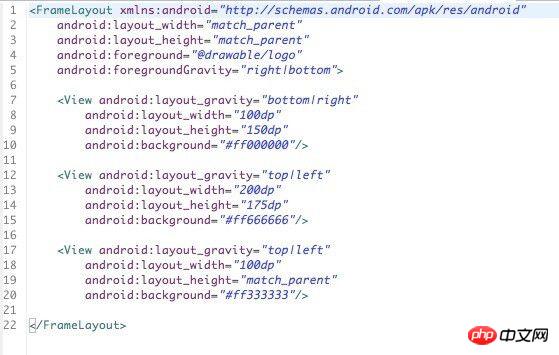
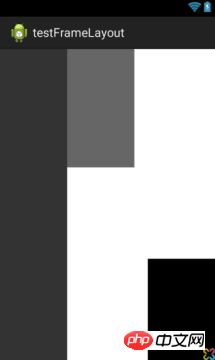
<FrameLayout 
android:layout_width="" //取值范围"match_parent"、"wrap_content"、"XXdp"  布局整体宽度
android:layout_height=""//取值范围"match_parent"、"wrap_content"、"XXdp"  布局整体高度
android:layout_weight=""//取值示例"1.0"  布局所占比重
android:layout_gravity="" //取值范围"center"、"top"、"bottom"、"left"、"right"、"right|bottom" 布局位置
android:layout_margin="" //取值示例"0dp" 距离父控件四个方向距离
android:layout_marginLeft="" //取值示例"0dp" 距离父控件左间距
android:layout_marginTop="" //取值示例"0dp" 距离父控件上间距
android:layout_marginRight="" //取值示例"0dp" 距离父控件右间距
android:layout_marginBottom="" //取值示例"0dp" 距离父控件下间距
android:layout_marginStart="" //取值示例"-50dp" "50dp"  控件离父控件开始的位置的距离(前者不显示前50dp)
android:layout_marginEnd=""   //取值示例"-50dp" "50dp"  控件离父控件结束的位置的距离(前者不显示后50dp)
android:addStatesFromChildren="" //取值范围"true" 、"false" viewgroup的drawable属性是否把它的子类的drawable的state包含进来。测试中linearlayout如果不包含该属性(false),当子widget被点击时不会出现被选中的状态。也就是子类的state不会被传递给父类了
android:descendantFocusability="" //见下
android:splitMotionEvents=""  //取值范围"true" "false" 定义布局是否传递touch事件到子布局
android:layoutMode="" //取值范围 "clipBounds" "opticalBounds"  见下
android:id="" 
android:tag="" //listView中区别Item非常有用的Tag标签(key-value)
android:scrollX="" //The initial horizontal scroll offset, in pixels. [dimension]最初的水平滚动的偏移,以像素为单位。
android:scrollY="" //The initial virtual scroll offset, in pixels. [dimension]最初的竖直滚动的偏移,以像素为单位。
android:background="" 
android:padding="" //取值示例"0dp" 控件内容(文本图片子控件等)距离控件四个方向边界的距离
android:paddingLeft="" 
android:paddingTop="" 
android:paddingRight="" 
android:paddingBottom="" 
android:paddingStart="" //见下  文字对齐方式详解
android:paddingEnd="" //见下  文字对齐方式详解
android:foreground="" //设置布局的前景图,前景图不会被子元素覆盖
android:foregroundGravity="" //设置布局前景图的位置
android:foregroundInsidePadding="" //
android:focusable="" //取值"true" "false"  能否获得焦点(按键)
android:focusableInTouchMode="" //取值"true" "false"  是否可以通过touch获取到焦点(android:focusable 为先决条件)
android:fitsSystemWindows="" //取值"true" "false"  设置布局调整时是否考虑系统窗口(如状态栏)
android:fadeScrollbars="" //取值"true" "false" 滚动条自动隐藏
android:fadingEdge=""  //设置拉滚动条时 ,边框渐变的方向。none(边框颜色不变),horizontal(水平方向颜色变淡),vertical(垂直方向颜色变淡)。
android:fadingEdgeLength="" //滚动条渐变长度
android:filterTouchesWhenObscured="" //取值范围  "true" "false"所在窗口被其它可见窗口遮住时,是否过滤触摸事件
android:visibility="" //取值范围 "gone" "visible" "invisible"(虽不可见,但占据布局位置)
android:scrollbars=""//取值范围 "none" "horizontal" "vertical" 设置滚动条
android:scrollbar //outsideInset :  该ScrollBar显示在视图(view)的边缘,增加了view的padding. 如果可能的话,该ScrollBar仅仅覆盖这个view的背景.                                  insideInset :该ScrollBar显示在padding区域里面,增加了控件的padding区域,该ScrollBar不会和视图的内容重叠.                                                    outsideOverlay :  该ScrollBar显示在视图(view)的边缘,不增加view的padding,该ScrollBar将被半透明覆盖                                                         insideOverlay : 该ScrollBar显示在内容区域里面,不会增加了控件的padding区域,该ScrollBar以半透明的样式覆盖在视图(view)的内容                    
android:isScrollContainer=""  //取值范围 "true""false" 设置当前View是否为滚动容器(是否可以为输入法腾出空间而隐藏)
android:scrollbarFadeDuration="" //褪色时间
android:scrollbarDefaultDelayBeforeFade="" //设置滚动条N毫秒后开始淡化,以毫秒为单位。
android:scrollbarSize="" //设置滚动条大小
android:scrollbarThumbHorizontal="@drawable" //设置水平滚动条的drawable
android:scrollbarThumbVertical="@drawable" //设置垂直滚动条的drawable.
android:scrollbarTrackHorizontal="@drawable"//设置水平滚动条背景(轨迹)的色drawable
android:scrollbarTrackVertical="@deawable" //设置垂直滚动条背景(轨迹)的drawable注意直接
android:scrollbarAlwaysDrawHorizontalTrack="true/false" //设置水平滚动条是否含有轨道
android:scrollbarAlwaysDrawVerticalTrack="true/false"  // 设置垂直滚动条是否含有轨道
android:requiresFadingEdge="none/horizontal/vertical" //定义褪色时滚动边缘
android:nextFocusLeft="@+id/" //Up键按下之后,哪一个控件获得焦点(被选中)
android:nextFocusRight="@+id/" 
android:nextFocusUp="@+id/" 
android:nextFocusDown="@+id/" 
android:nextFocusForward="@+id/" 
android:clickable="true/false" 
android:longClickable="true/false" 
android:saveEnabled="true/false" //设置是否在窗口冻结时(如旋转屏幕)保存View的数据
android:drawingCacheQuality="auto|low|hight" //设置绘图缓存质量 
android:keepScreenOn="true/false" //View在可见的情况下是否保持唤醒状态
android:duplicateParentState="true/false"  如果设置此属性,将直接从父容器中获取绘图状态(光标,按下等)。 注意根据目前测试情况仅仅是获取绘图状态,而没有获取事件,也就是你点一下LinearLayout时Button有被点击的效果,但是不执行点击事件。
android:minHeight="" 
android:minWidth="" 
android:soundEffectsEnabled="true/false" // 设置点击或触摸时是否有声音效果
android:hapticFeedbackEnabled="true/false" // 实现单击某个视图,系统提供一个触力反馈(震动一下)
android:contentDescription="@string/"        //图片不可见时的文字描述(盲人) 
android:onClick="" 
android:overScrollMode="ifContentScrolls/always/never" //滚动到边界时的效果 
android:alpha="0.1" //透明度
android:translationX="" //X轴的偏移距离
android:translationY="" 
android:transformPivotX="" //从某点的X轴偏移距离
android:transformPivotY="" 
android:rotation=""  //旋转
android:rotationX="" 
android:rotationY="" 
android:scaleX="" //设置X轴缩放比例
android:scaleY="" 
android:verticalScrollbarPosition="defaultPosition/left/right"  //设置垂直滚动条的位置
android:layerType="none/hardware/software" //绘图是否开启硬件加速
android:layoutDirection="" //定义布局图纸的方向
android:textDirection=""  //
android:textAlignment="inherit/....."   //文字对齐方式
android:importantForAccessibility="noHideDescendants/...."    //设置可达性的重要行
android:accessibilityLiveRegion="" 
android:labelFor=""   //添加标签
android:measureAllChildren=""  //见下
android:animateLayoutChanges="true"   //添加默认布局动画
android:clipChildren="" //见下
android:clipToPadding="" //见下转载
android:layoutAnimation="" //设置layout动画
android:animationCache=""
android:persistentDrawingCache="" android:alwaysDrawnWithCache="" />

android:descendantFocusability

A very common problem in development. The listview in the project is not just a simple text. You often need to define the listview yourself. Your own Adapter inherits the BaseAdapter and writes it in the adapter according to the requirements. Problems arise. Maybe It will happen that when you click on each item, there will be no response and focus cannot be obtained. The reason is mostly because there are sub-controls such as ImageButton, Button, CheckBox and other sub-controls (which can also be said to be sub-class controls of Button or Checkable) in the Item you define. At this time, these sub-controls will get the focus, so they often click What changes when it comes to item is the sub-control, and there is no response when clicking on the item itself.

At this time, you can use descendantFocusability to solve the problem. The API description is as follows:

android:descendantFocusability

Defines the relationship between the ViewGroup and its descendants when looking for a View to take focus.

Must be one of the following constant values.

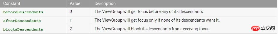
This attribute defines the relationship between the viewGroup and its child controls when a view gets focus.

There are three values ​​for the attribute:

beforeDescendants: the viewgroup will give priority to its subclass controls and get the focus

## AfterDescendants: ViewGroup only gets the focus only when its subclasses do not need to get the focus

Atep.

## ###

Usually we use the third method, which is to add the attribute android:descendantFocusability="blocksDescendants" to the root layout of the Item layout.

android:layoutMode


Defines the layout mode of this ViewGroup.

Must be one of the following constant values.

##ConstantValueDescription 0Use the children's clip bounds when laying out this container. Child control clipping bounds. 1Use the children's optical bounds when laying out this container. Subcontrol fiber boundary.

This corresponds to the global attribute resource symbol layoutMode.


##Related Methods
  • setLayoutMode( int)

android:paddingstart

##Android 4.1 (Jelly Bean) In TextView and EditText elements, set the "bidirectional" "Text Order" provides limited functional support, allowing applications to support both left-to-right (LTR) and right-to-left (RTL) arrangement formats when editing and displaying characters. Android 4.2 currently has full native-level support for the "right to left" text arrangement order, including providing a layout mirror tool, allowing developers to bring a high-quality user experience to every user, regardless of the user. Is the writing order from left to right or right to left.

Android 4.2 ensures that this new feature will not affect existing programs. If the previous program code is not modified, the appearance of the application will maintain the status quo. If you want to modify the program, with only minor changes, the application can be automatically "mirrored", making it easy to set the system language to a right-to-left writing format (Arabic, Hebrew Both English and Persian use this format). For example, the following screenshot shows the effect of the above settings:

Left to right layout

Complete explanation of Android Layout layout attributes

Right to left layout Method

Complete explanation of Android Layout layout attributes

To implement RTL (right to left) layout mirror reflection, just follow the following steps:

1. In your application In the declaration file (manifest), it is declared to enable RTL mirroring support. The specific method is: in the element of the manifest.xml declaration file, add android:supportsRtl="true"

2. Modify all the "left/right" layout attributes in the application and change them to Corresponding "start/end" layout

1) If your application is for the Android 4.2 target platform (the application's targetSdkVersion or minSdkVersion is 17 or higher), then you should replace the original "left" and "right" with "start" and "end" ". For example, android:paddingLeft should be replaced by android:paddingStart.

2) If you want your application to remain compatible with versions before Android 4.2 (that is, with targetSdkVersion or minSdkVersion of 16 or earlier), then you should add both "start" and "end", plus "left" and "right". For example, you should write: adnroid:paddingLeft and android:paddingStart at the same time.

In order to more accurately control the order in which applications write text on the UI (from left to right, or from right to left), Android 4.2 introduced the following API:

android:layoutDirection — This attribute sets the layout direction of the component

android:textDirection — This attribute sets the text alignment direction of the component

android:textAlignment — This property sets the alignment of text

getLayoutDirectionFromLocale() —This method is used to get the customary layout of the specified region

When using the right-to-left arrangement, you can even create custom layout methods, drawable objects, and other resources. By simply identifying your resources using the resource matcher "ldrtl", you can define resources as "right-to-left resources". In terms of debugging and optimizing right-to-left layout, HierarchyViewer currently supports hierarchical display of all information such as start/end attributes, layout direction, text direction, text alignment, etc.

So now is the time to develop beautiful Android apps for all users, regardless of whether their text language habits are left to right or right to left. We’re really looking forward to seeing these beautiful applications come to life!

android:foreground


  1. android:foreground  设置布局的前景图,前景图不会被子元素覆盖

  2. android:foregroundGravity 设置布局前景图的位置

对于FrameLayout.LayoutParams,这里仅有android:layout_gravity属性,可以查看前面文章
http://isux.tencent.com/learn-android-from-zero-session3.html

我们可以实践一下:
新建一个Android项目,然后在layout文件夹找到布局xml文件并写入以下布局
Complete explanation of Android Layout layout attributes

运行效果如下:
Complete explanation of Android Layout layout attributes

android:measureAllChildren

viewFlipper中的item如何动态设置高度?

例如:


<layout_width><include></include><include></include><include></include></layout_width>

假如想做成一个layoutone是50dp,layouttwo是50dp,layoutthree是80dp高度的话,你会发现在子布局中设置高度后,ViewFlipper切换时总是以子view中高度最大的值为其高度值,也就是80dp。但是又不想让layoutone和layouttwo太高,开始的时候想通过LayoutParams动态设置吧,可惜不行(把viewflipper单独出来才行),然后找到需要设置android:measureAllChildren="false",或者代码调用setMeasureAllChildren(false);即可,因为默认情况下measureAllChildren=true。设置后各个view的高度就不同了。该属性也适合FrameLayout等。

原因:参见FrameLayout#onMeasure(int, int)的源码,android:measureAllChildren="true"时,将所有children加入到mMeasureAllChildren的链表中,然后再重新measure下。

android:clipChildren

效果图

When you see this picture, you can first think about how you would achieve this effect if it were you. Immediately thought of using RelativeLayout? NO,NO,NO,,,

2. Implementation code


Complete explanation of Android Layout layout attributes

xml version="1.0" encoding="utf-8"?>
LinearLayout xmlns:android="http://schemas.android.com/apk/res/android"
    android:layout_width
="match_parent"
    android:layout_height
="match_parent"
    android:clipChildren
="false"
    android:orientation
="vertical" >

    android.support.v4.view.ViewPager
        
android:id="@+id/view_pager"
        android:layout_width
="match_parent"
        android:layout_height
="0dip"
        android:layout_weight
="1.0" />

    LinearLayout
        
android:layout_width="match_parent"
        android:layout_height
="48dip"
        android:background
="#B0C4DE"
        android:orientation
="horizontal" >

        ImageView
            
android:layout_width="0dip"
            android:layout_height
="fill_parent"
            android:layout_weight
="1.0"
            android:scaleType
="fitCenter"
            android:src
="@drawable/ic_launcher" />

        ImageView
            
android:layout_width="0dip"
            android:layout_height
="fill_parent"
            android:layout_weight
="1.0"
            android:scaleType
="fitCenter"
            android:src
="@drawable/ic_launcher" />

        ImageView
             
android:layout_width="0dip"
            android:layout_height
="64dip"
            android:layout_gravity
="bottom"
            android:layout_weight
="1.0"
            android:scaleType
="fitCenter"
            android:src
="@drawable/ic_launcher" />

        ImageView
            
android:layout_width="0dip"
android:layout_height
="fill_parent"
##="fitCenter"
android:src
="@drawable/ic_launcher"
/>
                                                                                        :layout_height="fill_parent" android:layout_weight

="1.0"## android:scaleType
="fitCenter"
android:src="@drawable/ic_launcher"
/>   
LinearLayout>
##LinearLayout
>
##Code Description: ##1. Just set android:clipChildren to false on the root node. The default is true

2. You can control how the excess part is displayed through android:layout_gravity.

3. The meaning of android:clipChildren:

Whether to limit the child View within its scopeComplete explanation of Android Layout layout attributes

Go through the document and find the following introduction


android:clipChildren setClipChildren(boolean)        Defines whether a child is limited to draw inside of its bounds or not. 
android:clipToPadding setClipToPadding(boolean)Defines whether the ViewGroup will clip its drawing surface so as to exclude the padding area. 

2. clipToPadding用来定义ViewGroup是否允许在padding中绘制。默认情况下,cliptopadding被设置为ture, 也就是把padding中的值都进行裁切了。1.clipChild用来定义他的子控件是否要在他应有的边界内进行绘制。 默认情况下,clipChild被设置为true。 也就是不允许进行扩展绘制。

还有该功能是android第一个版本就已经提供的方法。 所有可以跨任意android版本使用。


这两个属性联合起来能干什么呢? 哈, 用来做一些类似于心形放大等点击特效非常合适啊。    不用去更改布局, 只需加入这两个属相,并引入动画效果就完成了。

按照上面的思路,做个demo吧。

先看看最后的效果吧, 点击第三个机器人就会播放一个变大的效果(类似于心变大的效果)

废话不多说,上关键代码:

  1.  布局代码(核心)

    主要看设的两个关键属性android:clipChildren和android:clipToPadding均为false。  这就让点击第三个小人时,可以跨边界进行绘制,并且允许其在padding区域内绘制。


Complete explanation of Android Layout layout attributes

<linearlayout>

    <imageview></imageview>

    <imageview></imageview>

    <imageview></imageview>

    <imageview></imageview>

    <imageview></imageview>

    <imageview></imageview></linearlayout>

Complete explanation of Android Layout layout attributes

 2. 其他辅助代码,如动画和act等内容


Complete explanation of Android Layout layout attributes

<?xml  version="1.0" encoding="utf-8"?><scale></scale>

Complete explanation of Android Layout layout attributes


Complete explanation of Android Layout layout attributes

package com.example.clipchildren;import android.os.Bundle;import android.app.Activity;import android.view.Menu;import android.view.View;import android.view.animation.Animation;import android.view.animation.AnimationUtils;import android.widget.ImageView;import android.widget.Toast;public class MainActivity extends Activity {    //只对第三个小人做放大动作
    ImageView image3 =null;
    @Override    protected void onCreate(Bundle savedInstanceState) {        super.onCreate(savedInstanceState);
        setContentView(R.layout.activity_main);
        image3 = (ImageView) findViewById(R.id.img3);
    }


    @Override    public boolean onCreateOptionsMenu(Menu menu) {        // Inflate the menu; this adds items to the action bar if it is present.        getMenuInflater().inflate(R.menu.main, menu);        return true;
    }    
    public void AA(View view) {
        Toast.makeText(this, "aa", Toast.LENGTH_SHORT).show();
        Animation an = AnimationUtils.loadAnimation(getApplicationContext(), R.anim.anims);
        image3.startAnimation(an);
    }
    
}

Complete explanation of Android Layout layout attributes

 3. 除了这种应用,网上还有其他人对这两个属性的妙用:

  用viewPaper来实现一个Gallery效果:http://www.iteye.com/topic/1129898

clipBounds
opticalBounds

The above is the detailed content of Complete explanation of Android Layout layout attributes. For more information, please follow other related articles on the PHP Chinese website!

Statement:
The content of this article is voluntarily contributed by netizens, and the copyright belongs to the original author. This site does not assume corresponding legal responsibility. If you find any content suspected of plagiarism or infringement, please contact admin@php.cn