
Home >Web Front-end >CSS Tutorial >About the related properties of columns in multi-column layout in CSS3
About the related properties of columns in multi-column layout in CSS3

- 黄舟Original
- 2017-05-21 15:46:392128browse
CSS3 has added attributes that can implement multi-column layout
The previous implementation was very troublesome and may require various positioning
Now we only need one attribute You can achieve
Multi-column layout similar to our newspaper layout
This can make it easier for readers to view
The number of multiple columns and the width of multiple columns
If a line of text is too long, we You may not have the desire to read like this
<p class="demo">......</p>
.demo { width: 600px; height: 200px; border: 1px solid black;}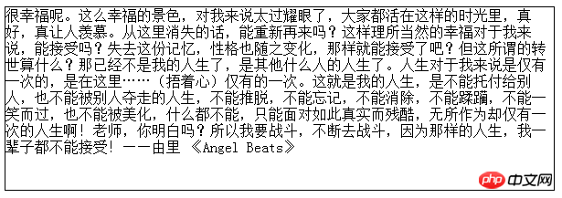
Multiple column number column-countYou can specify the number of columns you want
The browser will set the appropriate column width by itself
.demo { width: 600px; height: 200px; border: 1px solid black; column-count: 3; /*增*/}
You can also use column-width to set the column width without specifying the number of columns
And the above code is Equivalent
.demo { width: 600px; height: 200px; border: 1px solid black; column-width: 11em; /*改*/}If the width value you set is not enough to fill the entire element
The browser will try to use the largest width to ensure that the number of columns fills the entire element
For example, the 11em change above is 10em, the browser will also display a 3-column layout
Abbreviated multi-column syntax
column-count and column-width can be combined into a composite attribute columns
You can set columns through this attribute Width, number of columns, or both
But in general use, setting one of the properties can meet our needs
.demo {    width: 600px;    height: 200px;    border: 1px solid black;    columns: 3;    /*或者columns: 11em;*/
    /*或者columns: 11em 3;*/}
Column spacing width
Multiple column layout columns and There is this gap between columns
The default gap is 1em
We can control the column gap through the column-gap attribute
.demo { width: 600px; height: 200px; border: 1px solid black; columns: 3; column-gap: 2em; /*增*/}Note that if your column gap is set too large, the text will overflow
So it should be controlled with the appropriate number of columns
The element spans the columns
I add a title element to the text and change the height
<p class="demo"><h1>Angel Beats</h1>......</p>
.demo {    width: 600px;    height: 280px;/*改*/
    border: 1px solid black;    columns: 3;}
By default, the h1 element only occupies the first column.
If I want it to be on top of multiple columns, how should I do it?
Set styles for h1 elements
h1 {    column-span: all; <--
    text-align: center;}
column-span can specify the number of columns that the element spans. The default attribute value is 1
Setting For all, you can make elements span all columns
Column spacing style
If you feel that just spaces between columns are too boring
We can stack column spacing through column-rule Set "Rule"
This attribute is a composite attribute, the sub-attributes are as follows
column-rule-width
column-rule- style
column-rule-color
is somewhat similar to how we set the border attribute
.demo { width: 600px; height: 200px; border: 1px solid black; columns: 3; column-rule: 1px solid black;}
In this way, a solid black line of 1 pixel width is used between columns.
In addition to setting pixels, column-rule-width also has three keywords: thin, medium, and thick. Set three widths
column-rule-style attribute values have the following keywords
- none None
- hidden Hide
- dotted dotted
- dashed dashed line
- solid solid line
- double Double line ##groove Define 3D grooved rules
- ridge Define 3D ridged rules
- in
- set outset define 3D outset rules
- The effects of the last four depend on Width and color values, let’s first understand
but we still need to know the most basic attributes
The above is the detailed content of About the related properties of columns in multi-column layout in CSS3. For more information, please follow other related articles on the PHP Chinese website!