

Most web designers are new to print controls and are often more enamored with pixels than printers. In the real world, many people rely on printing web pages from websites for reference: In this digital age, many people still have paper in their hands on some special occasions. There are a few things web developers can do to bridge the gap between printers and LCD screens.
Styles designed for printers rather than screens
/* 样式将只应用于打印 */
@media print {


}
Note* You can also set the media="print" attribute of the link in a separate CSS file to specify that this style is dedicated to printing
<link type="text/css" rel="stylesheet" href="css/print.css" media="print">
It is not necessary to reshape the entire CSS for your site; overall, the default style is inherited by print; only qualify for different needs. To save toner when printing, most browsers automatically invert colors. For best results, color changes should be noticeable:
/*白纸黑字*/
@media print {
   body {
      color: #000;
      background: #fff;
   }
}
We are not creating screenshots of the entire web page, just to show a well-designed, readable website:
/*去除背景图片, 节约笔黑 */

h1 {
   color: #fff;
   background: url(banner.jpg);
}


@media print {
   h1 {
      color: #000;
      background: none;
   }


   nav, aside {
      display: none;
   }
}
In order to make the printer more efficient, only the main content should be displayed and the header and footer navigation bars should be removed
@media print {
   h1 {
      color: #000;
      background: none;
   }


   nav, aside {
      display: none;
   }


   body, article {
      width: 100%;
      margin: 0;
      padding: 0;
   }


   @page {
      margin: 2cm;
   }
}
Link processing
The link cannot be seen on the printer. The hyperlink should be expanded
/*在超链接后面添加带<http://XXX>的完整地址*/
@media print {
   article a {
      font-weight: bolder;
      text-decoration: none;
   }


   article a[href^=http]:after {
      content:" <" attr(href) "> ";
   }
}
The display effect may be like this

Control print setting options
The @page rule allows you to specify various aspects of the page. For example, you will want to specify the dimensions of the page. Page margins, headers and footers are all very important. [Many browsers already support it]
@PAGE rule paper size setting
Through the following CSS you can set the paper size, 5.5 inches wide and 8.5 inches high.
@page {
  size: 5.5in 8.5in;
}
You can also control the paper size through aliases, such as "A4" or "legal."
@page {
  size: A4;
}
You can also control the printing direction, portrait: print vertically, landscape: horizontally
@page {
  size: A4 landscape;
}
PAGE Model The Page Model
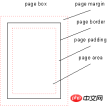
In the paginated media format model, the document is moved into one or more page boxes. The page frame is mapped to a rectangular plane. This is roughly similar to the CSS box model.
Note* Few browsers are supported
@page { width: 50em; }PAGE margin model Page-Margin Boxes
Before going any further, we should understand the box model of pages, as its behavior is somewhat different from how it works on the screen.
The page model defines the page area and then divides it into 16 peripheral edge boxes. You can control the size of the page area and the size of the margin between the edge of the page area and the end of the page itself.

Left and right margins
@page :left {
  margin-left: 30cm;
}


@page :right {
  margin-left: 4cm;
}
The following css will display the title at the bottom left, the page counter at the bottom right, and the chapter title at the top right.
@page:right{
  @bottom-left {
    margin: 10pt 0 30pt 0;
    border-top: .25pt solid #666;
    content: "Our Cats";
    font-size: 9pt;
    color: #333;
  }


  @bottom-right {
    margin: 10pt 0 30pt 0;
    border-top: .25pt solid #666;
    content: counter(page);
    font-size: 9pt;
  }


  @top-right {
    content:  string(doctitle);
    margin: 30pt 0 10pt 0;
    font-size: 9pt;
    color: #333;
  }
}
The display effect is as follows:

Note* This article is compiled from: Tips And Tricks For Print Style Sheets and Designing For Print With CSS and css3 page specification
The above is the detailed content of CSS styles specifically designed to control printing. For more information, please follow other related articles on the PHP Chinese website!

 Anchor Positioning Just Don't Care About Source OrderApr 29, 2025 am 09:37 AM
The fact that anchor positioning eschews HTML source order is so CSS-y because it's another separation of concerns between content and presentation.
 What does margin: 40px 100px 120px 80px signify?Apr 28, 2025 pm 05:31 PM
Article discusses CSS margin property, specifically "margin: 40px 100px 120px 80px", its application, and effects on webpage layout.
 What are the different CSS border properties?Apr 28, 2025 pm 05:30 PM
The article discusses CSS border properties, focusing on customization, best practices, and responsiveness. Main argument: border-radius is most effective for responsive designs.
 What are CSS backgrounds, list the properties?Apr 28, 2025 pm 05:29 PM
The article discusses CSS background properties, their uses in enhancing website design, and common mistakes to avoid. Key focus is on responsive design using background-size.
 What are CSS HSL Colors?Apr 28, 2025 pm 05:28 PM
Article discusses CSS HSL colors, their use in web design, and advantages over RGB. Main focus is on enhancing design and accessibility through intuitive color manipulation.
 How can we add comments in CSS?Apr 28, 2025 pm 05:27 PM
The article discusses the use of comments in CSS, detailing single-line and multi-line comment syntaxes. It argues that comments enhance code readability, maintainability, and collaboration, but may impact website performance if not managed properly.
 What are CSS Selectors?Apr 28, 2025 pm 05:26 PM
The article discusses CSS Selectors, their types, and usage for styling HTML elements. It compares ID and class selectors and addresses performance issues with complex selectors.
 Which type of CSS holds the highest priority?Apr 28, 2025 pm 05:25 PM
The article discusses CSS priority, focusing on inline styles having the highest specificity. It explains specificity levels, overriding methods, and debugging tools for managing CSS conflicts.


Hot AI Tools

Undresser.AI Undress
AI-powered app for creating realistic nude photos

AI Clothes Remover
Online AI tool for removing clothes from photos.

Undress AI Tool
Undress images for free

Clothoff.io
AI clothes remover

Video Face Swap
Swap faces in any video effortlessly with our completely free AI face swap tool!

Hot Article
Hot Tools

SublimeText3 Linux new version
SublimeText3 Linux latest version

MantisBT
Mantis is an easy-to-deploy web-based defect tracking tool designed to aid in product defect tracking. It requires PHP, MySQL and a web server. Check out our demo and hosting services.

Safe Exam Browser
Safe Exam Browser is a secure browser environment for taking online exams securely. This software turns any computer into a secure workstation. It controls access to any utility and prevents students from using unauthorized resources.

SAP NetWeaver Server Adapter for Eclipse
Integrate Eclipse with SAP NetWeaver application server.

Zend Studio 13.0.1
Powerful PHP integrated development environment

