


Overview of the latest version of flexbox layout in CSS 3
In CSS 3, the CSS Flexible Box module is a very important module, which is used to implement page layout processing in a very flexible way.
Although other CSS style properties can be used to implement page layout processing, if you use the flexible box layout technology defined in the CSS Flexible Box module, the display mode of each local area in the page can be automatically adjusted according to the screen size or browser window size, that is, Very flexible layout handling.
Although the CSS Flexible Box module has been announced for several years, the content defined in the module has undergone several major revisions since its initial release. The official version currently announced is ◦CSS Flexible Box Layout Module - W3C Candidate Recommendation, 18 September 2012.
So far, Opera 12.10 and above, IE 11 and above, Chrome 21 and above, and Firefox 22 and above all support this latest version.
Start learning the latest version of flexbox layout from the example page
Next, start learning the latest version of flexbox layout through a sample page. The code in the body element in this example page is as follows.
<p>
    </p><p>
        <section>
            <h1 id="section">section 1</h1>
            <p>示例文字</p>
        </section>
        <section>
            <h1 id="section">section 2</h1>
            <p>示例文字</p>
        </section>
        <section>
            <h1 id="section">section 3</h1>
            <p>示例文字</p>
        </section>
        <section>
            <h1 id="section">section 4</h1>
            <p>示例文字</p>
        </section>
    </p>
    <p>
        <section>
            <h1 id="section">section 5</h1>
            <p>示例文字</p>
            <section>
                <h1 id="section">section 6</h1>
                <p>示例文字</p>
            </section>
            <section>
                <h1 id="section">section 7</h1>
                <p>示例文字</p>
            </section>
            <section>
                <h1 id="section">section 8</h1>
                <p>示例文字</p>
            </section>
    </section></p>
    <p>
        <section>
            <h1 id="section">section 9</h1>
            <p>示例文字</p>
        </section>
        <section>
            <h1 id="section">section 10</h1>
            <p>示例文字</p>
        </section>
        <section>
            <h1 id="section">section 11</h1>
            <p>示例文字</p>
        </section>
        <section>
            <h1 id="section">section 12</h1>
            <p>示例文字</p>
        </section>
    </p>
Next, first specify the border style for each p element and section element in the page. The code is as follows.
<style>
#main {
    border: 1px dotted #f0f;
    padding: 1em;
}
.content {
    border: 1px dotted #0ff;
    padding: 1em;
}
section {
    border: 1px dotted #f00;
    padding: 1em;
}
</style>
Open the sample page so far in the browser. The elements on the page are arranged vertically from top to bottom, as shown in the figure below.

Use flexbox layout for the sample page
The way to specify the flexible box layout is to use the display:flex; style attribute on the container element of the element that needs to be laid out. In the CSS Flexible Box module, each element in the container element is called a "Flex item", and the container element is called a "Flex container".
One of the main differences between the flexbox layout method and the layout method using float and other style attributes is that when using float and other style attributes, you need to specify style attributes for each element in the container. When using flexbox layout, you only need to specify the style attribute for the container. Element specifies style attributes.
Next, we first use flexible box layout for all p elements with the style class name content. The container elements of these p elements are p elements with the id attribute value as main. Modify the style code of this element as follows:
#main {
    border: 1px dotted #f0f;
    padding: 1em;
    display: flex;
}
Open the sample page in the browser, and the arrangement of all p elements with the style class name content in the page is modified to horizontal arrangement, as shown in the figure below.

Set the arrangement direction of elements
The arrangement direction of all sub-elements in the container can be controlled by using the flex-direction style attribute. The specified values are as follows.
row: horizontal arrangement (default value)
row-reverse: Horizontal reverse arrangement
column: vertical arrangement
column-reverse: Vertical reverse arrangement
Modify the style code of the p element whose id attribute value is main as follows:
#main {
    border: 1px dotted #f0f;
    padding: 1em;
    display: flex;
    flex-direction: row-reverse;
}
Open the sample page in the browser. The arrangement of all p elements with the style class name content on the page is modified to be arranged horizontally and in reverse starting from the right end of the container element, that is, the p element with the id attribute value as main, as shown in the following figure. .

Next, first restore the arrangement of all p elements with the style class name content to horizontal and forward arrangement, and modify the style code of the p element whose id attribute value is main as follows:
#main {
    border: 1px dotted #f0f;
    padding: 1em;
    display: flex;
}
Then specify the flex-direction: column-reverse; style attribute for all p elements with the style class name content. The code is as follows:
.content {
    border: 1px dotted #0ff;
    padding: 1em;
    display: flex;
    flex-direction: column-reverse;
}
Open the sample page in the browser, and the arrangement of all section sub-elements of all content p elements in the page is modified to be vertically reversed (excluding section grandson elements in the section sub-element), as shown in the figure below.

Use the order style attribute to specify the sort order
When using flexible box layout, you can change the display order of each element through the order attribute. You can add the order attribute to the style of each element. This attribute uses an integer attribute value that represents the serial number. When displaying, the browser displays these elements based on the serial number from small to large.
Next, first set the arrangement of all section sub-elements of all p elements with the style class name content to vertical and forward arrangement. Modify the style code of all p elements with the style class name content as follows:
.content {
    border: 1px dotted #0ff;
    padding: 1em;
    display: flex;
    flex-direction: column;
}
接下来通过将所有样式类名为content的p元素中的第2个section子元素的order样式属性值设置为-1的方法设置这些section子元素被优先显示在其他section子元素之前,代码如下所示:
.content section:nth-child(2) {
    order: -1;
}
在浏览器中打开示例页面,页面中所有样式类名为content的p元素中的第2个section子元素被显示在其他section子元素之前,如下图所示。

设置元素宽度及高度
接下来首先介绍如何设置被横向排列的每一个元素的宽度。
可以通过flex属性值的使用使所有子元素的总宽度等于容器宽度。
接下来通过将所有样式类名为content的p元素的flex属性值设置为1的方法使所有样式类名为content的p元素的总宽度等于容器元素,即id属性值为main的p元素的宽度,代码如下所示。当所有样式类名为content的p元素的flex属性值都被设置为1时,这些p元素的宽度均等。
.content {
    border: 1px dotted #0ff;
    padding: 1em;
    display: flex;
    flex-direction: column;
    flex:1;
}
在浏览器中打开示例页面,所有样式类名为content的p元素的宽度自动增长,这些元素的总宽度等于容器元素,即id属性值为main的p元素的宽度,每一个样式类名为content的p元素的宽度均等,如下图所示。

接下来,我们设置第二个样式类名为content的p元素的flex属性值为2,代码如下所示。
.content:nth-child(2) {
    flex:2;
}
为了更清晰地计算元素宽度,我们取消所有元素的边框设置及内边距设置,修改后的完整样式代码如下所示。
<style>
#main {
    display: flex;
}
.content {
    display: flex;
    flex-direction: column;
    flex:1;
}
.content section:nth-child(2) {
    order: -1;
}
.content:nth-child(2) {
    flex:2;
}
</style>
在浏览器中打开示例页面,第二个样式类名为content的p元素宽度为其他样式类名为content的p元素宽度的两倍,假设这些元素的容器元素,即id属性值为main的p元素的宽度等于600px,则第一个与第三个样式类名为content的p元素宽度的宽度均等于150px,第二个样式类名为content的p元素宽度的宽度等于300px。
可以使用flex-grow属性来指定元素宽度,但是该样式属性对于元素宽度的计算方法与flex样式属性对于元素宽度的计算方法有所不同。
接下来指定所有样式类名为content的p元素的flex-grow样式属性值为1,宽度为150px,指定第二个样式类名为content的p元素的flex-grow样式属性值为为3。修改后的完整样式代码如下所示。
<style>
#main {
    display: flex;
}
.content {
    display: flex;
    flex-direction: column;
    width:150px;
    flex-grow:1;
}
.content section:nth-child(2) {
    order: -1;
}
.content:nth-child(2) {
    flex-grow:3;
}
</style>
在浏览器中打开示例页面,假设这些元素的容器元素,即id属性值为main的p元素的宽度等于600,则第一个与第三个样式类名为content的p元素宽度的宽度均等于180px,第二个样式类名为content的p元素宽度的宽度等于240px。对于每个样式类名为content的p元素宽度的计算步骤如下所示:
600(容器宽度)-150*3(三个样式类名为content的p元素宽度的总宽度)=150
150/5(三个样式类名为content的p元素宽度的flex-grow样式属性值的总和)=30
第一个与第三个样式类名为content的p元素宽度的宽度均等于150(其width样式属性值+)+30*1(其flew-grow样式属性值)=180px
第二个样式类名为content的p元素宽度的宽度等于150(其width样式属性值+)+30*3(其flew-grow样式属性值)=240px
可以使用flex-shrink属性来指定元素宽度,该样式属性与flex-grow样式属性的区别在于:当子元素的width样式属性值的总和小于容器元素的宽度值时,必须通过flex-grow样式属性来调整子元素宽度,当子元素的width样式属性值的总和大于容器元素的宽度值时,必须通过flex-shrink样式属性来调整子元素宽度。
接下来指定所有样式类名为content的p元素的flex-shrink样式属性值为1,宽度为250px,指定第二个样式类名为content的p元素的flex-shrink样式属性值为为3。修改后的完整样式代码如下所示。
<style>
#main {
    display: flex;
}
.content {
    display: flex;
    flex-direction: column;
    width:250px;
    flex-shrink:1;
}
.content section:nth-child(2) {
    order: -1;
}
.content:nth-child(2) {
    flex-shrink:3;
}
</style>
在浏览器中打开示例页面,假设这些元素的容器元素,即id属性值为main的p元素的宽度等于600,则第一个与第三个样式类名为content的p元素宽度的宽度均等于220px,第二个样式类名为content的p元素宽度的宽度等于160px。对于每个样式类名为content的p元素宽度的计算步骤如下所示:
250*3(三个样式类名为content的p元素宽度的总宽度)-600(容器宽度)=150
150/5(三个样式类名为content的p元素宽度的flex-shrink样式属性值的总和)=30
第一个与第三个样式类名为content的p元素宽度的宽度均等于250(其width样式属性值+)-30*1(其flew-shrink样式属性值)=220px
第二个样式类名为content的p元素宽度的宽度等于250(其width样式属性值+)-30*3(其flew-grow样式属性值)=160px
在使用flex-grow样式属性或flex-shrink样式属性调整子元素宽度时,也可以使用flex-basis样式属性指定调整前的子元素宽度,该样式属性与width样式属性的作用完全相同。
可以将flex-grow、flex-shrink以及flex-basis样式属性值合并写入flex样式属性中,方法如下所示。
flex:flex-grow样式属性值 flex-shrink样式属性值 flex-basis样式属性值;
在使用flex样式属性值时,flex-grow、flex-shrink以及flex-basis样式属性值均为可选用样式属性值,当不指定flex-grow、flex-shrink样式属性值时,默认样式属性值均为1,当不指定flex-basis样式属性值时,默认样式属性值为0px。
修改本示例中的样式代码如下所示:
<style>
#main {
    display: flex;
}
.content {
    display: flex;
    flex-direction: column;
    width:250px;
    flex:250px;
}
.content section:nth-child(2) {
    order: -1;
}
.content:nth-child(2) {
    flex:1 3 250px;
}
</style>
在浏览器中打开示例页面,假设这些元素的容器元素,即id属性值为main的p元素的宽度等于600,则第一个与第三个样式类名为content的p元素宽度的宽度均等于220px,第二个样式类名为content的p元素宽度的宽度等于160px。
在子元素为横向排列时,flex、flex-grow、flex-shrink以及flex-basis样式属性均用于指定或调整子元素宽度,当子元素为纵向排列时,flex、flex-grow、flex-shrink以及flex-basis样式属性均用于指定或调整子元素高度。
单行布局与多行布局
可以使用flex-wrap样式属性来指定单行布局或多行布局,可指定样式属性值如下所示:
nowrap:不换行
wrap:换行
wrap-reverse:虽然换行,但是换行方向与使用wrap样式属性值时的换行方向相反
接下来首先恢复页面内各p元素的边框与内边距(padding)的指定,同时指定所有样式类名为content的p元素的宽度为250px,代码如下所示。
<style>
#main {
    border: 1px dotted #f0f;
    padding: 1em;
    display: flex;
}
.content {
    border: 1px dotted #0ff;
    padding: 1em;
    display: flex;
    flex-direction: column;
    flex:250px;
}
section {
    border: 1px dotted #f00;
    padding: 1em;
}
.content section:nth-child(2) {
    order: -1;
}
</style>
然后指定容器元素,即id属性值为main的p元素的flex-wrap样式属性值为wrap,以指定允许对所有样式类名为content的p元素进行换行布局,代码如下所示。
#main {
    border: 1px dotted #f0f;
    padding: 1em;
    display: flex;
    flex-wrap: wrap;
}
在浏览器中打开示例页面,当浏览器窗口宽度不足以容纳三个样式类名为content的p元素时,最右边的样式类名为content的p元素被换行显示,如下图所示。

可以将flex-direction样式属性值与flex-wrap样式属性值合并书写在flex-flow样式属性中。以下两段代码的作用完全相同。
//使用flex-direction样式属性与flex-wrap样式属性
.content {
    flex-direction: row;
    flex-wrap: wrap;
}
//使用flex-flow样式属性
.content {
    flex-flow: row wrap;
}
弹性盒布局中的一些专用术语
接下来首先介绍弹性盒布局中的一些专用术语,在进行布局时这些术语的含义如下图所示。

main axis:进行布局时作为布局基准的轴,在横向布局时为水平轴,在纵向布局时为垂直轴。
main-start / main-end:进行布局时的布局起点与布局终点。在横向布局时为容器的左端与右端,在纵向布局时为容器的顶端与底端。
cross axis:与main axis垂直相交的轴,在横向布局时为垂直轴,在纵向布局时为水平轴。
cross-start / cross-end:cross axis轴的起点与终点。在横向布局时为容器的顶端与底端,在纵向布局时为容器的左端与右端。将flex-wrap属性值指定为wrap且进行横向多行布局时,按从cross-start到cross-end方向,即从上往下布局,将flex-wrap属性值指定为wrap-reverse且进行横向多行布局时,按从cross-end到cross-start方向,即从下往上布局。
justify-content属性
justify-content属性用于指定如何布局容器中除了子元素之外的main axis轴方向(横向布局时main axis轴方向为水平方向,纵向布局时main axis轴方向为垂直方向)上的剩余空白部分。
当flex-grow属性值不为0时,各子元素在main axis轴方向上自动填满容器,所以justify-content属性值无效。
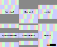
可指定justify-content属性值如下所示:
flex-start: Layout all child elements starting from main-start (default value).
flex-end: layout all child elements starting from main-end.
center: Layout all child elements in the center.
space-between: Lay out the first child element at main-start, place the last child element at main-end, and distribute the blank space evenly between all child elements.
space-around: Distribute the white space evenly in the following places: between main-start and the first child element, between each child element and child elements, and between the last child element and main-end.
The difference between the above attribute values is shown in the figure below (gray represents the blank part).

align-items attribute and align-self attribute
The align-items attribute is similar to the justify-content attribute and is used to specify the alignment of child elements, but the align-items attribute specifies the cross axis direction (the cross axis direction is the vertical direction in horizontal layout, and the cross axis axis in vertical layout). The alignment is in the horizontal direction), and the attribute values that can be specified are as follows.
flex-start: layout all child elements starting from cross-start (default value).
flex-end: layout all child elements starting from cross-end.
center: Center all child elements.
baseline: If the layout direction of the child element is inconsistent with the layout direction of the container, the effect of this value is equivalent to the effect of the flex-start attribute value. If the layout direction of the child elements is consistent with the layout direction of the container, the content in all child elements is aligned along the baseline.
stretch: The height of all child elements in the same row is adjusted to the maximum. If no child element height is specified, the height of all child elements is adjusted to be closest to the container height (when the element border and padding are taken into account, when the border width and padding are both 0, they are equal to the container height).
The difference between the above attribute values is shown in the figure below (gray represents the blank part).

The difference between the align-self attribute and the align-items attribute is that the align-items attribute is specified as the style attribute of the container element and is used to specify the alignment of all child elements, while the align-self attribute is specified as the style attribute of some child elements. , used to specify the alignment of these child elements individually. For example, after specifying the align-items attribute value of the container element as center (center alignment), you can specify the align-self attribute value of the first child element as flex-start (aligning at the cross-start end). The values that can be specified are as follows:
auto: Inherit the align-items attribute value of the parent element
flex-start
flex-end
center
baseline
stretch
align-content attribute
When making a multi-line layout, you can use the align-content attribute to specify the alignment of each line. The difference between this attribute and the align-items attribute is that the align-items attribute is used to specify the alignment of child elements, while the align-content attribute is used to specify the row alignment. The attribute values that can be specified are as follows:
flex-start: layout all rows starting from cross-start.
flex-end: layout all rows starting from cross-end.
center: Layout all rows in the center.
space-between: Lay out the first line at cross-start, lay out the last line at cross-end, and distribute the blank parts evenly between the lines.
space-around: Evenly distribute the white space in the following places: between cross-start and the first line, between each line, and between the last line and cross-end.
The difference between the above attribute values is shown in the figure below (gray represents the blank part).
The above is the detailed content of The latest version of flexbox layout in CSS3. For more information, please follow other related articles on the PHP Chinese website!

 A Little Reminder That Pseudo Elements are Children, Kinda.Apr 19, 2025 am 11:39 AM
Here's a container with some child elements:
 Menus with 'Dynamic Hit Areas'Apr 19, 2025 am 11:37 AM
Flyout menus! The second you need to implement a menu that uses a hover event to display more menu items, you're in tricky territory. For one, they should
 Improving Video Accessibility with WebVTTApr 19, 2025 am 11:27 AM
"The power of the Web is in its universality. Access by everyone regardless of disability is an essential aspect."- Tim Berners-Lee
 Weekly Platform News: CSS ::marker pseudo-element, pre-rendering web components, adding Webmention to your siteApr 19, 2025 am 11:25 AM
In this week's roundup: datepickers are giving keyboard users headaches, a new web component compiler that helps fight FOUC, we finally get our hands on styling list item markers, and four steps to getting webmentions on your site.
 Making width and flexible items play nice togetherApr 19, 2025 am 11:23 AM
The short answer: flex-shrink and flex-basis are probably what you’re lookin’ for.

 Weekly Platform News: HTML Inspection in Search Console, Global Scope of Scripts, Babel env Adds defaults QueryApr 19, 2025 am 11:18 AM
In this week's look around the world of web platform news, Google Search Console makes it easier to view crawled markup, we learn that custom properties
 IndieWeb and WebmentionsApr 19, 2025 am 11:16 AM
The IndieWeb is a thing! They've got a conference coming up and everything. The New Yorker is even writing about it:


Hot AI Tools

Undresser.AI Undress
AI-powered app for creating realistic nude photos

AI Clothes Remover
Online AI tool for removing clothes from photos.

Undress AI Tool
Undress images for free

Clothoff.io
AI clothes remover

AI Hentai Generator
Generate AI Hentai for free.

Hot Article
Hot Tools

PhpStorm Mac version
The latest (2018.2.1) professional PHP integrated development tool

SublimeText3 Mac version
God-level code editing software (SublimeText3)

SAP NetWeaver Server Adapter for Eclipse
Integrate Eclipse with SAP NetWeaver application server.

EditPlus Chinese cracked version
Small size, syntax highlighting, does not support code prompt function

DVWA
Damn Vulnerable Web App (DVWA) is a PHP/MySQL web application that is very vulnerable. Its main goals are to be an aid for security professionals to test their skills and tools in a legal environment, to help web developers better understand the process of securing web applications, and to help teachers/students teach/learn in a classroom environment Web application security. The goal of DVWA is to practice some of the most common web vulnerabilities through a simple and straightforward interface, with varying degrees of difficulty. Please note that this software

