This article mainly introduces the detailed explanation of five CSS methods to implement Footer bottoming. The editor thinks it is quite good, so I will share it with you now and give it as a reference. Let’s follow the editor to take a look.
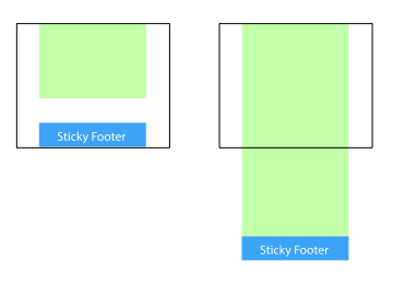
Sticky footer means that the footer part of the web page is always at the bottom of the browser window.
When the content of the web page is long enough to exceed the visual height of the browser, the footer will be pushed to the bottom of the web page along with the content; but if the content of the web page is not long enough, the bottom footer will remain in the browser bottom of window.

Method 1: Set the margin-bottom of the content part to a negative number
<p class="wrapper">
    <!-- content -->
    <p class="push"></p>
</p>
<p class="footer">footer</p>
html, body {
margin: 0;
padding: 0;
height: 100%;
}
.wrapper {
min-height: 100%;
margin-bottom: -50px; /* 等于footer的高度 */
}
.footer, .push {
height: 50px;
}1. This method requires additional placeholder elements in the container (p. push).
2. The margin-bottom of p.wrapper needs to be the same as the -height value of p.footer. Note that it is a negative height.
Method 2: Set the margin-top of the footer to a negative number
Add a parent element outside the content and let the padding of the content part -Bottom is equal to the height of the footer.
<p class="content">
  <p class="content-inside">
    <!-- content -->
  </p>
</p>
<p class="footer">footer</p>
html, body {
margin: 0;
padding: 0;
height: 100%;
}
.content {
min-height: 100%;
}
.content-inside {
padding: 20px;
padding-bottom: 50px;
}
.footer {
height: 50px;
margin-top: -50px;
}Method 3: Use calc() to set the content height
<p class="content">
  <!-- content -->
</p>
<p class="footer">footer</p>
.content {
  min-height: calc(100vh - 70px);
}
.footer {
  height: 50px;
}
Assume here that there is a 20px gap between p.content and p.footer, so 70px=50px+20px
Method 4: Use flexbox elasticity Box layout
The footer height of the above three methods is fixed. If there is too much content in the footer, the layout may be destroyed.
<p class="content">
  <!-- content -->
</p>
<p class="footer">footer</p>
html {
  height: 100%;
}
body {
  min-height: 100%;
  display: flex;
  flex-direction: column;
}
.content {
  flex: 1;
}
Method five: Use Grid grid layout
##
<p class="content">
  <!-- content -->
</p>
<p class="footer">footer</p>
html {
  height: 100%;
}
body {
  min-height: 100%;
  display: grid;
  grid-template-rows: 1fr auto;
}
.footer {
  grid-row-start: 2;
  grid-row-end: 3;
}
The above is the detailed content of An introduction to five ways to implement Footer placement using CSS. For more information, please follow other related articles on the PHP Chinese website!
 A Little Reminder That Pseudo Elements are Children, Kinda.Apr 19, 2025 am 11:39 AM
Here's a container with some child elements:
 Menus with 'Dynamic Hit Areas'Apr 19, 2025 am 11:37 AM
Flyout menus! The second you need to implement a menu that uses a hover event to display more menu items, you're in tricky territory. For one, they should
 Improving Video Accessibility with WebVTTApr 19, 2025 am 11:27 AM
"The power of the Web is in its universality. Access by everyone regardless of disability is an essential aspect."- Tim Berners-Lee
 Weekly Platform News: CSS ::marker pseudo-element, pre-rendering web components, adding Webmention to your siteApr 19, 2025 am 11:25 AM
In this week's roundup: datepickers are giving keyboard users headaches, a new web component compiler that helps fight FOUC, we finally get our hands on styling list item markers, and four steps to getting webmentions on your site.
 Making width and flexible items play nice togetherApr 19, 2025 am 11:23 AM
The short answer: flex-shrink and flex-basis are probably what you’re lookin’ for.
 Weekly Platform News: HTML Inspection in Search Console, Global Scope of Scripts, Babel env Adds defaults QueryApr 19, 2025 am 11:18 AM
In this week's look around the world of web platform news, Google Search Console makes it easier to view crawled markup, we learn that custom properties
 IndieWeb and WebmentionsApr 19, 2025 am 11:16 AM
The IndieWeb is a thing! They've got a conference coming up and everything. The New Yorker is even writing about it:


Hot AI Tools

Undresser.AI Undress
AI-powered app for creating realistic nude photos

AI Clothes Remover
Online AI tool for removing clothes from photos.

Undress AI Tool
Undress images for free

Clothoff.io
AI clothes remover

AI Hentai Generator
Generate AI Hentai for free.

Hot Article

Hot Tools

SecLists
SecLists is the ultimate security tester's companion. It is a collection of various types of lists that are frequently used during security assessments, all in one place. SecLists helps make security testing more efficient and productive by conveniently providing all the lists a security tester might need. List types include usernames, passwords, URLs, fuzzing payloads, sensitive data patterns, web shells, and more. The tester can simply pull this repository onto a new test machine and he will have access to every type of list he needs.

EditPlus Chinese cracked version
Small size, syntax highlighting, does not support code prompt function

Zend Studio 13.0.1
Powerful PHP integrated development environment

SublimeText3 English version
Recommended: Win version, supports code prompts!

PhpStorm Mac version
The latest (2018.2.1) professional PHP integrated development tool


