Home >Web Front-end >CSS Tutorial >Pure CSS to achieve ribbon-raising effect
Pure CSS to achieve ribbon-raising effect
- 高洛峰Original
- 2017-02-15 13:28:271568browse
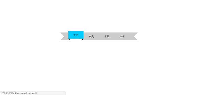
Use the hover action to change the margin-top of p to make the small module go up, and at the same time place two diagonal ones under the small module’s buttocks The lines are divided into squares of two colors, and the relative small modules are absolutely positioned to create a simple three-dimensional rising effect.
Just use border to realize the two ends of the ribbon and the rising shadow part.
But there is one detail that needs to be noted:
If it is a navigation bar, put the a tag inside the p, and the a tag inside it I also need to put the span tag; I thought it was unnecessary before, but it turns out that this span is very useful.
Because a must be higher than span, and then overflow:hidden can cover the parts of the magic that should not be exposed, and the parts that should be exposed Leave room.
Then span and p:before and p:after need to be set margin-top to positive, margin- The value of top is exactly equal to the value of a which is higher than span. hover Set margin-top:0px; during the action, and go up.
Then you say, I neither span nor p:before nor p:after set margin-top, ## Is it okay to set margin-top to negative during #hover action, and the value is equal to the value that a is higher than span? Can't! 

athe extra part goes up, so the magic can be successful; In the case of a
, if the extra part goes down, is it gone? It turns out that girls who like to get into trouble are the most popular yeah!  html code:
<p>
    <a href="#"><span>青龙</span></a>
    <a href="#"><span>白虎</span></a>
    <a href="#"><span>玄武</span></a>
    <a href="#"><span>朱雀</span></a>
</p>
css code:
p{
    width:500px;
    margin:200px auto 0px;
}
p:before{
    content:"";
    border:25px solid;
    border-color:#ccc #ccc #ccc transparent;
    margin-top:10px;
    float:left;
}
p:after{
    content:"";
    border:25px solid;
    border-color:#ccc transparent #ccc #ccc;
    margin-top:10px;
    float:left;
}
p span{
    display:inline-block;
    width:100px;
    line-height:50px;
    margin-top:10px;
    text-align:center;
    background:#ccc;
    position:relative;
    transition: background-color 0.5s, margin-top 0.3s;
}
p a{
    color:#000;
    text-decoration:none;
    height:60px;
    overflow:hidden;
    float:left;
}
p span:before{
    content:"";
    border-right:10px solid #000;
    border-bottom:10px solid #ccc;
    position:absolute;
    top:50px;
    left:0px;
}
p span:after{
    content:"";
    border-left:10px solid #000;
    border-bottom:10px solid #ccc;
    position:absolute;
    top:50px;
    right:0px;
}
p a:hover span{
    margin-top:0px;
    background:#0cf;
}
Use the
action to change the margin-top of p to make the small module move upward. Place two squares divided into two colors diagonally under the butt of the small module and position them absolutely relative to the small module to create a simple three-dimensional rising effect. Just use border
to realize the two ends of the ribbon and the rising shadow part.
If it is a navigation bar, put the
a
tag inside the p, and the a tag inside it I also need to put the span tag; I thought it was unnecessary before, but it turns out that this span is very useful. Because a
must be higher than span, and then overflow:hidden can cover the parts of the magic that should not be exposed, and the parts that should be exposed Leave room. Then span
and p:before and p:after need to be set margin-top to positive, margin- The value of top is exactly equal to the value of a which is higher than span. hover
Set margin-top:0px; during the action, and go up. Then you say, I neither span
nor p:before nor p:after set margin-top, ## Is it okay to set margin-top to negative during #hover action, and the value is equal to the value that a is higher than span? Can't! 
In the first case,  a
a
a, if the extra part goes down, is it gone? It turns out that girls who like to get into trouble are the most popular yeah!
html code:
<p>
    <a href="#"><span>青龙</span></a>
    <a href="#"><span>白虎</span></a>
    <a href="#"><span>玄武</span></a>
    <a href="#"><span>朱雀</span></a>
</p>
 css code:
 p{
width:500px;
margin:200px auto 0px;
}
p:before{
content:"";
border:25px solid;
border-color:#ccc #ccc #ccc transparent;
margin-top:10px;
float:left;
}
p:after{
content:"";
border:25px solid;
border-color:#ccc transparent #ccc #ccc;
margin-top:10px;
float:left;
}
p span{
display:inline-block;
width:100px;
line-height:50px;
margin-top:10px;
text-align:center;
background:#ccc;
position:relative;
transition: background-color 0.5s, margin-top 0.3s;
}
p a{
color:#000;
text-decoration:none;
height:60px;
overflow:hidden;
float:left;
}
p span:before{
content:"";
border-right:10px solid #000;
border-bottom:10px solid #ccc;
position:absolute;
top:50px;
left:0px;
}
p span:after{
content:"";
border-left:10px solid #000;
border-bottom:10px solid #ccc;
position:absolute;
top:50px;
right:0px;
}
p a:hover span{
margin-top:0px;
background:#0cf;
}
For more pure CSS to achieve the ribbon-raising effect, please pay attention to the PHP Chinese website for related articles!

