to be able to change its width and height, you can achieve the effect by setting display: block;. When the value of display is set to block, the element will be rendered in block-level form; when the value of display is set to inline, the element will be rendered in inline form.
If you want the element to be displayed inline and the width and height can be set, you can set:
display: inline-block;
inline-block In my opinion, it is to make the element Externally, it is an inline element, which can coexist with other elements in one line; internally, it is a block-level element, and its width and height can be changed.
#HTML code is executed sequentially. The page finally rendered by an HTML code without any CSS styles is arranged according to the order and type of elements. Block-level elements are arranged from top to bottom, and inline elements are arranged from left to right. In this unstyled situation, the distribution of elements is called normal flow, and the position where elements appear should be called normal position (this is what I made up). At the same time, all elements will occupy a space on the page, and the size of the space is determined by its box model. .
Box model
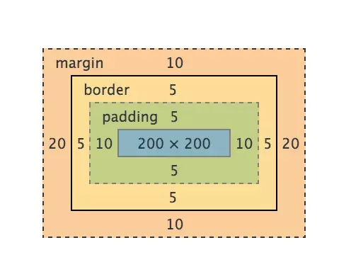
Every element displayed on the page (including inline elements) can be considered a Box, that is, box model. Please look at the screenshot in Chrome DevTools:

It can be clearly seen that the box model consists of 4 parts. From the inside to the outside they are:
content -> padding -> border -> margin
Logically speaking, the width (height and so on) of an element should be calculated like this:
总宽度 = margin-left + border-left + padding-left + width + padding-right + border-right + margin-right
But different browsers (you guessed it right, that’s the one) Different browsers) interpret width differently. Browsers that comply with W3C standards believe that the width of an element is only equal to the width of its content, and the rest must be calculated additionally. So you specify an element:
.example {
    width: 200px;
    padding: 10px;
    border: 5px solid #000;
    margin: 20px;
}
, then its final width should be:
宽度 = width(200px) + padding(10px * 2) + border(5px * 2) + margin(20px * 2) = 270px;
And under IE (lower than IE9), the final width is:
宽度 = width(200px) + margin(20px * 2) = 240px;
I Personally, I think IE's version is more in line with human thinking. After all, padding is called padding, and the border cannot be counted as extra width. In order to solve this problem, W3C finally added the box-sizing attribute to CSS3. When we set box-sizing: border-box;, border and padding are included in the width and height, which is the same as the previous standard of IE. Therefore, in order to prevent the same css from performing differently in different browsers, it is best to add:
*, *:before, *:after {
  -moz-box-sizing: border-box;
  -webkit-box-sizing: border-box;
  box-sizing: border-box;
}
There are two special cases here:
No width - absolute positioning (position: absolute;) Element
No width - floating (float) Elements
Their performance on the page None of them take up space (out of the normal flow, they feel like they are floating on the top of the page, and moving them does not affect the positioning of other elements). This involves two other core concepts: position and float.
position
position This attribute determines how the element will be positioned. It has roughly the following five values:
For specific effects, you can refer to the example of w3school, or you can understand it by writing it yourself.
Each web page can be seen as a layer of pages stacked up, as shown in the figure below.
#When position is set to relative, the element is still in the normal flow and the position is the normal position. You can move the element through left right, etc. Will affect the position of other elements.
When the position value of an element is absolute or fixed, three things will happen:
Move the element one level to the Z-axis direction. The element is out of the ordinary flow, so it no longer occupies the space of the original layer and will cover the elements of the lower layer.
The element will become a block-level element, which is equivalent to setting display: block; for the element (for an inline element, such as , after setting absolute, it will be found that it can set the width and height) .
If the element is a block-level element, the width of the element changes from the original width: 100% (occupies one line) to auto.
From this point of view, when position is set to absolute or fixed, there is no need to set display to block. And if you don't want to cover the underlying elements, you can set the z-index value to achieve the effect.
float
float As the name suggests, it floats the element. It has four values: left right none inherit. You can understand it just by looking at the name. , needless to say.
The initial float is just used to achieve the effect of text wrapping around the image, nothing more. Nowadays, float has more applications than this. Seniors have also written countless blog posts to explain it in simple and easy-to-understand terms.
I won't go into detail about the principles, just talk about a few key points of float:
Only floating left and right, not up and down.
After an element is set to float, it will break away from the normal flow (same as position: absolute;), no longer occupy the space of the original layer, and will also cover the elements of the next layer.
Floating will not have any effect on the element's previous sibling element.
After floating, the next sibling element of the element will be immediately behind the element that has not been set to float before the element (it is easy to understand, because the element is out of the ordinary flow, or is not on this layer, So of course its next element must fill its position).
If there is an inline element (usually text) in the next sibling element of the element, it will be displayed around the element, creating an effect similar to "text surrounding an image".
If the next sibling element is also set to float in the same direction, it will be displayed immediately after this element.
The element will become a block-level element, which is equivalent to setting display: block; (the same as position: absolute;) for the element.
There is another thing here, which is well-known-clearing floats. There are many specific methods, you can read this article: I won’t go into details about the floats we cleared together in those years.
For more articles related to the core concepts of CSS, please pay attention to the PHP Chinese website!


 etc. You can Google the complete list of elements.
