





通过css3制作拟物化开关滑动过渡,核心在于利用`checkbox`的隐藏状态驱动`label`的视觉变化,结合`transform`实现滑块的平滑位移,并使用`box-shadow`和渐变背景模拟立体光影。具体做法是将滑块设为绝对定位并添加阴影与高光,在`checked`状态下改变其`left`或`transform`属性,同时切换轨道的背景色以反映开启状态。

如何构建具有立体感的开关轨道与滑块结构
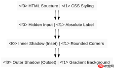
构建拟物化开关的第一步是确立HTML结构,通常使用一个隐藏的和一个
<div class="switch-container">
  <input type="checkbox" id="toggle" class="switch-input"><label for="toggle" class="switch-label">
    <span class="switch-slider"></span>
  </label>
</div>

<style>
.switch-container {
  position: relative;
  display: inline-block;
  width: 60px;
  height: 34px;
}

.switch-input {
  opacity: 0;
  width: 0;
  height: 0;
}

.switch-label {
  position: absolute;
  cursor: pointer;
  top: 0;
  left: 0;
  right: 0;
  bottom: 0;
  background-color: #ccc;
  transition: .4s;
  border-radius: 34px;
  /* 拟物化:内阴影模拟凹陷 */
  box-shadow: inset 0 2px 5px rgba(0, 0, 0, 0.3);
}

.switch-slider {
  position: absolute;
  top: 3px;
  left: 3px;
  width: 28px;
  height: 28px;
  background: linear-gradient(to bottom, #fff 0%, #f0f0f0 100%);
  transition: .4s;
  border-radius: 50%;
  /* 拟物化:外阴影模拟凸起 */
  box-shadow: 0 2px 5px rgba(0, 0, 0, 0.3),
              inset 0 1px 1px rgba(255, 255, 255, 0.8);
}

.switch-input:checked + .switch-label {
  background-color: #4CAF50;
}

.switch-input:checked + .switch-label .switch-slider {
  transform: translateX(26px);
}
</style>
上述代码定义了一个基础的拟物开关。轨道通过`box-shadow: inset`产生内部阴影,使其看起来像是一个凹槽。滑块使用线性渐变背景模拟球体的高光效果,并通过`box-shadow`增加外部投影,使其看起来悬浮于轨道之上。当复选框被选中时,滑块通过`transform: translateX`向右移动,同时轨道背景色变为绿色。
如何优化滑动过程中的动画与交互反馈
为了让开关手感更佳,需要调整`transition`的缓动函数,并增加点击时的微小缩放效果。可以使用`cubic-bezier`来模拟物理弹簧的阻尼感,而不是线性的匀速运动。此外,在`:active`状态下,可以稍微缩小滑块或加深阴影,提供按压的视觉反馈。


<style>
/* 继承上文基础样式 */

.switch-label {
  /* 使用贝塞尔曲线模拟自然阻尼 */
  transition: background-color 0.4s cubic-bezier(0.4, 0.0, 0.2, 1);
}

.switch-slider {
  /* 滑块移动也使用相同的缓动 */
  transition: transform 0.4s cubic-bezier(0.4, 0.0, 0.2, 1);
}

/* 按下时的反馈 */
.switch-label:active .switch-slider {
  width: 34px; /* 稍微拉长 */
  left: 0;     /* 重置位置以配合拉伸 */
  /* 保持当前位置的逻辑需更复杂JS或伪类技巧,此处简化为视觉压缩 */
  box-shadow: 0 1px 2px rgba(0, 0, 0, 0.3); /* 阴影变浅,模拟贴近表面 */
}

/* 更精细的光影调整 */
.switch-input:checked + .switch-label .switch-slider {
  background: linear-gradient(to bottom, #e0ffe0 0%, #b0ffb0 100%);
  box-shadow: 0 2px 5px rgba(0, 0, 0, 0.3),
              inset 0 1px 1px rgba(255, 255, 255, 0.9);
}
</style>
通过引入`cubic-bezier(0.4, 0.0, 0.2, 1)`,滑块的启动和停止更加柔和,符合物理直觉。在`:active`状态下,虽然纯CSS难以完美追踪动态位置的拉伸,但可以通过固定宽度的变化或阴影的深浅来暗示“用力”的感觉。这里主要强调了过渡曲线的选择对拟物手感的关键影响,以及光影细节在区分开启与关闭状态时的微妙作用。
基于滑块初始位置偏移量的具体计算问题
在示例程序中,滑块的初始`left`值为3px,宽度为28px,轨道总宽60px。当滑块移动到右侧时,其`transform: translateX(26px)`。这个26px的偏移量是如何确定的?它确保了滑块在开启状态下,右侧边缘距离轨道右侧边缘也是3px,从而保持左右间距对称。计算公式为:轨道宽度(60) - 滑块宽度(28) - 左侧边距(3) - 右侧期望边距(3) = 26px。若修改了滑块宽度或边距,必须重新计算此值以保持视觉平衡。
前端入门到VUE实战笔记:立即使用
在学习笔记中,你将探索 前端 的入门与实战技巧!