



通过纯css实现移动端仿原生tabbar,核心在于利用 position: fixed 将导航栏固定在视口底部,并使用 flex 布局均分空间。结合 border-top 模拟分割线,以及 active 状态下的颜色切换和图标位移,即可在不依赖javascript的情况下完成基础交互与视觉还原。
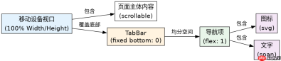
如何固定底部并均分导航项?
使用 fixed 定位配合 bottom: 0 确保导航栏始终贴底。内部容器使用 flex 布局,设置 justify-content: space-around 或 space-evenly 使每个Tab项等宽分布。每个Tab项包含图标和文字,通过 flex-col 垂直排列。
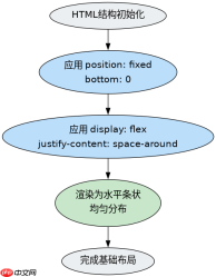
<div class="fixed bottom-0 left-0 right-0 bg-white border-t border-gray-200 h-16 flex items-center justify-around z-50">
  <a href="#home" class="flex flex-col items-center text-blue-600">
    <svg class="w-6 h-6" fill="currentColor" viewbox="0 0 20 20"><path d="M10.707 2.293a1 1 0 00-1.414 0l-7 7a1 1 0 001.414 1.414L4 10.414V17a1 1 0 001 1h2a1 1 0 001-1v-2a1 1 0 011-1h2a1 1 0 011 1v2a1 1 0 001 1h2a1 1 0 001-1v-6.586l.293.293a1 1 0 001.414-1.414l-7-7z"></path></svg><span class="text-xs mt-1">首页</span>
  </a>
  <a href="#search" class="flex flex-col items-center text-gray-500 hover:text-blue-600">
    <svg class="w-6 h-6" fill="currentColor" viewbox="0 0 20 20"><path fill-rule="evenodd" d="M8 4a4 4 0 100 8 4 4 0 000-8zM2 8a6 6 0 1110.89 3.476l4.817 4.817a1 1 0 01-1.414 1.414l-4.816-4.816A6 6 0 012 8z" clip-rule="evenodd"></path></svg><span class="text-xs mt-1">搜索</span>
  </a>
  <a href="#profile" class="flex flex-col items-center text-gray-500 hover:text-blue-600">
    <svg class="w-6 h-6" fill="currentColor" viewbox="0 0 20 20"><path d="M10 9a3 3 0 100-6 3 3 0 000 6zm-7 9a7 7 0 1114 0H3z"></path></svg><span class="text-xs mt-1">我的</span>
  </a>
</div>
如何通过CSS实现选中态高亮?
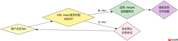
利用 :target 伪类或 :checked 配合隐藏复选框实现纯CSS状态切换。这里演示使用 :target 方案:当URL哈希匹配对应ID时,激活该Tab的样式。通过 #tab-home:target ~ .nav-container #home-link 这样的选择器链来改变颜色和图标状态。
<!-- 隐藏的目标元素 -->
<a id="tab-home" style="display:none"></a>
<a id="tab-search" style="display:none"></a>
<a id="tab-profile" style="display:none"></a>

<div class="fixed bottom-0 left-0 right-0 bg-white border-t border-gray-200 h-16 flex items-center justify-around z-50 nav-container">
  <a id="home-link" href="#tab-home" class="flex flex-col items-center text-gray-500">
    <svg class="w-6 h-6 icon" fill="currentColor" viewbox="0 0 20 20"><path d="M10.707 2.293a1 1 0 00-1.414 0l-7 7a1 1 0 001.414 1.414L4 10.414V17a1 1 0 001 1h2a1 1 0 001-1v-2a1 1 0 011-1h2a1 1 0 011 1v2a1 1 0 001 1h2a1 1 0 001-1v-6.586l.293.293a1 1 0 001.414-1.414l-7-7z"></path></svg><span class="text-xs mt-1">首页</span>
  </a>
  <a id="search-link" href="#tab-search" class="flex flex-col items-center text-gray-500">
    <svg class="w-6 h-6 icon" fill="currentColor" viewbox="0 0 20 20"><path fill-rule="evenodd" d="M8 4a4 4 0 100 8 4 4 0 000-8zM2 8a6 6 0 1110.89 3.476l4.817 4.817a1 1 0 01-1.414 1.414l-4.816-4.816A6 6 0 012 8z" clip-rule="evenodd"></path></svg><span class="text-xs mt-1">搜索</span>
  </a>
  <a id="profile-link" href="#tab-profile" class="flex flex-col items-center text-gray-500">
    <svg class="w-6 h-6 icon" fill="currentColor" viewbox="0 0 20 20"><path d="M10 9a3 3 0 100-6 3 3 0 000 6zm-7 9a7 7 0 1114 0H3z"></path></svg><span class="text-xs mt-1">我的</span>
  </a>
</div>

<style>
/* 默认非选中态 */
.nav-container a { color: #6B7280; }
.nav-container svg { fill: #6B7280; }

/* 选中态:当目标ID被激活时,找到对应的链接并应用样式 */
#tab-home:target ~ .nav-container #home-link,
#tab-search:target ~ .nav-container #search-link,
#tab-profile:target ~ .nav-container #profile-link {
  color: #2563EB;
}
#tab-home:target ~ .nav-container #home-link svg,
#tab-search:target ~ .nav-container #search-link svg,
#tab-profile:target ~ .nav-container #profile-link svg {
  fill: #2563EB;
}
</style>
当页面内容高度不足时TabBar会怎样?
如果页面内容高度小于视口高度,position: fixed 的TabBar依然会固定在屏幕底部,不会随内容滚动而消失。这与原生App行为一致。若希望内容少时TabBar不遮挡或保持自然流式布局,需添加最小高度约束或使用 min-h-screen 确保主体至少占满一屏,此时TabBar仍固定在底部,但视觉上更协调。
前端入门到VUE实战笔记:立即使用
在学习笔记中,你将探索 前端 的入门与实战技巧!