


In Excel, using the timeline filter can display data by time period more efficiently, which is more convenient than using the filter button. The Timeline is a dynamic filtering option that allows you to quickly display data for a single date, month, quarter, or year.
Step 1: Convert data to pivot table
First, convert the original Excel data into a pivot table. Select any cell in the data table (formatted or not) and click PivotTable on the Insert tab of the ribbon.


Related: How to Create Pivot Tables in Microsoft Excel
Don't be intimidated by the pivot table! We will teach you basic skills that you can master in minutes.
In the dialog box, make sure the entire data range (including the title) is selected, and then select New Worksheet or Existing Worksheet as needed. I'm more inclined to create pivot tables in new worksheets, which makes it better to use its tools and features. After the selection is complete, click "OK".

In the Pivot Table Fields pane, select the fields you want the Pivot Table to display. In my case, I want to see the month and total sales, so I checked these two fields.

Excel automatically places the Month field in the Row box and the Total Sales field in the Value box.

In the above figure, Excel also adds year and quarter to the Row box of the PivotTable. This means that my pivot table has been compressed to the maximum unit of time (in this case, year), and I can click on the "" and "-" symbols to expand and shrink the pivot table to show and hide the data for the quarter and month.

However, since I want the Pivot Table to always display monthly data in full, I will click the down arrow next to each other in the Pivot Table Fields pane and then click Remove Field, leaving only the original Month field in the Row box. Removing these fields helps the timeline work more efficiently and can be re-added directly through the timeline once it is ready.

Now my pivot table shows each month and the corresponding total sales.

Step 2: Insert the timeline filter
The next step is to add a timeline associated with this data. Select any cell in the Pivot Table, open the Insert tab on the ribbon, and click Timeline.

In the dialog box that appears, select Month (or any time period in the table), and click OK.

Now adjust the position and size of the timeline in the spreadsheet so that it is neatly located near the Pivot Table. In my case, I inserted some extra rows above the table and moved the timeline to the top of the worksheet.

Step 3: Set the format of the timeline filter
In addition to adjusting the size and position of the timeline, you can also format it to make it more beautiful. After selecting the timeline, Excel adds the Timeline tab to the ribbon. There, you can select the labels to display by selecting and unchecking the options in the Show group, or selecting a different design in the Timeline Style group.

Although the preset timeline style cannot be reset, the style can be copied and formatted. To do this, right-click the selected style and click Copy.

Then, in the Modify Timeline Style dialog box, rename the new style in the Name field, and then click Format.

Now browse the Fonts, Borders, and Fill tabs to apply your own design to the timeline, click OK twice when you are done to close both dialogs and save the new style.

Finally, select the timeline and click on the new timeline style you just created to apply its formatting.
Going a step further: Add Pivot Chart
The last step to getting the most out of the timeline is to add a pivot chart that will be updated based on the time you selected in the timeline. Select any cell in the Pivot Table and click Pivot Chart on the Insert tab of the ribbon.

Now, in the Insert Chart dialog box, select the Chart Type in the menu on the left and the Chart in the selector area on the right. In my case, I chose a simple clustered column chart. Then, click OK.

Related: 10 Most Used Excel Charts and What to Do
Choose the best way to visualize your data.

Resize the chart position and size, double-click the chart title to change the name, and then click the ' ' button to select the label you want to display.

Related: How to Format Charts in Excel
Excel provides (too many) tools to make your charts more beautiful.

Now, select a time period on the timeline and view the Pivot Table and Pivot Chart to display the relevant data.
Another way to quickly filter data in an Excel table is to add an Excel Data Slicer, which is a series of buttons representing different categories or values in the data. The added benefit of using slicers is that they don't require you to convert your data into pivot tables - they work as well as regular Excel tables.
The above is the detailed content of How to Create a Timeline Filter in Excel. For more information, please follow other related articles on the PHP Chinese website!

 Excel CONCATENATE function to combine strings, cells, columnsApr 30, 2025 am 10:23 AM
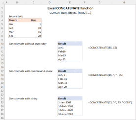
This article explores various methods for combining text strings, numbers, and dates in Excel using the CONCATENATE function and the "&" operator. We'll cover formulas for joining individual cells, columns, and ranges, offering solutio
 Merge and combine cells in Excel without losing dataApr 30, 2025 am 09:43 AM
This tutorial explores various methods for efficiently merging cells in Excel, focusing on techniques to retain data when combining cells in Excel 365, 2021, 2019, 2016, 2013, 2010, and earlier versions. Often, Excel users need to consolidate two or
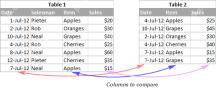 Excel: Compare two columns for matches and differencesApr 30, 2025 am 09:22 AM
This tutorial explores various methods for comparing two or more columns in Excel to identify matches and differences. We'll cover row-by-row comparisons, comparing multiple columns for row matches, finding matches and differences across lists, high
 Rounding in Excel: ROUND, ROUNDUP, ROUNDDOWN, FLOOR, CEILING functionsApr 30, 2025 am 09:18 AM
This tutorial explores Excel's rounding functions: ROUND, ROUNDUP, ROUNDDOWN, FLOOR, CEILING, MROUND, and others. It demonstrates how to round decimal numbers to integers or a specific number of decimal places, extract fractional parts, round to the
 Consolidate in Excel: Merge multiple sheets into oneApr 29, 2025 am 10:04 AM
This tutorial explores various methods for combining Excel sheets, catering to different needs: consolidating data, merging sheets via data copying, or merging spreadsheets based on key columns. Many Excel users face the challenge of merging multipl
 Calculate moving average in Excel: formulas and chartsApr 29, 2025 am 09:47 AM
This tutorial shows you how to quickly calculate simple moving averages in Excel, using functions to determine moving averages over the last N days, weeks, months, or years, and how to add a moving average trendline to your charts. Previous articles
 How to calculate average in Excel: formula examplesApr 29, 2025 am 09:38 AM
This tutorial demonstrates various methods for calculating averages in Excel, including formula-based and formula-free approaches, with options for rounding results. Microsoft Excel offers several functions for averaging numerical data, and this gui
 How to calculate weighted average in Excel (SUM and SUMPRODUCT formulas)Apr 29, 2025 am 09:32 AM
This tutorial shows you two simple ways to calculate weighted averages in Excel: using the SUM or SUMPRODUCT function. Previous articles covered basic Excel averaging functions. But what if some values are more important than others, impacting the f


Hot AI Tools

Undresser.AI Undress
AI-powered app for creating realistic nude photos

AI Clothes Remover
Online AI tool for removing clothes from photos.

Undress AI Tool
Undress images for free

Clothoff.io
AI clothes remover

Video Face Swap
Swap faces in any video effortlessly with our completely free AI face swap tool!

Hot Article
Hot Tools

SublimeText3 Linux new version
SublimeText3 Linux latest version

WebStorm Mac version
Useful JavaScript development tools

Dreamweaver Mac version
Visual web development tools

SublimeText3 English version
Recommended: Win version, supports code prompts!

Zend Studio 13.0.1
Powerful PHP integrated development environment

