


Excel Font Selection Guide: The Keys to Clear and Easy-to-Read Data Tables
Choose the right Excel font to determine whether your spreadsheet is clear and easy to read or difficult to recognize. After all, if others can’t read data, then no matter how beautiful a spreadsheet is, it doesn’t make sense! This article will explore several key factors in choosing Excel fonts, whether it is chart labels or cell content.
Microsoft 365 subscription users can use more Excel fonts, but this article is for all Excel versions and levels of users.
Distinguish between letters and numbers
The most important thing is to avoid misreading the data, especially paying attention to the confusion between letters and numbers. More specifically, it is necessary to distinguish between the letter "O" and the number "0", as well as the uppercase "I", lowercase "l" and the number "1".
Distinguish between "O" and "0"
The main difference between "O" and "0" is usually in the character width—the letter "O" is usually wider than the number "0". However, some fonts are not so clear.

In the above picture, the letter "O" of the Franklin Gothic Book is only slightly wider than the number "0", while the number "0" of Georgia looks like the lowercase letter "o". This can cause problems in the case of combinations of numbers and letters such as code or serial numbers.
On the other hand, fonts such as Aptos, Arial, Baskerville Old Face, Garamond, Rockwell, Segoe UI and Times New Roman are easiest to distinguish letters from numbers, mainly because their number "0" is very narrow. Terminal fonts go a step further, adding strikethroughs to the number "0", further distinguishing between the two.
Distinguish between "I", "l" and "1"
Distinguishing these three characters mainly depends on whether they have serifs (short strokes connecting the ends of numbers or letter strokes), and the thickness of the serifs.

The above image shows a lot of problems. Note that the lowercase "l" in Courier New is surprisingly similar to the number "1" and the uppercase "I" of Arial is exactly the same as the lowercase "l". In fact, a closer look at the list and you will see that most fonts have awkward crossover between these three characters.
Ironically, the same problem exists in the fonts (Roboto) used in this article, but since numbers and letters are in the title or sentence, it is less important to distinguish them. However, it is crucial to distinguish characters when they appear independently in separate cells or combine them with other numbers or letters into less logical strings.
The fonts that are best suited to distinguish these three characters are Aptos, Tahoma, Verdana and (unfortunately) Comic Sans MS. You can also think that Cambria can distinguish these three characters more than most fonts.
Avoid narrow or tight fonts
Generally speaking, narrow or compact fonts are difficult to read. The Accessibility Checker states that fonts with "enough spacing between letters and characters" are most accessible. The service also notes that "narrow" or "fine" fonts are considered to be less accessible.
Many standard fonts in Excel, including Aptos, Arial, Calibri, Franklin Gothic Book, Georgia, Rockwell, Segoe UI and Verdana, have narrow or thin variants. If you want your data to be easier to read for everyone, it is best to avoid these variants. The same is true for fonts with standard forms such as Agency FB, Niagara Engraved, Onyx, and The Hand.

Font affects line height
Did you notice that in the first two screenshots of the above picture, lines 7 and lines 13 are higher than the other lines? This is because some fonts are larger than others, even if the font size settings are the same. As Microsoft explains, "The difference in font metrics is a function of how Microsoft Windows reports font information to Microsoft Excel."
In addition to Comic Sans MS and Segoe UI in the above picture, Bauhaus 93, Blackadder ITC, Bradley Hand ITC, Dubai, Yu Gothic, etc. will affect your Excel row height, so you are looking for an Excel spreadsheet to make your Excel This needs to be considered when it comes to a consistent and tidy approach. The following table shows the various fonts and their row heights at 16 pounds. I put Aptos (the default font for Microsoft as of this writing) on top and it doesn't affect line height.

Avoid using art style numbers
In short, Excel is not a place to try creative fonts. Instead, as I mentioned repeatedly before, your goal in Excel should be to make your data as easy to read as possible. For this purpose, it is not recommended to use fonts that look like handwritten fonts, with fancy strokes and serifs, or otherwise art-style. Note that the fonts in the table below will prevent even the most keenest data analysts from reading data efficiently and accurately.

Even some commonly used fonts, such as Georgia, have some artistic features that are not suitable for serious numerical calculations. Note the inconsistency between the upper and lower edges of the numbers.

On the other hand, the fonts in the table below usually show the numbers more clearly and are more suitable for friendly spreadsheets.

So, what fonts should you use in Excel?
I have discussed ensuring clarity between numbers and letters, avoiding fonts with poor accessibility, considering how different fonts affect the layout of the spreadsheet and the applicability of artistic fonts – all of which should help You decide which font you will use in Excel.
In my opinion, it seems appropriate for Microsoft to use Aptos as the default font for Excel spreadsheets (as of this writing). It has a clear difference between numbers and letters, and other fonts can be confused; it is neither too narrow nor too wide; it does not adversely affect the behavior of my spreadsheet; and it is easy to read.
However, no matter my point of view, here are some final points to consider:
- Keep consistency: Whether typing in a Word document, designing an impressive PowerPoint presentation, or making complex spreadsheets, try to stick to one font.
- Context is always the key: Are spreadsheets for your own viewing only? Then, as long as you are satisfied, you can choose any font you want! But if you are sharing your spreadsheet with your colleagues, then choose a clear, easy-to-access professional font.
- What does your spreadsheet contain? If you have more text on the spreadsheet, the font you choose has less impact. On the other hand, if your spreadsheet contains a large number of numbers, the font you choose may significantly affect people's ability to get data.
Even if Microsoft programs come with a long list of fonts, you may want to download and add more fonts to that list for a more comprehensive selection.
The above is the detailed content of Which Fonts Should You Use in Excel?. For more information, please follow other related articles on the PHP Chinese website!

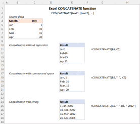 Excel CONCATENATE function to combine strings, cells, columnsApr 30, 2025 am 10:23 AM
This article explores various methods for combining text strings, numbers, and dates in Excel using the CONCATENATE function and the "&" operator. We'll cover formulas for joining individual cells, columns, and ranges, offering solutio
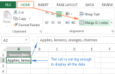 Merge and combine cells in Excel without losing dataApr 30, 2025 am 09:43 AM
This tutorial explores various methods for efficiently merging cells in Excel, focusing on techniques to retain data when combining cells in Excel 365, 2021, 2019, 2016, 2013, 2010, and earlier versions. Often, Excel users need to consolidate two or
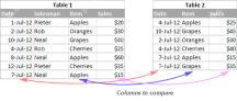 Excel: Compare two columns for matches and differencesApr 30, 2025 am 09:22 AM
This tutorial explores various methods for comparing two or more columns in Excel to identify matches and differences. We'll cover row-by-row comparisons, comparing multiple columns for row matches, finding matches and differences across lists, high
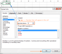 Rounding in Excel: ROUND, ROUNDUP, ROUNDDOWN, FLOOR, CEILING functionsApr 30, 2025 am 09:18 AM
This tutorial explores Excel's rounding functions: ROUND, ROUNDUP, ROUNDDOWN, FLOOR, CEILING, MROUND, and others. It demonstrates how to round decimal numbers to integers or a specific number of decimal places, extract fractional parts, round to the
 Consolidate in Excel: Merge multiple sheets into oneApr 29, 2025 am 10:04 AM
This tutorial explores various methods for combining Excel sheets, catering to different needs: consolidating data, merging sheets via data copying, or merging spreadsheets based on key columns. Many Excel users face the challenge of merging multipl
 Calculate moving average in Excel: formulas and chartsApr 29, 2025 am 09:47 AM
This tutorial shows you how to quickly calculate simple moving averages in Excel, using functions to determine moving averages over the last N days, weeks, months, or years, and how to add a moving average trendline to your charts. Previous articles
 How to calculate average in Excel: formula examplesApr 29, 2025 am 09:38 AM
This tutorial demonstrates various methods for calculating averages in Excel, including formula-based and formula-free approaches, with options for rounding results. Microsoft Excel offers several functions for averaging numerical data, and this gui
 How to calculate weighted average in Excel (SUM and SUMPRODUCT formulas)Apr 29, 2025 am 09:32 AM
This tutorial shows you two simple ways to calculate weighted averages in Excel: using the SUM or SUMPRODUCT function. Previous articles covered basic Excel averaging functions. But what if some values are more important than others, impacting the f


Hot AI Tools

Undresser.AI Undress
AI-powered app for creating realistic nude photos

AI Clothes Remover
Online AI tool for removing clothes from photos.

Undress AI Tool
Undress images for free

Clothoff.io
AI clothes remover

Video Face Swap
Swap faces in any video effortlessly with our completely free AI face swap tool!

Hot Article
Hot Tools

SublimeText3 Chinese version
Chinese version, very easy to use

SAP NetWeaver Server Adapter for Eclipse
Integrate Eclipse with SAP NetWeaver application server.

SublimeText3 English version
Recommended: Win version, supports code prompts!

mPDF
mPDF is a PHP library that can generate PDF files from UTF-8 encoded HTML. The original author, Ian Back, wrote mPDF to output PDF files "on the fly" from his website and handle different languages. It is slower than original scripts like HTML2FPDF and produces larger files when using Unicode fonts, but supports CSS styles etc. and has a lot of enhancements. Supports almost all languages, including RTL (Arabic and Hebrew) and CJK (Chinese, Japanese and Korean). Supports nested block-level elements (such as P, DIV),

SecLists
SecLists is the ultimate security tester's companion. It is a collection of various types of lists that are frequently used during security assessments, all in one place. SecLists helps make security testing more efficient and productive by conveniently providing all the lists a security tester might need. List types include usernames, passwords, URLs, fuzzing payloads, sensitive data patterns, web shells, and more. The tester can simply pull this repository onto a new test machine and he will have access to every type of list he needs.

