
Heim >Web-Frontend >H5-Tutorial >Detaillierte HTML5-Übungserklärung zur Verwendung von CSS3 zum Anreichern von Bildstilen (1)
Detaillierte HTML5-Übungserklärung zur Verwendung von CSS3 zum Anreichern von Bildstilen (1)

- 黄舟Original
- 2017-03-23 15:55:331890Durchsuche
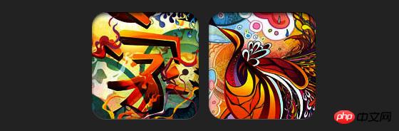
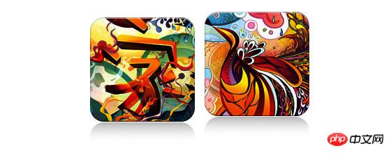
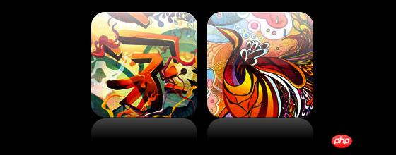
Wenn in CSS3 Box-Shadow und Border-Radius direkt für Bilder verwendet werden, kann der Browser diese nicht gut rendern. Wenn Sie das Bild jedoch als Hintergrundbild verwenden, kann der hinzugefügte Stilbrowser es gut rendern. Ich werde vorstellen, wie man Kastenschatten, Randradius und Übergang verwendet, um verschiedene Bildstileffekte zu erzeugen.
Problem
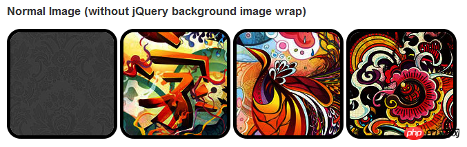
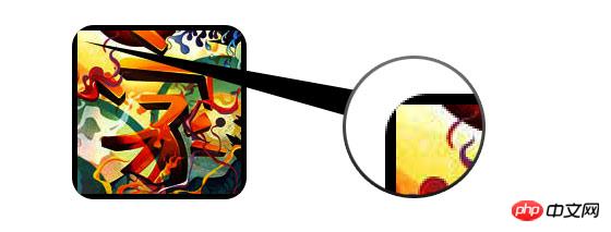
Wenn wir uns die Demo ansehen, können wir feststellen, dass wir den Rahmenradius und den Inline-Boxschatten für die erste Bildreihe festlegen. Firefox rendert den Randradius des Bildes, jedoch nicht den Inline-Boxschatten. Beide Effekte werden in Chrome und Safari nicht gerendert.
.normal img {
border: solid 5px #000;
-webkit-border-radius: 20px;
-moz-border-radius: 20px;  border-radius: 20px;
-webkit-box-shadow: inset 0 1px 5px rgba(0,0,0,.5);
-moz-box-shadow: inset 0 1px 5px rgba(0,0,0,.5);
box-shadow: inset 0 1px 5px rgba(0,0,0,.5);
}
Firefox-Effekt:
Chrom/Safari
Problemumgehung
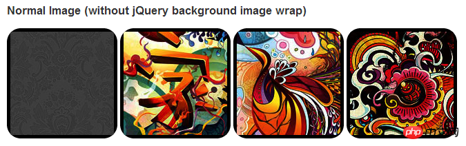
Damit der Randradius und der eingebettete Boxschatten ordnungsgemäß funktionieren, müssen wir das Bild in ein Hintergrundbild konvertieren.
Dynamische Methode
Um diese Arbeit dynamisch abzuschließen, müssen wir für jede Methode jquery verwenden Bild Fügen Sie dem Wrapper ein Hintergrundbild hinzu. Der folgende js-Code fügt jedem Bild ein Span-Paket hinzu. Der Hintergrundbildpfad von Span ist der Pfad des Bildes.
Der Code ist relativ einfach, daher glaube ich nicht, dass es nötig ist, ihn zu erklären. Wenn Sie sich nicht sicher sind, können Sie die JQuery-API direkt überprüfen.
<script type="text/javascript" src="http://ajax.googleapis.com/ajax/libs/jquery/1.5/jquery.min.js"></script>
<script type="text/javascript">
$(document).ready(function(){
$("img").load(function() {
$(this).wrap(function(){
return '<span class="image-wrap ' + $(this).attr('class') + '" style="position:relative;
display:inline-block; background:url(' + $(this).attr('src') + ') no-repeat center center;
width: ' + $(this).width() + 'px; height: ' + $(this).height() + 'px;" />';
});
$(this).css("opacity","0");
});
});</script>Ausgabe
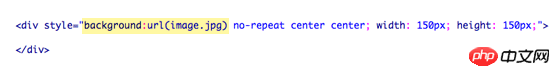
Der obige Code gibt die folgenden Ergebnisse aus:
<span class="image-wrap " style="position:relative;
display:inline-block; background:url(image.jpg) no-repeat center center;
width: 150px; height: 150px;">
<img src="image.jpg" style="opacity: 0;">
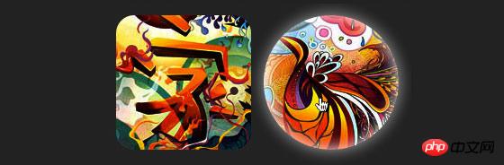
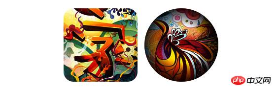
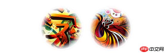
</span>Kreisförmiges Bild
Fügen Sie hinzu, dass wir den Randradius verwenden erreichen Der Effekt eines kreisförmigen Bildes ist wie folgt:
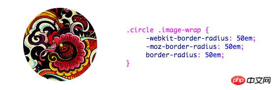
CSS:
.circle .image-wrap {
    -webkit-border-radius: 50em;
    -moz-border-radius: 50em;
    border-radius: 50em;
}
Kartenstil
Das Folgende ist eine Karte Stilbild, Es werden mehrere Inline-Box-Schatten verwendet.
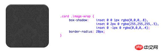
CSS:
.card .image-wrap {
    -webkit-box-shadow: inset 0 0 1px rgba(0,0,0,.8), inset 0 2px 0 rgba(255,255,255,.5), inset 0 -1px 0 rgba(0,0,0,.4);
    -moz-box-shadow: inset 0 0 1px rgba(0,0,0,.8), inset 0 2px 0 rgba(255,255,255,.5), inset 0 -1px 0 rgba(0,0,0,.4);
    box-shadow: inset 0 0 1px rgba(0,0,0,.8), inset 0 2px 0 rgba(255,255,255,.5), inset 0 -1px 0 rgba(0,0,0,.4);

    -webkit-border-radius: 20px;
    -moz-border-radius: 20px;
    border-radius: 20px;
}
Reliefstil
Das Folgende ist der Reliefeffekt.
CSS:
.embossed .image-wrap {
    -webkit-box-shadow: inset 0 0 2px rgba(0,0,0,.8),
    inset 0 2px 0 rgba(255,255,255,.5),
    inset 0 -7px 0 rgba(0,0,0,.6),
    inset 0 -9px 0 rgba(255,255,255,.3);
    -moz-box-shadow: inset 0 0 2px rgba(0,0,0,.8),
    inset 0 2px 0 rgba(255,255,255,.5), inset 0 -7px 0 rgba(0,0,0,.6),
    inset 0 -9px 0 rgba(255,255,255,.3);
    box-shadow: inset 0 0 2px rgba(0,0,0,.8),
    inset 0 2px 0 rgba(255,255,255,.5),
    inset 0 -7px 0 rgba(0,0,0,.6), inset 0 -9px 0 rgba(255,255,255,.3);

    -webkit-border-radius: 20px;
    -moz-border-radius: 20px;
    border-radius: 20px;
}
Flexibler Reliefstil
Im Vergleich zum Reliefstil fügt der neue Stil ein 1-Pixel-Unschärfeattribut hinzu.
CSS:
.soft-embossed .image-wrap {
    -webkit-box-shadow: inset 0 0 4px rgba(0,0,0,1),
    inset 0 2px 1px rgba(255,255,255,.5),
    inset 0 -9px 2px rgba(0,0,0,.6),
    inset 0 -12px 2px rgba(255,255,255,.3);
    -moz-box-shadow: inset 0 0 4px rgba(0,0,0,1),
    inset 0 2px 1px rgba(255,255,255,.5),
    inset 0 -9px 2px rgba(0,0,0,.6),
    inset 0 -12px 2px rgba(255,255,255,.3);
    box-shadow: inset 0 0 4px rgba(0,0,0,1),
    inset 0 2px 1px rgba(255,255,255,.5),
    inset 0 -9px 2px rgba(0,0,0,.6),
    inset 0 -12px 2px rgba(255,255,255,.3);

    -webkit-border-radius: 20px;
    -moz-border-radius: 20px;
    border-radius: 20px;
}
Ausschnittstil
Verwenden Sie eingebetteten Box-Shadow, um den Ausschnitteffekt zu erzielen.
CSS:
.cut-out .image-wrap {
-webkit-box-shadow: 0 1px 0 rgba(255,255,255,.2),
inset 0 4px 5px rgba(0,0,0,.6),
inset 0 1px 0 rgba(0,0,0,.6);
-moz-box-shadow: 0 1px 0 rgba(255,255,255,.2),
inset 0 4px 5px rgba(0,0,0,.6),
inset 0 1px 0 rgba(0,0,0,.6);
box-shadow: 0 1px 0 rgba(255,255,255,.2),
inset 0 4px 5px rgba(0,0,0,.6),
inset 0 1px 0 rgba(0,0,0,.6);
-webkit-border-radius: 20px;
-moz-border-radius: 20px;
border-radius: 20px;
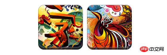
}Transformation und Glanz
In diesem Beispiel fügen wir das Übergangsattribut zum Bildpaket hinzu und das Wenn die Maus darüber gleitet, wechselt er von „Abgerundete Ecken“ zu „Abgerundete Ecken“. Dann verwenden wir mehrere Box-Shadows, um den Glow-Effekt zu erzielen.
css:
.morphing-glowing .image-wrap {
    -webkit-transition: 1s;
    -moz-transition: 1s;
    transition: 1s;

    -webkit-border-radius: 20px;
    -moz-border-radius: 20px;
    border-radius: 20px;
}.morphing-glowing .image-wrap:hover {
    -webkit-box-shadow: 0 0 20px rgba(255,255,255,.6),
    inset 0 0 20px rgba(255,255,255,1);
    -moz-box-shadow: 0 0 20px rgba(255,255,255,.6),
    inset 0 0 20px rgba(255,255,255,1);
    box-shadow: 0 0 20px rgba(255,255,255,.6),
    inset 0 0 20px rgba(255,255,255,1);

    -webkit-border-radius: 60em;
    -moz-border-radius: 60em;
    border-radius: 60em;
}
Hervorhebungseffekt
Der Hervorhebungseffekt wird durch Hinzufügen der Pseudoklasse :after zum Element erreicht .
CSS:
.glossy .image-wrap {
    -webkit-box-shadow: inset 0 -1px 0 rgba(0,0,0,.5);
    -moz-box-shadow: inset 0 -1px 0 rgba(0,0,0,.5);
    box-shadow: inset 0 -1px 0 rgba(0,0,0,.5);

    -webkit-border-radius: 20px;
    -moz-border-radius: 20px;
    border-radius: 20px;
}.glossy .image-wrap:after {
    position: absolute;
    content: ' ';
    width: 100%;
    height: 50%;
    top: 0;
    left: 0;

    -webkit-border-radius: 20px;
    -moz-border-radius: 20px;
    border-radius: 20px;

    background: -moz-linear-gradient(top, rgba(255,255,255,0.7) 0%, rgba(255,255,255,.1) 100%);
    background: -webkit-gradient(linear, left top, left bottom, color-stop(0%,rgba(255,255,255,0.7)), color-stop(100%,rgba(255,255,255,.1)));
    background: linear-gradient(top, rgba(255,255,255,0.7) 0%,rgba(255,255,255,.1) 100%);
}
Reflexionseffekt
In diesem Beispiel verschieben wir den Hervorhebungseffekt nach unten, um die Reflexion zu erzielen Wirkung .
css:
.reflection .image-wrap:after {
    position: absolute;
    content: ' ';
    width: 100%;
    height: 30px;
    bottom: -31px;
    left: 0;

    -webkit-border-top-left-radius: 20px;
    -webkit-border-top-right-radius: 20px;
    -moz-border-radius-topleft: 20px;
    -moz-border-radius-topright: 20px;
    border-top-left-radius: 20px;
    border-top-right-radius: 20px;

    background: -moz-linear-gradient(top, rgba(0,0,0,.3) 0%, rgba(255,255,255,0) 100%);
    background: -webkit-gradient(linear, left top, left bottom, color-stop(0%,rgba(0,0,0,.3)),
    color-stop(100%,rgba(255,255,255,0)));
    background: linear-gradient(top, rgba(0,0,0,.3) 0%,rgba(255,255,255,0) 100%);
}.reflection .image-wrap:hover {
    position: relative;
    top: -8px;
}
Hervorhebung und Reflexion
In diesem Beispiel verwenden wir :before und :after, um die Hervorhebung und zu kombinieren Reflexionseffekte treten auf.
css:
.glossy-reflection .image-wrap {
    -webkit-box-shadow: inset 0 -1px 0 rgba(0,0,0,.5), inset 0 1px 0 rgba(255,255,255,.6);
    -moz-box-shadow: inset 0 -1px 0 rgba(0,0,0,.5), inset 0 1px 0 rgba(255,255,255,.6);
    box-shadow: inset 0 -1px 0 rgba(0,0,0,.5), inset 0 1px 0 rgba(255,255,255,.6);

    -webkit-transition: 1s;
    -moz-transition: 1s;
    transition: 1s;

    -webkit-border-radius: 20px;
    -moz-border-radius: 20px;
    border-radius: 20px;
}.glossy-reflection .image-wrap:before {
    position: absolute;
    content: ' ';
    width: 100%;
    height: 50%;
    top: 0;
    left: 0;

    -webkit-border-radius: 20px;
    -moz-border-radius: 20px;
    border-radius: 20px;

    background: -moz-linear-gradient(top, rgba(255,255,255,0.7) 0%, rgba(255,255,255,.1) 100%);
    background: -webkit-gradient(linear, left top, left bottom, color-stop(0%,rgba(255,255,255,0.7)), color-stop(100%,rgba(255,255,255,.1)));
    background: linear-gradient(top, rgba(255,255,255,0.7) 0%,rgba(255,255,255,.1) 100%);
}.glossy-reflection .image-wrap:after {
    position: absolute;
    content: ' ';
    width: 100%;
    height: 30px;
    bottom: -31px;
    left: 0;

    -webkit-border-top-left-radius: 20px;
    -webkit-border-top-right-radius: 20px;
    -moz-border-radius-topleft: 20px;
    -moz-border-radius-topright: 20px;
    border-top-left-radius: 20px;
    border-top-right-radius: 20px;

    background: -moz-linear-gradient(top, rgba(230,230,230,.3) 0%, rgba(230,230,230,0) 100%);
    background: -webkit-gradient(linear, left top, left bottom, color-stop(0%,rgba(230,230,230,.3)), color-stop(100%,rgba(230,230,230,0)));
    background: linear-gradient(top, rgba(230,230,230,.3) 0%,rgba(230,230,230,0) 100%);
}
Tape-Stil
In diesem Beispiel verwenden wir :after, um den Effekt von Tape zu erzielen.
css:
.tape .image-wrap {
    -webkit-box-shadow: inset 0 0 2px rgba(0,0,0,.7),
    inset 0 2px 0 rgba(255,255,255,.3), inset 0 -1px 0 rgba(0,0,0,.5), 0 1px 3px rgba(0,0,0,.4);
    -moz-box-shadow: inset 0 0 2px rgba(0,0,0,.7),
    inset 0 2px 0 rgba(255,255,255,.3),
    inset 0 -1px 0 rgba(0,0,0,.5), 0 1px 3px rgba(0,0,0,.4);
    box-shadow: inset 0 0 2px rgba(0,0,0,.7), inset 0 2px 0 rgba(255,255,255,.3),
    inset 0 -1px 0 rgba(0,0,0,.5), 0 1px 3px rgba(0,0,0,.4);
}.tape .image-wrap:after {
    position: absolute;
    content: ' ';
    width: 60px;
    height: 25px;
    top: -10px;
    left: 50%;
    margin-left: -30px;
    border: solid 1px rgba(137,130,48,.2);

    background: -moz-linear-gradient(top, rgba(254,243,127,.6) 0%, rgba(240,224,54,.6) 100%);
    background: -webkit-gradient(linear, left top, left bottom, color-stop(0%,rgba(254,243,127,.6)), color-stop(100%,rgba(240,224,54,.6)));
    background: linear-gradient(top, rgba(254,243,127,.6) 0%,rgba(240,224,54,.6) 100%);
    -webkit-box-shadow: inset 0 1px 0 rgba(255,255,255,.3), 0 1px 0 rgba(0,0,0,.2);
}
Transformation und Färbung
In diesem Beispiel verwenden wir :after auf dem Element, wenn die Maus gedrückt wird Erzielen Sie beim Durchgang den Effekt eines radialen Gradienten.
CSS:
.morphing-tinting .image-wrap {
    position: relative;

    -webkit-transition: 1s;
    -moz-transition: 1s;
    transition: 1s;

    -webkit-border-radius: 20px;
    -moz-border-radius: 20px;
    border-radius: 20px;
}.morphing-tinting .image-wrap:hover {
    -webkit-border-radius: 30em;
    -moz-border-radius: 30em;
    border-radius: 30em;
}.morphing-tinting .image-wrap:after {
    position: absolute;
    content: ' ';
    width: 100%;
    height: 100%;
    top: 0;
    left: 0;

    -webkit-transition: 1s;
    -moz-transition: 1s;
    transition: 1s;

    -webkit-border-radius: 30em;
    -moz-border-radius: 30em;
    border-radius: 30em;
}.morphing-tinting .image-wrap:hover:after  {
    background: -webkit-gradient(radial, 50% 50%, 40, 50% 50%, 80, from(rgba(0,0,0,0)), to(rgba(0,0,0,1)));
    background: -moz-radial-gradient(50% 50%, circle, rgba(0,0,0,0) 40px, rgba(0,0,0,1) 80px);
}
Federkantenkreis
Wir können auch einen radialen Farbverlauf verwenden, um eine Maske zu generieren. Erreichen Federeffekt.
css:
.feather .image-wrap {
    position: relative;

    -webkit-border-radius: 30em;
    -moz-border-radius: 30em;
    border-radius: 30em;
}.feather .image-wrap:after  {
    position: absolute;
    content: ' ';
    width: 100%;
    height: 100%;
    top: 0;
    left: 0;

    background: -webkit-gradient(radial, 50% 50%, 50, 50% 50%, 70, from(rgba(255,255,255,0)), to(rgba(255,255,255,1)));
    background: -moz-radial-gradient(50% 50%, circle, rgba(255,255,255,0) 50px, rgba(255,255,255,1) 70px);
}
浏览器兼容性
这种实现方式在大多数支持border-radius, box-shadow, :before and :after特性的浏览器中(例如Chrome, Firefox 和 Safari),都能很好的工作。在不支持新特性的浏览器中,只会显示原始图片。
创造你自己的实现
借助:before 和:after伪类能为图片创造很多种样式,你可以自己尝试创建出新的效果。
Das obige ist der detaillierte Inhalt vonDetaillierte HTML5-Übungserklärung zur Verwendung von CSS3 zum Anreichern von Bildstilen (1). Für weitere Informationen folgen Sie bitte anderen verwandten Artikeln auf der PHP chinesischen Website!
In Verbindung stehende Artikel
Mehr sehen- Das Vollbild-Bildlauf-Plug-in AlloyTouch erstellt in 30 Sekunden eine flüssige H5-Seite
- Tatsächlicher HTML5-Kampf und Analyse von Touch-Ereignissen (Touchstart, Touchmove und Touchend)
- Ausführliche Erläuterung der Beispiele für Bildzeichnungen in HTML5 Canvas 9
- Reguläre Ausdrücke und neue HTML5-Elemente
- So kombinieren Sie NodeJS und HTML5, um mehrere Dateien per Drag-and-Drop auf den Server hochzuladen