Bootstrap warning
This chapter will explain warnings (Alerts) and the classes provided by Bootstrap for warnings. Alerts provide users with a way to define message styles. They provide contextual feedback for typical user actions.
You can add an optional close button to the alert box. To create an inline cancelable alert box, use the Alerts jQuery plugin.
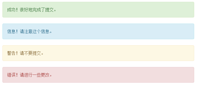
You can do this by creating a <div> and adding a .alert class and four context classes (i.e. .alert-success, .alert-info, .alert-warning, .alert-danger) to add a basic warning box. The following example demonstrates this:
Instance
<!DOCTYPE html>
<html>
<head>
   <title>Bootstrap 实例 - 警告(Alerts)</title>
   <link href="http://libs.baidu.com/bootstrap/3.0.3/css/bootstrap.min.css" rel="stylesheet">
<script src="http://libs.baidu.com/jquery/2.0.0/jquery.min.js"></script>
<script src="http://libs.baidu.com/bootstrap/3.0.3/js/bootstrap.min.js"></script>
</head>
<body>

<div class="alert alert-success">成功!很好地完成了提交。</div>
<div class="alert alert-info">信息!请注意这个信息。</div>
<div class="alert alert-warning">警告!请不要提交。</div>
<div class="alert alert-danger">错误!请进行一些更改。</div>


</body>
</html>
Run Instance»
Click the "Run Instance" button to view Online example
Cancelable warning (Dismissal Alerts)
The steps to create a cancelable warning (Dismissal Alert) are as follows:
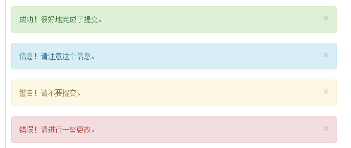
By creating a <div> and adding a .alert class and four context classes (i.e. .alert-success, .alert-info , .alert-warning, .alert-danger) to add a basic warning box.
Also add optional .alert-dismissable to the <div> class above.
Add a close button.
The following example demonstrates this:
Example
<!DOCTYPE html>
<html>
<head>
   <title>Bootstrap 实例 - 可取消的警告(Dismissal Alerts)</title>
   <link href="http://libs.baidu.com/bootstrap/3.0.3/css/bootstrap.min.css" rel="stylesheet">
<script src="http://libs.baidu.com/jquery/2.0.0/jquery.min.js"></script>
<script src="http://libs.baidu.com/bootstrap/3.0.3/js/bootstrap.min.js"></script>
</head>
<body>

<div class="alert alert-success alert-dismissable">
   <button type="button" class="close" data-dismiss="alert"
      aria-hidden="true">
      ×
   </button>
   成功!很好地完成了提交。
</div>
<div class="alert alert-info alert-dismissable">
   <button type="button" class="close" data-dismiss="alert"
      aria-hidden="true">
      ×
   </button>
   信息!请注意这个信息。
</div>
<div class="alert alert-warning alert-dismissable">
   <button type="button" class="close" data-dismiss="alert"
      aria-hidden="true">
      ×
   </button>
   警告!请不要提交。
</div>
<div class="alert alert-danger alert-dismissable">
   <button type="button" class="close" data-dismiss="alert"
      aria-hidden="true">
      ×
   </button>
   错误!请进行一些更改。
</div>


</body>
</html>
Running Example»
Click the "Run Instance" button to view the online instance
Please make sure to use the <button> element with the data-dismiss="alert" data attribute.
The results are as follows:
Links in Alerts
The steps to create links in Alerts are as follows :
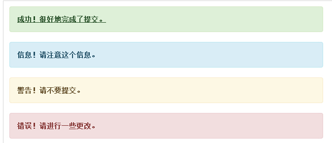
By creating a <div> and adding a .alert class and four context classes (i.e. .alert-success, .alert-info, .alert-warning, .alert-danger) to add a basic warning box.
Use the .alert-link entity class to quickly provide links with matching colors.
Example
<!DOCTYPE html>
<html>
<head>
   <title>Bootstrap 实例 - 警告(Alerts)中的链接</title>
   <link href="http://libs.baidu.com/bootstrap/3.0.3/css/bootstrap.min.css" rel="stylesheet">
<script src="http://libs.baidu.com/jquery/2.0.0/jquery.min.js"></script>
<script src="http://libs.baidu.com/bootstrap/3.0.3/js/bootstrap.min.js"></script>
</head>
<body>

<div class="alert alert-success">
   <a href="#" class="alert-link">成功!很好地完成了提交。</a>
</div>
<div class="alert alert-info">
   <a href="#" class="alert-link">信息!请注意这个信息。</a>
</div>
<div class="alert alert-warning">
   <a href="#" class="alert-link">警告!请不要提交。</a>
</div>
<div class="alert alert-danger">
   <a href="#" class="alert-link">错误!请进行一些更改。</a>
</div>


</body>
</html>
Run Instance»
Click the "Run Instance" button to view the online instance
The result is as follows: