flex必须知道的三个属性
页面布局
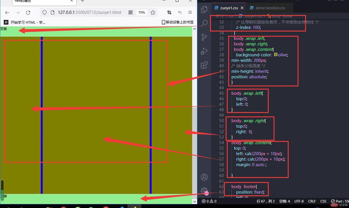
@import '../css/reset.css';/* 页眉页脚 *//* body header,body footer{ background-color: aqua; height: 50px;} */body header,body footer { height: 50px; background-color: lightgreen;}body .wrap { max-width: 1000px; min-height: 1500px; margin: 10px auto; background-color: blue; /* 相对定位 */ position: relative; top: 50px; } body header{ position: fixed; right: 0; left: 0; top: 0; /* 让导航栏固定在首页,不会受到主体挡住 */ z-index: 100; } body .wrap .left, body .wrap .right, body .wrap .content{ background-color: olive;min-width: 200px;/* 继承父级高度 */min-height: inherit;position: absolute; }body .wrap .left{ top:0; left: 0;}body .wrap .right{ top:0; right: 0;}body .wrap .content{ top: 0; left: calc(200px + 10px); right: calc(200px + 10px); margin: 0 auto ;}body footer{ position: fixed; left: 0; right: 0; bottom: 0;}
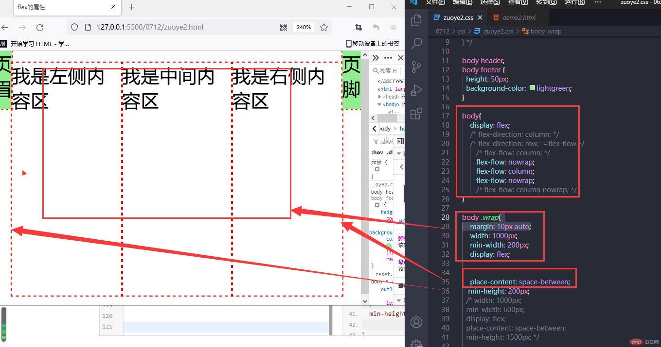
剩余空间的分配
@import '../css/reset.css';/* 页眉页脚 *//* body header,body footer{ background-color: aqua; height: 50px;} */body header,body footer { height: 50px; background-color: lightgreen;}body{ display: flex; /* flex-direction: column; */ /* flex-direction: row; =flex-flow */ /* flex-flow: column; */ flex-flow: nowrap; flex-flow: column; flex-flow: nowrap; /* flex-flow: column nowrap; */}body .wrap{ margin: 10px auto; width: 1000px; min-width: 200px; display: flex; place-content: space-between; min-height: 200px; /* width: 1000px; min-width: 600px; display: flex; place-content: space-between; min-height: 1500px; */}
项目间的主轴平均分配
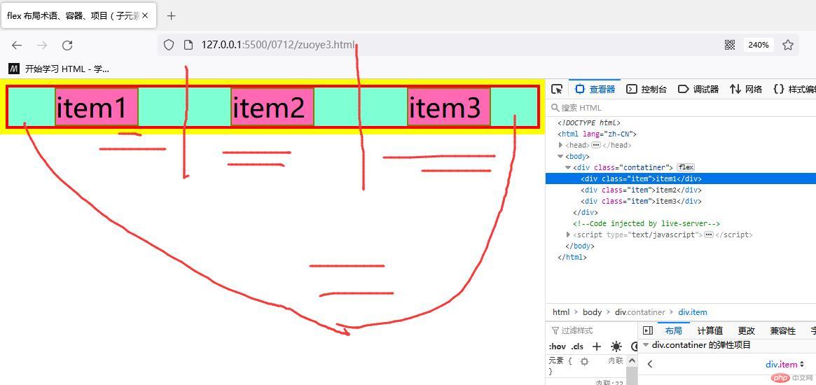
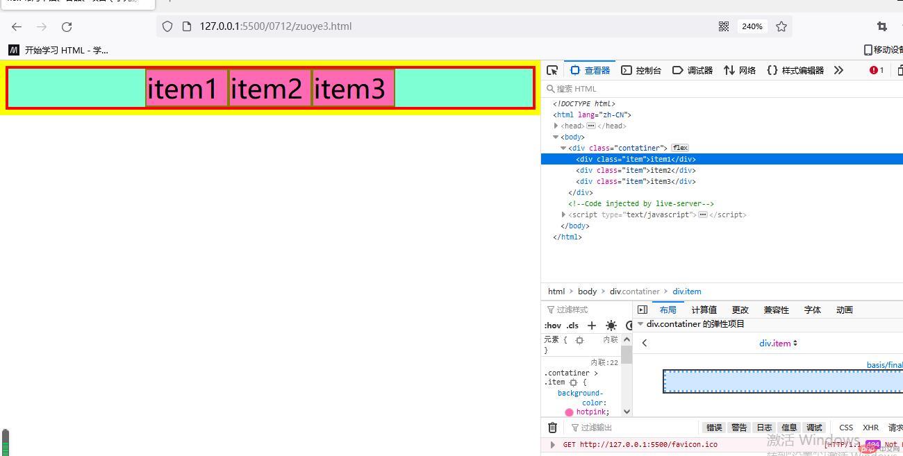
<!DOCTYPE html><html lang="zh-CN"><head> <meta charset="UTF-8"> <meta http-equiv="X-UA-Compatible" content="IE=edge"> <meta name="viewport" content="width=ww, initial-scale=1.0"> <title>flex 布局术语、容器、项目(子元素)</title><style>* { margin: 0; padding: 0; box-sizing: border-box; border: 2px solid yellow; }.contatiner{ /* flex 弹性盒子 从垂直排列改为水平排列主轴排列 block 块级盒子 inline 内联盒子 */ display: flex; background-color: aquamarine; border: 2px solid red ; }.contatiner > .item { background-color: hotpink; width: 50px; border: 1px solid olive;}.contatiner { /* 主轴方向 默认是行排版,支持列排版 column */ flex-direction: row; /* 项目在主轴排列是否允许换行,默认是不换行的 nowrap 不允许自动放到、缩小 */ /* flex-wrap: wrap; */ flex-wrap: nowrap; /* 简写 */ /* flex-flow: =flex-wrap flex-direction; 默认值 row nowrap */ /* flex-flow: column; flex-flow: row; */ /* flex-flow: row-reverse; */ /* flex-flow: row wrap; */ flex-flow: row nowrap;/* 剩余空间的分配 左右分 左边 start 右边end*/ place-content: start; place-content: end; /*剩余空间在 左右 两边平均分配 */ place-content: center; /* 剩余空间在所有项目(子集)间分配 ,左右两边不分配*/ place-content: space-between; /* 剩余空间在所有项目(子集)间分配 ,左右两边分配\分散对齐*/ place-content: space-around; /* 剩余空间在所有项目(子集)间分配 ,左右两边分配\分散对齐 两边相同 平均分配*/ place-content: space-evenly;}</style></head><body> <div class="contatiner"> <div class="item">item1</div> <div class="item">item2</div> <div class="item">item3</div> </div></body></html>
](https://img.php.cn/upload/image/400/426/564/1657688267338648.jpg)
](https://img.php.cn/upload/image/217/202/192/1657688301543510.jpg)](https://img.php.cn/upload/image/260/550/841/1657688291507620.jpg)
项目在交叉轴上的对齐
/* place-items: 交叉轴对齐; *//* 默认值,自动伸展 *//* height: 5em; *//* place-items: stretch; *//* 上对其start 下对齐end */place-items: start;
项目在页面的布局,响应或者不响应
<!DOCTYPE html><html lang="zh-CN"><head> <meta charset="UTF-8"> <meta http-equiv="X-UA-Compatible" content="IE=edge"> <meta name="viewport" content="width=device-width, initial-scale=1.0"> <title>flex 项目子集上的常用属性</title> <style>* { margin: 0; padding: 0; box-sizing: border-box; border: 2px solid yellow; }.contatiner{ /* flex 弹性盒子 从垂直排列改为水平排列主轴排列 block 块级盒子 inline 内联盒子 */ height: 10em; display: flex; background-color: aquamarine; border: 2px solid red ; }.contatiner > .item { background-color: hotpink; width: 5em; border: 1px solid olive; min-width: 8em;/* flex 放大因子、收缩因子 计算宽度 *//* 因为宽度设置值,所以auto引用父级 *//* flex:0 1 auto; m默认值 *//* flex:0 1 auto; *//* flex:0 1 7em; *//* min-width > flex.width> item.width */ flex:inherit; /* flex:1 1 auto;浏览器自动计算大小 完全响应式flex:1 1 auto; =flex :auto */flex:1 1 auto;/* pc失去响应,禁止放大缩小 flex: 0 0 auto; =flex :none*/flex: 0 0 auto;} </style></head><body> <body> <div class="contatiner"> <div class="item">item1</div> <div class="item">item2</div> <div class="item">item3</div> </div></body></html>
项目子集排列顺序
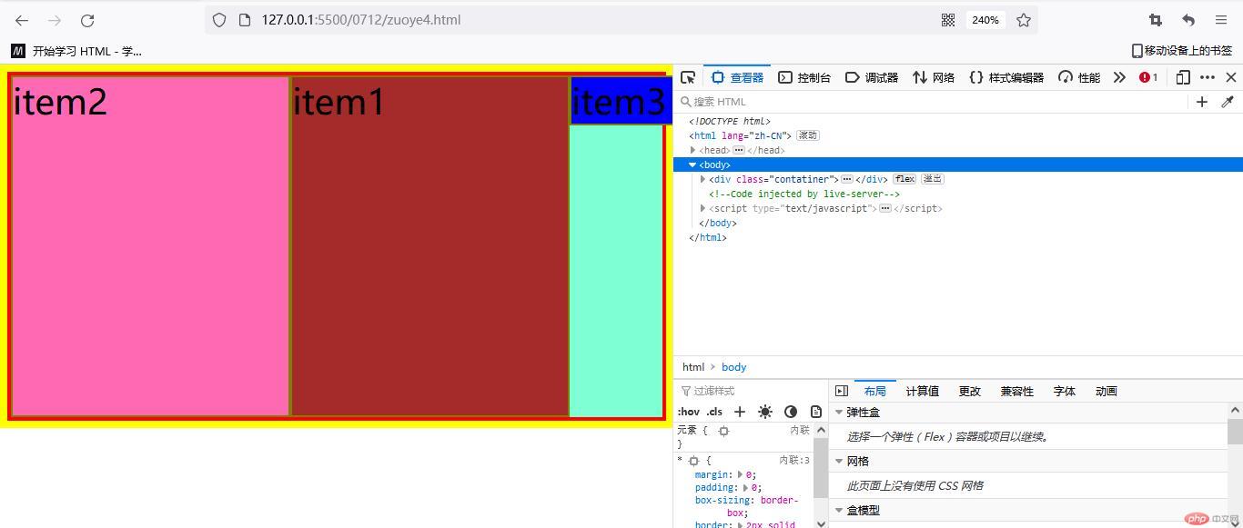
/* 改变项目、子集展示顺序 order 默认值是1 越小越靠前*/.contatiner > .item:first-of-type{background-color: brown;order: 2;}.contatiner > .item:last-of-type{background-color: blue;order: 5;}
