
字体大小
<!DOCTYPE html><html lang="zh-CN"><head><meta charset="UTF-8"><meta http-equiv="X-UA-Compatible" content="IE=edge"><meta name="viewport" content="width=device-width, initial-scale=1.0"><title>CSS常用单位</title><style>.em{font-size: 2em;color: aqua;}.px{font-size: 15px;color: blue ;}.rem{font-size: 2rem;color: rebeccapurple;}.baifen{background-color: aqua;font-size: 6em;}.baifen>.bai {font-size: 50%;}/* 根元素就是 html = :root */:root{font-size: 8px;font-size: 16px;}.rot {background-color: blue;font-size: 2rem;}body{width: 100vw;/* 如果高度不写,高度就是很宽度成比例变化 */height: 100vh;}.box{width: 50vh;height: 50vh;background-color: brown;}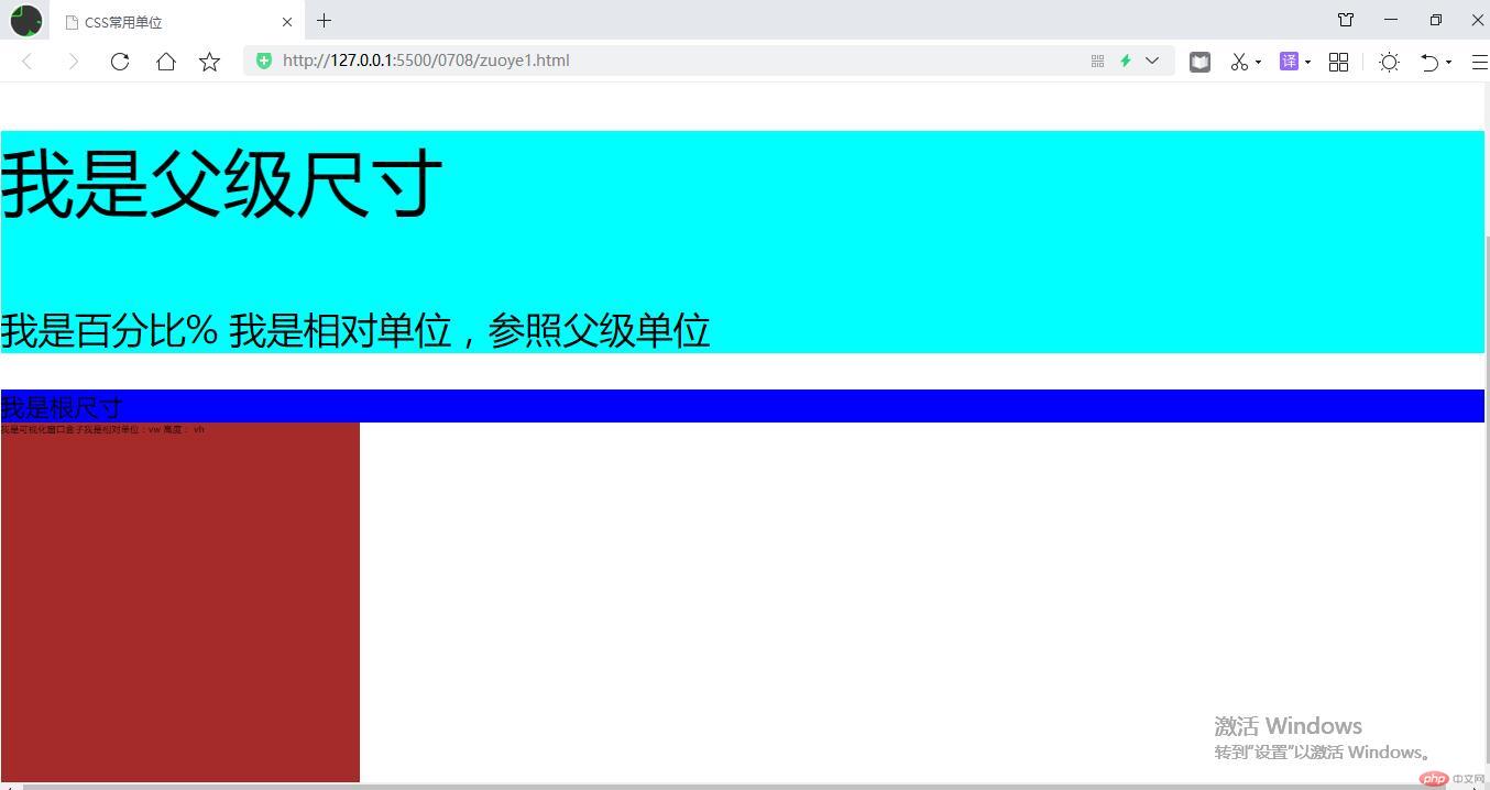</style></head><body><!-- 1em =1rem=16px 浏览器默认16px 像素是 默认矩形的框 1英寸=96px 1英寸约等于25.4毫米 1mm=(10/43)px≈0.2325px 43mm≈10px1 厘米=0.3937 英寸 1 英寸=2.54 厘米 72像素/英寸=28.346像素/厘米 300像素/英寸=118.11像素/厘米--><p class="em">我是em单位尺寸 绝对尺寸单位</p><p class="px">我是px单位尺寸 绝对尺寸单位</p><p class="rem">我是rem单位尺寸</p><div class="baifen"><p>我是父级尺寸</p><p class="bai">我是百分比% 我是相对单位,参照父级单位</p></div><div class="rot">我是根尺寸</div><div class="box">我是可视化窗口盒子我是相对单位:vw 高度: vh</div></body></html>

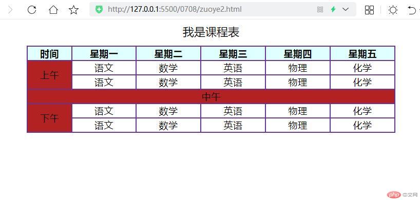
表格常用样式
<!DOCTYPE html><html lang="zh-CN"><head><meta charset="UTF-8"><meta http-equiv="X-UA-Compatible" content="IE=edge"><meta name="viewport" content="width=device-width, initial-scale=1.0"><title>表格常用的样式</title><style>/* 1、添加表格线 border */table th,table tr,table td{border: 2px solid rebeccapurple;}/* 2、折叠表格线 border-collapse: collapse;*/table{border-collapse: collapse;}/* 3、表格进行布局设置 */table{width: 80%;/* table 块级元素在父级中的居中 有margin-left margin-right */margin: auto;/* 表格内容文字居中 */text-align: center;}table caption {font-size: 1.2em;/* 增加外边距,远离标题 */margin-bottom: 0.6em;}table thead {background-color: lightcyan;}/* 给上午添加背景 常规方式 .属性名 或者 table tboday .shangwu *//* .shangwu{background-color: blue;} *//* 简化写法 ,用伪类写 ,可以进行删选、个性化书写table tbody tr:first-of-type td:first-of-type注意空格table tbody:not(tbody:nth-of-type(2)) tr:first-of-type td:first-of-type {*//* table tbody:not(tbody:nth-of-type(2)) tr:first-of-type td:first-of-type{ */table tbody:not(tbody:nth-of-type(2)) tr:first-of-type td:first-of-type {background-color: firebrick;}</style></head><body><!-- table>caption+(thead>tr>th)+(tbody>tr>td) --><table><caption>我是课程表</caption><thead><tr><th>时间</th><th>星期一</th><th>星期二</th><th>星期三</th><th>星期四</th><th>星期五</th></tr></thead><!-- 我是第一个tbody --><tbody><tr><td rowspan="2" class="shangwu">上午</td><td>语文</td><td>数学</td><td>英语</td><td>物理</td><td>化学</td></tr><tr><td>语文</td><td>数学</td><td>英语</td><td>物理</td><td>化学</td></tr></tbody><!-- 我是第二tbody --><tbody><tr><td colspan="6">中午</td></tr></tbody><!-- 我是第三tbody --><tbody><tr><td rowspan="2">下午</td><td>语文</td><td>数学</td><td>英语</td><td>物理</td><td>化学</td></tr><tr><td>语文</td><td>数学</td><td>英语</td><td>物理</td><td>化学</td></tr></tbody></table></body></html>
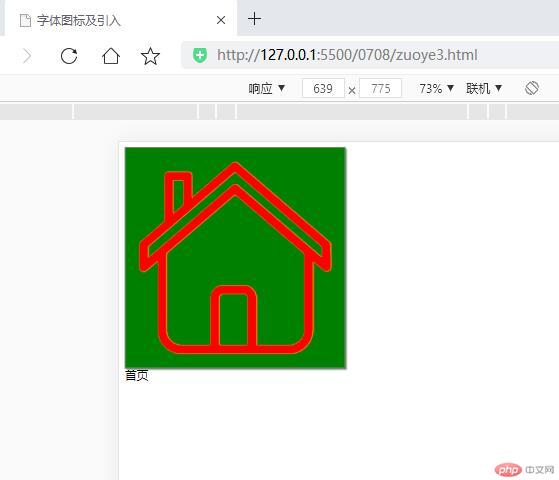
字体图标
<!DOCTYPE html><html lang="zh-CN"><head><meta charset="UTF-8"><meta http-equiv="X-UA-Compatible" content="IE=edge"><meta name="viewport" content="width=device-width, initial-scale=1.0"><title>字体图标及引入</title><!-- <link rel="stylesheet" href="./iconfont.css"> --><link rel="stylesheet" href="../0708/css/zuoye3.css"><style>/* .myicon1{font-size: 300px;color: red;box-shadow: 2px 2px 2px #888;border: 1px solid #888;background-color: green;} *//* 可以使用 .myicon进行对图标大小的定义,定义属性参考 文字 注意 里面要有myicon属性 */</style></head><body><!-- 注意 icon-shouye 是字体图标的名称 另外可从下载的 demo_index.html 打开获取操作指导 --><span id="shouye" class="iconfont icon-shouye myicon1"></span><br>首页</body></html>
注意:引入的css 后面要跟分号,且 在自定义样式的前面,否则不显示@import '../font_icon/iconfont.css';/* 2. 自定义图标样式 */.myicon1{font-size: 300px;color: red;box-shadow: 2px 2px 2px #888;border: 1px solid #888;background-color: green;}
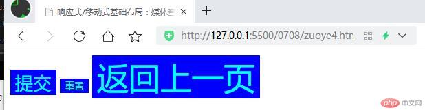
响应式/移动端布局基础:媒体查询
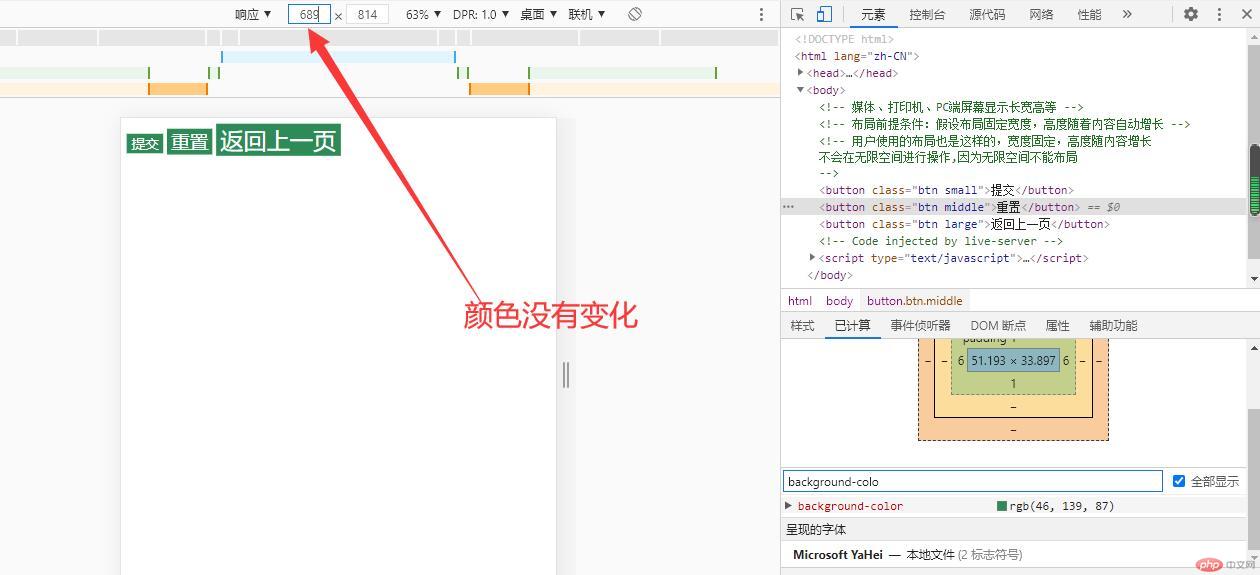
1、按钮随着 根属性变化
<!DOCTYPE html><html lang="zh-CN"><head><meta charset="UTF-8"><meta http-equiv="X-UA-Compatible" content="IE=edge"><meta name="viewport" content="width=device-width, initial-scale=1.0"><title>响应式/移动式基础布局:媒体查询</title><style>:root{/* 设置根字号的尺寸 */font-size: 20px;/* 等于1.6rem */}button{background-color: blue;color: aqua;border: none;/* outline: 1.875rem; *//* border: none; 没有边框,背景 */outline: none;}/* :hover 鼠标悬停的基本样式 */.bin:hover{/* cursor: pointer; 鼠标变成一个小手 */cursor: pointer;/* opacity 选择后的背景透明度变化 80% */opacity: 0.8;/* 缓冲过度 注意后面跟着秒数*/transition: 0.5s;}.small{/* 小按钮 可以用字体大小调节按钮大小.,按钮默认尺寸是 13.333333 */font-size: 1.5rem;/* px是绝对值不能用在媒体查询中 往后不要用了 ,在跟字体设置,用rem表示尺寸,修改 root 根字体后,这些按键就会动态改变 */}.middle{font-size: 0.6rem;}.large{font-size: 2.5rem;}</style></head><body><!-- 媒体、打印机、PC端屏幕显示长宽高等 --><!-- 布局前提条件:假设布局固定宽度,高度随着内容自动增长 --><!-- 用户使用的布局也是这样的,宽度固定,高度随内容增长不会在无限空间进行操作,因为无限空间不能布局--><button class="bin small">提交</button><button class="bin middle">重置</button><button class="bin large">返回上一页</button></body></html>
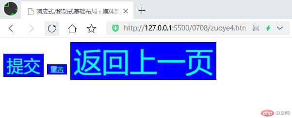
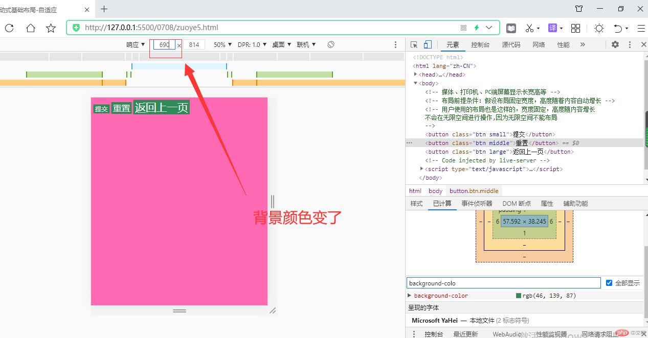
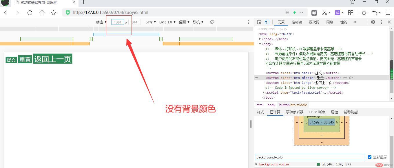
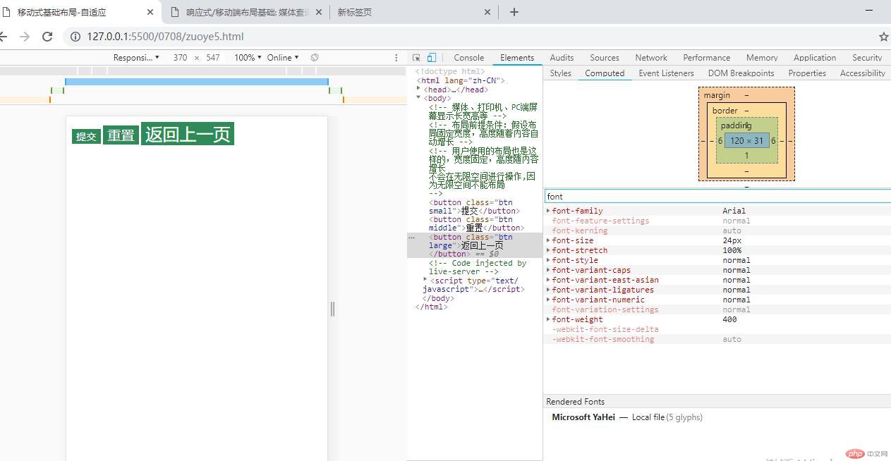
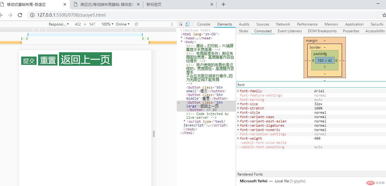
2、移动端按钮随着 屏幕大小变化属性变化
<!DOCTYPE html><html lang="zh-CN"><head><meta charset="UTF-8"><meta http-equiv="X-UA-Compatible" content="IE=edge"><meta name="viewport" content="width=device-width, initial-scale=1.0"><title>移动式基础布局-自适应</title><style>/* html { *//* 设置根字号的尺寸 *//* font-size: 20px; *//* 等于1.6rem *//* } */html {/* 根字号 *//* 为了计算方便: 把根字号设置为 10px */font-size: 10px;/* 10px = 1rem; */}/* button{background-color: blue;color: aqua;border: none; *//* outline: 1.875rem; *//* border: none; 没有边框,背景 *//* outline: none;} *//* :hover 鼠标悬停的基本样式 *//* .btn:hover{ *//* cursor: pointer; 鼠标变成一个小手 *//* cursor: pointer; *//* opacity 选择后的背景透明度变化 80% *//* opacity: 0.8; *//* 缓冲过度 注意后面跟着秒数*//* transition: 0.5s; *//* }*/.btn {background-color: seagreen;color: white;border: none;outline: none;}/* .small{ *//* 小按钮 可以用字体大小调节按钮大小.,按钮默认尺寸是 13.333333 *//* font-size: 1.5rem; *//* px是绝对值不能用在媒体查询中 往后不要用了 ,在跟字体设置,用rem表示尺寸,修改 root 根字体后,这些按键就会动态改变 *//* } *//* .middle{ *//* font-size: 0.6rem; *//* } *//* .large{font-size: 2.5rem;} */.small {/* 小按钮: 12px *//* font-size: 12px; *//* px: 绝对值,不能用在媒体查询中 */font-size: 1.2rem;}.middle {/* 中等按钮: 16px; *//* font-size: 16px; */font-size: 1.6rem;}.large {/* 大按钮: 20px *//* font-size: 20px; */font-size: 2rem;}/* 移动优先:一定要从小屏幕开始写 ,安卓的乱七八遭尺寸都有,苹果的比较同意 *//* 注意:@media是引入的属性,max-width是最大尺寸,是大于min-width是最小的尺寸是不包含的,小于随着改变屏幕的尺寸/手持机的类型,按键大小会变化的 *//* 375px < width < 414px 注意中间用and连接 */@media (max-width: 374px) {html {font-size: 12px;}}/* 375px < width < 414px */@media (min-width: 375px) and (max-width: 413px) {html {font-size: 14px;}}/* > 414px */@media (min-width: 414px) {html {font-size: 16px;}}@media (min-width: 600px) {html {font-size: 18px;}}</style></head><body><!-- 媒体、打印机、PC端屏幕显示长宽高等 --><!-- 布局前提条件:假设布局固定宽度,高度随着内容自动增长 --><!-- 用户使用的布局也是这样的,宽度固定,高度随内容增长不会在无限空间进行操作,因为无限空间不能布局--><button class="btn small">提交</button><button class="btn middle">重置</button><button class="btn large">返回上一页</button></body></html>
2、PC端端按钮随着 屏幕大小变化属性变化
```
/ 上面 style 代码增加一下部分。PC端 设置 600 <width< 1200px /
@media (min-width: 600px) and (max-width: 1200px) {
html {
background-color: hotpink;}}
``