
一、伪类选择器
1. 位置类伪类选择器
1.1 选择某个元素
HTML示例基础代码如下:<!DOCTYPE html><html lang="en"><head><meta charset="UTF-8"><meta http-equiv="X-UA-Compatible" content="IE=edge"><meta name="viewport" content="width=device-width, initial-scale=1.0"><title></title><link rel="stylesheet" href="test.css"></head><body><ul class="list"><li class="first">item1</li><li>item2</li><li>item3</li><li>item4</li><li>item5</li><li>item6</li><li>item7</li><li>item8</li></ul></body></html>test.css文件内容.list>li:nth-of-type(1){background-color: blue;}
效果如下: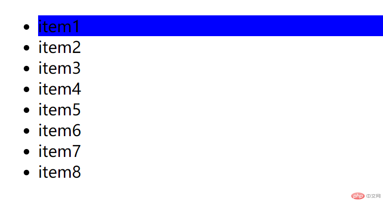
1.2 选中一组元素
.list>li:nth-of-type(1n){background-color: blue;}
效果如下: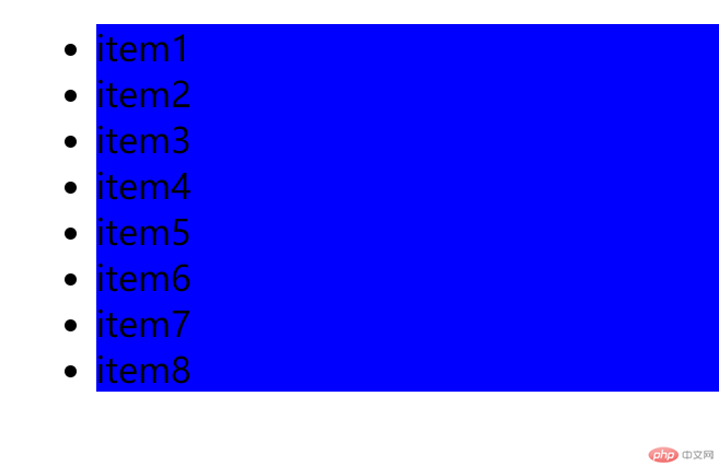
1.3 选择一组中第三个元素后所有元素
.list>li:nth-of-type(1n+3){background-color: blue;}
效果如下: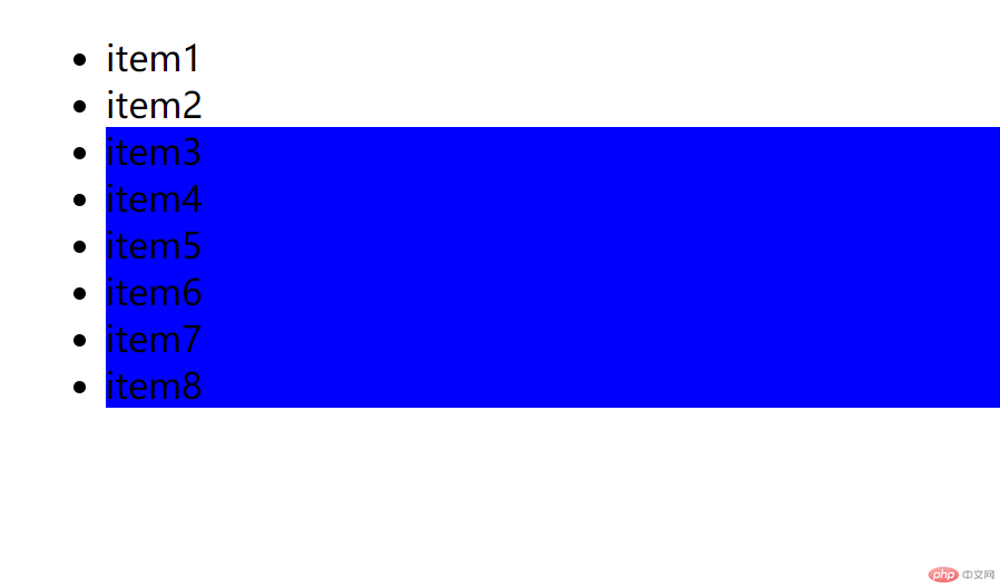
1.4 选择一组中前三个
.list>li:nth-of-type(-1n+3){background-color: red;}
效果如下: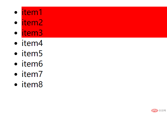
1.5 选择一组中的偶数项
.list>li:nth-of-type(2n){background-color: red;}或者.list>li:nth-of-type(even){background-color: red;}
效果如下: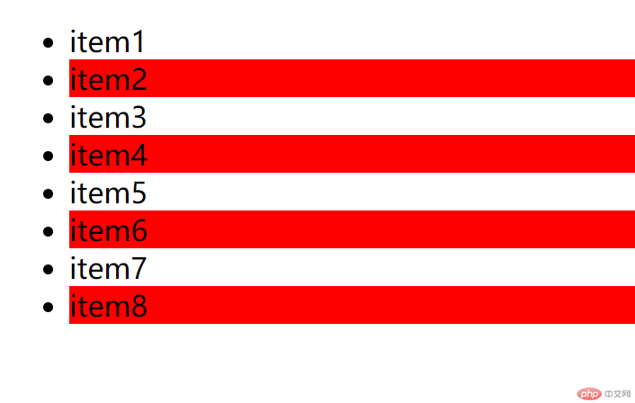
1.6 选择一组中的奇数项
.list>li:nth-of-type(2n+1){background-color: red;}或者.list>li:nth-of-type(odd){background-color: red;}
效果如下: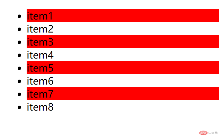
使用2n-1也可以选择奇数项
1.7 选择倒数3个
.list>li:nth-last-of-type(-n+3){background-color: red;}
效果如下: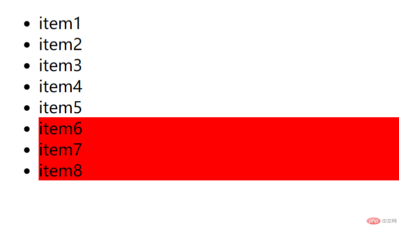
1.8 永远选择第一个和最后一个元素
.list>li:first-of-type{background-color: red;}.list>li:last-of-type{background-color: red;}
效果如下: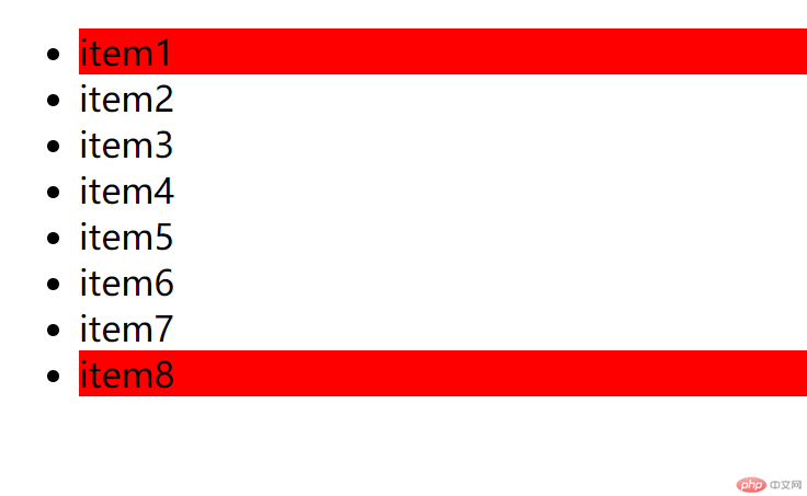
2. 状态类伪类选择器
HTML示例基础代码如下:
<!DOCTYPE html><html lang="en"><head><meta charset="UTF-8"><meta http-equiv="X-UA-Compatible" content="IE=edge"><meta name="viewport" content="width=device-width, initial-scale=1.0"><title></title><link rel="stylesheet" href="test.css"></head><body><form action=""><fieldset style="width: 512px;"><legend>用户注册</legend><label>用户名<input type="text"></label><br/><label for="tips">警告:</label><input type="text" id="uname" value="一旦注册不能注销" style="border: none;" disabled/><div class="gender"><input type="radio" id="male" name="sex" value="male" checked/><label for="male">男</label><input type="radio" id="female" name="sex" value="female" /><label for="female">女</label><br /><button>提交</button></div></fieldset></form></body></html>
2.1 获取input文本元素的disable属性
改变其样式
input:disabled{color: red;background-color: yellow;}
效果如下: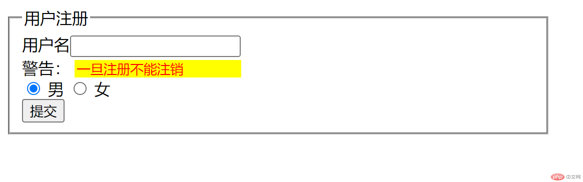
2.2 获取input 单选框的选中属性
找到相邻元素,改变其样式。
input:checked +label{color:red;}
效果如下: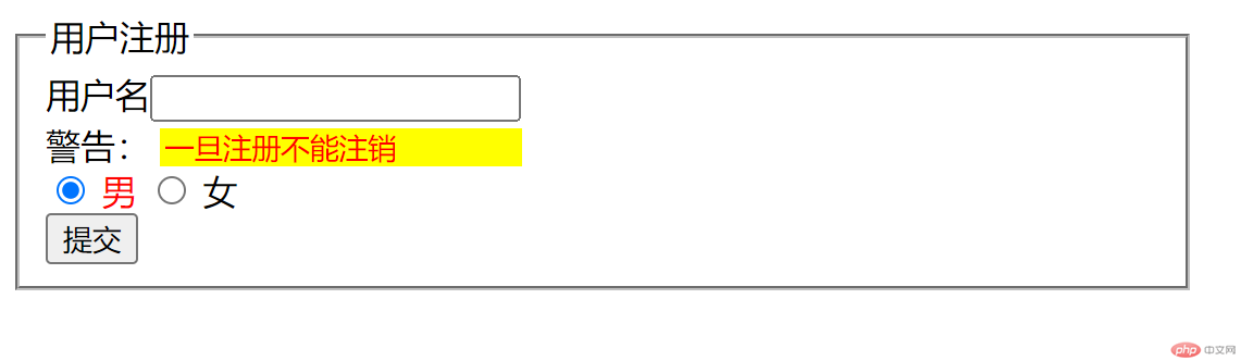
单选框被选中时,“男”变为红色。
2.3 获取提交按钮的悬停属性
更改按钮样式
button{height: 30;border: none;outline: none;background-color: seagreen;color: white;}
效果如下: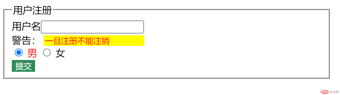
获取悬停属性并改变其样式
button:hover{cursor: pointer;background-color: coral;}
效果如下: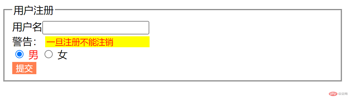
鼠标悬停指针变为小手(受截图限制未看到效果),悬停在按钮上颜色会变为橘红色。
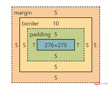
二、 盒子模型常用属性
HTML示例基础代码如下:<!DOCTYPE html><html lang="en"><head><meta charset="UTF-8"><meta http-equiv="X-UA-Compatible" content="IE=edge"><meta name="viewport" content="width=device-width, initial-scale=1.0"><title></title><link rel="stylesheet" href="test.css"></head><body><div class="box"></div></body></html>
来看下一个块元素的盒子模型常用属性,如下图:
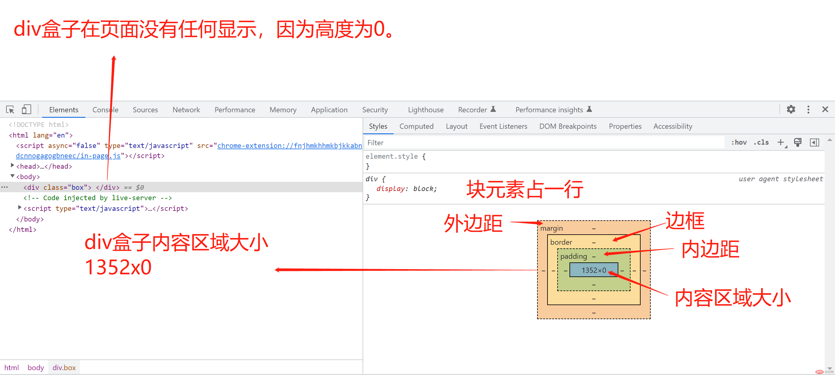
块元素占一行,宽度随页面变化自动调整,自动铺满一行。div元素当前外边距、边框、内边距都是没有值的。
当前div盒子高度为0,因此不可见,我们做些设置来使其可见。
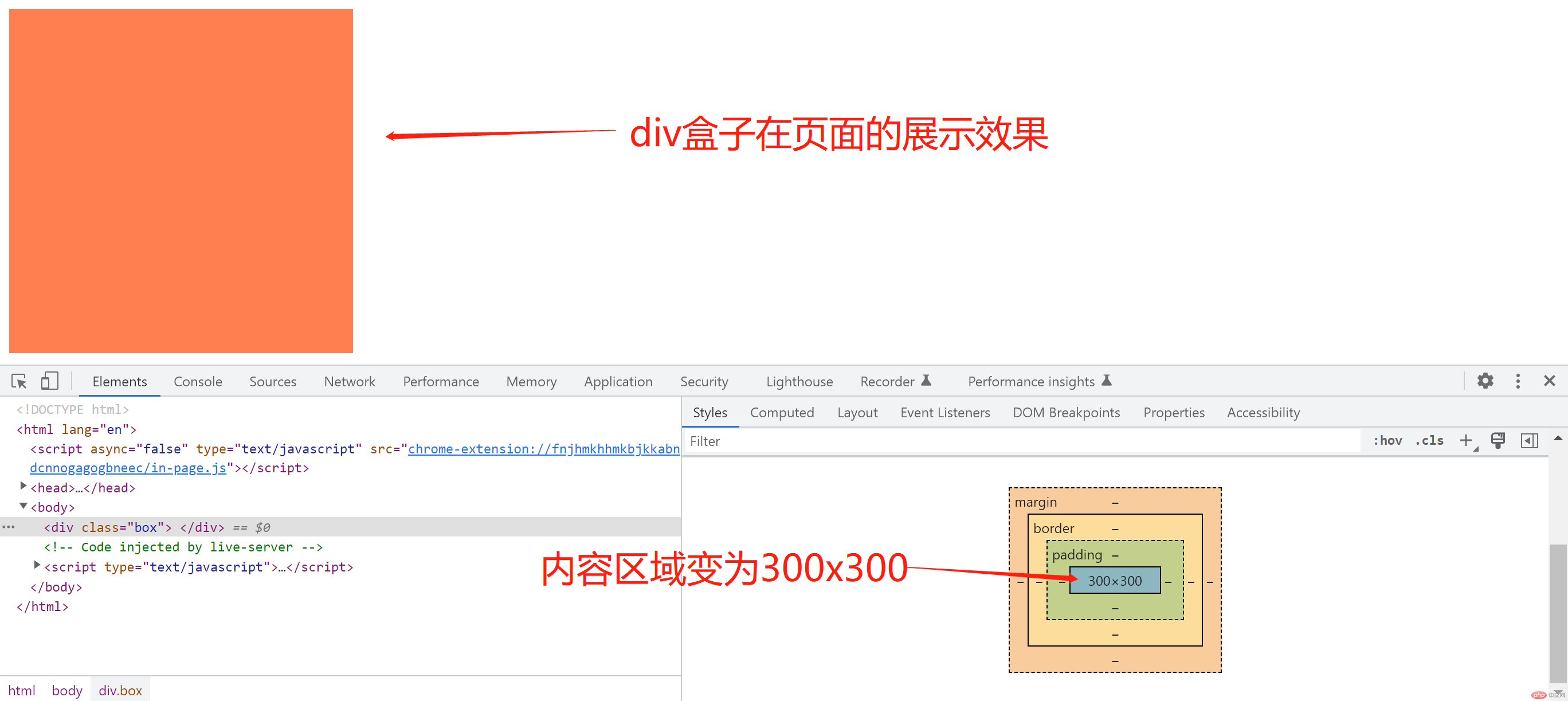
调整下宽度和高度,并增加可见属性,如背景颜色。
.box{width: 300px;height: 300px;background-color: coral;}
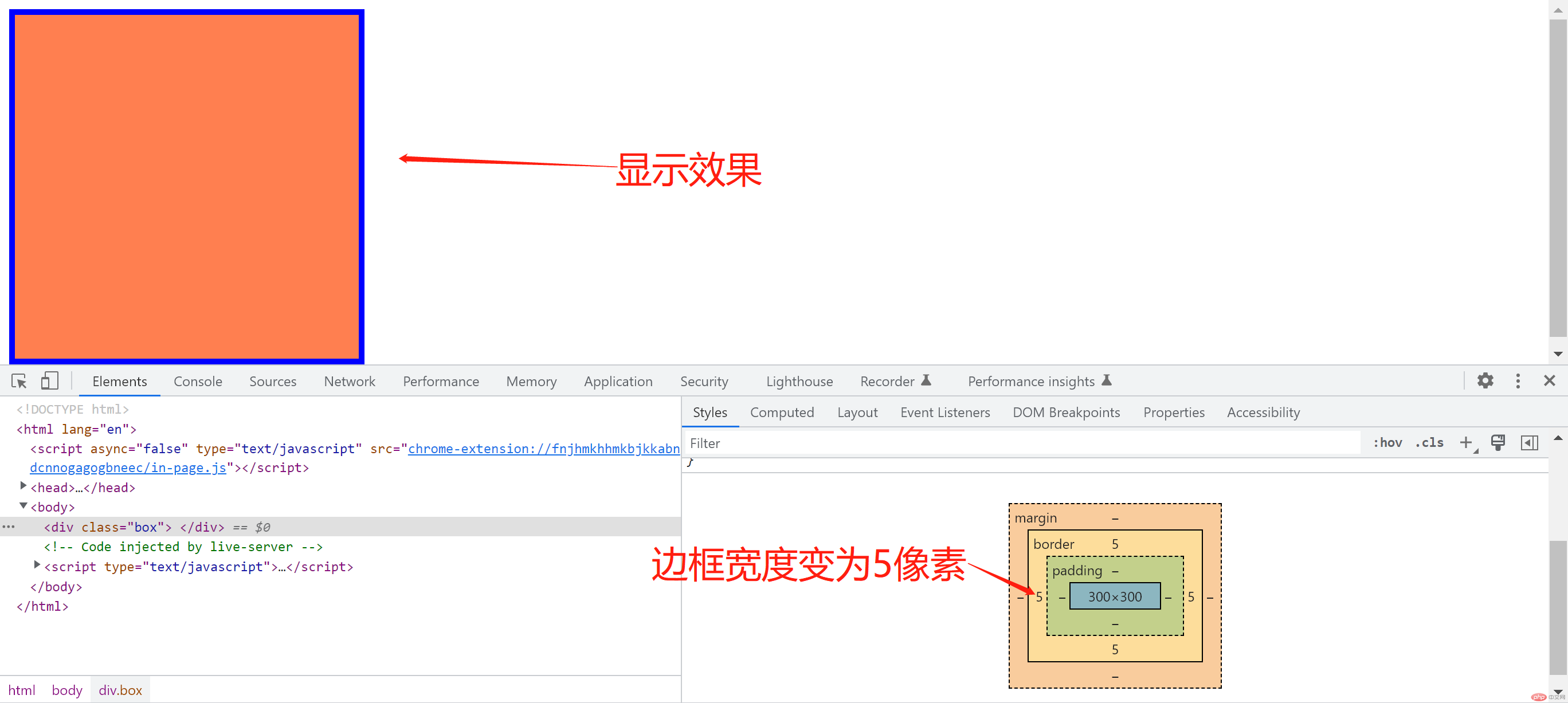
增加边框效果
.box{width: 300px;height: 300px;background-color: coral;border: 5px solid blue;}
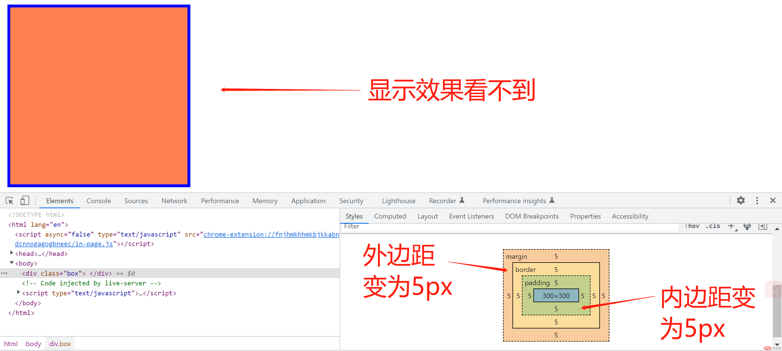
内边距和外边距属于不可见属性,改变不能被直接看到。且不可见属性,只能设置其宽度,不能设置特征(如颜色,实线等)。
.box{width: 300px;height: 300px;background-color: coral;border: 5px solid blue;padding: 5px;margin: 5px;}
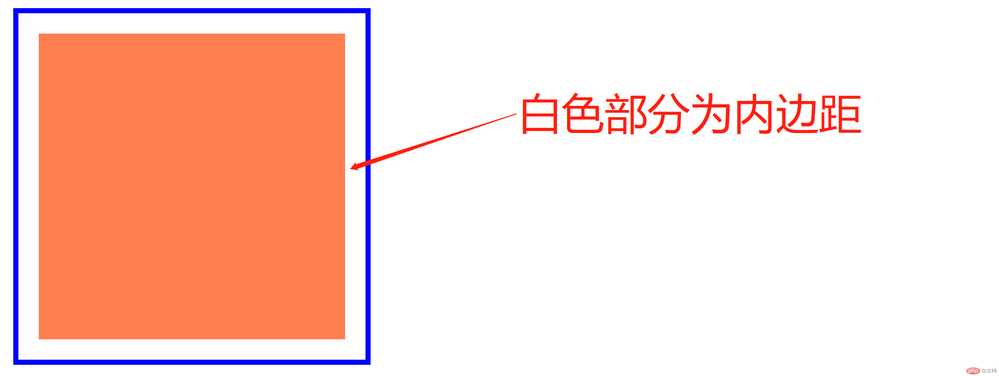
让内边距可见,使用背景裁切,间接实现内边距可见。为了显示效果将内边距调整为20px。
.box{width: 300px;height: 300px;background-color: coral;background-clip: content-box;border: 5px solid blue;padding: 20px;margin: 5px;}
让盒子的大小包含边框和内边距
.box{width: 300px;height: 300px;background-color: coral;background-clip: content-box;border: 5px solid blue;padding: 20px;margin: 5px;box-sizing: border-box;}
box-sizing: border-box;即表示让盒子的大小包含边框和内边距,可以看到盒子设置的高和宽都是300.
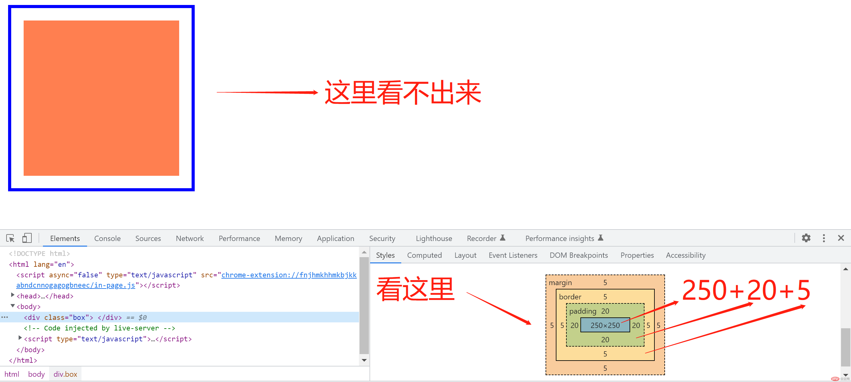
盒子的大小已经包含了边框和内边距。
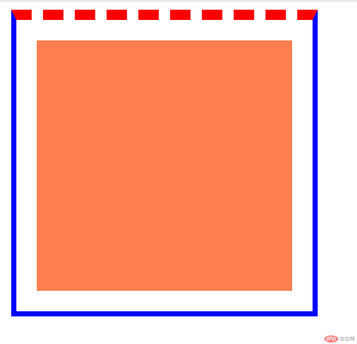
使用如下方式单独设置某一条边框
border-top: 10px dashed red;
设置内边距的普通方法
padding-left: 5px;padding-right: 10px;padding-top: 7px;padding-bottom: 3px;
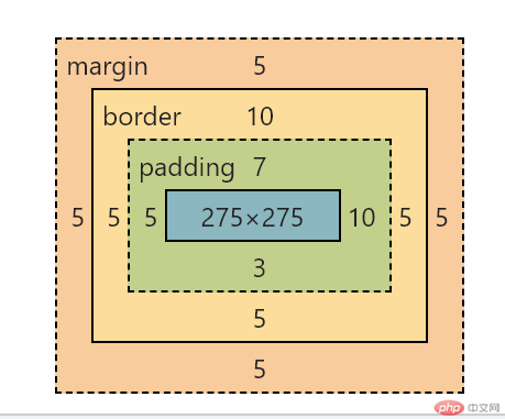
设置内边距的简化方法
简化为四个参数,从左至右为顺时针,分别表示内边距的上右下左。
padding: 5px 7px 10px 3px;
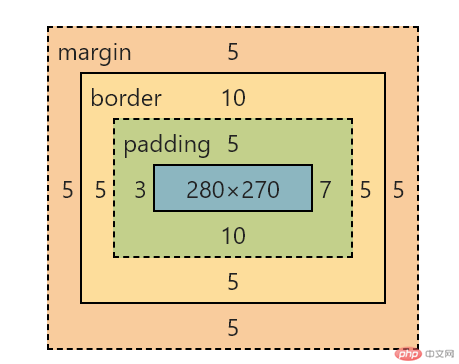
简化为三个参数,分别表示内边距的上 ,右(左),下。
padding: 5px 7px 10px;
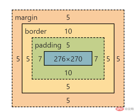
简化为两个参数,分别表示内边距的上(下)和 右(左)。
padding: 5px 7px;